0 概述
flutter经验汇总。flutter明显要比微信小程序严谨多了,唯一缺点是没有微信的生态,动态性也不好。
参考资料:
- flutter官方文档
- dart官方文档
- flutter实战第二版,这本书讲的非常好,建议多点看,为此,我也捐献了作者红包,希望作者做出更好的作品。
- 欢迎 Slivers 体系 5 位新成员
本文章中的demo代码和描述大多来自flutter官方文档和flutter实战第二版,推荐大家移步看他们的文档,本文档仅作快速索引和补充。
1 快速入门
安装的时候遇到较多的问题,参考资料有:
代码在这里
1.1 安装flutter
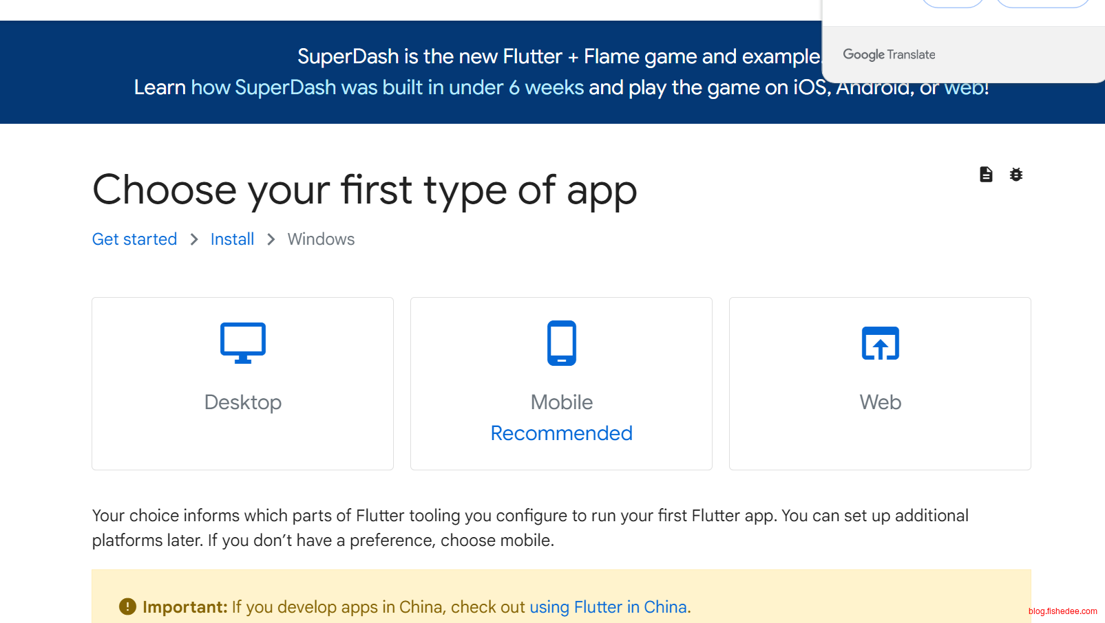
首先到这里,下载Windows下的工具
PATH=C:\Users\MyUser\Util\flutter\bin将安装包解压,并且将flutter目录下的bin文件夹加入到PATH环境变量中
flutter doctor --android-licenses如果我们这个时候,直接执行flutter docker会提示报错,因为Android SDK还没有安装完毕
1.2 安装Android命令行工具
按照这里的经验,安装好Android SDK
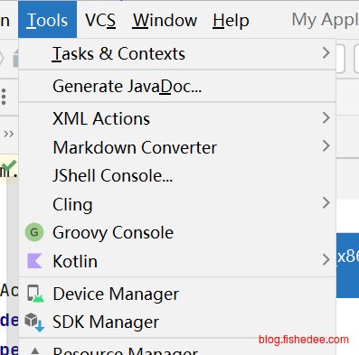
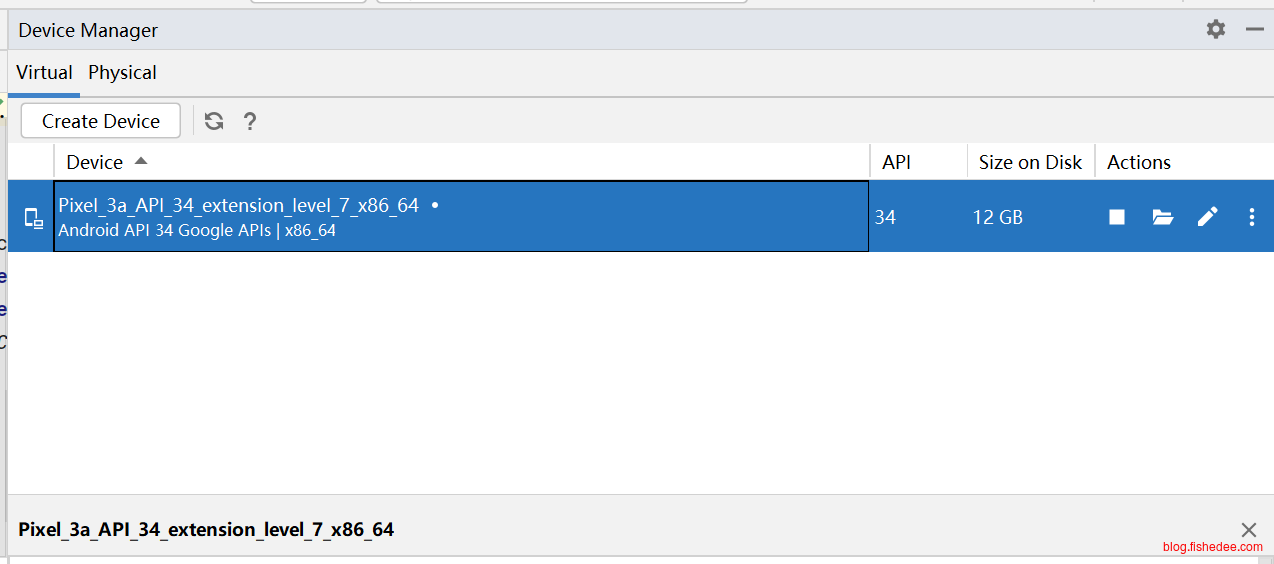
创建好一个Android模拟器,注意要打开硬件加速,可以看这里和这里
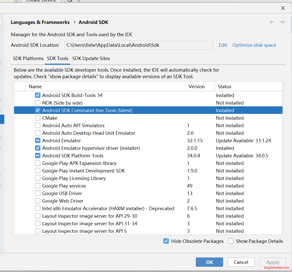
打开Sdk Manager,我们需要安装
- Android SDK Platform, API 33.0.0
- Android SDK Command-line Tools,注意必须要安装这个
- Android SDK Build-Tools
- Android SDK Platform-Tools
- Android Emulator
ANDROID_HOME=C:\Users\fishe\AppData\Local\Android\Sdk
PATH=%ANDROID_HOME%\platform-tools:%ANDROID_HOME%\cmdline-tools\latest\bin:%PATH%
加入以上环境变量
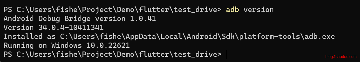
能启动adb,证明platform-tools安装成功了
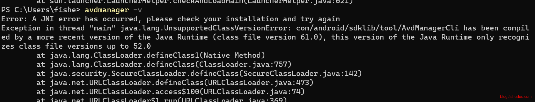
能出现avdmanager,证明command-line tools安装成功了
1.3 配置flutter
export FLUTTER_STORAGE_BASE_URL=https://storage.flutter-io.cn
export PUB_HOSTED_URL=https://pub.flutter-io.cn
加入flutter的镜像地址
flutter doctor --android-licenses执行android签名,这里需要多次输入y,来确认同意
flutter doctor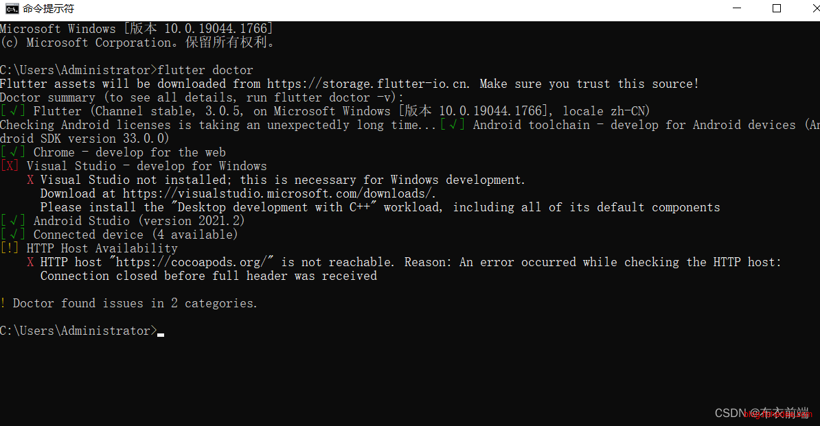
执行这一步就能成功了
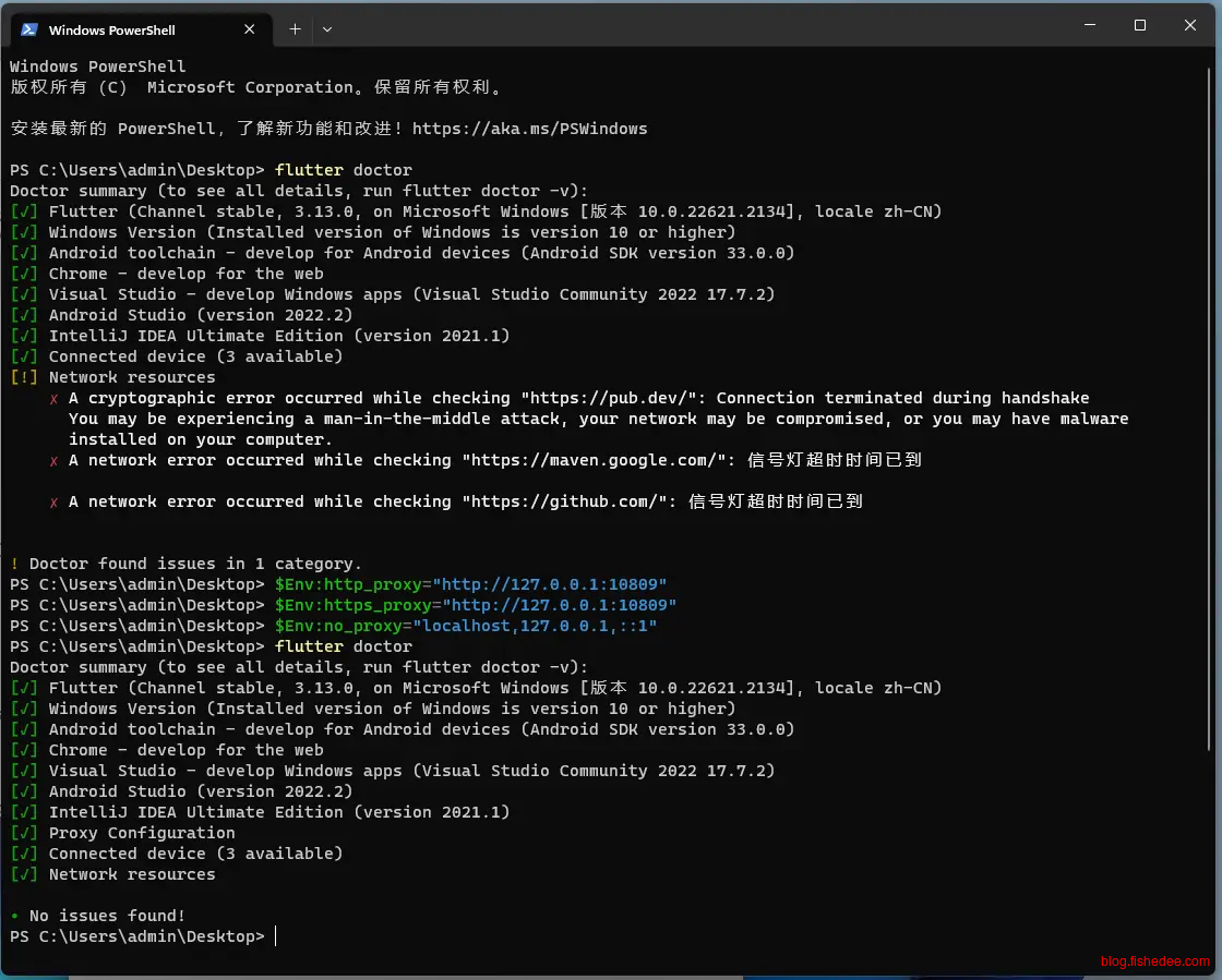
$Env:http_proxy="http://127.0.0.1:7890"
$Env:https_proxy="http://127.0.0.1:7890"
$Env:no_proxy="localhost,127.0.0.1,::1"
有时候,配置了镜像地址还是失败,这是因为flutter向github请求的时候失败了,这个时候需要配置代理,在命令行输入以上代码即可,配置为你对应的代理地址。
1.4 新建项目
flutter create test_drive
cd test_drive
创建项目
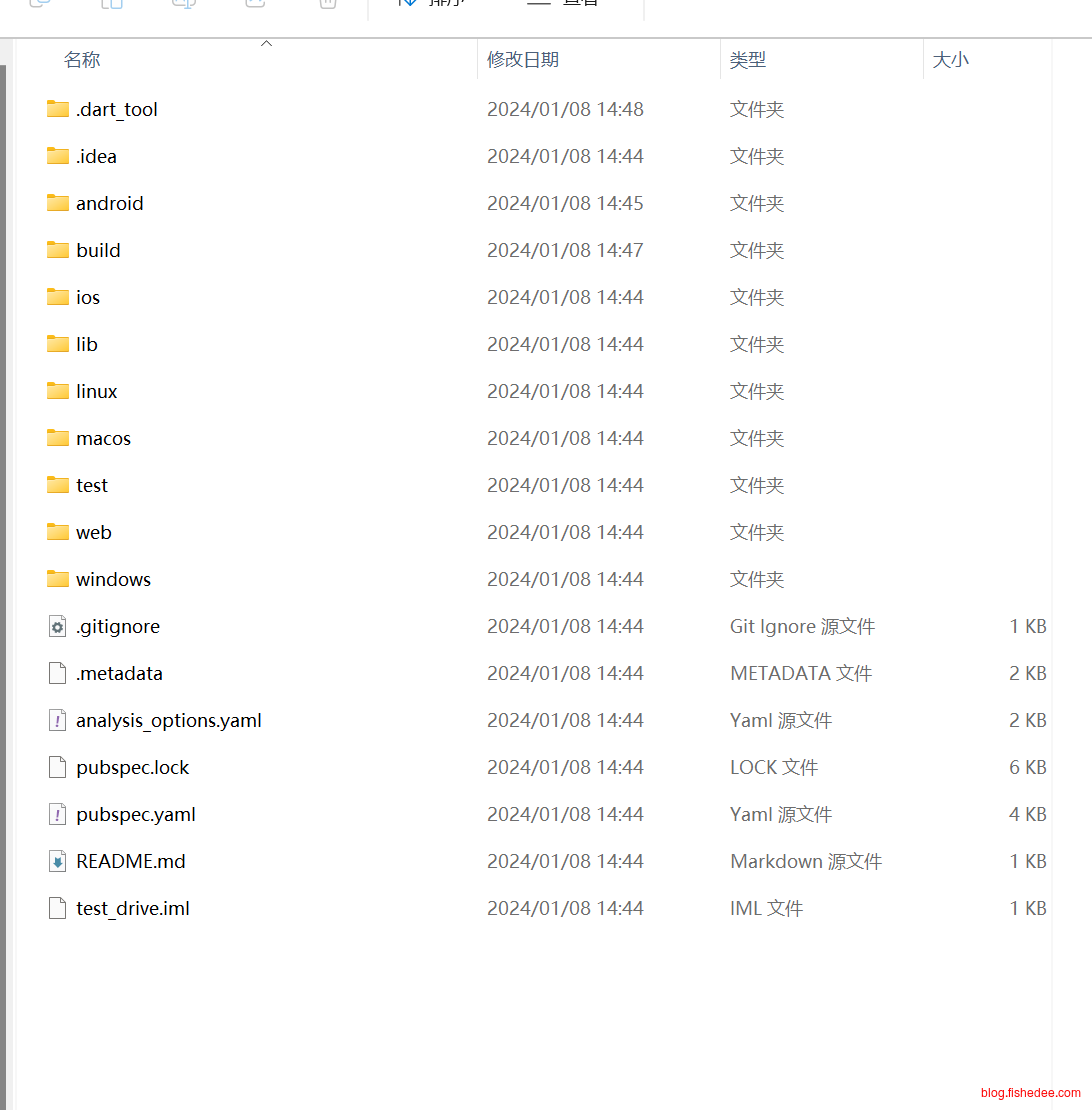
这是生成的项目目录,源代码都放在了lib文件夹
1.5 启动和调试项目
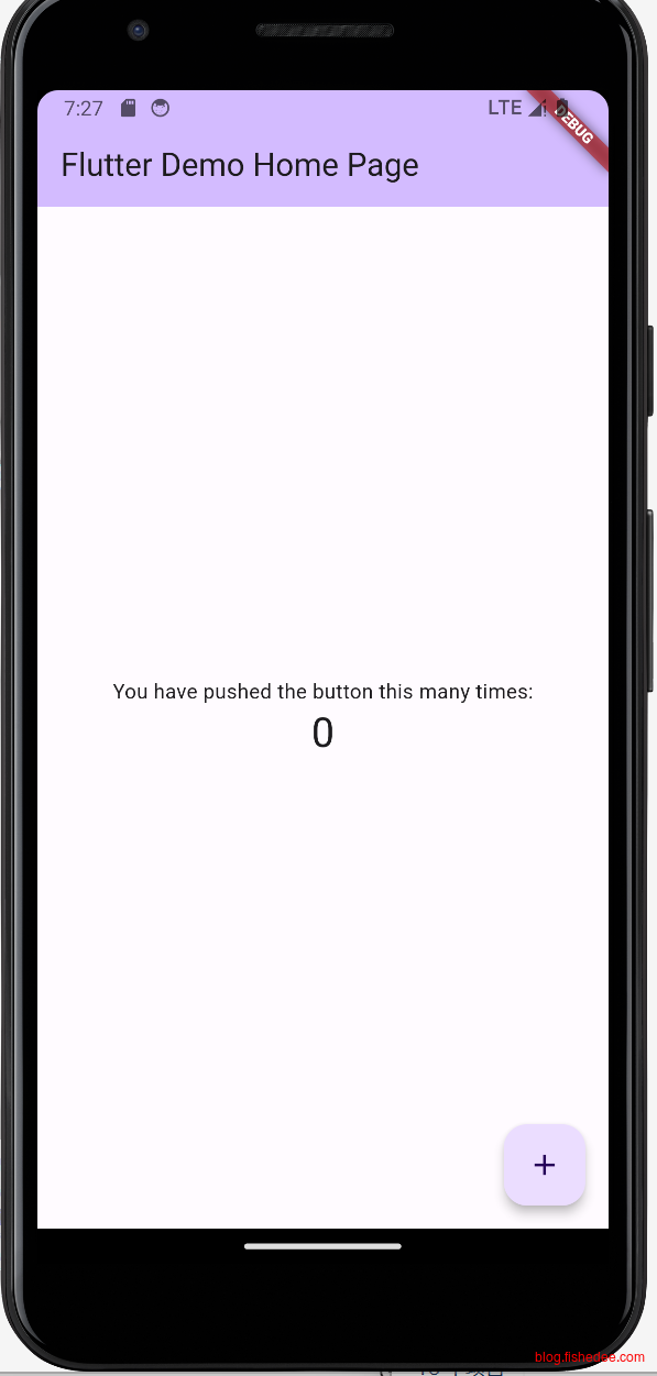
flutter run启动flutter
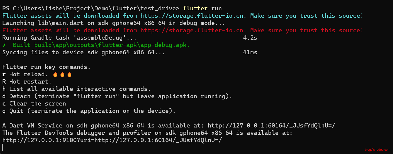
启动的时候有显示调试地址,直接复制到浏览器就能显示了,比较简单
另外,在代码变化以后,需要手动在控制台输入r,才能刷新UI。
1.6 FAQ
参考资料:
1.6.1 Gradle报错
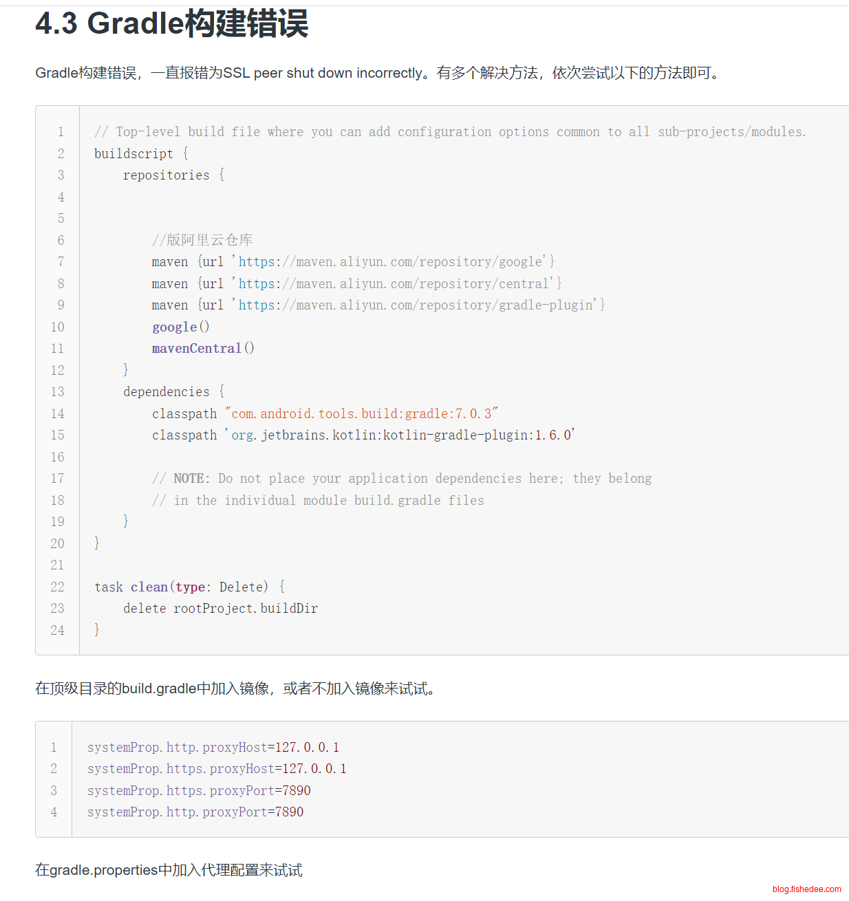
启动Android项目的时候,如果遇到Gradle报错,一般是因为没有配置镜像导致的,可以看这里
1.6.2 iOS编译报错,找不到Generated.xcconfig
以下操作即可
- 在Xcode12上运行”Product > Clean Build Folder“。
- 在终端上运行flutter clean
- 在终端上运行flutter pub get (这将创建/project/ios/flutter/Generated.xcconfig)
- 在终端上运行pod install (假设您在/project/ios文件夹中)
然后可以在xcode上进行构建。
1.6.3 iOS编译错误,Module … not found
XCode打开的文件不是ios/Runner.xcodeproj, 而是ios/Runner.xcworkspace
2 状态管理
本章描述从React迁移到flutter,快速掌握flutter的状态处理。代码在这里
2.1 基础
import 'package:flutter/material.dart';
class BasicWidget extends StatelessWidget {
const BasicWidget({
Key? key,
}) : super(key: key);
@override
Widget build(BuildContext context) {
return const Center(
child: Text(
'Hello, world!',
textDirection: TextDirection.ltr,
),
);
}
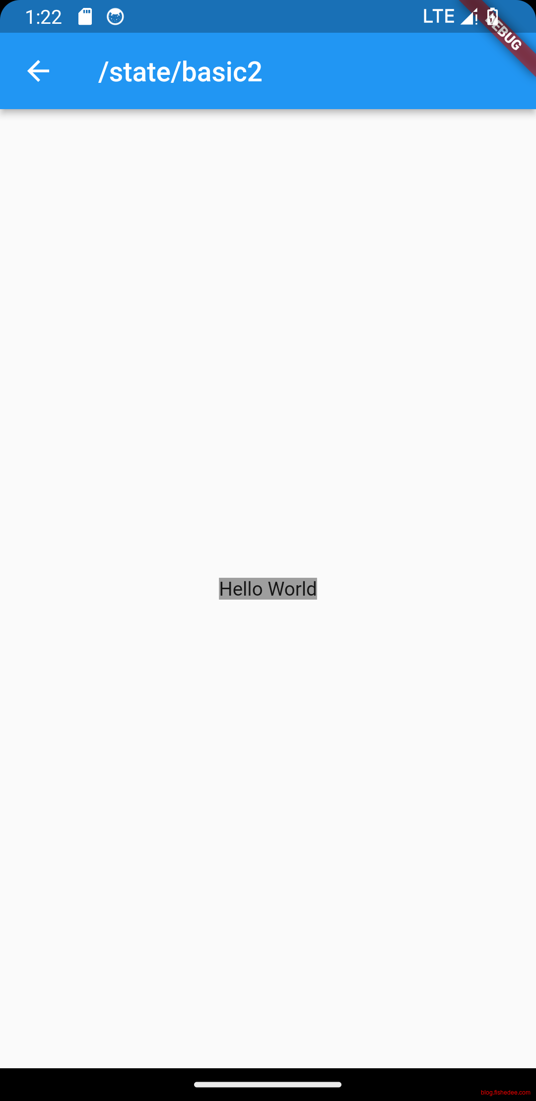
}Hello World快速入门,没啥好说的
2.2 无状态组件(纯组件)
import 'package:flutter/material.dart';

class BasicWidget2 extends StatelessWidget {
  const BasicWidget2({
    Key? key,
  }) : super(key: key);

  @override
  Widget build(BuildContext context) {
    return const MyText(text: "Hello World");
  }
}

class MyText extends StatelessWidget {
  const MyText({
    Key? key,
    required this.text,
    this.backgroundColor = Colors.grey, //默认为灰色
  }) : super(key: key);

  final String text;
  final Color backgroundColor;

  @override
  Widget build(BuildContext context) {
    return Center(
      child: Container(
        color: backgroundColor,
        child: Text(text, textDirection: TextDirection.ltr),
      ),
    );
  }
}
无状态组件,直接使用StatlessWidget,继承后直接使用就可以了。
2.3 状态组件(非纯组件)
import 'package:flutter/material.dart';
class Counter extends StatefulWidget {
//counter的props发生变化的时候,Counter实例不会发生变化,会绑定到新的state上
const Counter({super.key, required this.initValue});
final int initValue;
@override
State<Counter> createState() => _CounterState();
}
class _CounterState extends State<Counter> {
int _counter = 0;
void _increment() {
setState(() {
// This call to setState tells the Flutter framework
// that something has changed in this State, which
// causes it to rerun the build method below so that
// the display can reflect the updated values. If you
// change _counter without calling setState(), then
// the build method won't be called again, and so
// nothing would appear to happen.
_counter++;
});
}
@override
void initState() {
super.initState();
//初始化状态
_counter = widget.initValue;
print("initState");
}
@override
Widget build(BuildContext context) {
// This method is rerun every time setState is called,
// for instance, as done by the _increment method above.
// The Flutter framework has been optimized to make
// rerunning build methods fast, so that you can just
// rebuild anything that needs updating rather than
// having to individually changes instances of widgets.
return Row(
mainAxisAlignment: MainAxisAlignment.center,
children: <Widget>[
ElevatedButton(
onPressed: _increment,
child: const Text('Increment'),
),
const SizedBox(width: 16),
Text('Count: $_counter'),
],
);
}
//同一个Element上更新Widget时出现的
//相当于React里面getDerivedStateFromProps
@override
void didUpdateWidget(Counter oldWidget) {
super.didUpdateWidget(oldWidget);
print("didUpdateWidget ");
}
@override
void deactivate() {
super.deactivate();
print("deactivate");
}
@override
void dispose() {
super.dispose();
print("dispose");
}
@override
void reassemble() {
super.reassemble();
print("reassemble");
}
@override
void didChangeDependencies() {
super.didChangeDependencies();
print("didChangeDependencies");
}
}
class BasicWidget3 extends StatelessWidget {
const BasicWidget3({
Key? key,
}) : super(key: key);
@override
Widget build(BuildContext context) {
return const Counter(initValue: 0);
}
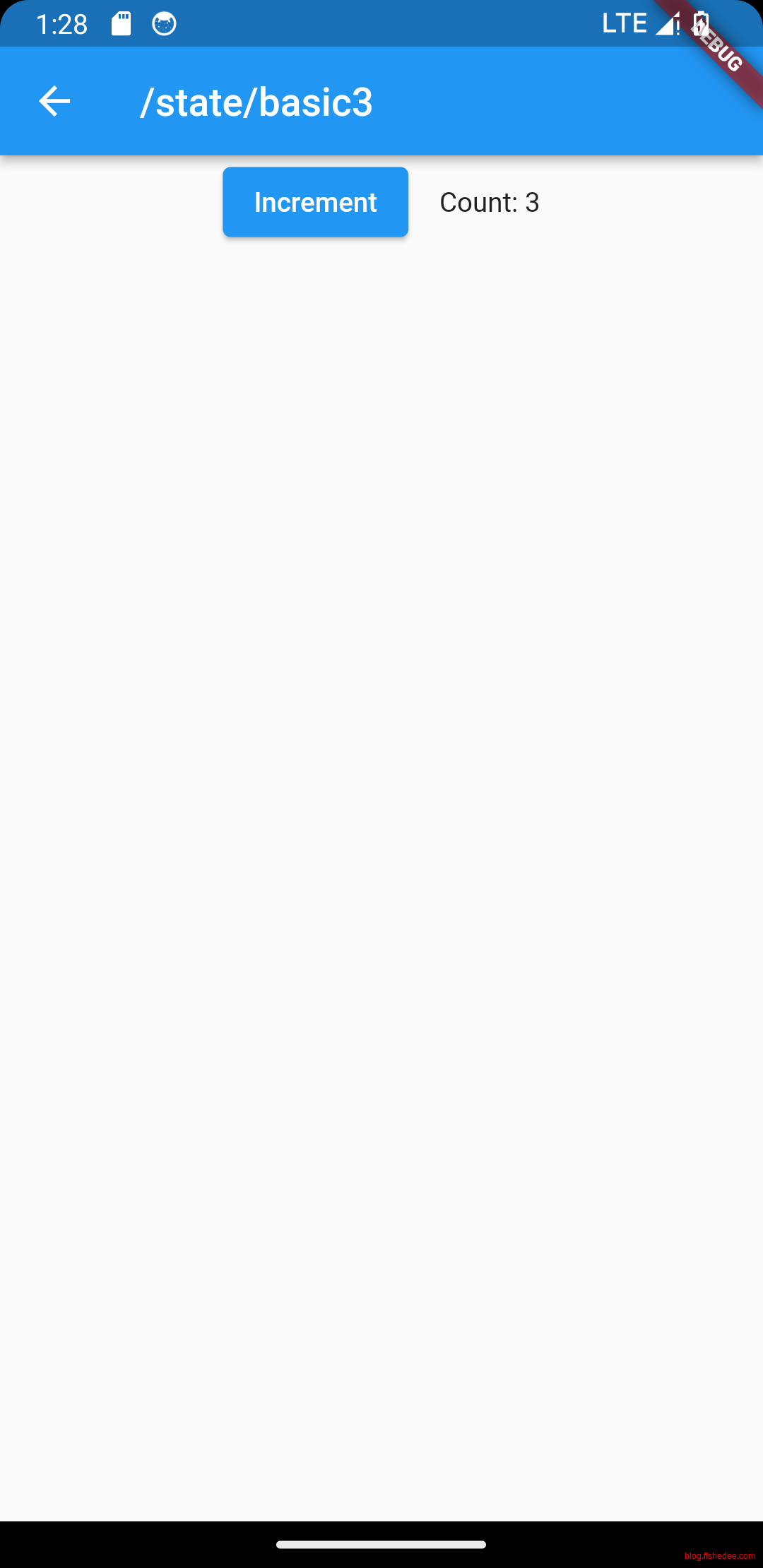
}状态组件,就是React里面的非纯组件了。要点如下:
- flutter里面的组件只能是Immutable的,一旦创建就不能修改。Widget相当于React.createElement。但是React.Element可以通过cloneElement来修改属性。flutter的Widget不可以属性。
- flutter的StatfulWidget在immutable的基础上,提供了createState,在State<Counter>里面可以修改属性。
- flutter的Widget可以看出是React.createElement,State<Counter>就是实际的组件的ref,这个ref里面可以通过.widget属性来获取最新的Widget。
生命周期可以看这里
- initState:当 widget 第一次插入到 widget 树时会被调用,对于每一个State对象,Flutter 框架只会调用一次该回调,所以,通常在该回调中做一些一次性的操作,如状态初始化、订阅子树的事件通知等。不能在该回调中调用BuildContext.dependOnInheritedWidgetOfExactType(该方法用于在 widget 树上获取离当前 widget 最近的一个父级InheritedWidget,关于InheritedWidget我们将在后面章节介绍),原因是在初始化完成后, widget 树中的InheritFrom widget也可能会发生变化,所以正确的做法应该在在build()方法或didChangeDependencies()中调用它。
- didChangeDependencies():当State对象的依赖发生变化时会被调用;例如:在之前build() 中包含了一个InheritedWidget (第七章介绍),然后在之后的build() 中Inherited widget发生了变化,那么此时InheritedWidget的子 widget 的didChangeDependencies()回调都会被调用。典型的场景是当系统语言 Locale 或应用主题改变时,Flutter 框架会通知 widget 调用此回调。需要注意,组件第一次被创建后挂载的时候(包括重创建)对应的didChangeDependencies也会被调用。
- build():此回调读者现在应该已经相当熟悉了,它主要是用于构建 widget 子树的,会在如下场景被调用。1. 在调用initState()之后。2. 在调用didUpdateWidget()之后。3. 在调用setState()之后。4. 在调用didChangeDependencies()之后。5. 在State对象从树中一个位置移除后(会调用deactivate)又重新插入到树的其他位置之后。
- reassemble():此回调是专门为了开发调试而提供的,在热重载(hot reload)时会被调用,此回调在Release模式下永远不会被调用。
- didUpdateWidget ():在 widget 重新构建时,Flutter 框架会调用widget.canUpdate来检测 widget 树中同一位置的新旧节点,然后决定是否需要更新,如果widget.canUpdate返回true则会调用此回调。正如之前所述,widget.canUpdate会在新旧 widget 的 key 和 runtimeType 同时相等时会返回true,也就是说在在新旧 widget 的key和runtimeType同时相等时didUpdateWidget()就会被调用。
- deactivate():当 State 对象从树中被移除时,会调用此回调。在一些场景下,Flutter 框架会将 State 对象重新插到树中,如包含此 State 对象的子树在树的一个位置移动到另一个位置时(可以通过GlobalKey 来实现)。如果移除后没有重新插入到树中则紧接着会调用dispose()方法。
- dispose():当 State 对象从树中被永久移除时调用;通常在此回调中释放资源。
2.4 State
import 'package:flutter/material.dart';

class Counter extends StatefulWidget {
  //注意,counter的props发生变化的时候,state不会丢失
  //counter设计为immutable,可以大幅简化build里面diff的效率。
  //如果diff的前后引用是相同的,例如是const类型,那这个Widget的整颗树都是肯定没变化的。这也是为什么build里面这么多const变量的原因。
  //如果Widget设计为非immutable,用户可以偷偷复用同一个Widget,只是里面的数据变更了,build里面就无法通过引用来快速筛选掉不变的Widget树。
  final String prefixShow;

  const Counter({required this.prefixShow, super.key});

  //要不要createState的根本取决于Widget的key有没有发生变化
  //没有变化的话,复用原来的State。有变化的话,需要创建新的state
  //state上面的widget引用不一定是原来的那个。
  @override
  State<Counter> createState() => _CounterState();
}

class _CounterState extends State<Counter> {
  int _counter = 0;

  void _increment() {
    setState(() {
      _counter++;
    });
  }

  @override
  Widget build(BuildContext context) {
    //build的时候,可以使用两种变量
    //本地变量,_counter
    //state当前widget的变量,也就是widget.prefixShow。同一个state对应的widget在每次build的时候都是不同,或者相同的。
    return Row(
      mainAxisAlignment: MainAxisAlignment.center,
      children: <Widget>[
        ElevatedButton(
          onPressed: _increment,
          child: Text('${widget.prefixShow}_Increment'),
        ),
        const SizedBox(width: 16),
        Text('Count: $_counter'),
      ],
    );
  }
}

class Message extends StatefulWidget {
  const Message({super.key});

  @override
  State<Message> createState() => _MessageState();
}

class _MessageState extends State<Message> {
  int _counter2 = 0;

  void _increment() {
    setState(() {
      _counter2++;
    });
  }

  @override
  Widget build(BuildContext context) {
    return Column(
      mainAxisAlignment: MainAxisAlignment.center,
      children: <Widget>[
        ElevatedButton(
          onPressed: _increment,
          child: const Text('IncrementMessage'),
        ),
        const SizedBox(width: 16),
        Counter(prefixShow: 'msg_$_counter2'),
      ],
    );
  }
}

class BasicWidget4 extends StatelessWidget {
  const BasicWidget4({
    Key? key,
  }) : super(key: key);

  @override
  Widget build(BuildContext context) {
    return const Message();
  }
}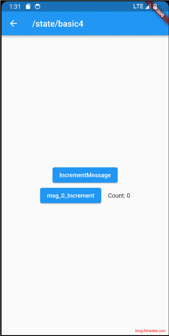
要点如下:
- 我们在更新Counter的Props,但是State<Counter>并不会变成新实例
- StatefulWidget是否沿用同一个State,取决于两点,它的key是否不变,它的Widget类型是否不变。可以看一下Widget.canUpdate的源代码
因此,我们得到
- counter的props发生变化的时候,state不会丢失。counter设计为immutable,可以大幅简化build里面diff的效率。如果diff的前后引用是相同的,例如是const类型,那这个Widget的整颗树都是肯定没变化的。这也是为什么build里面这么多const变量的原因。如果Widget设计为非immutable,用户可以偷偷复用同一个Widget,只是里面的数据变更了,build里面就无法通过引用来快速筛选掉不变的Widget树。
- 要不要createState的根本取决于Widget的key有没有发生变化。没有变化的话,复用原来的State。有变化的话,需要创建新的state。state上面的widget引用不一定是原来的那个。
- Counter在build的时候,可以使用两种变量。本地变量,_counter。state当前widget的变量,也就是widget.prefixShow。同一个state对应的widget在每次build的时候都是不同,或者相同的。
2.5 LocalKey
2.5.1 没有LocalKey
import 'package:flutter/material.dart';

class Counter extends StatefulWidget {
  final String prefixShow;

  const Counter({required this.prefixShow, super.key});

  @override
  State<Counter> createState() => _CounterState();
}

class _CounterState extends State<Counter> {
  int _counter = 0;

  void _increment() {
    setState(() {
      _counter++;
    });
  }

  @override
  Widget build(BuildContext context) {
    return Row(
      mainAxisAlignment: MainAxisAlignment.center,
      children: <Widget>[
        ElevatedButton(
          onPressed: _increment,
          child: Text('${widget.prefixShow}_Increment'),
        ),
        const SizedBox(width: 16),
        Text('Count: $_counter'),
      ],
    );
  }
}

class Message extends StatefulWidget {
  const Message({super.key});

  @override
  State<Message> createState() => _MessageState();
}

class _MessageState extends State<Message> {
  int _counter2 = 0;

  void _increment() {
    setState(() {
      _counter2++;
    });
  }

  @override
  Widget build(BuildContext context) {
    Widget child1 = const Counter(prefixShow: 'Count a');
    Widget child2 = const Counter(prefixShow: 'Count b');
    //Swap Counter以后,发现只是label变了,state依然没变
    if (_counter2 % 2 == 1) {
      (child2, child1) = (child1, child2);
    }

    return Column(
      mainAxisAlignment: MainAxisAlignment.center,
      children: <Widget>[
        ElevatedButton(
          onPressed: _increment,
          child: const Text('Swap Counter'),
        ),
        const SizedBox(width: 16),
        Column(children: [child1, child2]),
      ],
    );
  }
}

class BasicWidget5_1 extends StatelessWidget {
  const BasicWidget5_1({
    Key? key,
  }) : super(key: key);

  @override
  Widget build(BuildContext context) {
    return const Message();
  }
}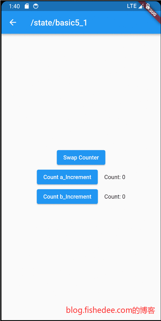
要点如下;
- 没有localKey的时候,切换两个Counter,发现他们的State没有变更。
2.5.2 有LocalKey
import 'package:flutter/material.dart';

class Counter extends StatefulWidget {
  final String prefixShow;

  const Counter({required this.prefixShow, super.key});

  @override
  State<Counter> createState() => _CounterState();
}

class _CounterState extends State<Counter> {
  int _counter = 0;

  void _increment() {
    setState(() {
      _counter++;
    });
  }

  @override
  Widget build(BuildContext context) {
    return Row(
      mainAxisAlignment: MainAxisAlignment.center,
      children: <Widget>[
        ElevatedButton(
          onPressed: _increment,
          child: Text('${widget.prefixShow}_Increment'),
        ),
        const SizedBox(width: 16),
        Text('Count: $_counter'),
      ],
    );
  }
}

class Message extends StatefulWidget {
  const Message({super.key});

  @override
  State<Message> createState() => _MessageState();
}

class _MessageState extends State<Message> {
  int _counter2 = 0;

  void _increment() {
    setState(() {
      _counter2++;
    });
  }

  @override
  Widget build(BuildContext context) {
    Widget child1 = const Counter(key: ValueKey("a"), prefixShow: 'Count a');
    Widget child2 = const Counter(key: ValueKey("b"), prefixShow: 'Count b');
    //在Counter上加上key以后,Swap就能正确对应到原来Counter的state上了
    //Swap Counter发现label变了,且state变了
    if (_counter2 % 2 == 1) {
      (child2, child1) = (child1, child2);
    }

    return Column(
      mainAxisAlignment: MainAxisAlignment.center,
      children: <Widget>[
        ElevatedButton(
          onPressed: _increment,
          child: const Text('Swap Counter'),
        ),
        const SizedBox(width: 16),
        Column(children: [child1, child2]),
      ],
    );
  }
}

class BasicWidget5_2 extends StatelessWidget {
  const BasicWidget5_2({
    Key? key,
  }) : super(key: key);

  @override
  Widget build(BuildContext context) {
    return const Message();
  }
}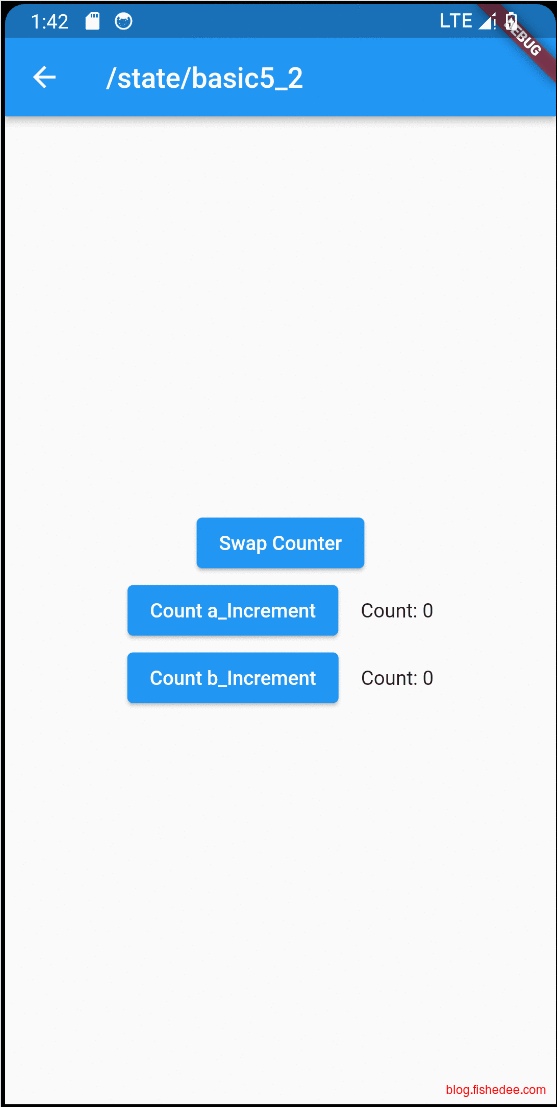
要点:
- 给节点加上localKey以后,flutter就能识别当Widget交换的时候,State也得一起交换。
2.6 GlobalKey
2.6.1 没有GlobalKey
import 'package:flutter/material.dart';

class Counter extends StatefulWidget {
  final String prefixShow;

  const Counter({required this.prefixShow, super.key});

  @override
  State<Counter> createState() => _CounterState();
}

class _CounterState extends State<Counter> {
  int _counter = 0;

  void _increment() {
    setState(() {
      _counter++;
    });
  }

  @override
  Widget build(BuildContext context) {
    return Row(
      mainAxisAlignment: MainAxisAlignment.center,
      children: <Widget>[
        ElevatedButton(
          onPressed: _increment,
          child: Text('${widget.prefixShow}_Increment'),
        ),
        const SizedBox(width: 16),
        Text('Count: $_counter'),
      ],
    );
  }
}

class Message extends StatefulWidget {
  const Message({super.key});

  @override
  State<Message> createState() => _MessageState();
}

class _MessageState extends State<Message> {
  int _counter2 = 0;

  void _increment() {
    setState(() {
      _counter2++;
    });
  }

  @override
  Widget build(BuildContext context) {
    Widget child1 = const Counter(key: ValueKey("a"), prefixShow: 'Count a');
    Widget child2 = Container(
        child: const Counter(key: ValueKey("b"), prefixShow: 'Count b'));
    //在Counter上加上localKey以后,Swap依然不能正确取得Counter的state。
    //因为无法跨层级取到原来对应的Widget
    //切换以后,每次Counter b总是重置
    if (_counter2 % 2 == 1) {
      (child2, child1) = (child1, child2);
    }

    return Column(
      mainAxisAlignment: MainAxisAlignment.center,
      children: <Widget>[
        ElevatedButton(
          onPressed: _increment,
          child: const Text('Swap Counter'),
        ),
        const SizedBox(width: 16),
        Column(children: [child1, child2]),
      ],
    );
  }
}

class BasicWidget6_1 extends StatelessWidget {
  const BasicWidget6_1({
    Key? key,
  }) : super(key: key);

  @override
  Widget build(BuildContext context) {
    return const Message();
  }
}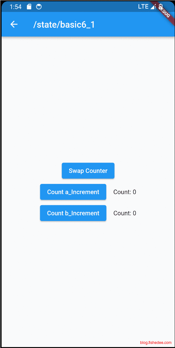
要点如下:
- 这次我们也是使用localKey,但是State依然丢失了。这是因为child1和child2并不在同一个层级的子树中。flutter默认并不能跨层级找到两个Widget交换了
2.6.2 有GlobalKey
import 'package:flutter/material.dart';

class Counter extends StatefulWidget {
  final String prefixShow;

  const Counter({required this.prefixShow, super.key});

  @override
  State<Counter> createState() => _CounterState();
}

class _CounterState extends State<Counter> {
  int _counter = 0;

  void _increment() {
    setState(() {
      _counter++;
    });
  }

  @override
  Widget build(BuildContext context) {
    return Row(
      mainAxisAlignment: MainAxisAlignment.center,
      children: <Widget>[
        ElevatedButton(
          onPressed: _increment,
          child: Text('${widget.prefixShow}_Increment'),
        ),
        const SizedBox(width: 16),
        Text('Count: $_counter'),
      ],
    );
  }
}

class Message extends StatefulWidget {
  const Message({super.key});

  @override
  State<Message> createState() => _MessageState();
}

class _MessageState extends State<Message> {
  int _counter2 = 0;

  void _increment() {
    setState(() {
      _counter2++;
    });
  }

  //GlobalKey可以实现跨层级复用Widget
  final GlobalKey<_CounterState> _globalKey1 = GlobalKey();

  //GlobalKey可以实现跨层级复用Widget
  final GlobalKey<_CounterState> _globalKey2 = GlobalKey();

  @override
  Widget build(BuildContext context) {
    Widget child1 = Counter(key: _globalKey1, prefixShow: 'Count a');
    Widget child2 =
        Container(child: Counter(key: _globalKey2, prefixShow: 'Count b'));
    //在Counter上加上globalKey以后,Widget就能正常地重用了
    if (_counter2 % 2 == 1) {
      (child2, child1) = (child1, child2);
    }

    return Column(
      mainAxisAlignment: MainAxisAlignment.center,
      children: <Widget>[
        ElevatedButton(
          onPressed: _increment,
          child: const Text('Swap Counter'),
        ),
        const SizedBox(width: 16),
        Column(children: [child1, child2]),
      ],
    );
  }
}

class BasicWidget6_2 extends StatelessWidget {
  const BasicWidget6_2({
    Key? key,
  }) : super(key: key);

  @override
  Widget build(BuildContext context) {
    return const Message();
  }
}
要点如下:
- 我们改为globalKey作为key,这一次跨子树也能交换State了。这个是React没有的功能。
- GlobalKey不仅可以作为跨子树diff的工具,还能直接从globalKey中获取widget的实例state。
- GlobalKey的性能耗费要较大,谨慎使用
2.7 子树渲染
2.7.1 默认子树全渲染
import 'dart:developer';

import 'package:flutter/material.dart';

class BasicWidget7_1 extends StatelessWidget {
  const BasicWidget7_1({
    Key? key,
  }) : super(key: key);

  @override
  Widget build(BuildContext context) {
    return const Page1();
  }
}

class Page1 extends StatefulWidget {
  const Page1({super.key});

  @override
  State<StatefulWidget> createState() {
    return _Page1();
  }
}

class _Page1 extends State<Page1> with SingleTickerProviderStateMixin {
  late AnimationController controller;

  String text = "Hello World";

  @override
  void initState() {
    super.initState();
    controller =
        AnimationController(duration: const Duration(seconds: 2), vsync: this);
    controller.addListener(() {
      setState(() {});
    });
  }

  @override
  Widget build(BuildContext context) {
    const curve = Curves.ease;

    var tween =
        Tween<double>(begin: 100.0, end: 10).chain(CurveTween(curve: curve));

    return Center(
        child: Column(
      children: [
        ElevatedButton(
            onPressed: () {
              controller.forward();
            },
            child: const Text('Go!')),
        SizedBox(height: tween.evaluate(controller)),
        RedText(text: text)
      ],
    ));
  }
}

class RedText extends StatelessWidget {
  final String text;
  const RedText({super.key, required this.text});

  @override
  Widget build(BuildContext context) {
    //触发了很多次的build,因为每次的RedText都是重新创建的
    print('red text build2');
    return Container(
        color: Colors.redAccent,
        constraints: const BoxConstraints(maxHeight: 200, maxWidth: 100),
        padding: const EdgeInsets.symmetric(horizontal: 8),
        child: Text(text));
  }
}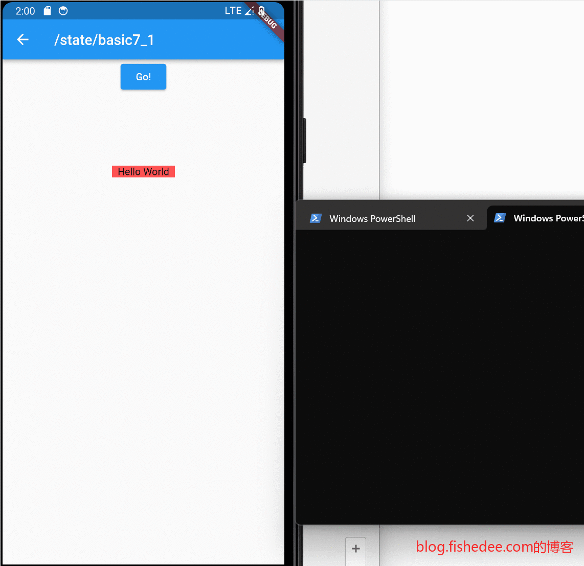
在默认的情况下,flutter是setState为起点,将所有的子树都重新build一次。它缺少了React的shouldComponentUpdate的diff操作。
2.7.2 避免子树渲染
import 'dart:developer';

import 'package:flutter/material.dart';

class BasicWidget7_2 extends StatelessWidget {
  const BasicWidget7_2({
    Key? key,
  }) : super(key: key);

  @override
  Widget build(BuildContext context) {
    return const Page1();
  }
}

class ShouldRebuildWidget<T extends Widget> extends StatefulWidget {
  final bool Function(T oldWidget) shouldRebuild;

  final T Function() build;

  const ShouldRebuildWidget(
      {super.key, required this.shouldRebuild, required this.build});

  @override
  State<ShouldRebuildWidget<T>> createState() => _ShouldRebuildWidget<T>();
}

class _ShouldRebuildWidget<T extends Widget>
    extends State<ShouldRebuildWidget<T>> {
  T? _oldWidget;

  @override
  Widget build(BuildContext context) {
    var old = _oldWidget;
    if (old == null || widget.shouldRebuild(old)) {
      var newWidget = widget.build();
      _oldWidget = newWidget;
      return newWidget;
    }
    return old;
  }
}

class Page1 extends StatefulWidget {
  const Page1({super.key});

  @override
  State<StatefulWidget> createState() {
    return _Page1();
  }
}

class _Page1 extends State<Page1> with SingleTickerProviderStateMixin {
  late AnimationController controller;

  String text = "Hello World";

  @override
  void initState() {
    super.initState();
    controller =
        AnimationController(duration: const Duration(seconds: 2), vsync: this);
    controller.addListener(() {
      setState(() {});
    });
  }

  @override
  Widget build(BuildContext context) {
    const curve = Curves.ease;

    var tween =
        Tween<double>(begin: 100.0, end: 10).chain(CurveTween(curve: curve));

    return Center(
        child: Column(
      children: [
        ElevatedButton(
            onPressed: () {
              controller.forward();
            },
            child: const Text('Go!')),
        SizedBox(height: tween.evaluate(controller)),
        //使用缓存方式的Widget,可以避免渲染子组件
        ShouldRebuildWidget(
            build: () => RedText(text: text),
            shouldRebuild: (oldWidget) => oldWidget.text != text)
      ],
    ));
  }
}

class RedText extends StatelessWidget {
  final String text;
  const RedText({super.key, required this.text});

  @override
  Widget build(BuildContext context) {
    //触发了很多次的build,因为每次的RedText都是重新创建的
    print('red text build4');
    return Container(
        color: Colors.redAccent,
        constraints: const BoxConstraints(maxHeight: 200, maxWidth: 100),
        padding: const EdgeInsets.symmetric(horizontal: 8),
        child: Text(text));
  }
}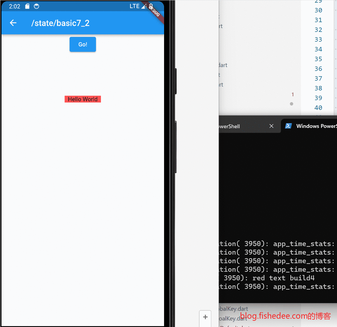
要点如下:
- 我们可以复用widget的引用来避免子树render。
- 这是利用了flutter在diff的过程中,使用Widget引用比较的原理。当Widget的引用不变的时候,整个Widget就能避免重新build的操作。
- 注意。在js中并不能实现类似的方法,因为js的引用不变,不代表它的子字段不变。但是在dart语言中,当class是immutable标注的时候,它的所有字段都必须是final的。这意味着class的引用不变,它的所有字段,包括子字段都肯定是不变的。这个实现挺好的,NICE。
3 UI基础组件
代码在这里
3.1 Text
import 'package:flutter/material.dart';

class TextDemo extends StatelessWidget {
  const TextDemo({
    Key? key,
  }) : super(key: key);

  final TextStyle bold24Roboto = const TextStyle(
    color: Colors.red,
    fontSize: 18.0,
    fontWeight: FontWeight.bold,
  );

  // 声明文本样式
  final robotoTextStyle = const TextStyle(
    fontFamily: 'Roboto',
  );

  final robotoTextItalicStyle = const TextStyle(
    fontFamily: 'Roboto',
    fontStyle: FontStyle.italic,
  );

  final robotoTextBoldStyle = const TextStyle(
    fontFamily: 'Roboto',
    fontWeight: FontWeight.w500,
  );

  final qingKeHuangyouTextStyle = const TextStyle(
    fontFamily: 'QingKeHuangyou',
  );

  @override
  Widget build(BuildContext context) {
    return Center(
        child: Column(children: [
      //文本对齐
      const Text(
        "Hello world",
        textAlign: TextAlign.left,
      ),
      //多行文本
      const Text(
        "Hello world! I'm Jack. ",
        maxLines: 1,
        overflow: TextOverflow.ellipsis,
      ),
      //斜体,加粗,字体
      Text(
        "我是Robo字体,普通. ",
        style: robotoTextStyle,
      ),
      Text(
        "我是Robo字体,斜体. ",
        style: robotoTextItalicStyle,
      ),
      Text(
        "我是Robo字体,加粗. ",
        style: robotoTextBoldStyle,
      ),
      Text(
        "我是QingKeHuangyou字体,普通. ",
        style: qingKeHuangyouTextStyle,
      ),
      //样式
      Text(
        "Hello world",
        style: TextStyle(
            color: Colors.blue,
            fontSize: 18.0,
            //行高,是倍数,高度为fontSize*height
            height: 1.2,
            fontFamily: "Courier",
            background: Paint()..color = Colors.yellow,
            decoration: TextDecoration.underline,
            decorationStyle: TextDecorationStyle.dashed),
      ),
      //多文本组合
      RichText(
        text: TextSpan(
          style: bold24Roboto,
          children: const <TextSpan>[
            TextSpan(text: 'Lorem '),
            TextSpan(
              text: 'ipsum',
              style: TextStyle(
                fontWeight: FontWeight.w300,
                fontStyle: FontStyle.italic,
                color: Colors.green,
                fontSize: 48,
              ),
            ),
          ],
        ),
      ),
      //继承文本样式
      const DefaultTextStyle(
          //1.设置文本默认样式
          style: TextStyle(
            color: Colors.purple,
            fontSize: 20.0,
          ),
          textAlign: TextAlign.start,
          child: Row(
            crossAxisAlignment: CrossAxisAlignment.start,
            children: <Widget>[
              Text("hello world"),
              Text("I am Jack"),
              Text(
                "I am Jack",
                style: TextStyle(
                    inherit: false, //2.不继承默认样式

                    color: Colors.grey),
              ),
            ],
          )),
    ]));
  }
}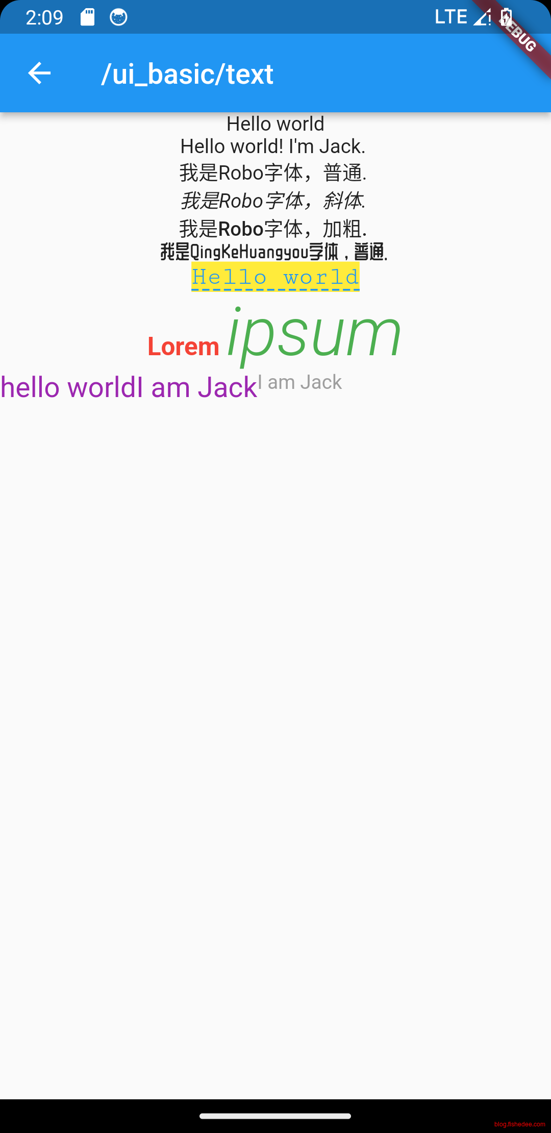
样式如上,没啥好说的。RichText下面放入多个TextSpan就能实现富文本。
3.2 Button
import 'package:flutter/material.dart';

class ButtonDemo extends StatelessWidget {
  const ButtonDemo({
    Key? key,
  }) : super(key: key);

  @override
  Widget build(BuildContext context) {
    return Center(
        child: Column(children: [
      //漂浮"按钮,它默认带有阴影和灰色背景。按
      ElevatedButton(
        child: const Text("normal"),
        onPressed: () {},
      ),
      //文本按钮
      TextButton(
        child: const Text("normal"),
        onPressed: () {},
      ),
      //普通边框按钮
      OutlinedButton(
        child: const Text("normal"),
        onPressed: () {},
      ),
      //带图标按钮
      IconButton(
        icon: const Icon(Icons.thumb_up),
        onPressed: () {},
      ),
      //图片与文字按钮
      ElevatedButton.icon(
        icon: const Icon(Icons.send),
        label: const Text("发送"),
        onPressed: () {},
      ),
      OutlinedButton.icon(
        icon: const Icon(Icons.add),
        label: const Text("添加"),
        onPressed: () {},
      ),
      TextButton.icon(
        icon: const Icon(Icons.info),
        label: const Text("详情"),
        onPressed: () {},
      ),
    ]));
  }
}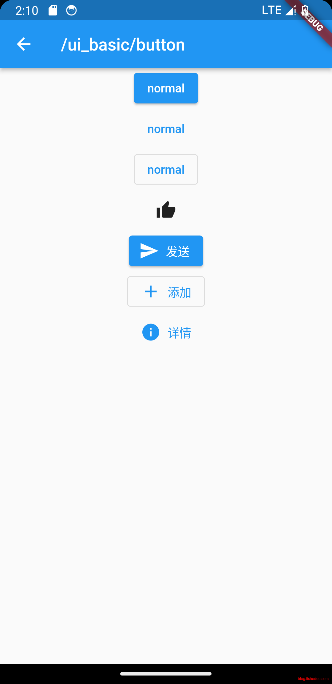
按钮也没啥好说的,比较简单。Button准确来说属于Material的组件,不是flutter的自带组件。
3.3 Image
import 'package:flutter/material.dart';
import 'package:transparent_image/transparent_image.dart';
import 'package:cached_network_image/cached_network_image.dart';

class ImageDemo extends StatelessWidget {
  const ImageDemo({
    Key? key,
  }) : super(key: key);

  final img = const AssetImage("assets/images/star.webp");

  List<Widget> _buildNetwork() {
    return [
      const Text("image load type..."),
      Image.network(
        "https://picsum.photos/250?image=9",
        width: 100.0,
      ),
      Image.asset(
        "assets/images/star.webp",
        width: 100.0,
      ),
      //占位图和淡入效果
      FadeInImage.memoryNetwork(
        placeholder: kTransparentImage,
        image: 'https://picsum.photos/250?image=9',
      ),
      //cachednetworkimage组件的缓存系统可以将图片缓存到内存和磁盘,并基于使用模式自动清理过期的缓存条目,
      CachedNetworkImage(
        placeholder: (context, url) => const CircularProgressIndicator(),
        imageUrl: 'https://picsum.photos/250?image=9',
      ),
    ];
  }

  List<Widget> _buildImageFill() {
    var widgets = [
      Image(
        image: img,
        height: 50.0,
        width: 100.0,
        fit: BoxFit.fill,
      ),
      Image(
        image: img,
        height: 50,
        width: 50.0,
        fit: BoxFit.contain,
      ),
      Image(
        image: img,
        width: 100.0,
        height: 50.0,
        fit: BoxFit.cover,
      ),
      Image(
        image: img,
        width: 100.0,
        height: 50.0,
        fit: BoxFit.fitWidth,
      ),
      Image(
        image: img,
        width: 100.0,
        height: 50.0,
        fit: BoxFit.fitHeight,
      ),
      Image(
        image: img,
        width: 100.0,
        height: 50.0,
        fit: BoxFit.scaleDown,
      ),
      Image(
        image: img,
        height: 50.0,
        width: 100.0,
        fit: BoxFit.none,
      ),
      Image(
        image: img,
        width: 100.0,
        color: Colors.blue,
        //颜色反色,高对比度
        colorBlendMode: BlendMode.difference,
        fit: BoxFit.fill,
      ),
      Image(
        image: img,
        width: 100.0,
        height: 200.0,
        repeat: ImageRepeat.repeatY,
      )
    ].map((e) {
      return Row(
        children: <Widget>[
          Container(
            decoration: BoxDecoration(
                border: Border.all(width: 1, color: Colors.black)),
            margin: const EdgeInsets.all(16.0),
            child: SizedBox(
              width: 100,
              child: e,
            ),
          ),
          Text(e.fit.toString())
        ],
      );
    }).toList();
    return [const Text("image fit type..."), ...widgets];
  }

  @override
  Widget build(BuildContext context) {
    return SingleChildScrollView(
        child: Column(children: [
      ..._buildNetwork(),
      ..._buildImageFill(),
    ]));
  }
}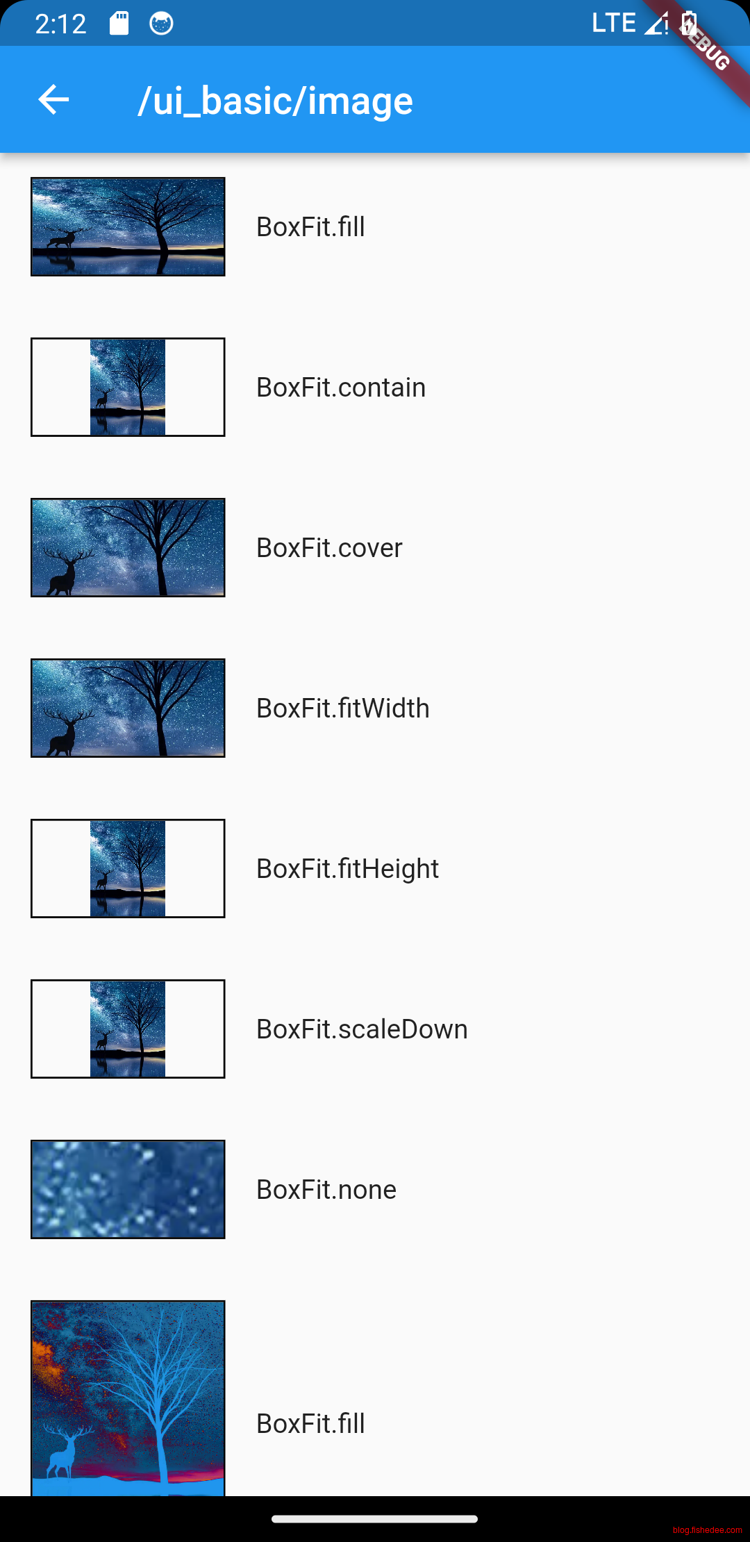
image也是没啥好说的,注意一下BoxFit的选择就可以了。
3.4 Icon
import 'package:flutter/material.dart';
import 'package:transparent_image/transparent_image.dart';
import 'package:cached_network_image/cached_network_image.dart';

class IconDemo extends StatelessWidget {
  const IconDemo({
    Key? key,
  }) : super(key: key);

  Widget _buildMaterialIcon() {
    //https://material.io/tools/icons/,在这里可以查到所有的Material icon
    String icons = "";
    // accessible: 0xe03e
    icons += "\uE03e";
    // error:  0xe237
    icons += " \uE237";
    // fingerprint: 0xe287
    icons += " \uE287";

    return Text(icons,
        style: const TextStyle(
          fontFamily: "MaterialIcons",
          fontSize: 24.0,
          color: Colors.green,
        ));
  }

  Widget _buildMaterialIcon2() {
    return const Row(
      mainAxisAlignment: MainAxisAlignment.center,
      children: <Widget>[
        Icon(Icons.accessible, color: Colors.green),
        Icon(Icons.error, color: Colors.green),
        Icon(Icons.fingerprint, color: Colors.green),
        Text("icon2"),
      ],
    );
  }

  // book 图标
  final IconData like =
      const IconData(0xe61d, fontFamily: 'myIcon', matchTextDirection: true);
  // 微信图标
  final IconData home =
      const IconData(0xe61e, fontFamily: 'myIcon', matchTextDirection: true);

  Widget _buildMyIcon() {
    return Row(
      mainAxisAlignment: MainAxisAlignment.center,
      children: <Widget>[
        Icon(like, color: Colors.green),
        Icon(home, color: Colors.green),
        const Text("myIcon3"),
      ],
    );
  }

  @override
  Widget build(BuildContext context) {
    return SingleChildScrollView(
        child: Column(children: [
      _buildMaterialIcon(),
      _buildMaterialIcon2(),
      _buildMyIcon(),
    ]));
  }
}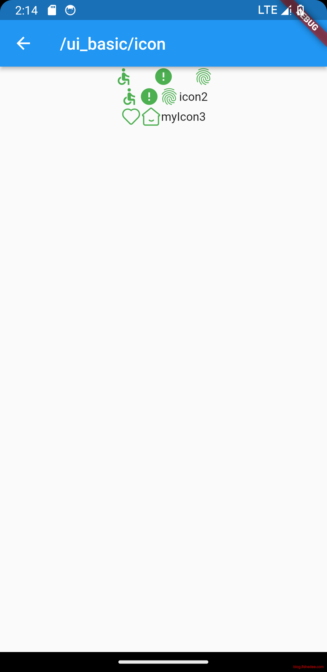
Icon也是比较简单,注意可以插入自己的图标。
flutter:

  # The following line ensures that the Material Icons font is
  # included with your application, so that you can use the icons in
  # the material Icons class.
  uses-material-design: true
  fonts:
    - family: Roboto
      fonts:
        - asset: assets/fonts/Roboto-Regular.ttf
        - asset: assets/fonts/Roboto-Medium.ttf
          weight: 500
        - asset: assets/fonts/Roboto-Thin.ttf
          weight: 300
        - asset: assets/fonts/Roboto-Italic.ttf
          style: italic
    - family: QingKeHuangyou
      fonts:
        - asset: assets/fonts/ZCOOLQingKeHuangyou-Regular.ttf
    - family: myIcon
      fonts:
        - asset: assets/icons/iconfont.ttf
在pubspec.yaml中,配置加入自己的字体,命名为myIcon。然后IconData中指定fontFamily和icon对应的unicode值就可以了。
3.5 TextEdit
文本输入框相对较为复杂,需要掌握
3.5.1 样式
import 'package:flutter/material.dart';

class TextEditStyleDemo extends StatelessWidget {
  const TextEditStyleDemo({
    Key? key,
  }) : super(key: key);

  List<Widget> _buildNormalTextField() {
    //边框样式
    const _outlineInputBorder = OutlineInputBorder(
      borderRadius: BorderRadius.zero,
      gapPadding: 0,
      borderSide: BorderSide(
        color: Colors.blue,
      ),
    );

    return [
      const TextField(
        autofocus: true,
        decoration: InputDecoration(
            labelText: "用户名",
            hintText: "用户名或邮箱",
            prefixIcon: Icon(Icons.person)),
      ),
      const TextField(
        decoration: InputDecoration(
            labelText: "密码", hintText: "您的登录密码", prefixIcon: Icon(Icons.lock)),
        //密码
        obscureText: true,
      ),
      const TextField(
        //仅输入数字的输入框,其他的还有
        //TextInputType.datetime
        //TextInputType.emailAddress
        keyboardType: TextInputType.number,
        decoration: InputDecoration(labelText: "年龄", hintText: "您的年龄"),
      ),
      TextField(
        //键盘的输入类型
        textInputAction: TextInputAction.search,
        decoration: const InputDecoration(labelText: "搜索", hintText: "查询"),
        onSubmitted: (data) {
          print('submit! ${data}');
        },
      ),
      const TextField(
        //多行文本
        maxLines: 3,
        decoration: InputDecoration(labelText: "内容"),
      ),
      const TextField(
        //自定义样式
        style: TextStyle(
          color: Colors.blue,
          fontSize: 18.0,
          //行高,是倍数,高度为fontSize*height
          height: 1.2,
          fontFamily: "Courier",
        ),
        decoration: InputDecoration(
          labelText: "手机",
          //labelStyle,未选中的时候,标签样式
          labelStyle: TextStyle(color: Colors.blue, fontSize: 15.0),
          //floatingLabelStyle,选中的时候,标签的样式
          floatingLabelStyle: TextStyle(color: Colors.pink, fontSize: 12.0),
          //图标和前缀文字
          prefixIcon: Icon(Icons.phone),
          prefixText: "+86",
          //placeholder的名称,选中为焦点的时候才会出现
          hintText: "请输入手机号码",
          hintStyle: TextStyle(color: Colors.purple, fontSize: 13.0),
          // 未获得焦点下划线设为黄色
          enabledBorder: UnderlineInputBorder(
            borderSide: BorderSide(color: Colors.yellow),
          ),
          //获得焦点下划线设为绿色
          focusedBorder: UnderlineInputBorder(
            borderSide: BorderSide(color: Colors.green),
          ),
        ),
      ),
      const TextField(
          //常用样式配置
          style: TextStyle(
            color: Colors.red,
            fontSize: 15,
            height: 1,
          ),
          decoration: InputDecoration(
            fillColor: Colors.lightGreen, //背景颜色,必须结合filled: true,才有效
            filled: true, //重点,必须设置为true,fillColor才有效
            isCollapsed: true, //重点,相当于高度包裹的意思,必须设置为true,不然有默认奇妙的最小高度
            contentPadding:
                EdgeInsets.symmetric(vertical: 0, horizontal: 0), //内容内边距,影响高度
            hintText: "电子邮件地址",
            border: _outlineInputBorder,
            focusedBorder: _outlineInputBorder,
            enabledBorder: _outlineInputBorder,
            disabledBorder: _outlineInputBorder,
            errorBorder: _outlineInputBorder,
            focusedErrorBorder: _outlineInputBorder,
          ))
    ];
  }

  @override
  Widget build(BuildContext context) {
    return SingleChildScrollView(
        child: Column(children: [
      ..._buildNormalTextField(),
    ]));
  }
}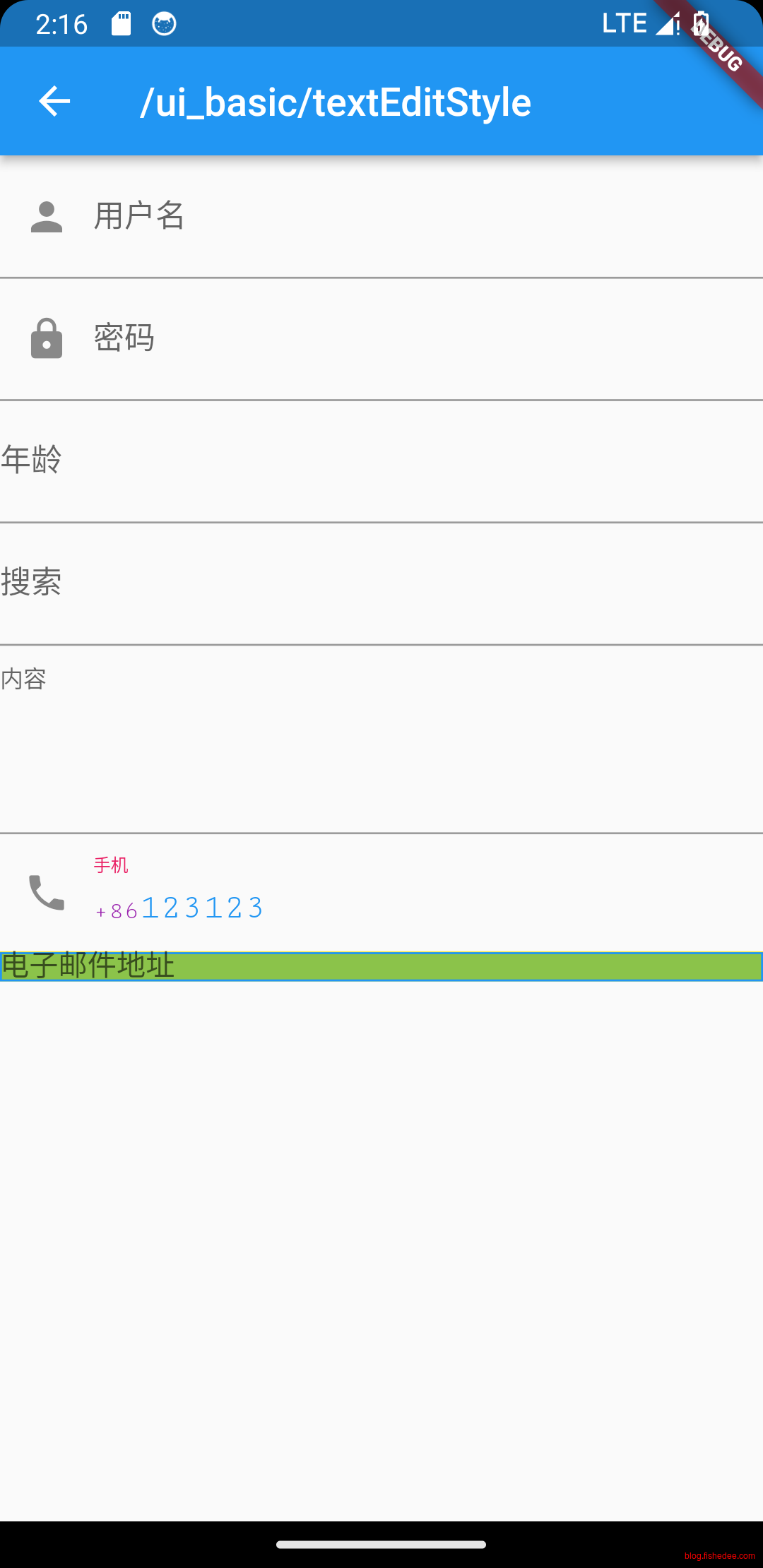
要点如下:
- 输入框的配置主要通过InputDecoration来实现。
- InputDecoration中的isCollapsed设置了才能去掉默认的padding高度
- height是行高,指fontSize的倍数,不是一个绝对值
3.5.2 事件
import 'package:flutter/material.dart';

class TextEditChangedAndSetDemo extends StatelessWidget {
  const TextEditChangedAndSetDemo({super.key});

  @override
  Widget build(BuildContext context) {
    return const MaterialApp(
      title: 'Retrieve Text Input',
      home: Scaffold(body: SafeArea(child: MyCustomForm())),
    );
  }
}

// Define a custom Form widget.
class MyCustomForm extends StatefulWidget {
  const MyCustomForm({super.key});

  @override
  State<MyCustomForm> createState() => _MyCustomFormState();
}

class _MyCustomFormState extends State<MyCustomForm> {
  final myController = TextEditingController();

  @override
  void initState() {
    super.initState();
    myController.addListener(_printLatestValue);
  }

  @override
  void dispose() {
    myController.dispose();
    super.dispose();
  }

  void _printLatestValue() {
    final text = myController.text;
    print('Second text field: $text (${text.characters.length})');
  }

  @override
  Widget build(BuildContext context) {
    return Scaffold(
      appBar: AppBar(
        title: const Text('Retrieve Text Input'),
      ),
      body: Padding(
        padding: const EdgeInsets.all(16),
        child: Column(
          children: [
            TextField(
              onChanged: (text) {
                print('First text field: $text (${text.characters.length})');
              },
            ),
            TextField(
              controller: myController,
            ),
            ElevatedButton(
              child: const Text('设置第二个TextField'),
              onPressed: () {
                //设置默认值,并从第三个字符开始选中后面的字符
                myController.text = "hello world!";
                myController.selection = TextSelection(
                    baseOffset: 2, extentOffset: myController.text.length);
              },
            )
          ],
        ),
      ),
    );
  }
}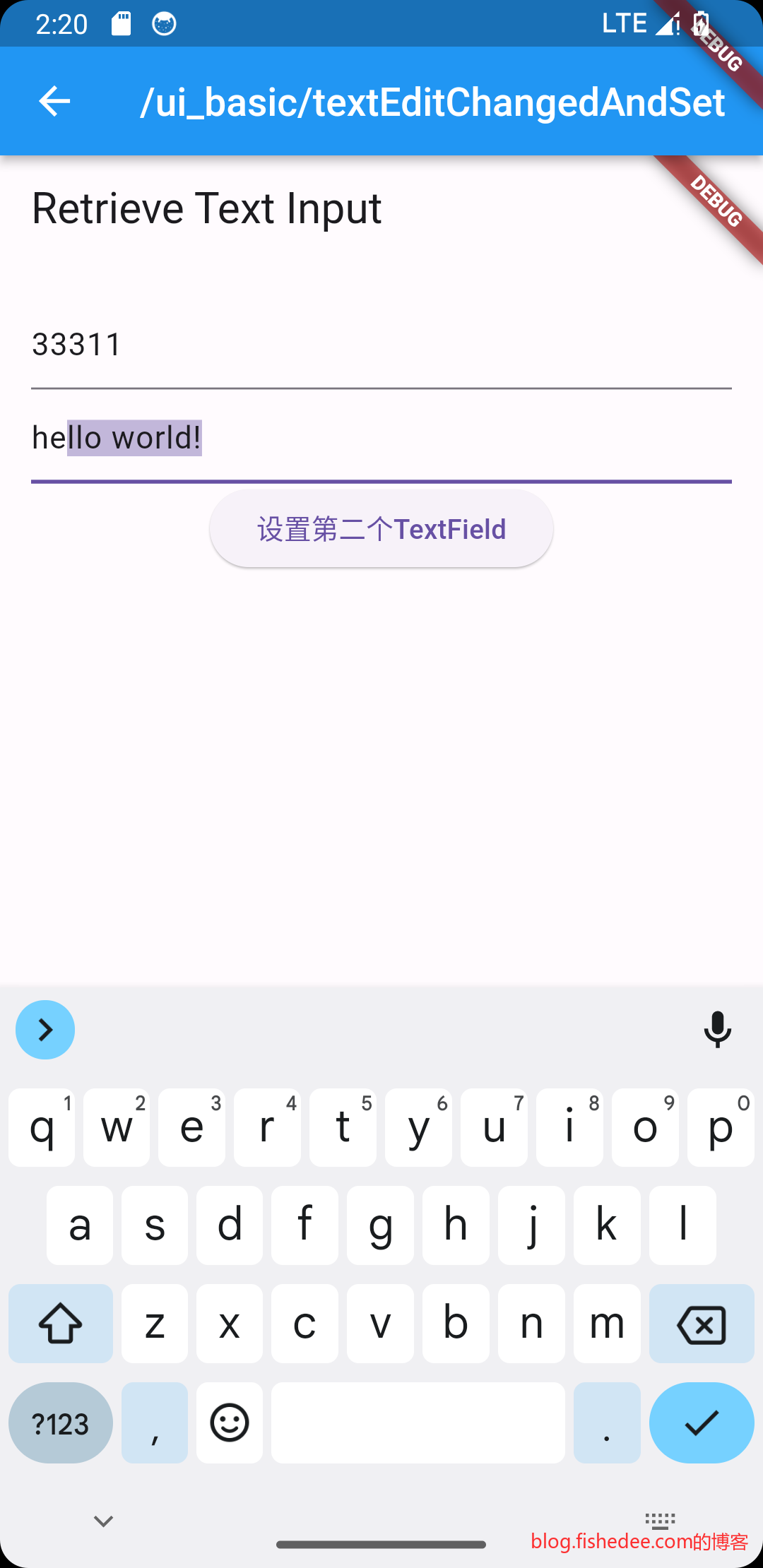
要点如下:
- 使用TextEditingController,来获取text,设置text,设置text的selection
- 使用TextEditingController,来侦听text的变化
3.5.3 焦点
import 'package:flutter/material.dart';

class TextEditFocus1 extends StatefulWidget {
  @override
  State<TextEditFocus1> createState() => _TextEditFocus1();
}

class _TextEditFocus1 extends State<TextEditFocus1> {
  FocusNode focusNode1 = FocusNode();
  FocusNode focusNode2 = FocusNode();
  FocusScopeNode? focusScopeNode;

  @override
  void initState() {
    super.initState();

    //监听焦点状态改变事件
    focusNode1.addListener(() {
      print('focusNode1 focus info: [${focusNode1.hasFocus}]');
    });

    focusNode2.addListener(() {
      print('focusNode1 focus info: [${focusNode2.hasFocus}]');
    });
  }

  @override
  Widget build(BuildContext context) {
    return Padding(
      padding: EdgeInsets.all(16.0),
      child: Column(
        children: <Widget>[
          TextField(
            autofocus: true,
            focusNode: focusNode1, //关联focusNode1
            decoration: const InputDecoration(labelText: "input1"),
          ),
          TextField(
            focusNode: focusNode2, //关联focusNode2
            decoration: const InputDecoration(labelText: "input2"),
          ),
          Builder(
            builder: (ctx) {
              return Column(
                children: <Widget>[
                  ElevatedButton(
                    child: Text("移动焦点"),
                    onPressed: () {
                      //将焦点从第一个TextField移到第二个TextField
                      // 这是一种写法 FocusScope.of(context).requestFocus(focusNode2);
                      // 这是第二种写法
                      var a = focusScopeNode ?? FocusScope.of(context);
                      focusScopeNode = a;
                      a.requestFocus(focusNode2);
                    },
                  ),
                  ElevatedButton(
                    child: Text("隐藏键盘"),
                    onPressed: () {
                      // 当所有编辑框都失去焦点时键盘就会收起
                      focusNode1.unfocus();
                      focusNode2.unfocus();
                    },
                  ),
                ],
              );
            },
          ),
        ],
      ),
    );
  }
}
要点如下:
- 给TextField指定focusNode
- 移动焦点的时候,使用focusNode.focus,或者focusNode.unfocus.
3.5.4 焦点2
import 'package:flutter/material.dart';

class TextEditFocus2 extends StatefulWidget {
  @override
  State<TextEditFocus2> createState() => _TextEditFocus2();
}

class _TextEditFocus2 extends State<TextEditFocus2> {
  FocusNode focusNode1 = FocusNode();
  FocusNode focusNode2 = FocusNode();
  final FocusScopeNode focusScopeNode = FocusScopeNode();

  @override
  void initState() {
    super.initState();

    //监听焦点状态改变事件
    focusNode1.addListener(() {
      print('focusNode1 focus info: [${focusNode1.hasFocus}]');
    });

    focusNode2.addListener(() {
      print('focusNode1 focus info: [${focusNode2.hasFocus}]');
    });
  }

  @override
  Widget build(BuildContext context) {
    return Padding(
        padding: EdgeInsets.all(16.0),
        child: FocusScope(
          node: focusScopeNode,
          child: Column(
            children: <Widget>[
              TextField(
                autofocus: true,
                focusNode: focusNode1, //关联focusNode1
                decoration: const InputDecoration(labelText: "input1"),
              ),
              TextField(
                focusNode: focusNode2, //关联focusNode2
                decoration: const InputDecoration(labelText: "input2"),
              ),
              Builder(
                builder: (ctx) {
                  return Column(
                    children: <Widget>[
                      ElevatedButton(
                        child: const Text("下一个焦点"),
                        onPressed: () {
                          focusScopeNode.nextFocus();
                        },
                      ),
                      ElevatedButton(
                        child: const Text("上一个焦点"),
                        onPressed: () {
                          focusScopeNode.previousFocus();
                        },
                      ),
                      ElevatedButton(
                        child: const Text("取消焦点"),
                        onPressed: () {
                          focusScopeNode.unfocus();
                        },
                      )
                    ],
                  );
                },
              ),
            ],
          ),
        ));
  }
}
要点如下:
- 直接使用FocusScopeNode.nextFocus,previousFocus, unfocus就可以进行焦点操作了。
- 而且FocusScopeNode可以以某几个TextEdit作范围来指定。
4 UI布局
代码在这里
4.1 Flex
4.1.1 主轴direction和交叉轴direction
import 'package:flutter/material.dart';

class RowAxisAndDirectionDemo extends StatelessWidget {
  const RowAxisAndDirectionDemo({
    Key? key,
  }) : super(key: key);

  @override
  Widget build(BuildContext context) {
    return const Column(
      //测试Row对齐方式,排除Column默认居中对齐的干扰
      crossAxisAlignment: CrossAxisAlignment.start,
      children: <Widget>[
        Row(
          mainAxisAlignment: MainAxisAlignment.center,
          children: <Widget>[
            Text(" hello world "),
            Text(" I am Jack "),
          ],
        ),
        Row(
          mainAxisSize: MainAxisSize.min,
          mainAxisAlignment: MainAxisAlignment.center,
          children: <Widget>[
            Text(" hello world "),
            Text(" I am Jack "),
          ],
        ),
        Row(
          //mainAxisAlignment是主轴对齐方向
          mainAxisAlignment: MainAxisAlignment.end,
          //textDirection是水平方向的对齐方式,只有ltr,和rtl两种方式。一般不需要配置
          textDirection: TextDirection.rtl,
          children: <Widget>[
            Text(" hello world "),
            Text(" I am Jack "),
          ],
        ),
        Row(
          //crossAxisAlignment是交叉轴对齐方向
          crossAxisAlignment: CrossAxisAlignment.start,
          //verticalDirection是垂直方向对齐方式,有up和down,两种方式。一般不需要配置
          verticalDirection: VerticalDirection.up,
          children: <Widget>[
            Text(
              " hello world ",
              style: TextStyle(fontSize: 30.0),
            ),
            Text(" I am Jack "),
          ],
        ),
      ],
    );
  }
}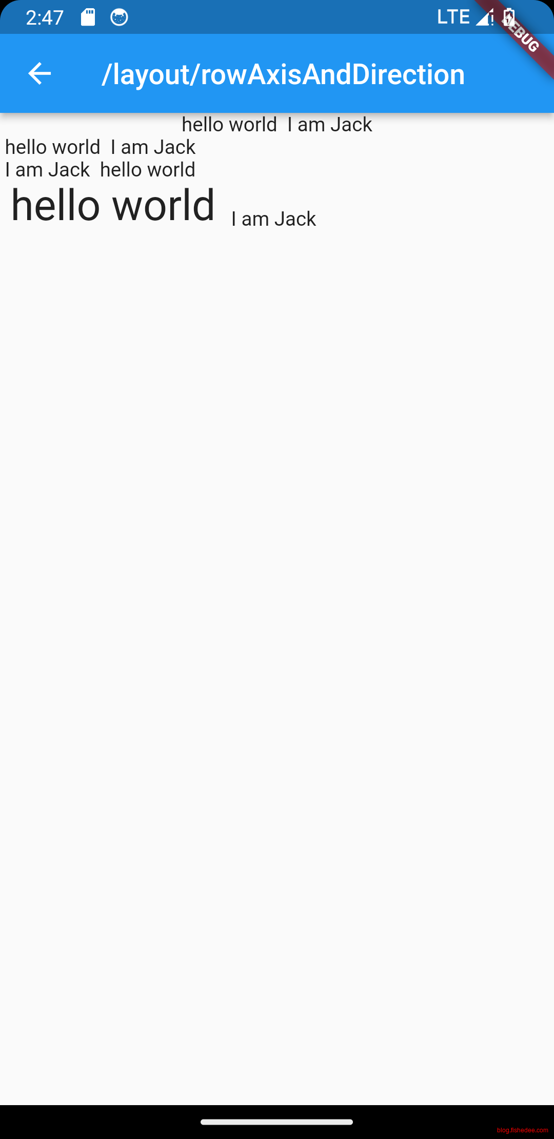
没啥好说的,比较简单
4.1.2 主轴size和交叉轴排列
import 'package:flutter/material.dart';

class ColumnStretchAndMainSizeDemo extends StatelessWidget {
  const ColumnStretchAndMainSizeDemo({
    Key? key,
  }) : super(key: key);

  Widget _buildColumn_mainAxisSize_min() {
    return SizedBox(
      width: 300,
      height: 300,
      child: Container(
          padding: const EdgeInsets.all(16.0),
          color: const Color(0xffdddddd),
          child: Align(
            alignment: Alignment.topLeft,
            child: Container(
                decoration: BoxDecoration(
                  border: Border.all(color: Colors.red, width: 1),
                ),
                child: Column(
                  crossAxisAlignment: CrossAxisAlignment.start,
                  //maxAxisSize仅当它是loose约束才有效
                  //默认值是min,也就是取子控件的宽高的合并
                  mainAxisSize: MainAxisSize.min,
                  children: <Widget>[
                    Container(
                      color: Colors.green,
                      child: const Column(
                        children: <Widget>[
                          Text("hello world "),
                          Text("I am Jack "),
                        ],
                      ),
                    )
                  ],
                )),
          )),
    );
  }

  Widget _buildColumn_mainAxisSize_max() {
    return SizedBox(
      width: 300,
      height: 300,
      child: Container(
          padding: const EdgeInsets.all(16.0),
          color: const Color(0xffdddddd),
          child: Align(
            alignment: Alignment.topLeft,
            child: Container(
                decoration: BoxDecoration(
                  border: Border.all(color: Colors.red, width: 1),
                ),
                child: Column(
                  crossAxisAlignment: CrossAxisAlignment.start,
                  //maxAxisSize仅当它是loose约束才有效
                  //当取max的时候,就是取maxHeight,也就是取父控件的高度
                  mainAxisSize: MainAxisSize.max,
                  children: <Widget>[
                    Container(
                      color: Colors.green,
                      child: const Column(
                        children: <Widget>[
                          Text("hello world "),
                          Text("I am Jack "),
                        ],
                      ),
                    )
                  ],
                )),
          )),
    );
  }

  Widget _buildColumn_mainAxisSize_sub_max() {
    return SizedBox(
      width: 300,
      height: 300,
      child: Container(
          padding: const EdgeInsets.all(16.0),
          color: const Color(0xffdddddd),
          child: Align(
            alignment: Alignment.topLeft,
            child: Container(
                decoration: BoxDecoration(
                  border: Border.all(color: Colors.red, width: 1),
                ),
                child: Column(
                  crossAxisAlignment: CrossAxisAlignment.start,
                  mainAxisSize: MainAxisSize.max,
                  children: <Widget>[
                    Container(
                      color: Colors.green,
                      child: const Column(
                        //Column下面的子Column取max是没有用的,因为row/column下面的约束是Unbounded的,maxHeight = 无穷
                        //子控件,无法使用MainAxisSize.max,只能取子控件的最大值
                        mainAxisSize: MainAxisSize.max,
                        children: <Widget>[
                          Text("hello world "),
                          Text("I am Jack "),
                        ],
                      ),
                    )
                  ],
                )),
          )),
    );
  }

  Widget _buildColumn_mainAxisSize_sub_max_fix() {
    return SizedBox(
      width: 300,
      height: 300,
      child: Container(
          padding: const EdgeInsets.all(16.0),
          color: const Color(0xffdddddd),
          child: Align(
            alignment: Alignment.topLeft,
            child: Container(
                decoration: BoxDecoration(
                  border: Border.all(color: Colors.red, width: 1),
                ),
                child: Column(
                  crossAxisAlignment: CrossAxisAlignment.start,
                  mainAxisSize: MainAxisSize.max,
                  children: <Widget>[
                    //一个简单的办法就是:
                    //Column下面的子Column放在Expanded里面,会得到tight约束,高度就是父Column的高度
                    //子控件,无需使用MainAxisSize.max,因为height是tight约束,无法更改的。
                    Expanded(
                        child: Container(
                      color: Colors.green,
                      child: const Column(
                        children: <Widget>[
                          Text("hello world "),
                          Text("I am Jack "),
                        ],
                      ),
                    ))
                  ],
                )),
          )),
    );
  }

  Widget _buildColumn_mainAxisSize_sub_max_fix2() {
    return SizedBox(
      width: 300,
      height: 300,
      child: Container(
          padding: const EdgeInsets.all(16.0),
          color: const Color(0xffdddddd),
          child: Align(
            alignment: Alignment.topLeft,
            child: Container(
                decoration: BoxDecoration(
                  border: Border.all(color: Colors.red, width: 1),
                ),
                child: Column(
                  crossAxisAlignment: CrossAxisAlignment.start,
                  mainAxisSize: MainAxisSize.max,
                  children: <Widget>[
                    //另外一个办法就是:
                    //Column下面的子Column放在Expanded里面,会得到tight约束,
                    //同时使用Align,将tight约束转换为loose约束
                    //这个时候的子Column就可以使用MainAxisSize.max/MainAxisSize.min来控制自身的高度
                    //这种方法很少用,甚至没有必要,仅仅是演示效果而已。
                    Expanded(
                        child: Align(
                            //注意,没有widthFactor,没有heightFactor的时候,宽高取父的宽高。存在的时候,取子宽高的比例放大。
                            widthFactor: 1,
                            heightFactor: 1,
                            alignment: Alignment.topLeft,
                            child: Container(
                              color: Colors.green,
                              child: const Column(
                                mainAxisSize: MainAxisSize.max,
                                crossAxisAlignment: CrossAxisAlignment.start,
                                children: <Widget>[
                                  Text("hello world "),
                                  Text("I am Jack "),
                                ],
                              ),
                            )))
                  ],
                )),
          )),
    );
  }

  @override
  Widget build(BuildContext context) {
    return SingleChildScrollView(
        child: Column(
      children: [
        _buildColumn_mainAxisSize_min(),
        const SizedBox(height: 20),
        _buildColumn_mainAxisSize_max(),
        const SizedBox(height: 20),
        _buildColumn_mainAxisSize_sub_max(),
        const SizedBox(height: 20),
        _buildColumn_mainAxisSize_sub_max_fix(),
        const SizedBox(height: 20),
        _buildColumn_mainAxisSize_sub_max_fix2(),
      ],
    ));
  }
}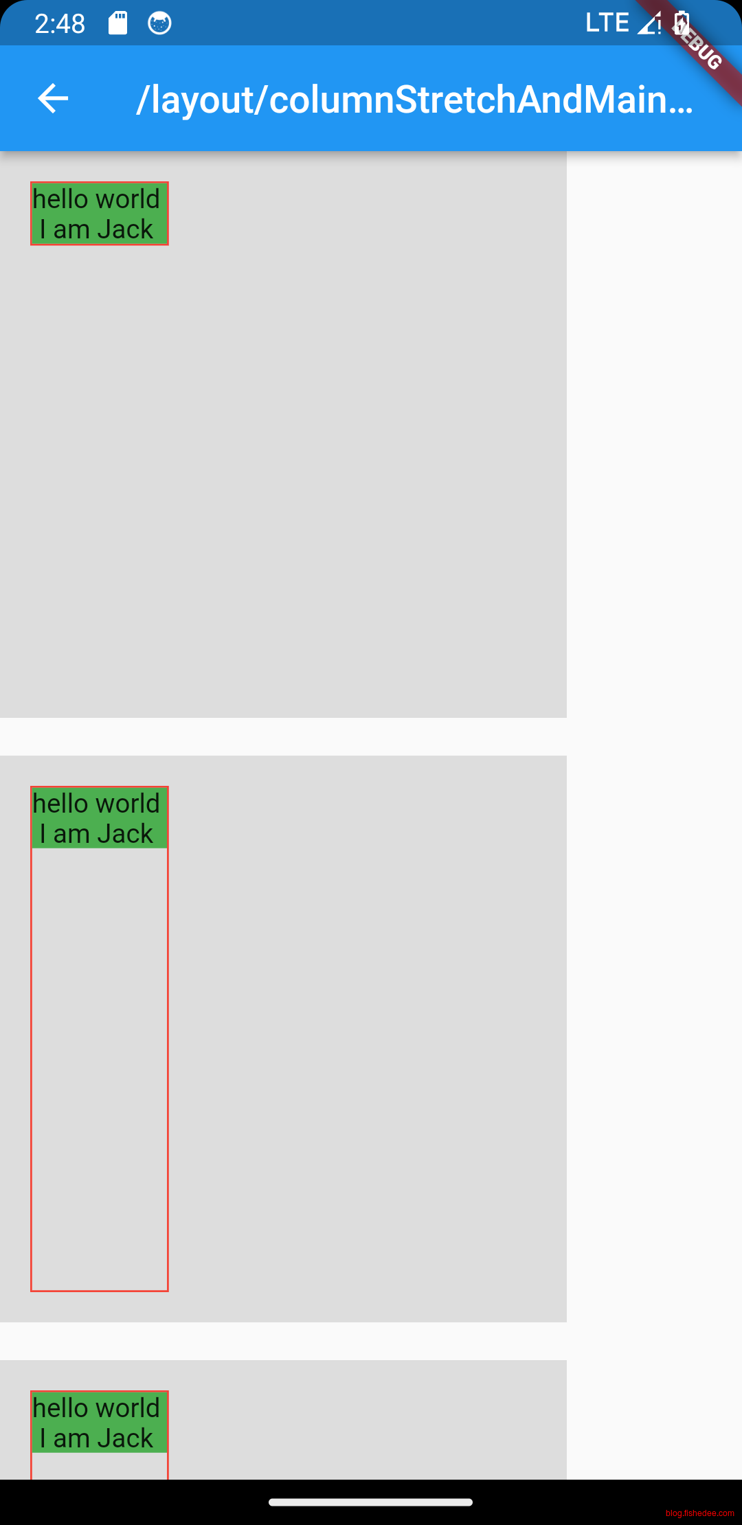
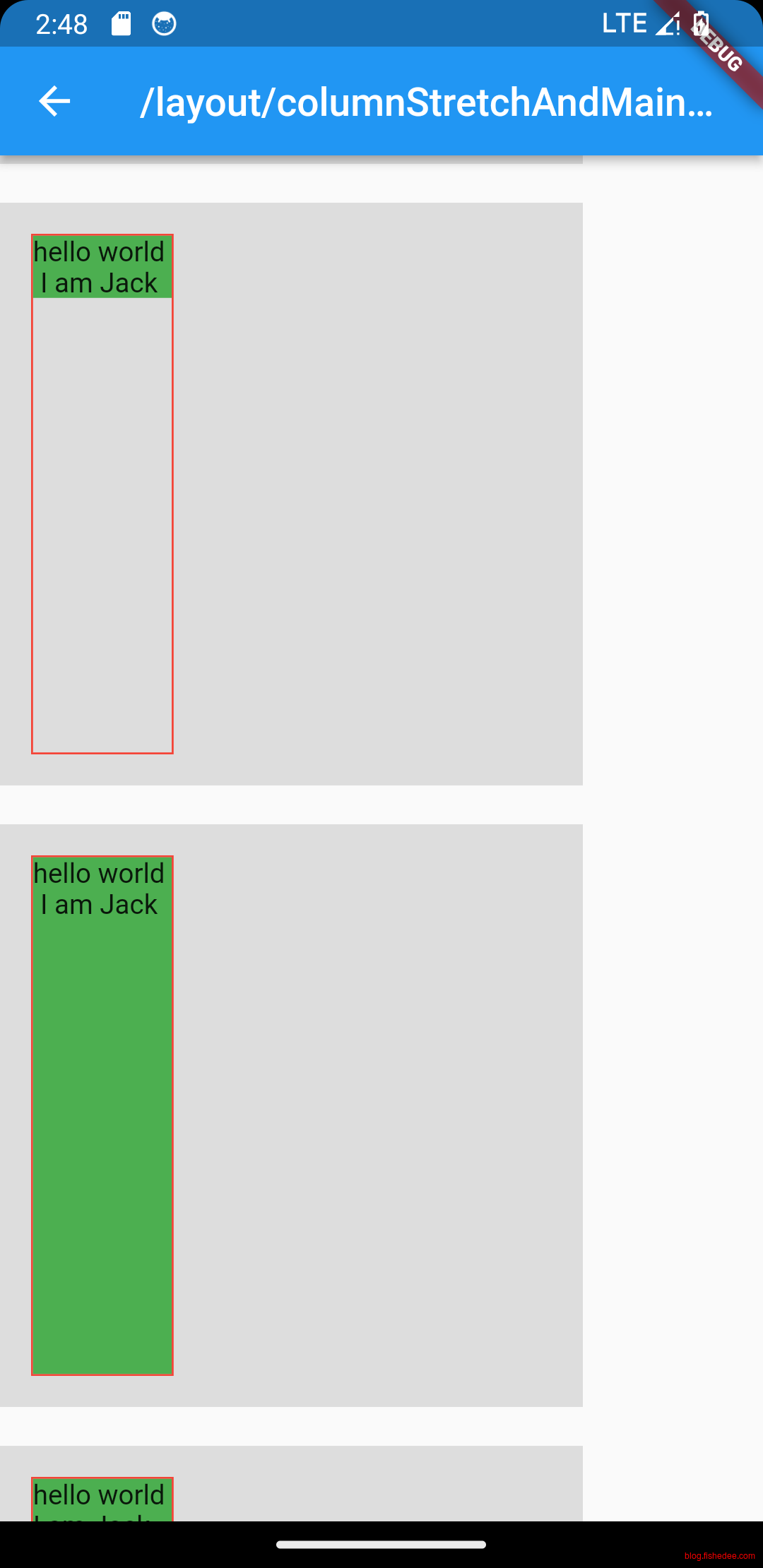
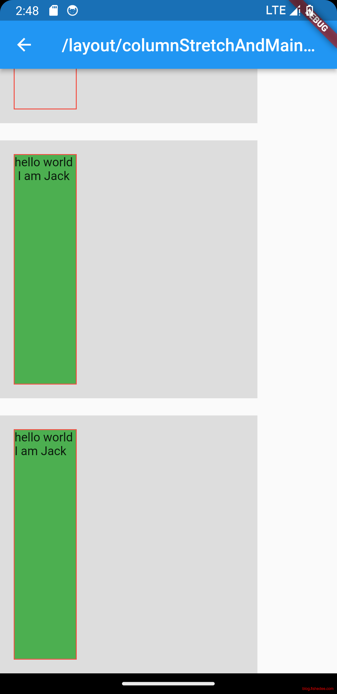
要点如下:
- 当flex的大小是tight约束,设置mainAxisSize是无效的。
- 当flex的大小是loose约束,mainAxisSize的默认是是min,也就是取子空间的宽高合并。如果mainAxisSize的值为max,就是取父控件的宽高
- flex的子控件没有Expanded的时候都是Unbounded约束,所以子控件设置MainAxisSize.max是无效的。
- flex的子控件有Expanded的时候都是tight约束,所以子控件设置MainAxisSize.max是无效的。
- flex的子控件是Expanded的时候,且再套一层Align,才是loose约束。这个时候,子控件设置MainAxisSize.max才是有效的。
4.1.3 主轴stretch
import 'package:flutter/material.dart';

class flexAndExpandedDemo extends StatelessWidget {
  const flexAndExpandedDemo({
    Key? key,
  }) : super(key: key);

  @override
  Widget build(BuildContext context) {
    return Column(
      children: <Widget>[
        //Flex的两个子widget按1:2来占据水平空间
        Flex(
          direction: Axis.horizontal,
          children: <Widget>[
            Expanded(
              flex: 1,
              child: Container(
                height: 30.0,
                color: Colors.red,
              ),
            ),
            Expanded(
              flex: 2,
              child: Container(
                height: 30.0,
                color: Colors.green,
              ),
            ),
          ],
        ),
        Padding(
          padding: const EdgeInsets.only(top: 20.0),
          child: SizedBox(
            height: 100.0,
            //Flex的三个子widget,在垂直方向按2:1:1来占用100像素的空间
            child: Flex(
              direction: Axis.vertical,
              children: <Widget>[
                Expanded(
                  flex: 2,
                  child: Container(
                    height: 30.0,
                    color: Colors.red,
                  ),
                ),
                //相当于Expanded(flex:1)
                const Spacer(
                  flex: 1,
                ),
                Expanded(
                  flex: 1,
                  child: Container(
                    height: 30.0,
                    color: Colors.green,
                  ),
                ),
              ],
            ),
          ),
        ),
      ],
    );
  }
}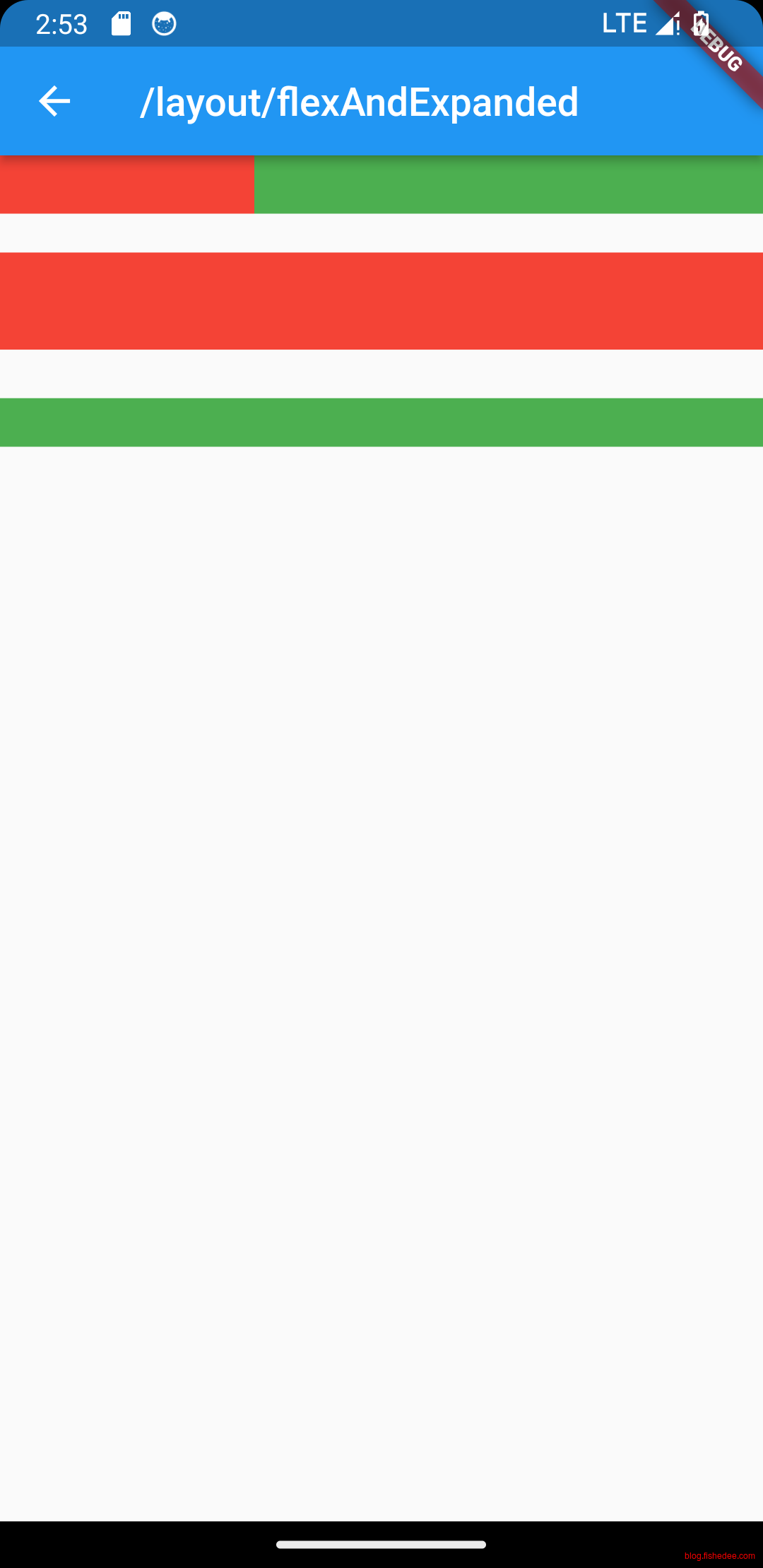
要点如下:
- Expanded取的是剩余主轴大小,子控件是tight约束
- Spacer相当于Expanded(flex:1)
4.1.4 Wrap
import 'package:flutter/material.dart';

class flexWrapDemo extends StatelessWidget {
  const flexWrapDemo({
    Key? key,
  }) : super(key: key);

  @override
  Widget build(BuildContext context) {
    //Wrap就是允许wrap的flex而已,flex的属性它都允许使用
    return const Align(
        alignment: Alignment.topCenter,
        child: Wrap(
          spacing: 8.0, // 主轴(水平)方向间距
          runSpacing: 4.0, // 纵轴(垂直)方向间距
          alignment: WrapAlignment.center, //沿主轴方向居中
          children: <Widget>[
            Chip(
              avatar:
                  CircleAvatar(backgroundColor: Colors.blue, child: Text('A')),
              label: Text('Hamilton'),
            ),
            Chip(
              avatar:
                  CircleAvatar(backgroundColor: Colors.blue, child: Text('M')),
              label: Text('Lafayette'),
            ),
            Chip(
              avatar:
                  CircleAvatar(backgroundColor: Colors.blue, child: Text('H')),
              label: Text('Mulligan'),
            ),
            Chip(
              avatar:
                  CircleAvatar(backgroundColor: Colors.blue, child: Text('J')),
              label: Text('Laurens'),
            ),
          ],
        ));
  }
}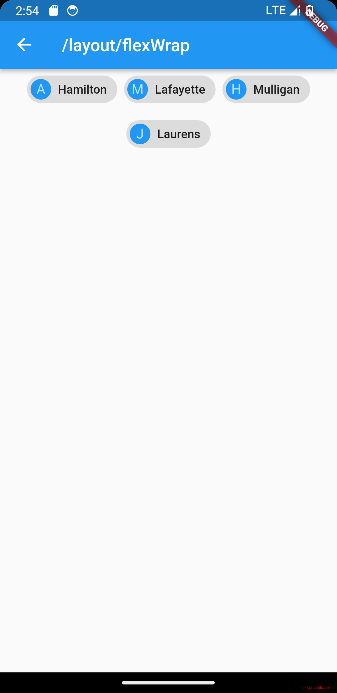
没啥好说的,比较简单,比较神奇的是。Wrap不是flex的一个属性,是一个新的布局组件。
4.2 Flow
4.2.1 基础
import 'package:flutter/material.dart';

/*
https://book.flutterchina.club/chapter4/wrap_and_flow.html#_4-5-1-wrap
我们一般很少会使用Flow,因为其过于复杂,需要自己实现子 widget 的位置转换,在很多场景下首先要考虑的是Wrap是否满足需求。Flow主要用于一些需要自定义布局策略或性能要求较高(如动画中)的场景。Flow有如下优点:

性能好;Flow是一个对子组件尺寸以及位置调整非常高效的控件,Flow用转换矩阵在对子组件进行位置调整的时候进行了优化:在Flow定位过后,如果子组件的尺寸或者位置发生了变化,在FlowDelegate中的paintChildren()方法中调用context.paintChild 进行重绘,而context.paintChild在重绘时使用了转换矩阵,并没有实际调整组件位置。
灵活;由于我们需要自己实现FlowDelegate的paintChildren()方法,所以我们需要自己计算每一个组件的位置,因此,可以自定义布局策略。
缺点:

使用复杂。
Flow 不能自适应子组件大小,必须通过指定父容器大小或实现TestFlowDelegate的getSize返回固定大小。
*/
class FlowBasicDemo extends StatelessWidget {
  const FlowBasicDemo({
    Key? key,
  }) : super(key: key);

  @override
  Widget build(BuildContext context) {
    //Wrap就是允许wrap的flex而已,flex的属性它都允许使用
    return Flow(
      delegate: TestFlowDelegate(margin: EdgeInsets.all(10.0)),
      children: <Widget>[
        Container(
          width: 80.0,
          height: 80.0,
          color: Colors.red,
        ),
        Container(
          width: 80.0,
          height: 80.0,
          color: Colors.green,
        ),
        Container(
          width: 80.0,
          height: 80.0,
          color: Colors.blue,
        ),
        Container(
          width: 80.0,
          height: 80.0,
          color: Colors.yellow,
        ),
        Container(
          width: 80.0,
          height: 80.0,
          color: Colors.brown,
        ),
        Container(
          width: 80.0,
          height: 80.0,
          color: Colors.purple,
        ),
      ],
    );
  }
}

class TestFlowDelegate extends FlowDelegate {
  EdgeInsets margin;

  TestFlowDelegate({this.margin = EdgeInsets.zero});

  double width = 0;
  double height = 0;

  @override
  void paintChildren(FlowPaintingContext context) {
    var x = margin.left;
    var y = margin.top;
    //计算每一个子widget的位置
    for (int i = 0; i < context.childCount; i++) {
      var w = context.getChildSize(i)!.width + x + margin.right;
      if (w < context.size.width) {
        context.paintChild(i, transform: Matrix4.translationValues(x, y, 0.0));
        x = w + margin.left;
      } else {
        x = margin.left;
        y += context.getChildSize(i)!.height + margin.top + margin.bottom;
        //绘制子widget(有优化)
        context.paintChild(i, transform: Matrix4.translationValues(x, y, 0.0));
        x += context.getChildSize(i)!.width + margin.left + margin.right;
      }
    }
  }

  @override
  Size getSize(BoxConstraints constraints) {
    // 指定Flow的大小,简单起见我们让宽度尽可能大,但高度指定为200,
    // 实际开发中我们需要根据子元素所占用的具体宽高来设置Flow大小
    return Size(double.infinity, 200.0);
  }

  @override
  bool shouldRepaint(FlowDelegate oldDelegate) {
    return oldDelegate != this;
  }
}Flow其实是一个自定义的布局组件,可以看这里。我们一般很少会使用Flow,因为其过于复杂,需要自己实现子 widget 的位置转换,在很多场景下首先要考虑的是Wrap是否满足需求。Flow主要用于一些需要自定义布局策略或性能要求较高(如动画中)的场景。Flow有如下优点:
- 性能好;Flow是一个对子组件尺寸以及位置调整非常高效的控件,Flow用转换矩阵在对子组件进行位置调整的时候进行了优化:在Flow定位过后,如果子组件的尺寸或者位置发生了变化,在FlowDelegate中的paintChildren()方法中调用context.paintChild 进行重绘,而context.paintChild在重绘时使用了转换矩阵,并没有实际调整组件位置。
- 灵活;由于我们需要自己实现FlowDelegate的paintChildren()方法,所以我们需要自己计算每一个组件的位置,因此,可以自定义布局策略。
缺点:
- 使用复杂。
- Flow 不能自适应子组件大小,必须通过指定父容器大小或实现TestFlowDelegate的getSize返回固定大小。
4.2.2 parallel效果
import 'package:flutter/material.dart';
import 'package:flutter/rendering.dart';

//https://docs.flutter.dev/cookbook/effects/parallax-scrolling
/*
该Demo比较复杂,使用了两种方法来实现Parallax,包含了以下内容
* 使用Flow来布局
* 1. 在FlowDelegate中,获取滚动条位置,获取item相对屏幕和滚动区域的位置,然后使用paintChild的transform来转换显示
* 2. Flow布局仅修改了paint阶段,在layout阶段没有任何操作,所以不需要额外侦听scroll的事件
* 使用Parallel控件来实
* 1. 侦听scroll的事件,当scroll事件发生的时候,触发当前widget为dirty.
* 2. 在dirty里面的layout阶段,重写performLayout操作,将子widget进行transform
* 3. 在paint阶段,也进行了重写
*/
const Color darkBlue = Color.fromARGB(255, 18, 32, 47);

class FlowParallaxDemo extends StatelessWidget {
  const FlowParallaxDemo({
    super.key,
  });

  @override
  Widget build(BuildContext context) {
    return SingleChildScrollView(
      child: Column(
        children: [
          for (final location in locations)
            LocationListItem(
              imageUrl: location.imageUrl,
              name: location.name,
              country: location.place,
            ),
        ],
      ),
    );
  }
}

class LocationListItem extends StatelessWidget {
  LocationListItem({
    super.key,
    required this.imageUrl,
    required this.name,
    required this.country,
  });

  final String imageUrl;
  final String name;
  final String country;
  final GlobalKey _backgroundImageKey = GlobalKey();

  @override
  Widget build(BuildContext context) {
    return Padding(
      padding: const EdgeInsets.symmetric(horizontal: 24, vertical: 16),
      child: AspectRatio(
        aspectRatio: 16 / 9,
        child: ClipRRect(
          borderRadius: BorderRadius.circular(16),
          child: Stack(
            children: [
              _buildParallaxBackground(context),
              _buildGradient(),
              _buildTitleAndSubtitle(),
            ],
          ),
        ),
      ),
    );
  }

  Widget _buildParallaxBackground(BuildContext context) {
    return Flow(
      delegate: ParallaxFlowDelegate(
        scrollable: Scrollable.of(context),
        listItemContext: context,
        backgroundImageKey: _backgroundImageKey,
      ),
      children: [
        Image.network(
          imageUrl,
          key: _backgroundImageKey,
          fit: BoxFit.cover,
        ),
      ],
    );
  }

  Widget _buildGradient() {
    return Positioned.fill(
      child: DecoratedBox(
        decoration: BoxDecoration(
          gradient: LinearGradient(
            colors: [Colors.transparent, Colors.black.withOpacity(0.7)],
            begin: Alignment.topCenter,
            end: Alignment.bottomCenter,
            stops: const [0.6, 0.95],
          ),
        ),
      ),
    );
  }

  Widget _buildTitleAndSubtitle() {
    return Positioned(
      left: 20,
      bottom: 20,
      child: Column(
        mainAxisSize: MainAxisSize.min,
        crossAxisAlignment: CrossAxisAlignment.start,
        children: [
          Text(
            name,
            style: const TextStyle(
              color: Colors.white,
              fontSize: 20,
              fontWeight: FontWeight.bold,
            ),
          ),
          Text(
            country,
            style: const TextStyle(
              color: Colors.white,
              fontSize: 14,
            ),
          ),
        ],
      ),
    );
  }
}

class ParallaxFlowDelegate extends FlowDelegate {
  ParallaxFlowDelegate({
    required this.scrollable,
    required this.listItemContext,
    required this.backgroundImageKey,
  }) : super(repaint: scrollable.position);

  final ScrollableState scrollable;
  final BuildContext listItemContext;
  final GlobalKey backgroundImageKey;

  @override
  BoxConstraints getConstraintsForChild(int i, BoxConstraints constraints) {
    return BoxConstraints.tightFor(
      width: constraints.maxWidth,
    );
  }

  @override
  void paintChildren(FlowPaintingContext context) {
    // Calculate the position of this list item within the viewport.
    final scrollableBox = scrollable.context.findRenderObject() as RenderBox;
    final listItemBox = listItemContext.findRenderObject() as RenderBox;
    final listItemOffset = listItemBox.localToGlobal(
        listItemBox.size.centerLeft(Offset.zero),
        ancestor: scrollableBox);

    // Determine the percent position of this list item within the
    // scrollable area.
    final viewportDimension = scrollable.position.viewportDimension;
    final scrollFraction =
        (listItemOffset.dy / viewportDimension).clamp(0.0, 1.0);

    // Calculate the vertical alignment of the background
    // based on the scroll percent.
    final verticalAlignment = Alignment(0.0, scrollFraction * 2 - 1);

    // Convert the background alignment into a pixel offset for
    // painting purposes.
    final backgroundSize =
        (backgroundImageKey.currentContext!.findRenderObject() as RenderBox)
            .size;
    final listItemSize = context.size;
    final childRect =
        verticalAlignment.inscribe(backgroundSize, Offset.zero & listItemSize);

    // Paint the background.
    context.paintChild(
      0,
      transform:
          Transform.translate(offset: Offset(0.0, childRect.top)).transform,
    );
  }

  @override
  bool shouldRepaint(ParallaxFlowDelegate oldDelegate) {
    return scrollable != oldDelegate.scrollable ||
        listItemContext != oldDelegate.listItemContext ||
        backgroundImageKey != oldDelegate.backgroundImageKey;
  }
}

class Parallax extends SingleChildRenderObjectWidget {
  const Parallax({
    super.key,
    required Widget background,
  }) : super(child: background);

  @override
  RenderObject createRenderObject(BuildContext context) {
    return RenderParallax(scrollable: Scrollable.of(context));
  }

  @override
  void updateRenderObject(
      BuildContext context, covariant RenderParallax renderObject) {
    renderObject.scrollable = Scrollable.of(context);
  }
}

class ParallaxParentData extends ContainerBoxParentData<RenderBox> {}

class RenderParallax extends RenderBox
    with RenderObjectWithChildMixin<RenderBox>, RenderProxyBoxMixin {
  RenderParallax({
    required ScrollableState scrollable,
  }) : _scrollable = scrollable;

  ScrollableState _scrollable;

  ScrollableState get scrollable => _scrollable;

  set scrollable(ScrollableState value) {
    if (value != _scrollable) {
      if (attached) {
        _scrollable.position.removeListener(markNeedsLayout);
      }
      _scrollable = value;
      if (attached) {
        _scrollable.position.addListener(markNeedsLayout);
      }
    }
  }

  @override
  void attach(covariant PipelineOwner owner) {
    super.attach(owner);
    _scrollable.position.addListener(markNeedsLayout);
  }

  @override
  void detach() {
    _scrollable.position.removeListener(markNeedsLayout);
    super.detach();
  }

  @override
  void setupParentData(covariant RenderObject child) {
    if (child.parentData is! ParallaxParentData) {
      child.parentData = ParallaxParentData();
    }
  }

  @override
  void performLayout() {
    size = constraints.biggest;

    // Force the background to take up all available width
    // and then scale its height based on the image's aspect ratio.
    final background = child!;
    final backgroundImageConstraints =
        BoxConstraints.tightFor(width: size.width);
    background.layout(backgroundImageConstraints, parentUsesSize: true);

    // Set the background's local offset, which is zero.
    (background.parentData as ParallaxParentData).offset = Offset.zero;
  }

  @override
  void paint(PaintingContext context, Offset offset) {
    // Get the size of the scrollable area.
    final viewportDimension = scrollable.position.viewportDimension;

    // Calculate the global position of this list item.
    final scrollableBox = scrollable.context.findRenderObject() as RenderBox;
    final backgroundOffset =
        localToGlobal(size.centerLeft(Offset.zero), ancestor: scrollableBox);

    // Determine the percent position of this list item within the
    // scrollable area.
    final scrollFraction =
        (backgroundOffset.dy / viewportDimension).clamp(0.0, 1.0);

    // Calculate the vertical alignment of the background
    // based on the scroll percent.
    final verticalAlignment = Alignment(0.0, scrollFraction * 2 - 1);

    // Convert the background alignment into a pixel offset for
    // painting purposes.
    final background = child!;
    final backgroundSize = background.size;
    final listItemSize = size;
    final childRect =
        verticalAlignment.inscribe(backgroundSize, Offset.zero & listItemSize);

    // Paint the background.
    context.paintChild(
        background,
        (background.parentData as ParallaxParentData).offset +
            offset +
            Offset(0.0, childRect.top));
  }
}

class Location {
  const Location({
    required this.name,
    required this.place,
    required this.imageUrl,
  });

  final String name;
  final String place;
  final String imageUrl;
}

const urlPrefix =
    'https://docs.flutter.dev/cookbook/img-files/effects/parallax';
const locations = [
  Location(
    name: 'Mount Rushmore',
    place: 'U.S.A',
    imageUrl: '$urlPrefix/01-mount-rushmore.jpg',
  ),
  Location(
    name: 'Gardens By The Bay',
    place: 'Singapore',
    imageUrl: '$urlPrefix/02-singapore.jpg',
  ),
  Location(
    name: 'Machu Picchu',
    place: 'Peru',
    imageUrl: '$urlPrefix/03-machu-picchu.jpg',
  ),
  Location(
    name: 'Vitznau',
    place: 'Switzerland',
    imageUrl: '$urlPrefix/04-vitznau.jpg',
  ),
  Location(
    name: 'Bali',
    place: 'Indonesia',
    imageUrl: '$urlPrefix/05-bali.jpg',
  ),
  Location(
    name: 'Mexico City',
    place: 'Mexico',
    imageUrl: '$urlPrefix/06-mexico-city.jpg',
  ),
  Location(
    name: 'Cairo',
    place: 'Egypt',
    imageUrl: '$urlPrefix/07-cairo.jpg',
  ),
];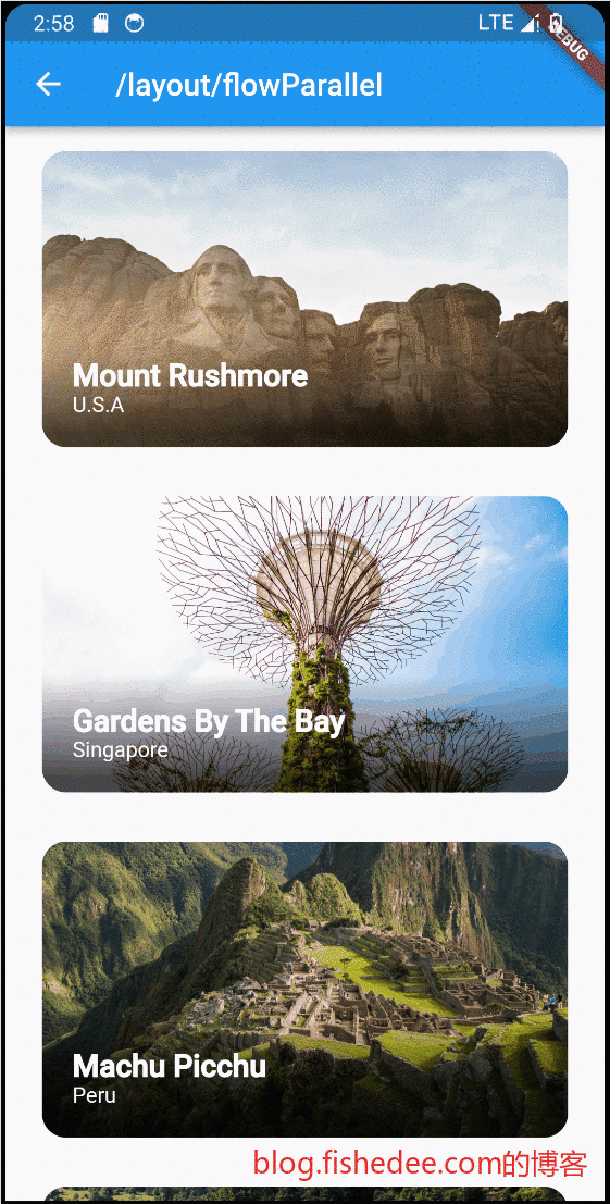
具体解释看这里。该Demo比较复杂,会涉及到滚动条的处理,flow的处理,布局约束等知识,建议看完整个文档以后,再回头看这里。
它使用了两种方法来实现Parallax,包含了以下内容
使用Flow来布局
- 在FlowDelegate中,获取滚动条位置,获取item相对屏幕和滚动区域的位置,然后使用paintChild的transform来转换显示
- Flow布局仅修改了paint阶段,在layout阶段没有任何操作,所以不需要额外侦听scroll的事件
使用Parallel控件来实
- 侦听scroll的事件,当scroll事件发生的时候,触发当前widget为dirty.
- 在dirty里面的layout阶段,重写performLayout操作,将子widget进行transform
- 在paint阶段,也进行了重写
4.3 Stack
4.3.1 基础
import 'package:flutter/material.dart';
class StackNormalDemo extends StatelessWidget {
const StackNormalDemo({
Key? key,
}) : super(key: key);
@override
Widget build(BuildContext context) {
return ConstrainedBox(
constraints: const BoxConstraints.expand(),
child: Stack(
//默认在放在center的位置
alignment: Alignment.center, //指定未定位或部分定位widget的对齐方式
children: <Widget>[
Container(
//都在center
color: Colors.red,
child: const Text("Hello world",
style: TextStyle(color: Colors.white)),
),
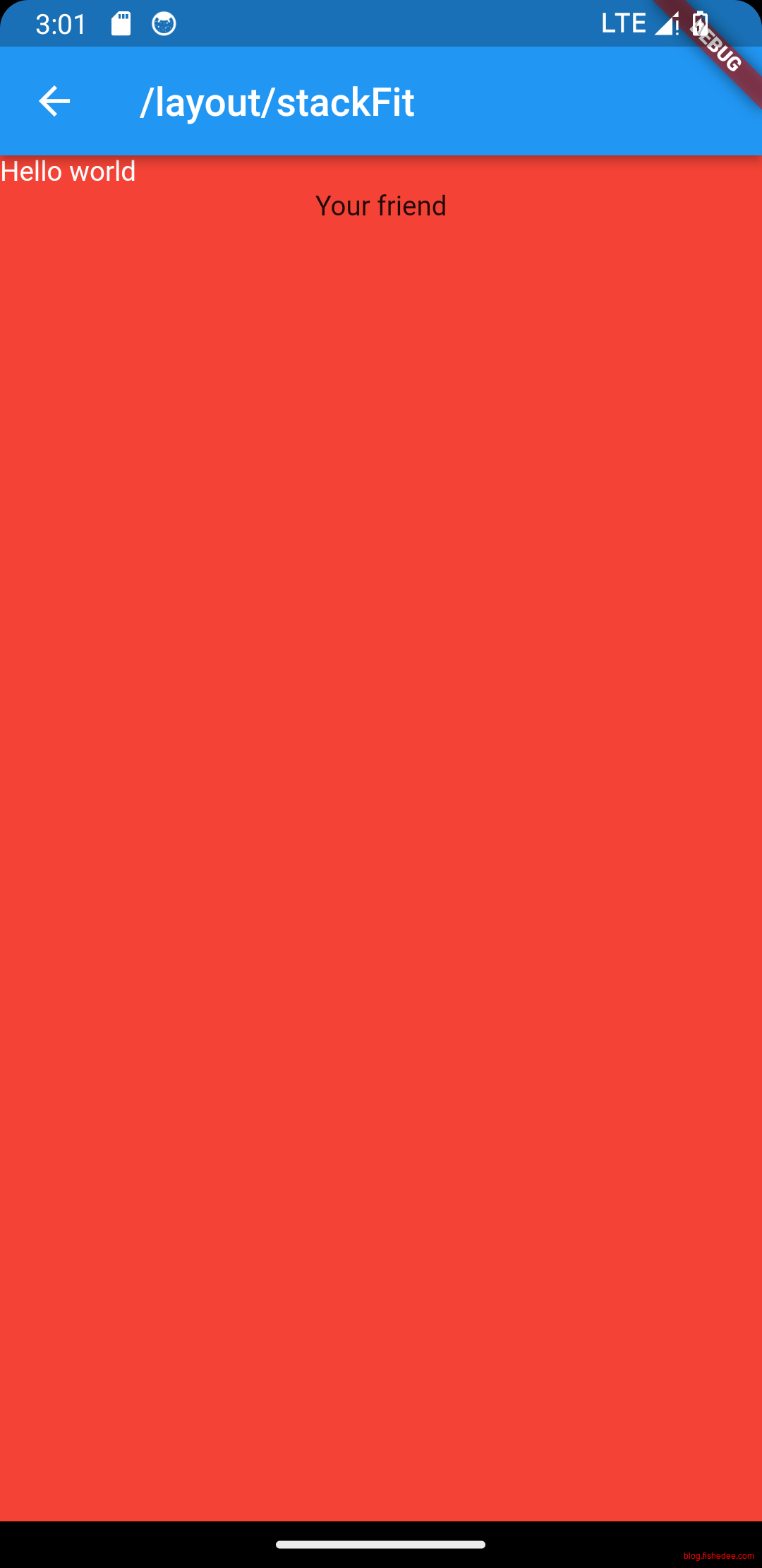
const Positioned(
//left为18,加上垂直居中
left: 18.0,
child: Text("I am Jack"),
),
const Positioned(
//top为18,加上水平居中
top: 18.0,
child: Text("Your friend"),
)
],
),
);
}
}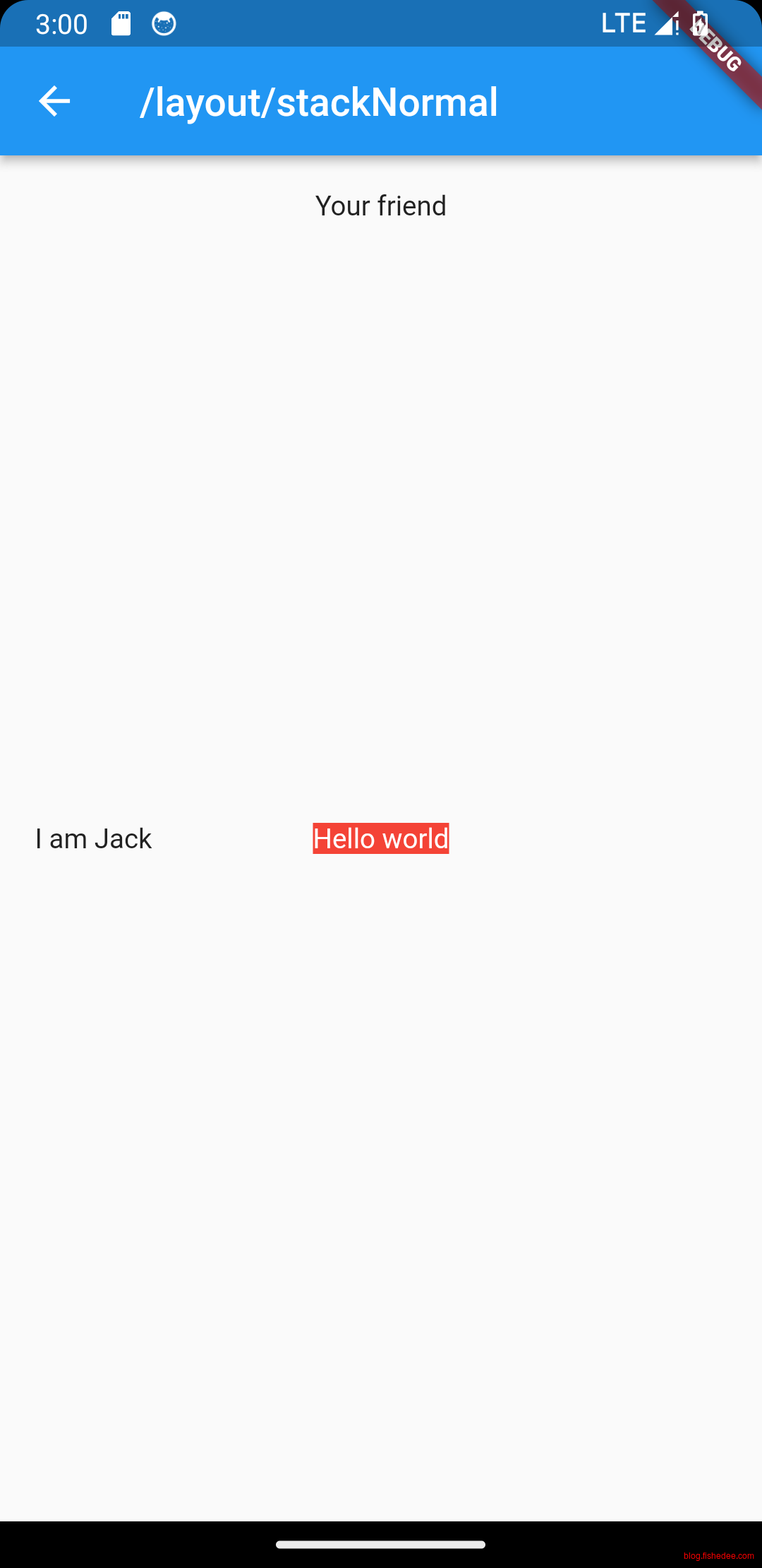
要点如下:
- Stack就是html5中的absolute布局
- 默认情况下,未指定的轴,都是放在center的位置。可以通过修改alignment来更改这个默认设定。
4.3.2 fit
import 'package:flutter/material.dart';

class StackFitDemo extends StatelessWidget {
  const StackFitDemo({
    Key? key,
  }) : super(key: key);

  @override
  Widget build(BuildContext context) {
    return ConstrainedBox(
      constraints: const BoxConstraints.expand(),
      child: Stack(
        //默认放在中间
        alignment: Alignment.center,
        //没有left,没有top的占满整个空间
        fit: StackFit.expand,
        children: <Widget>[
          //left为18,加上垂直居中
          const Positioned(
            left: 18.0,
            child: Text("I am Jack"),
          ),
          //占满整个空间
          Container(
            color: Colors.red,
            child: const Text("Hello world",
                style: TextStyle(color: Colors.white)),
          ),
          //top为18,加上水平居中
          const Positioned(
            top: 18.0,
            child: Text("Your friend"),
          )
        ],
      ),
    );
  }
}
我们也可以通过设置fit,来让没有布局的控件默认覆盖整个控件。
4.4 Align
import 'package:flutter/material.dart';

class AlignAndCenterDemo extends StatelessWidget {
  const AlignAndCenterDemo({
    Key? key,
  }) : super(key: key);

  /*
  * Alignment的偏移计算公式,常用于Widget内部的偏移,以childWidth中间点来偏移。Alignment(this.x, this.y),x和y常取-1和1,0.
  实际偏移 = (Alignment.x * (parentWidth - childWidth) / 2 + (parentWidth - childWidth) / 2,
        Alignment.y * (parentHeight - childHeight) / 2 + (parentHeight - childHeight) / 2)
  */
  Widget _buildAlign() {
    return Container(
      height: 120.0,
      width: 120.0,
      color: Colors.blue.shade50,
      child: const Align(
        alignment: Alignment.topRight,
        child: FlutterLogo(
          size: 60,
        ),
      ),
    );
  }

  /*
  * FractionalOffset 以矩形左侧原点来偏移。
  实际偏移 = (FractionalOffse.x * (parentWidth - childWidth), FractionalOffse.y * (parentHeight - childHeight))
  */
  Widget _buildAlign2() {
    return Container(
      height: 120.0,
      width: 120.0,
      color: Colors.blue.shade50,
      child: const Align(
        alignment: FractionalOffset(0.2, 0.6),
        child: FlutterLogo(
          size: 60,
        ),
      ),
    );
  }

  //center其实就是Align
  Widget _buildCenter() {
    return Container(
      height: 120.0,
      width: 120.0,
      color: Colors.blue.shade50,
      child: const Center(
        child: FlutterLogo(
          size: 60,
        ),
      ),
    );
  }

  @override
  Widget build(BuildContext context) {
    return ConstrainedBox(
      constraints: const BoxConstraints.expand(),
      child: Column(
        children: [
          _buildAlign(),
          const SizedBox(height: 20),
          _buildAlign2(),
          const SizedBox(height: 20),
          _buildCenter(),
        ],
      ),
    );
  }
}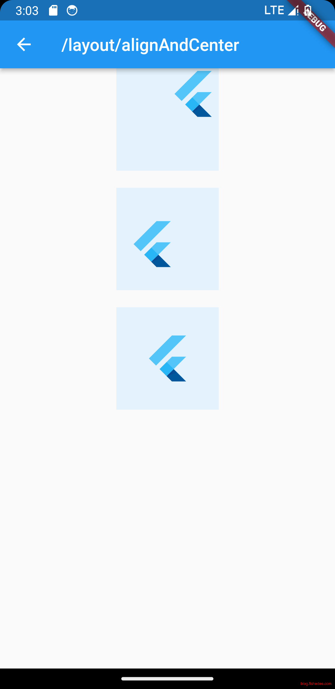
Alignment的偏移计算公式,常用于Widget内部的偏移,以childWidth中间点来偏移。Alignment(this.x, this.y),x和y常取-1和1,0.
实际偏移 = (Alignment.x * (parentWidth - childWidth) / 2 + (parentWidth - childWidth) / 2,Alignment.y * (parentHeight - childHeight) / 2 + (parentHeight - childHeight) / 2)

FractionalOffset 以矩形左侧原点来偏移。
实际偏移 = (FractionalOffse.x * (parentWidth - childWidth), FractionalOffse.y * (parentHeight - childHeight))
要点如下:
- Align是特有的组件,align/center的实际作用是将tight约束转换为loose约束,这个在《布局约束》这一节有详细介绍。
- Align的Alignment是以childWidget中间点来计算偏移的。
- Align的FractionalOffset是以childWidget的左上角原点来计算偏移的。
- Center其实就是默认在中间的Align节点而已。
4.5 LayoutBuilder
import 'package:flutter/material.dart';

//使用LayoutBuilder来做响应式布局。
//LayoutBuilder可以在运行时获取constraint,根据不同的constraint来做布局
class ResponsiveColumn extends StatelessWidget {
  const ResponsiveColumn({Key? key, required this.children}) : super(key: key);

  final List<Widget> children;

  @override
  Widget build(BuildContext context) {
    // 通过 LayoutBuilder 拿到父组件传递的约束,然后判断 maxWidth 是否小于200
    return LayoutBuilder(
      builder: (BuildContext context, BoxConstraints constraints) {
        if (constraints.maxWidth < 200) {
          // 最大宽度小于200,显示单列
          return Column(mainAxisSize: MainAxisSize.min, children: children);
        } else {
          // 大于200,显示双列
          var widgetChildren = <Widget>[];
          for (var i = 0; i < children.length; i += 2) {
            if (i + 1 < children.length) {
              widgetChildren.add(Row(
                mainAxisSize: MainAxisSize.min,
                children: [children[i], children[i + 1]],
              ));
            } else {
              widgetChildren.add(children[i]);
            }
          }
          return Column(
              mainAxisSize: MainAxisSize.min, children: widgetChildren);
        }
      },
    );
  }
}

//LayoutBuilder也可以用作运行时的布局调试
class LayoutLogPrint extends StatelessWidget {
  const LayoutLogPrint({
    Key? key,
    required this.child,
  }) : super(key: key);

  final Widget child;

  @override
  Widget build(BuildContext context) {
    return LayoutBuilder(builder: (_, constraints) {
      // assert在编译release版本时会被去除
      assert(() {
        print('${key ?? child}: $constraints');
        return true;
      }());
      return child;
    });
  }
}

class LayoutBuilderDemo extends StatelessWidget {
  const LayoutBuilderDemo({
    Key? key,
  }) : super(key: key);

  @override
  Widget build(BuildContext context) {
    return ConstrainedBox(
      constraints: const BoxConstraints.expand(),
      child: Column(
        children: [
          Container(
              color: Colors.blue,
              child: const ResponsiveColumn(children: [
                Text("Fish "),
                Text("HelloWorld"),
              ])),
          const SizedBox(height: 20),
          SizedBox(
            width: 180,
            height: 180,
            child: Container(
                color: Colors.green,
                child: const ResponsiveColumn(children: [
                  Text("Fish "),
                  Text("HelloWorld"),
                ])),
          ),
          const SizedBox(height: 20),
          Container(
              color: Colors.yellow,
              child: const LayoutLogPrint(child: Text("uu")))
        ],
      ),
    );
  }
}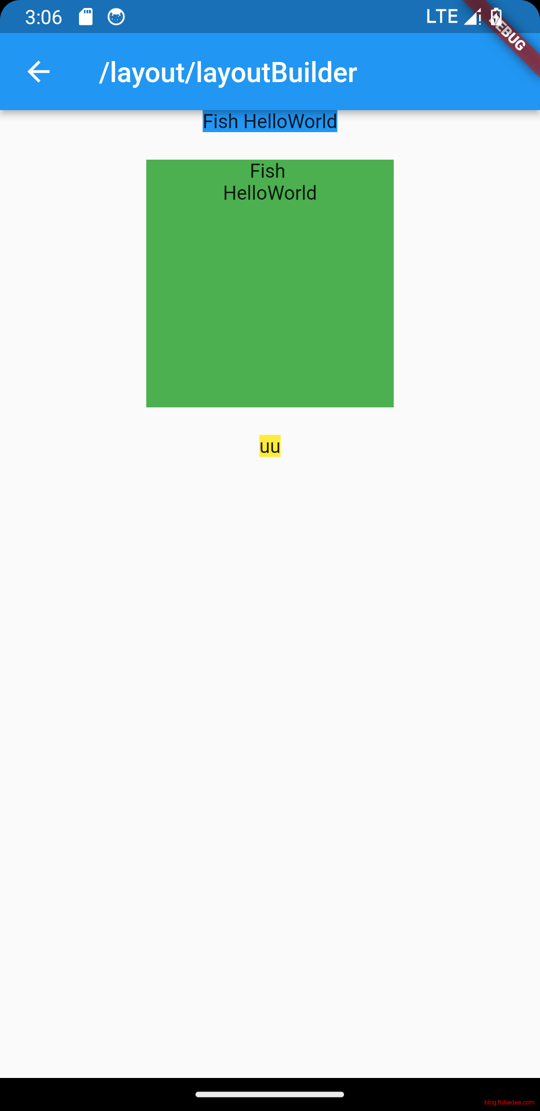
LayoutBuilder是相当有用的组件,可以在运行时拿到父级别的constraint来进行按需布局,常用于:
- 响应式布局
- 调试布局的时候,打印布局约束的数据
5 UI布局约束
代码在这里
布局约束是flutter的第一大难点,需要重点掌握
5.1 布局约束
import 'package:flutter/material.dart';
const red = Colors.red;
const green = Colors.green;
const blue = Colors.blue;
const big = TextStyle(fontSize: 30);
//////////////////////////////////////////////////
class ConstraintBoxDemo extends StatelessWidget {
const ConstraintBoxDemo({super.key});
@override
Widget build(BuildContext context) {
return const FlutterLayoutArticle([
Example1(),
Example2(),
Example3(),
Example4(),
Example5(),
Example6(),
Example7(),
Example8(),
Example9(),
Example10(),
Example11(),
Example12(),
Example13(),
Example14(),
Example15(),
Example16(),
Example17(),
Example18(),
Example19(),
Example20(),
Example21(),
Example22(),
Example23(),
Example24(),
Example25(),
Example26(),
Example27(),
Example28(),
Example29(),
Example30(),
]);
}
}
//////////////////////////////////////////////////
abstract class Example extends StatelessWidget {
const Example({super.key});
String get code;
String get explanation;
}
//////////////////////////////////////////////////
class FlutterLayoutArticle extends StatefulWidget {
const FlutterLayoutArticle(
this.examples, {
super.key,
});
final List<Example> examples;
@override
State<FlutterLayoutArticle> createState() => _FlutterLayoutArticleState();
}
//////////////////////////////////////////////////
class _FlutterLayoutArticleState extends State<FlutterLayoutArticle> {
late int count;
late Widget example;
late String code;
late String explanation;
@override
void initState() {
count = 1;
code = const Example1().code;
explanation = const Example1().explanation;
super.initState();
}
@override
void didUpdateWidget(FlutterLayoutArticle oldWidget) {
super.didUpdateWidget(oldWidget);
var example = widget.examples[count - 1];
code = example.code;
explanation = example.explanation;
}
@override
Widget build(BuildContext context) {
return MaterialApp(
debugShowCheckedModeBanner: false,
title: 'Flutter Layout Article',
home: SafeArea(
child: Material(
color: Colors.black,
child: FittedBox(
child: Container(
width: 400,
height: 670,
color: const Color(0xFFCCCCCC),
child: Column(
crossAxisAlignment: CrossAxisAlignment.center,
children: [
Expanded(
child: ConstrainedBox(
constraints: const BoxConstraints.tightFor(
width: double.infinity, height: double.infinity),
child: widget.examples[count - 1])),
Container(
height: 50,
width: double.infinity,
color: Colors.black,
child: SingleChildScrollView(
scrollDirection: Axis.horizontal,
child: Row(
mainAxisSize: MainAxisSize.min,
children: [
for (int i = 0; i < widget.examples.length; i++)
Container(
width: 58,
padding: const EdgeInsets.only(left: 4, right: 4),
child: button(i + 1),
),
],
),
),
),
Container(
height: 273,
color: Colors.grey[50],
child: Scrollbar(
child: SingleChildScrollView(
key: ValueKey(count),
child: Padding(
padding: const EdgeInsets.all(10),
child: Column(
children: [
Center(child: Text(code)),
const SizedBox(height: 15),
Text(
explanation,
style: TextStyle(
color: Colors.blue[900],
fontStyle: FontStyle.italic),
),
],
),
),
),
),
),
],
),
),
),
),
),
);
}
Widget button(int exampleNumber) {
return Button(
key: ValueKey('button$exampleNumber'),
isSelected: count == exampleNumber,
exampleNumber: exampleNumber,
onPressed: () {
showExample(
exampleNumber,
widget.examples[exampleNumber - 1].code,
widget.examples[exampleNumber - 1].explanation,
);
},
);
}
void showExample(int exampleNumber, String code, String explanation) {
setState(() {
count = exampleNumber;
this.code = code;
this.explanation = explanation;
});
}
}
//////////////////////////////////////////////////
class Button extends StatelessWidget {
final bool isSelected;
final int exampleNumber;
final VoidCallback onPressed;
const Button({
super.key,
required this.isSelected,
required this.exampleNumber,
required this.onPressed,
});
@override
Widget build(BuildContext context) {
return TextButton(
style: TextButton.styleFrom(
foregroundColor: Colors.white,
backgroundColor: isSelected ? Colors.grey : Colors.grey[800],
),
child: Text(exampleNumber.toString()),
onPressed: () {
Scrollable.ensureVisible(
context,
duration: const Duration(milliseconds: 350),
curve: Curves.easeOut,
alignment: 0.5,
);
onPressed();
},
);
}
}
//////////////////////////////////////////////////
class Example1 extends Example {
const Example1({super.key});
@override
final code = 'Container(color: red)';
@override
final explanation = 'The screen is the parent of the Container, '
'and it forces the Container to be exactly the same size as the screen.'
'\n\n'
'So the Container fills the screen and paints it red.';
@override
Widget build(BuildContext context) {
return Container(color: red);
}
}
//////////////////////////////////////////////////
class Example2 extends Example {
const Example2({super.key});
@override
final code = 'Container(width: 100, height: 100, color: red)';
@override
final String explanation =
'The red Container wants to be 100x100, but it can\'t, '
'because the screen forces it to be exactly the same size as the screen.'
'\n\n'
'So the Container fills the screen.';
@override
Widget build(BuildContext context) {
return Container(width: 100, height: 100, color: red);
}
}
//////////////////////////////////////////////////
class Example3 extends Example {
const Example3({super.key});
@override
final code = 'Center(\n'
' child: Container(width: 100, height: 100, color: red))';
@override
final String explanation =
'The screen forces the Center to be exactly the same size as the screen, '
'so the Center fills the screen.'
'\n\n'
'The Center tells the Container that it can be any size it wants, but not bigger than the screen.'
'Now the Container can indeed be 100x100.';
@override
Widget build(BuildContext context) {
return Center(
child: Container(width: 100, height: 100, color: red),
);
}
}
//////////////////////////////////////////////////
class Example4 extends Example {
const Example4({super.key});
@override
final code = 'Align(\n'
' alignment: Alignment.bottomRight,\n'
' child: Container(width: 100, height: 100, color: red))';
@override
final String explanation =
'This is different from the previous example in that it uses Align instead of Center.'
'\n\n'
'Align also tells the Container that it can be any size it wants, but if there is empty space it won\'t center the Container. '
'Instead, it aligns the Container to the bottom-right of the available space.';
@override
Widget build(BuildContext context) {
return Align(
alignment: Alignment.bottomRight,
child: Container(width: 100, height: 100, color: red),
);
}
}
//////////////////////////////////////////////////
class Example5 extends Example {
const Example5({super.key});
@override
final code = 'Center(\n'
' child: Container(\n'
' color: red,\n'
' width: double.infinity,\n'
' height: double.infinity))';
@override
final String explanation =
'The screen forces the Center to be exactly the same size as the screen, '
'so the Center fills the screen.'
'\n\n'
'The Center tells the Container that it can be any size it wants, but not bigger than the screen.'
'The Container wants to be of infinite size, but since it can\'t be bigger than the screen, it just fills the screen.';
@override
Widget build(BuildContext context) {
return Center(
child: Container(
width: double.infinity, height: double.infinity, color: red),
);
}
}
//////////////////////////////////////////////////
class Example6 extends Example {
const Example6({super.key});
@override
final code = 'Center(child: Container(color: red))';
@override
final String explanation =
'The screen forces the Center to be exactly the same size as the screen, '
'so the Center fills the screen.'
'\n\n'
'The Center tells the Container that it can be any size it wants, but not bigger than the screen.'
'\n\n'
'Since the Container has no child and no fixed size, it decides it wants to be as big as possible, so it fills the whole screen.'
'\n\n'
'But why does the Container decide that? '
'Simply because that\'s a design decision by those who created the Container widget. '
'It could have been created differently, and you have to read the Container documentation to understand how it behaves, depending on the circumstances. ';
@override
Widget build(BuildContext context) {
return Center(
child: Container(color: red),
);
}
}
//////////////////////////////////////////////////
class Example7 extends Example {
const Example7({super.key});
@override
final code = 'Center(\n'
' child: Container(color: red\n'
' child: Container(color: green, width: 30, height: 30)))';
@override
final String explanation =
'The screen forces the Center to be exactly the same size as the screen, '
'so the Center fills the screen.'
'\n\n'
'The Center tells the red Container that it can be any size it wants, but not bigger than the screen.'
'Since the red Container has no size but has a child, it decides it wants to be the same size as its child.'
'\n\n'
'The red Container tells its child that it can be any size it wants, but not bigger than the screen.'
'\n\n'
'The child is a green Container that wants to be 30x30.'
'\n\n'
'Since the red `Container` has no size but has a child, it decides it wants to be the same size as its child. '
'The red color isn\'t visible, since the green Container entirely covers all of the red Container.';
@override
Widget build(BuildContext context) {
return Center(
child: Container(
color: red,
child: Container(color: green, width: 30, height: 30),
),
);
}
}
//////////////////////////////////////////////////
class Example8 extends Example {
const Example8({super.key});
@override
final code = 'Center(\n'
' child: Container(color: red\n'
' padding: const EdgeInsets.all(20),\n'
' child: Container(color: green, width: 30, height: 30)))';
@override
final String explanation =
'The red Container sizes itself to its children size, but it takes its own padding into consideration. '
'So it is also 30x30 plus padding. '
'The red color is visible because of the padding, and the green Container has the same size as in the previous example.';
@override
Widget build(BuildContext context) {
return Center(
child: Container(
padding: const EdgeInsets.all(20),
color: red,
child: Container(color: green, width: 30, height: 30),
),
);
}
}
//////////////////////////////////////////////////
class Example9 extends Example {
const Example9({super.key});
@override
final code = 'ConstrainedBox(\n'
' constraints: BoxConstraints(\n'
' minWidth: 70, minHeight: 70,\n'
' maxWidth: 150, maxHeight: 150),\n'
' child: Container(color: red, width: 10, height: 10)))';
@override
final String explanation =
'You might guess that the Container has to be between 70 and 150 pixels, but you would be wrong. '
'The ConstrainedBox only imposes ADDITIONAL constraints from those it receives from its parent.'
'\n\n'
'Here, the screen forces the ConstrainedBox to be exactly the same size as the screen, '
'so it tells its child Container to also assume the size of the screen, '
'thus ignoring its \'constraints\' parameter.';
@override
Widget build(BuildContext context) {
return ConstrainedBox(
constraints: const BoxConstraints(
minWidth: 70,
minHeight: 70,
maxWidth: 150,
maxHeight: 150,
),
child: Container(color: red, width: 10, height: 10),
);
}
}
//////////////////////////////////////////////////
class Example10 extends Example {
const Example10({super.key});
@override
final code = 'Center(\n'
' child: ConstrainedBox(\n'
' constraints: BoxConstraints(\n'
' minWidth: 70, minHeight: 70,\n'
' maxWidth: 150, maxHeight: 150),\n'
' child: Container(color: red, width: 10, height: 10))))';
@override
final String explanation =
'Now, Center allows ConstrainedBox to be any size up to the screen size.'
'\n\n'
'The ConstrainedBox imposes ADDITIONAL constraints from its \'constraints\' parameter onto its child.'
'\n\n'
'The Container must be between 70 and 150 pixels. It wants to have 10 pixels, so it will end up having 70 (the MINIMUM).';
@override
Widget build(BuildContext context) {
return Center(
child: ConstrainedBox(
constraints: const BoxConstraints(
minWidth: 70,
minHeight: 70,
maxWidth: 150,
maxHeight: 150,
),
child: Container(color: red, width: 10, height: 10),
),
);
}
}
//////////////////////////////////////////////////
class Example11 extends Example {
const Example11({super.key});
@override
final code = 'Center(\n'
' child: ConstrainedBox(\n'
' constraints: BoxConstraints(\n'
' minWidth: 70, minHeight: 70,\n'
' maxWidth: 150, maxHeight: 150),\n'
' child: Container(color: red, width: 1000, height: 1000))))';
@override
final String explanation =
'Center allows ConstrainedBox to be any size up to the screen size.'
'The ConstrainedBox imposes ADDITIONAL constraints from its \'constraints\' parameter onto its child'
'\n\n'
'The Container must be between 70 and 150 pixels. It wants to have 1000 pixels, so it ends up having 150 (the MAXIMUM).';
@override
Widget build(BuildContext context) {
return Center(
child: ConstrainedBox(
constraints: const BoxConstraints(
minWidth: 70,
minHeight: 70,
maxWidth: 150,
maxHeight: 150,
),
child: Container(color: red, width: 1000, height: 1000),
),
);
}
}
//////////////////////////////////////////////////
class Example12 extends Example {
const Example12({super.key});
@override
final code = 'Center(\n'
' child: ConstrainedBox(\n'
' constraints: BoxConstraints(\n'
' minWidth: 70, minHeight: 70,\n'
' maxWidth: 150, maxHeight: 150),\n'
' child: Container(color: red, width: 100, height: 100))))';
@override
final String explanation =
'Center allows ConstrainedBox to be any size up to the screen size.'
'ConstrainedBox imposes ADDITIONAL constraints from its \'constraints\' parameter onto its child.'
'\n\n'
'The Container must be between 70 and 150 pixels. It wants to have 100 pixels, and that\'s the size it has, since that\'s between 70 and 150.';
@override
Widget build(BuildContext context) {
return Center(
child: ConstrainedBox(
constraints: const BoxConstraints(
minWidth: 70,
minHeight: 70,
maxWidth: 150,
maxHeight: 150,
),
child: Container(color: red, width: 100, height: 100),
),
);
}
}
//////////////////////////////////////////////////
class Example13 extends Example {
const Example13({super.key});
@override
final code = 'UnconstrainedBox(\n'
' child: Container(color: red, width: 20, height: 50));';
@override
final String explanation =
'The screen forces the UnconstrainedBox to be exactly the same size as the screen.'
'However, the UnconstrainedBox lets its child Container be any size it wants.';
@override
Widget build(BuildContext context) {
return UnconstrainedBox(
child: Container(color: red, width: 20, height: 50),
);
}
}
//////////////////////////////////////////////////
class Example14 extends Example {
const Example14({super.key});
@override
final code = 'UnconstrainedBox(\n'
' child: Container(color: red, width: 4000, height: 50));';
@override
final String explanation =
'The screen forces the UnconstrainedBox to be exactly the same size as the screen, '
'and UnconstrainedBox lets its child Container be any size it wants.'
'\n\n'
'Unfortunately, in this case the Container has 4000 pixels of width and is too big to fit in the UnconstrainedBox, '
'so the UnconstrainedBox displays the much dreaded "overflow warning".';
@override
Widget build(BuildContext context) {
return UnconstrainedBox(
child: Container(color: red, width: 4000, height: 50),
);
}
}
//////////////////////////////////////////////////
class Example15 extends Example {
const Example15({super.key});
@override
final code = 'OverflowBox(\n'
' minWidth: 0,'
' minHeight: 0,'
' maxWidth: double.infinity,'
' maxHeight: double.infinity,'
' child: Container(color: red, width: 4000, height: 50));';
@override
final String explanation =
'The screen forces the OverflowBox to be exactly the same size as the screen, '
'and OverflowBox lets its child Container be any size it wants.'
'\n\n'
'OverflowBox is similar to UnconstrainedBox, and the difference is that it won\'t display any warnings if the child doesn\'t fit the space.'
'\n\n'
'In this case the Container is 4000 pixels wide, and is too big to fit in the OverflowBox, '
'but the OverflowBox simply shows as much as it can, with no warnings given.';
@override
Widget build(BuildContext context) {
return OverflowBox(
minWidth: 0,
minHeight: 0,
maxWidth: double.infinity,
maxHeight: double.infinity,
child: Container(color: red, width: 4000, height: 50),
);
}
}
//////////////////////////////////////////////////
class Example16 extends Example {
const Example16({super.key});
@override
final code = 'UnconstrainedBox(\n'
' child: Container(color: Colors.red, width: double.infinity, height: 100));';
@override
final String explanation =
'This won\'t render anything, and you\'ll see an error in the console.'
'\n\n'
'The UnconstrainedBox lets its child be any size it wants, '
'however its child is a Container with infinite size.'
'\n\n'
'Flutter can\'t render infinite sizes, so it throws an error with the following message: '
'"BoxConstraints forces an infinite width."';
@override
Widget build(BuildContext context) {
return UnconstrainedBox(
child: Container(color: Colors.red, width: double.infinity, height: 100),
);
}
}
//////////////////////////////////////////////////
class Example17 extends Example {
const Example17({super.key});
@override
final code = 'UnconstrainedBox(\n'
' child: LimitedBox(maxWidth: 100,\n'
' child: Container(color: Colors.red,\n'
' width: double.infinity, height: 100));';
@override
final String explanation = 'Here you won\'t get an error anymore, '
'because when the LimitedBox is given an infinite size by the UnconstrainedBox, '
'it passes a maximum width of 100 down to its child.'
'\n\n'
'If you swap the UnconstrainedBox for a Center widget, '
'the LimitedBox won\'t apply its limit anymore (since its limit is only applied when it gets infinite constraints), '
'and the width of the Container is allowed to grow past 100.'
'\n\n'
'This explains the difference between a LimitedBox and a ConstrainedBox.';
@override
Widget build(BuildContext context) {
return UnconstrainedBox(
child: LimitedBox(
maxWidth: 100,
child: Container(
color: Colors.red,
width: double.infinity,
height: 100,
),
),
);
}
}
//////////////////////////////////////////////////
class Example18 extends Example {
const Example18({super.key});
@override
final code = 'FittedBox(\n'
' child: Text(\'Some Example Text.\'));';
@override
final String explanation =
'The screen forces the FittedBox to be exactly the same size as the screen.'
'The Text has some natural width (also called its intrinsic width) that depends on the amount of text, its font size, and so on.'
'\n\n'
'The FittedBox lets the Text be any size it wants, '
'but after the Text tells its size to the FittedBox, '
'the FittedBox scales the Text until it fills all of the available width.';
@override
Widget build(BuildContext context) {
return const FittedBox(
child: Text('Some Example Text.'),
);
}
}
//////////////////////////////////////////////////
class Example19 extends Example {
const Example19({super.key});
@override
final code = 'Center(\n'
' child: FittedBox(\n'
' child: Text(\'Some Example Text.\')));';
@override
final String explanation =
'But what happens if you put the FittedBox inside of a Center widget? '
'The Center lets the FittedBox be any size it wants, up to the screen size.'
'\n\n'
'The FittedBox then sizes itself to the Text, and lets the Text be any size it wants.'
'\n\n'
'Since both FittedBox and the Text have the same size, no scaling happens.';
@override
Widget build(BuildContext context) {
return const Center(
child: FittedBox(
child: Text('Some Example Text.'),
),
);
}
}
////////////////////////////////////////////////////
class Example20 extends Example {
const Example20({super.key});
@override
final code = 'Center(\n'
' child: FittedBox(\n'
' child: Text(\'…\')));';
@override
final String explanation =
'However, what happens if FittedBox is inside of a Center widget, but the Text is too large to fit the screen?'
'\n\n'
'FittedBox tries to size itself to the Text, but it can\'t be bigger than the screen. '
'It then assumes the screen size, and resizes Text so that it fits the screen, too.';
@override
Widget build(BuildContext context) {
return const Center(
child: FittedBox(
child: Text(
'This is some very very very large text that is too big to fit a regular screen in a single line.'),
),
);
}
}
//////////////////////////////////////////////////
class Example21 extends Example {
const Example21({super.key});
@override
final code = 'Center(\n'
' child: Text(\'…\'));';
@override
final String explanation = 'If, however, you remove the FittedBox, '
'the Text gets its maximum width from the screen, '
'and breaks the line so that it fits the screen.';
@override
Widget build(BuildContext context) {
return const Center(
child: Text(
'This is some very very very large text that is too big to fit a regular screen in a single line.'),
);
}
}
//////////////////////////////////////////////////
class Example22 extends Example {
const Example22({super.key});
@override
final code = 'FittedBox(\n'
' child: Container(\n'
' height: 20, width: double.infinity));';
@override
final String explanation =
'FittedBox can only scale a widget that is BOUNDED (has non-infinite width and height).'
'Otherwise, it won\'t render anything, and you\'ll see an error in the console.';
@override
Widget build(BuildContext context) {
return FittedBox(
child: Container(
height: 20,
width: double.infinity,
color: Colors.red,
),
);
}
}
//////////////////////////////////////////////////
class Example23 extends Example {
const Example23({super.key});
@override
final code = 'Row(children:[\n'
' Container(color: red, child: Text(\'Hello!\'))\n'
' Container(color: green, child: Text(\'Goodbye!\'))]';
@override
final String explanation =
'The screen forces the Row to be exactly the same size as the screen.'
'\n\n'
'Just like an UnconstrainedBox, the Row won\'t impose any constraints onto its children, '
'and instead lets them be any size they want.'
'\n\n'
'The Row then puts them side-by-side, and any extra space remains empty.';
@override
Widget build(BuildContext context) {
return Row(
children: [
Container(color: red, child: const Text('Hello!', style: big)),
Container(color: green, child: const Text('Goodbye!', style: big)),
],
);
}
}
//////////////////////////////////////////////////
class Example24 extends Example {
const Example24({super.key});
@override
final code = 'Row(children:[\n'
' Container(color: red, child: Text(\'…\'))\n'
' Container(color: green, child: Text(\'Goodbye!\'))]';
@override
final String explanation =
'Since the Row won\'t impose any constraints onto its children, '
'it\'s quite possible that the children might be too big to fit the available width of the Row.'
'In this case, just like an UnconstrainedBox, the Row displays the "overflow warning".';
@override
Widget build(BuildContext context) {
return Row(
children: [
Container(
color: red,
child: const Text(
'This is a very long text that '
'won\'t fit the line.',
style: big,
),
),
Container(color: green, child: const Text('Goodbye!', style: big)),
],
);
}
}
//////////////////////////////////////////////////
class Example25 extends Example {
const Example25({super.key});
@override
final code = 'Row(children:[\n'
' Expanded(\n'
' child: Container(color: red, child: Text(\'…\')))\n'
' Container(color: green, child: Text(\'Goodbye!\'))]';
@override
final String explanation =
'When a Row\'s child is wrapped in an Expanded widget, the Row won\'t let this child define its own width anymore.'
'\n\n'
'Instead, it defines the Expanded width according to the other children, and only then the Expanded widget forces the original child to have the Expanded\'s width.'
'\n\n'
'In other words, once you use Expanded, the original child\'s width becomes irrelevant, and is ignored.';
@override
Widget build(BuildContext context) {
return Row(children: [
Expanded(
child: Center(
child: Container(
color: red,
child: const Text(
'This is a very long text that won\'t fit the line.',
style: big,
),
),
),
),
Container(color: green, child: const Text('Goodbye!', style: big)),
]);
}
}
//////////////////////////////////////////////////
class Example26 extends Example {
const Example26({super.key});
@override
final code = 'Row(children:[\n'
' Expanded(\n'
' child: Container(color: red, child: Text(\'…\')))\n'
' Expanded(\n'
' child: Container(color: green, child: Text(\'Goodbye!\'))]';
@override
final String explanation =
'If all of Row\'s children are wrapped in Expanded widgets, each Expanded has a size proportional to its flex parameter, '
'and only then each Expanded widget forces its child to have the Expanded\'s width.'
'\n\n'
'In other words, Expanded ignores the preffered width of its children.';
@override
Widget build(BuildContext context) {
return Row(
children: [
Expanded(
child: Container(
color: red,
child: const Text(
'This is a very long text that won\'t fit the line.',
style: big,
),
),
),
Expanded(
child: Container(
color: green,
child: const Text(
'Goodbye!',
style: big,
),
),
),
],
);
}
}
//////////////////////////////////////////////////
class Example27 extends Example {
const Example27({super.key});
@override
final code = 'Row(children:[\n'
' Flexible(\n'
' child: Container(color: red, child: Text(\'…\')))\n'
' Flexible(\n'
' child: Container(color: green, child: Text(\'Goodbye!\'))]';
@override
final String explanation =
'The only difference if you use Flexible instead of Expanded, '
'is that Flexible lets its child be SMALLER than the Flexible width, '
'while Expanded forces its child to have the same width of the Expanded.'
'\n\n'
'But both Expanded and Flexible ignore their children\'s width when sizing themselves.'
'\n\n'
'This means that it\'s IMPOSSIBLE to expand Row children proportionally to their sizes. '
'The Row either uses the exact child\'s width, or ignores it completely when you use Expanded or Flexible.';
@override
Widget build(BuildContext context) {
return Row(
children: [
Flexible(
child: Container(
color: red,
child: const Text(
'This is a very long text that won\'t fit the line.',
style: big,
),
),
),
Flexible(
child: Container(
color: green,
child: const Text(
'Goodbye!',
style: big,
),
),
),
],
);
}
}
//////////////////////////////////////////////////
class Example28 extends Example {
const Example28({super.key});
@override
final code = 'Scaffold(\n'
' body: Container(color: blue,\n'
' child: Column(\n'
' children: [\n'
' Text(\'Hello!\'),\n'
' Text(\'Goodbye!\')])))';
@override
final String explanation =
'The screen forces the Scaffold to be exactly the same size as the screen, '
'so the Scaffold fills the screen.'
'\n\n'
'The Scaffold tells the Container that it can be any size it wants, but not bigger than the screen.'
'\n\n'
'When a widget tells its child that it can be smaller than a certain size, '
'we say the widget supplies "loose" constraints to its child. More on that later.';
@override
Widget build(BuildContext context) {
return Scaffold(
body: Container(
color: blue,
child: const Column(
children: [
Text('Hello!'),
Text('Goodbye!'),
],
),
),
);
}
}
//////////////////////////////////////////////////
class Example29 extends Example {
const Example29({super.key});
@override
final code = 'Scaffold(\n'
' body: Container(color: blue,\n'
' child: SizedBox.expand(\n'
' child: Column(\n'
' children: [\n'
' Text(\'Hello!\'),\n'
' Text(\'Goodbye!\')]))))';
@override
final String explanation =
'If you want the Scaffold\'s child to be exactly the same size as the Scaffold itself, '
'you can wrap its child with SizedBox.expand.'
'\n\n'
'When a widget tells its child that it must be of a certain size, '
'we say the widget supplies "tight" constraints to its child. More on that later.';
@override
Widget build(BuildContext context) {
return Scaffold(
body: SizedBox.expand(
child: Container(
color: blue,
child: const Column(
children: [
Text('Hello!'),
Text('Goodbye!'),
],
),
),
),
);
}
}
//////////////////////////////////////////////////
class Example30 extends Example {
const Example30({super.key});
@override
final code = '''
Scaffold(
body: Container(
color: Colors.blue,
height: 150,
width: 150,
padding: const EdgeInsets.all(10),
child: FractionallySizedBox(
alignment: Alignment.topLeft,
widthFactor: 1.5,
heightFactor: 1.5,
child: Container(
color: Colors.red,
child: const Column(
children: [
Text('Hello!'),
Text('Goodbye!'),
],
),
)))
''';
@override
final String explanation = '''
FractionallySizedBox的布局行为主要跟它的宽高因子两个参数有关,当参数为null或者有具体数值的时候,布局表现不一样。当然,还有一个辅助参数alignment,作为对齐方式进行布局。
当设置了具体的宽高因子,具体的宽高则根据现有空间宽高 * 因子,有可能会超出父控件的范围,当宽高因子大于1的时候;
当没有设置宽高因子,则填满可用区域;
''';
@override
Widget build(BuildContext context) {
return Scaffold(
body: Container(
color: Colors.blue,
height: 150,
width: 150,
padding: const EdgeInsets.all(10),
child: FractionallySizedBox(
alignment: Alignment.topLeft,
widthFactor: 1.5,
heightFactor: 1.5,
child: Container(
color: Colors.red,
child: const Column(
children: [
Text('Hello!'),
Text('Goodbye!'),
],
),
))),
);
}
}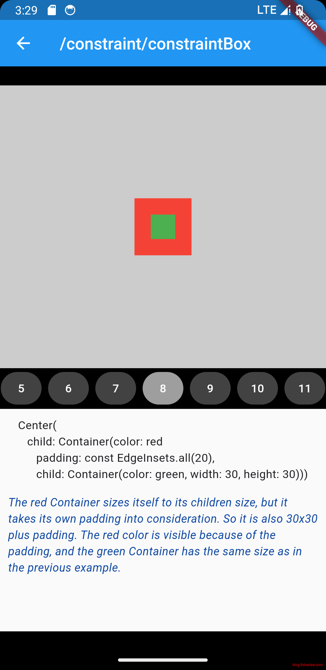
参考资料
了解关键的几步:
Constraints go down. Sizes go up. Parent sets position.
其实就是Android measure, layout的过程。区别在于:
- Android的measure是允许多次的,对子控件传入match_parent或者wrap_content的约束,从而测量出不同情况下的measure,然后再进行一次layout的操作。
- Flutter的measure仅仅允许一次,然后子控件只返回一次width/height,最后就layout了。
当前widget的长宽必须在父级constraint的约束下进行得到。
- 父级constraint不断往下传递。
- widget结合自己设定(padding,margin等)+ 父级constraint,计算得到下级的constraint,并将这些下级的constraint传递给他们
- 下级constraint结合自己的宽高(text,image)和constraint,得到宽高返回给widget。
- widget得到子级宽高,合并计算得到自己的宽高。
- 父级获得自己的宽高。
constraint的定义:
- minWidth,maxWidth
- minHeight,maxHeight
三种情况的Widget的constraints类型
- Tight, minWidth = maxWidth && minHeight = maxHeight。这种情况下,子级需要计算自身的宽高,宽高必然为constraint
- Loose, minWidth < maxWidth || minHeight < maxHeight。minWidth和minHeight允许为0,这种情况下,子级才有可能有自己设置宽高的可能性
- Unbounded , maxWidth = 无穷 || maxHeight = 无穷。这种情况下,子级有设置自己宽高的巨大空间。
- 但是,1.如果放在ListView是垂直的,(主轴或交叉轴)同时给他一个宽度Unbounded的约束,它就会抱怨无法排版。因为它不知道如何wrap每个item,或者如何显示滚动条
2.在Column里面,(主轴)给他一个高度为Unbounded的约束,同时给一个Expandable的child,它就会抱怨无法排版,因为它不知道空白空间应该分配多少。3.在Column里面,(交叉轴)给它一个宽度为Unbounded的约束,同时给一个CrossAxisAlignment.stretch,它就会抱怨无法排版,因为无法计算交叉轴应该stretch到一个什么的数值。4.在Column里面,嵌套一个无Expandable的垂直ListView,它就抱怨无法排版。因为ListView只有高度确定的情况下才能按需显示元素。
实际Widget的常见constraints
- MaterialApp,Tight约束,宽高都是就是Screen的宽高
- Center/Align/Scaffold,
- 修改子约束,可以将Tight约束转换为Loose约束,不改变maxWidth和maxHeight,但是将minWidth和minHeight设置为0,以保证子组件可以设置自己的宽高。
- 确定自身宽高,没有widthFactor,没有heightFactor的时候,宽高取父的宽高。存在的时候,取子宽高的比例放大。
- SizedBox.expand,将Loose约束转换为Tight约束。将minWidth和minHeight设置为对应的maxWidth和maxHeight。
- SizedBox.shrink,将Loose约束转换为Tight约束。将maxWidth和maxHeight设置为对应的minWidth和minHeight。
- SizedBox(),将Loose约束转换为Tight约束。将满足父约束的条件下,将min和max都一起收缩到指定的width和height。
- Container,无Child的时候,宽高就是constraint的最大值,有Child的时候,宽高就是子Child在宽高(在constraint的计算下)。
- BoxConstraints,不改变Tight和Loose,仅仅是在父constraint,的条件下加入自己的constraint(如果交集为空,且只取父级的constraint),然后传递到下一级。
- UnconstrainedBox,Unbounded约束,minWidth = minHeight = 0,maxWidth=maxHeight = 无穷,如果子控件超出了父控件的渲染范围,就会报出overflow warning的错误。如果最终计算的子控件的宽高是无穷的话,就会取消渲染
- OverflowBox约束,忽略父级约束,直接指定当前约束,如果子控件超出了父控件的渲染范围,也不会报错
- LimitedBox,将父级的Unbounded约束转换为Loose或Tight约束,如果父级不是Unbounded约束,则不进行转换,常用于UnconstrainedBox下面。
- FittedBox,将Loose或Tight约束转换为一个Unbounded约束,然后使用scale的手段来显示,返回一个满足上级约束的宽高。如果下级的宽高结果是Unbounded的话,则渲染错误error。
- FractionallySizedBox,以父级的maxWidth和maxHeight为依据,乘以对应的widthFactor和heightFactor,得到一个tight约束,也就是子控件无法控制宽高。
- Row/Column,传递下级是(主轴)Unbounded约束,(交叉轴)是将父级的任意约束转换为loose约束。
1.可以使用Expanded来实现传递下级变为Tight约束,分配固定的空白空间。2.可以使用Flexible来实现传递下级变为Loose约束,maxWidth和maxHeight是空白空间,但是minWidth和minHeight允许为0。这样做的话,相对布局不确定。3.Expanded/Flexible不能同时与Row/Column自身的主轴是Unbounded约束结合,因为无法计算无穷的空白空间是多少。4.crossAxisAlignment: CrossAxisAlignment.stretch不能同时与Row/Column自身的交叉轴是Unbounded约束结合,因为无法计算交叉轴应该stretch到一个什么的数值。
5.2 ListView作为子控件
5.2.1 正常的ListView
import 'package:flutter/material.dart';

class ListViewDefaultDemo extends StatefulWidget {
  const ListViewDefaultDemo({
    super.key,
  });

  @override
  State<ListViewDefaultDemo> createState() => _HomePageState();
}

class _HomePageState extends State<ListViewDefaultDemo> {
  @override
  void initState() {
    super.initState();
  }

  @override
  Widget build(BuildContext context) {
    return ListView(
        children: List.generate(100, (index) => Text("Text_${index + 1}")));
  }
}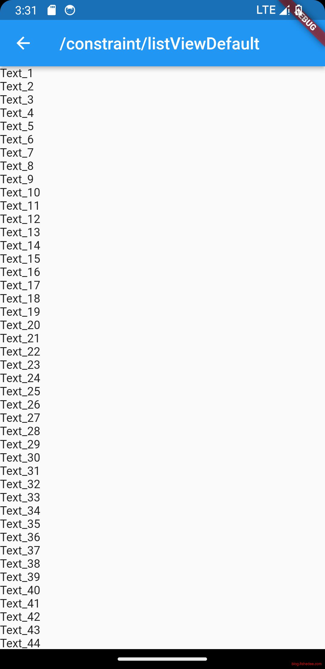
没啥好说的,比较简单
5.2.2 ListView在Unbounded的宽度
import 'package:flutter/material.dart';

class ListViewInfiniteWidthDemo extends StatefulWidget {
  const ListViewInfiniteWidthDemo({
    super.key,
  });

  @override
  State<ListViewInfiniteWidthDemo> createState() => _HomePageState();
}

class _HomePageState extends State<ListViewInfiniteWidthDemo> {
  @override
  void initState() {
    super.initState();
  }

  @override
  Widget build(BuildContext context) {
    return OverflowBox(
        //RenderBox was not laid out报错,ListView需要有限的最大宽度
        maxWidth: double.infinity,
        child: ListView(
            children:
                List.generate(100, (index) => Text("Text_${index + 1}"))));
  }
}
RenderBox was not laid out报错,ListView需要有限的最大宽度
5.2.3 ListView在Unbounded的高度
import 'package:flutter/material.dart';

class ListViewInfiniteHeightDemo extends StatefulWidget {
  const ListViewInfiniteHeightDemo({
    super.key,
  });

  @override
  State<ListViewInfiniteHeightDemo> createState() => _HomePageState();
}

class _HomePageState extends State<ListViewInfiniteHeightDemo> {
  @override
  void initState() {
    super.initState();
  }

  @override
  Widget build(BuildContext context) {
    return OverflowBox(
        //RenderBox was not laid out报错,ListView需要有限的最大高度
        maxHeight: double.infinity,
        child: ListView(
            children:
                List.generate(100, (index) => Text("Text_${index + 1}"))));
  }
}
RenderBox was not laid out报错,ListView需要有限的最大高度
5.2.4 ListView在Column的子控件
import 'package:flutter/material.dart';

class ListViewInColumnDemo extends StatefulWidget {
  const ListViewInColumnDemo({
    super.key,
  });

  @override
  State<ListViewInColumnDemo> createState() => _HomePageState();
}

class _HomePageState extends State<ListViewInColumnDemo> {
  @override
  void initState() {
    super.initState();
  }

  @override
  Widget build(BuildContext context) {
    // RenderBox was not laid out,报错
    //Column的每个child在主轴方向默认就是Unbounded约束,导致ListView无法排版
    return Column(children: [
      const Text("ListViewInColumnDemo"),
      ListView(
          children: List.generate(100, (index) => Text("Text_${index + 1}")))
    ]);
  }
}
RenderBox was not laid out,报错,Column的每个child在主轴方向默认就是Unbounded约束,导致ListView无法排版
5.2.5 ListView在Column的子控件修复
import 'package:flutter/material.dart';

class ListViewInColumnFixDemo extends StatefulWidget {
  const ListViewInColumnFixDemo({
    super.key,
  });

  @override
  State<ListViewInColumnFixDemo> createState() => _HomePageState();
}

class _HomePageState extends State<ListViewInColumnFixDemo> {
  @override
  void initState() {
    super.initState();
  }

  @override
  Widget build(BuildContext context) {
    //Column的child设置为Expanded的话,会变成loose约束
    return Column(children: [
      const Text("ListViewInColumnFixDemo"),
      Expanded(
          child: ListView(
              children:
                  List.generate(100, (index) => Text("Text_${index + 1}"))))
    ]);
  }
}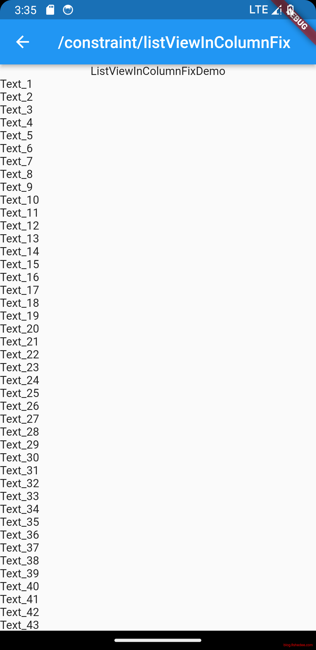
Column的child设置为Expanded的话,会变成loose约束,传递给ListView的高度就是有限的,这个时候就可以排版了
5.2.6 ListView在Row的子控件
import 'package:flutter/material.dart';

class ListViewInRowDemo extends StatefulWidget {
  const ListViewInRowDemo({
    super.key,
  });

  @override
  State<ListViewInRowDemo> createState() => _HomePageState();
}

class _HomePageState extends State<ListViewInRowDemo> {
  @override
  void initState() {
    super.initState();
  }

  @override
  Widget build(BuildContext context) {
    // RenderBox was not laid out,报错
    //Row的每个child在主轴方向默认就是Unbounded约束,导致ListView无法排版
    return Row(children: [
      const Text("ListViewInRowDemo"),
      ListView(
          children: List.generate(100, (index) => Text("Text_${index + 1}")))
    ]);
  }
}
RenderBox was not laid out,报错。Row的每个child在主轴方向默认就是Unbounded约束,导致ListView无法排版
5.2.7 ListView在Row的子控件修复
import 'package:flutter/material.dart';

class ListViewInRowFixDemo extends StatefulWidget {
  const ListViewInRowFixDemo({
    super.key,
  });

  @override
  State<ListViewInRowFixDemo> createState() => _HomePageState();
}

class _HomePageState extends State<ListViewInRowFixDemo> {
  @override
  void initState() {
    super.initState();
  }

  @override
  Widget build(BuildContext context) {
    return Row(children: [
      const Text("ListViewInRowFixDemo"),
      Expanded(
          child: ListView(
              children:
                  List.generate(100, (index) => Text("Text_${index + 1}"))))
    ]);
  }
}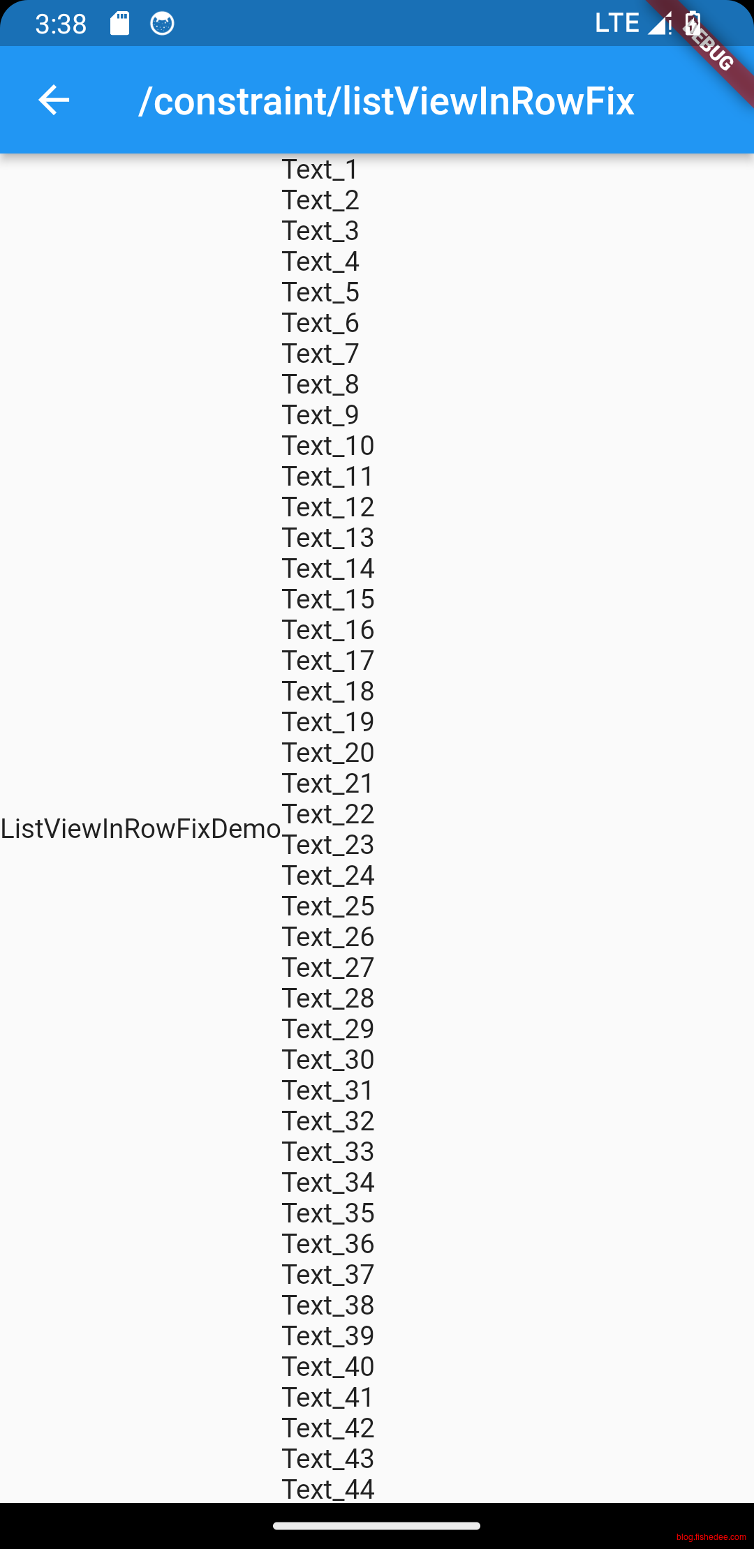
Row的child设置为Expanded的话,会变成loose约束,传递给ListView的宽度就是有限的,这个时候就可以排版了
5.3 IntrinsicHeight/IntrinsicWidth
Constraints go down. Sizes go up. Parent sets position.Flutter的这个布局约束,简单高效,可以实现近线性时间的高速布局。但是,在某些情况下,无法实现特殊的布局。这个时候,flutter提供了IntrinsicHeight/IntrinsicWidth来为布局系统打补丁。
5.3.1 Flex使用Expanded在Unbounded约束下
import 'package:flutter/material.dart';

class IntrinsticHeightExpanedDemo extends StatefulWidget {
  const IntrinsticHeightExpanedDemo({
    super.key,
  });

  @override
  State<IntrinsticHeightExpanedDemo> createState() => _HomePageState();
}

class _HomePageState extends State<IntrinsticHeightExpanedDemo> {
  @override
  void initState() {
    super.initState();
  }

  @override
  Widget build(BuildContext context) {
    return SizedBox.expand(
        child: SingleChildScrollView(
            child: Column(
                children: list.map((e) {
      final index = list.indexOf(e);
      return _lineItems(e, index);
    }).toList())));
  }

  List list = [
    {
      'title': '这种情况下Container的宽高铺满,我们给他套上IntrinsicWidth,不设置宽/高步长',
      'content': 'IntrinsticHeightExpanedDemo'
    },
    {
      'title': '这种情况下Container的宽高铺满,我们给他套上IntrinsicWidth,不设置宽/高步长',
      'content': '可以讲子控件的高度调整至实'
    },
    {
      'title': 'IntrinsicHeight',
      'content': '可以讲子控件的高度调整至实际高度。下面这个例子如果不使用IntrinsicHeight的情况下,'
    },
    {
      'title': 'IntrinsicHeight',
      'content':
          '可以讲子控件的高度调整至实际高度。下面这个例子如果不使用IntrinsicHeight的情况下,第一个Container将会撑满整个body的高度,但使用了IntrinsicHeight高度会约束在50。这里Row的高度时需要有子内容的最大高度来决定的,但是第一个Container本身没有高度,有没有子控件,那么他就会去撑满父控件,然后发现父控件Row也是不具有自己的高度的,就撑满了body的高度。IntrinsicHeight就起到了约束Row实际高度的作用'
    },
    {
      'title': '可以发现Container宽度被压缩到50,但是高度没有变化。我们再设置宽度步长为11',
      'content': '这里设置步长会影响到子控件最后大小'
    },
    {
      'title': '可以发现Container宽度被压缩到50,但是高度没有变化。我们再设置宽度步长为11',
      'content': '这里设置步长会影响到子控件最后大小'
    }
  ];

  Widget _lineItems(res, index) {
    var isBottom = (index == list.length - 1);
    return Container(
        decoration: const BoxDecoration(
            // color: Colors.cyan,
            border: Border(bottom: BorderSide(color: Colors.grey, width: 1))),
        padding: const EdgeInsets.only(left: 15),
        margin: const EdgeInsets.fromLTRB(0, 0, 0, 0),
        child: Row(
          children: <Widget>[
            Column(children: [
              Container(
                width: 16,
                height: 16,
                decoration: BoxDecoration(
                    color: Colors.red, borderRadius: BorderRadius.circular(8)),
              ),
              //提示报错,RenderBox was not laid
              //我们将该组件的Column设置为Expanded,也报错了,Column的高度约束为无限,它无法计算Expanded是多少
              Expanded(
                  child: Container(
                width: 5,
                color: isBottom ? Colors.transparent : Colors.blue,
              )),
            ]),
            Expanded(
              child: rightWidget(res),
            ),
          ],
        ));
  }

  Widget rightWidget(res) {
    return Container(
      // color: Colors.blue,
      child: Column(
        crossAxisAlignment: CrossAxisAlignment.start,
        children: <Widget>[
          const SizedBox(height: 15),
          Text(
            res['title'],
            style: const TextStyle(
                color: Colors.black, fontSize: 20, fontWeight: FontWeight.bold),
          ),
          Text(
            res['content'],
            style: const TextStyle(color: Colors.orange, fontSize: 15),
          ),
          const SizedBox(height: 15),
        ],
      ),
    );
  }
}
我们的本意是用Expanded使得,同级的两个Column的高度是一致的。
但是提示报错,RenderBox was not laid,因为ListView的高度是无限的,Column的高度约束为Unbounded,它无法计算Expanded是多少
5.3.2 Flex使用Expanded在Unbounded约束下修复
import 'package:flutter/material.dart';

class IntrinsticHeightExpandedFixDemo extends StatefulWidget {
  const IntrinsticHeightExpandedFixDemo({
    super.key,
  });

  @override
  State<IntrinsticHeightExpandedFixDemo> createState() => _HomePageState();
}

class _HomePageState extends State<IntrinsticHeightExpandedFixDemo> {
  @override
  void initState() {
    super.initState();
  }

  @override
  Widget build(BuildContext context) {
    return SizedBox.expand(
        child: SingleChildScrollView(
            child: Column(
                children: list.map((e) {
      final index = list.indexOf(e);
      return _lineItems(e, index);
    }).toList())));
  }

  List list = [
    {
      'title': '这种情况下Container的宽高铺满,我们给他套上IntrinsicWidth,不设置宽/高步长',
      'content': 'IntrinsticHeightExpandedFixDemo'
    },
    {
      'title': '这种情况下Container的宽高铺满,我们给他套上IntrinsicWidth,不设置宽/高步长',
      'content': '可以讲子控件的高度调整至实'
    },
    {
      'title': 'IntrinsicHeight',
      'content': '可以讲子控件的高度调整至实际高度。下面这个例子如果不使用IntrinsicHeight的情况下,'
    },
    {
      'title': 'IntrinsicHeight',
      'content':
          '可以讲子控件的高度调整至实际高度。下面这个例子如果不使用IntrinsicHeight的情况下,第一个Container将会撑满整个body的高度,但使用了IntrinsicHeight高度会约束在50。这里Row的高度时需要有子内容的最大高度来决定的,但是第一个Container本身没有高度,有没有子控件,那么他就会去撑满父控件,然后发现父控件Row也是不具有自己的高度的,就撑满了body的高度。IntrinsicHeight就起到了约束Row实际高度的作用'
    },
    {
      'title': '可以发现Container宽度被压缩到50,但是高度没有变化。我们再设置宽度步长为11',
      'content': '这里设置步长会影响到子控件最后大小'
    },
    {
      'title': '可以发现Container宽度被压缩到50,但是高度没有变化。我们再设置宽度步长为11',
      'content': '这里设置步长会影响到子控件最后大小'
    }
  ];

  Widget _lineItems(res, index) {
    var isBottom = (index == list.length - 1);
    return Container(
        decoration: const BoxDecoration(
            // color: Colors.cyan,
            border: Border(bottom: BorderSide(color: Colors.grey, width: 1))),
        padding: const EdgeInsets.only(left: 15),
        margin: const EdgeInsets.fromLTRB(0, 0, 0, 0),
        child: IntrinsicHeight(
            //这时候Row的Constraint的高度就是有限的,不再是Unbounded了
            child: Row(
          children: <Widget>[
            Column(children: [
              Container(
                width: 16,
                height: 16,
                decoration: BoxDecoration(
                    color: Colors.red, borderRadius: BorderRadius.circular(8)),
              ),
              //这个时候的maxHeight是有限的,所以可以进行Expanded
              Expanded(
                  child: Container(
                width: 5,
                color: isBottom ? Colors.transparent : Colors.blue,
              )),
            ]),
            Expanded(
              child: rightWidget(res),
            ),
          ],
        )));
  }

  Widget rightWidget(res) {
    return Container(
      // color: Colors.blue,
      child: Column(
        crossAxisAlignment: CrossAxisAlignment.start,
        children: <Widget>[
          const SizedBox(height: 15),
          Text(
            res['title'],
            style: const TextStyle(
                color: Colors.black, fontSize: 20, fontWeight: FontWeight.bold),
          ),
          Text(
            res['content'],
            style: const TextStyle(color: Colors.orange, fontSize: 15),
          ),
          const SizedBox(height: 15),
        ],
      ),
    );
  }
}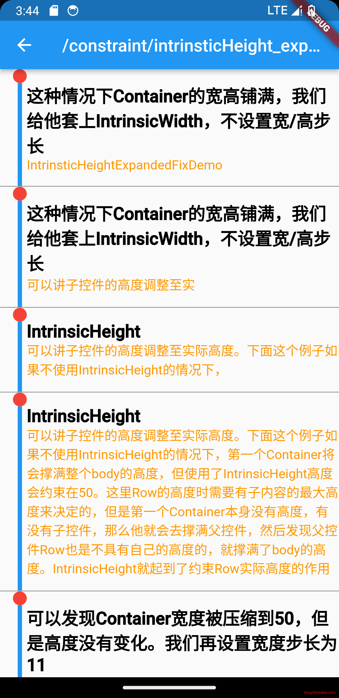
我们使用IntrinsicHeight就达到我们想要的效果了,参考资料可以看这里
- IntrinsicHeight的工作,先收集子节点的getMaxIntrinsicHeight来确定高度
- 从而将Column的Unbounded约束,改为了loose约束。然后才进行Constraints go down. Sizes go up. Parent sets position.的流程
使用IntrinsicHeight的情况下,相当于安卓里面的 2次measure + 1次layout的过程,布局的时间会更慢。最坏情况会导致O(N*N)的时间复杂度,应该尽量避免使用
5.3.3 Flex使用Stretch在Unbounded约束下
import 'package:flutter/material.dart';

class IntrinsticHeightStretchDemo extends StatefulWidget {
  const IntrinsticHeightStretchDemo({
    super.key,
  });

  @override
  State<IntrinsticHeightStretchDemo> createState() => _HomePageState();
}

class _HomePageState extends State<IntrinsticHeightStretchDemo> {
  @override
  void initState() {
    super.initState();
  }

  @override
  Widget build(BuildContext context) {
    return SizedBox.expand(
        child: SingleChildScrollView(
            child: Column(
                children: list.map((e) {
      final index = list.indexOf(e);
      return _lineItems(e, index);
    }).toList())));
  }

  List list = [
    {
      'title': '这种情况下Container的宽高铺满,我们给他套上IntrinsicWidth,不设置宽/高步长',
      'content': 'IntrinsticHeightStretchDemo'
    },
    {
      'title': '这种情况下Container的宽高铺满,我们给他套上IntrinsicWidth,不设置宽/高步长',
      'content': '可以讲子控件的高度调整至实'
    },
    {
      'title': 'IntrinsicHeight',
      'content': '可以讲子控件的高度调整至实际高度。下面这个例子如果不使用IntrinsicHeight的情况下,'
    },
    {
      'title': 'IntrinsicHeight',
      'content':
          '可以讲子控件的高度调整至实际高度。下面这个例子如果不使用IntrinsicHeight的情况下,第一个Container将会撑满整个body的高度,但使用了IntrinsicHeight高度会约束在50。这里Row的高度时需要有子内容的最大高度来决定的,但是第一个Container本身没有高度,有没有子控件,那么他就会去撑满父控件,然后发现父控件Row也是不具有自己的高度的,就撑满了body的高度。IntrinsicHeight就起到了约束Row实际高度的作用'
    },
    {
      'title': '可以发现Container宽度被压缩到50,但是高度没有变化。我们再设置宽度步长为11',
      'content': '这里设置步长会影响到子控件最后大小'
    },
    {
      'title': '可以发现Container宽度被压缩到50,但是高度没有变化。我们再设置宽度步长为11',
      'content': '这里设置步长会影响到子控件最后大小'
    }
  ];

  Widget _lineItems(res, index) {
    var isBottom = (index == list.length - 1);
    return Container(
        decoration: const BoxDecoration(
            // color: Colors.cyan,
            border: Border(bottom: BorderSide(color: Colors.grey, width: 1))),
        padding: const EdgeInsets.only(left: 15),
        margin: const EdgeInsets.fromLTRB(0, 0, 0, 0),
        child: Row(
          crossAxisAlignment: CrossAxisAlignment.stretch,
          children: <Widget>[
            Column(children: [
              Container(
                width: 16,
                height: 16,
                decoration: BoxDecoration(
                    color: Colors.red, borderRadius: BorderRadius.circular(8)),
              ),
              Container(
                width: 5,
                color: isBottom ? Colors.transparent : Colors.blue,
              ),
            ]),
            Expanded(
              child: rightWidget(res),
            ),
          ],
        ));
  }

  Widget rightWidget(res) {
    return Container(
      // color: Colors.blue,
      child: Column(
        crossAxisAlignment: CrossAxisAlignment.start,
        children: <Widget>[
          const SizedBox(height: 15),
          Text(
            res['title'],
            style: const TextStyle(
                color: Colors.black, fontSize: 20, fontWeight: FontWeight.bold),
          ),
          Text(
            res['content'],
            style: const TextStyle(color: Colors.orange, fontSize: 15),
          ),
          const SizedBox(height: 15),
        ],
      ),
    );
  }
}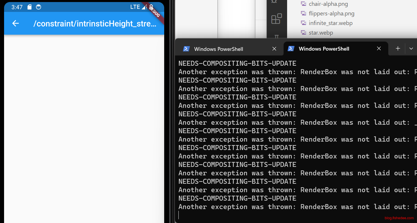
在html5中,当我们希望两个children是在垂直方向是等高的,我们会设置交叉轴为stretch。但是在,flutter中就会报错,因为flutter的交叉轴为stretch是指和父组件等高,而不是与子组件等高
但是提示报错,RenderBox was not laid,因为ListView的高度是无限的,Column的高度约束为Unbounded,它无法计算交叉轴的stretch是多少
5.3.4 Flex使用Stretch在Unbounded约束下修复
import 'package:flutter/material.dart';

class IntrinsticHeightStretchFixDemo extends StatefulWidget {
  const IntrinsticHeightStretchFixDemo({
    super.key,
  });

  @override
  State<IntrinsticHeightStretchFixDemo> createState() => _HomePageState();
}

class _HomePageState extends State<IntrinsticHeightStretchFixDemo> {
  @override
  void initState() {
    super.initState();
  }

  @override
  Widget build(BuildContext context) {
    return SizedBox.expand(
        child: SingleChildScrollView(
            child: Column(
                children: list.map((e) {
      final index = list.indexOf(e);
      return _lineItems(e, index);
    }).toList())));
  }

  List list = [
    {
      'title': '这种情况下Container的宽高铺满,我们给他套上IntrinsicWidth,不设置宽/高步长',
      'content': 'IntrinsticHeightStretchFixDemo'
    },
    {
      'title': '这种情况下Container的宽高铺满,我们给他套上IntrinsicWidth,不设置宽/高步长',
      'content': '可以讲子控件的高度调整至实'
    },
    {
      'title': 'IntrinsicHeight',
      'content': '可以讲子控件的高度调整至实际高度。下面这个例子如果不使用IntrinsicHeight的情况下,'
    },
    {
      'title': 'IntrinsicHeight',
      'content':
          '可以讲子控件的高度调整至实际高度。下面这个例子如果不使用IntrinsicHeight的情况下,第一个Container将会撑满整个body的高度,但使用了IntrinsicHeight高度会约束在50。这里Row的高度时需要有子内容的最大高度来决定的,但是第一个Container本身没有高度,有没有子控件,那么他就会去撑满父控件,然后发现父控件Row也是不具有自己的高度的,就撑满了body的高度。IntrinsicHeight就起到了约束Row实际高度的作用'
    },
    {
      'title': '可以发现Container宽度被压缩到50,但是高度没有变化。我们再设置宽度步长为11',
      'content': '这里设置步长会影响到子控件最后大小'
    },
    {
      'title': '可以发现Container宽度被压缩到50,但是高度没有变化。我们再设置宽度步长为11',
      'content': '这里设置步长会影响到子控件最后大小'
    }
  ];

  Widget _lineItems(res, index) {
    var isBottom = (index == list.length - 1);
    return Container(
        decoration: const BoxDecoration(
            // color: Colors.cyan,
            border: Border(bottom: BorderSide(color: Colors.grey, width: 1))),
        padding: const EdgeInsets.only(left: 15),
        margin: const EdgeInsets.fromLTRB(0, 0, 0, 0),
        child: IntrinsicHeight(
            child: Row(
          //这个时候的maxHeight是有限的,所以可以进行stretch
          crossAxisAlignment: CrossAxisAlignment.stretch,
          children: <Widget>[
            Column(children: [
              Container(
                width: 16,
                height: 16,
                decoration: BoxDecoration(
                    color: Colors.red, borderRadius: BorderRadius.circular(8)),
              ),
              Container(
                width: 5,
                color: isBottom ? Colors.transparent : Colors.blue,
              ),
            ]),
            Expanded(
              child: rightWidget(res),
            ),
          ],
        )));
  }

  Widget rightWidget(res) {
    return Container(
      // color: Colors.blue,
      child: Column(
        crossAxisAlignment: CrossAxisAlignment.start,
        children: <Widget>[
          const SizedBox(height: 15),
          Text(
            res['title'],
            style: const TextStyle(
                color: Colors.black, fontSize: 20, fontWeight: FontWeight.bold),
          ),
          Text(
            res['content'],
            style: const TextStyle(color: Colors.orange, fontSize: 15),
          ),
          const SizedBox(height: 15),
        ],
      ),
    );
  }
}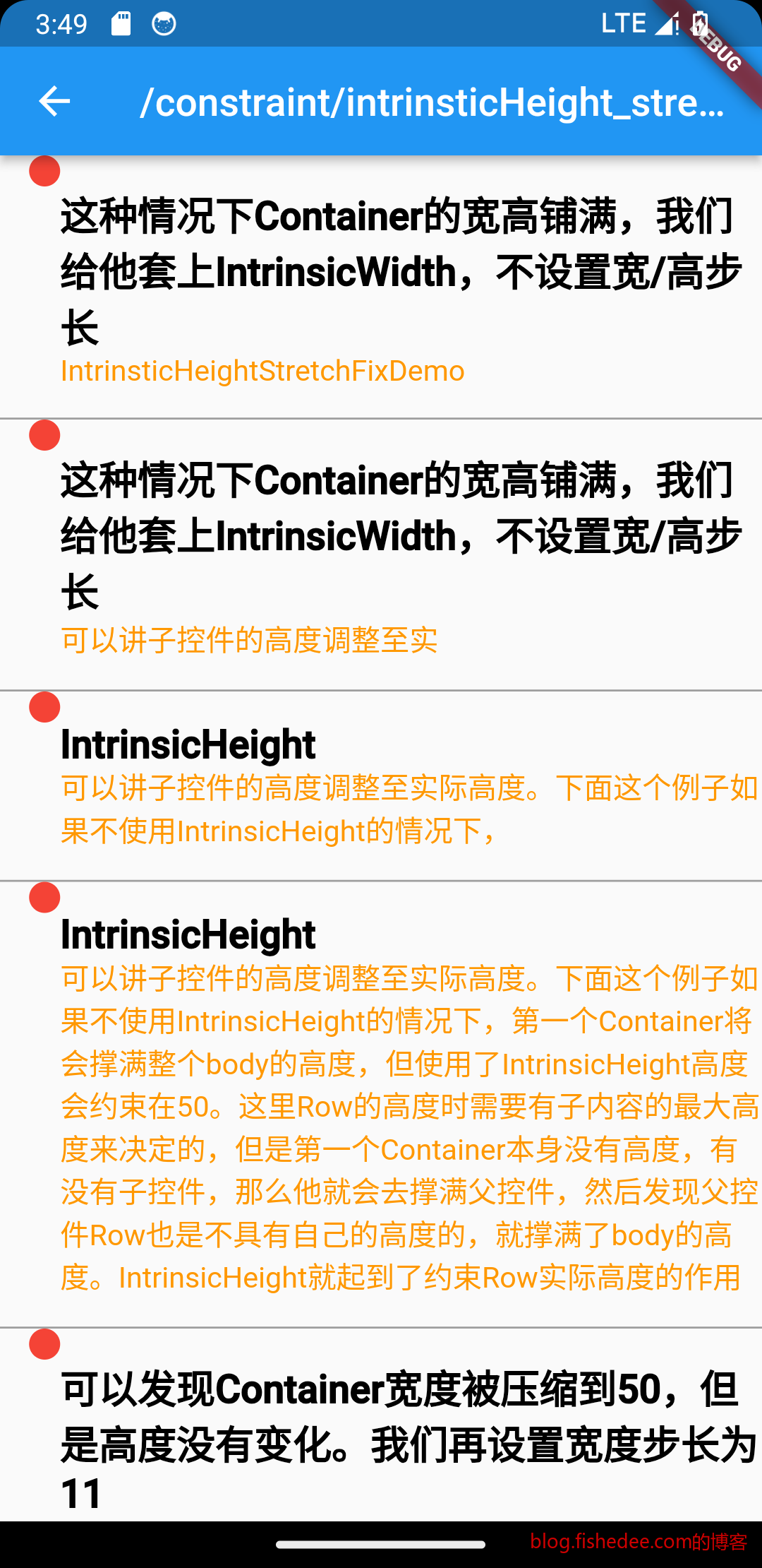
我们使用IntrinsicHeight就达到我们想要的效果了,参考资料可以看这里
- IntrinsicHeight的工作,先收集子节点的getMaxIntrinsicHeight来确定高度
- 从而将Column的Unbounded约束,改为了loose约束。然后才进行Constraints go down. Sizes go up. Parent sets position.的流程
使用IntrinsicHeight的情况下,相当于安卓里面的 2次measure + 1次layout的过程,布局的时间会更慢。最坏情况会导致O(N*N)的时间复杂度,应该尽量避免使用
5.4 Row/Column作为子控件
5.3.1 Flex使用SpaceBetween在最小屏幕空间下
import 'package:flutter/material.dart';

class ColumnInListViewSpaceBetweenDemo extends StatelessWidget {
  const ColumnInListViewSpaceBetweenDemo({super.key});

  @override
  Widget build(BuildContext context) {
    const items = 4;
    //Column下面有spaceBetween的话,需要的是一个非0的minHeight。
    //当items数目较少的时候,这些items可以均分屏幕的空间。
    return LayoutBuilder(builder: (context, constraints) {
      return SingleChildScrollView(
        child: ConstrainedBox(
          constraints: BoxConstraints(minHeight: constraints.maxHeight),
          child: Column(
            mainAxisAlignment: MainAxisAlignment.spaceBetween,
            children: List.generate(
                items, (index) => ItemWidget(text: 'Item $index')),
          ),
        ),
      );
    });
  }
}

class ItemWidget extends StatelessWidget {
  const ItemWidget({
    super.key,
    required this.text,
  });

  final String text;

  @override
  Widget build(BuildContext context) {
    return Card(
      child: SizedBox(
        height: 100,
        child: Center(child: Text(text)),
      ),
    );
  }
}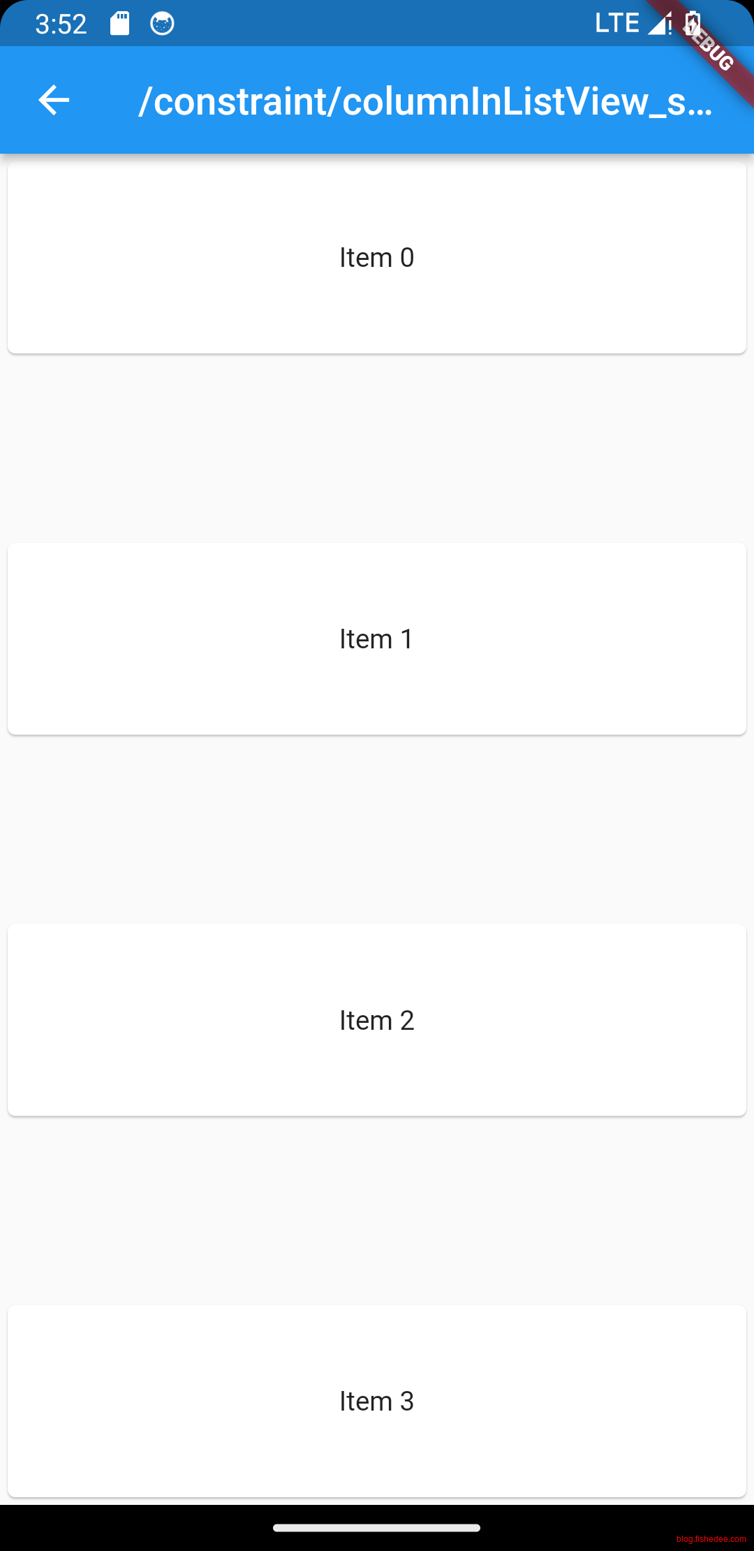
在SingleChildScrollView的maxHeight是Unbounded,minHeight是0。因此,spaceBetween只会计算为0。但是LayoutBuilder来获取屏幕高度,然后传递Column,指定它的maxHeight是Unbounded,minHeight是screenHeight,这样就能计算spaceBetween了。
5.3.2 Flex使用Spacer在Unbounded下
import 'package:flutter/material.dart';

class ColumnInListViewExpandedDemo extends StatelessWidget {
  const ColumnInListViewExpandedDemo({super.key});

  @override
  Widget build(BuildContext context) {
    const items = 4;

    //Column下面有Spacer,或者Expanded的话,需要的是一个非无穷的maxHeight,所以有IntrinsicHeight
    //当items数目较少的时候,这些items可以均分屏幕的空间。
    return LayoutBuilder(builder: (context, constraints) {
      return const SingleChildScrollView(
        child: IntrinsicHeight(
          child: Column(
            children: [
              ItemWidget(text: 'Item 1'),
              Spacer(),
              ItemWidget(text: 'Item 2'),
              Expanded(
                child: ItemWidget(text: 'Item 3'),
              ),
            ],
          ),
        ),
      );
    });
  }
}

class ItemWidget extends StatelessWidget {
  const ItemWidget({
    super.key,
    required this.text,
  });

  final String text;

  @override
  Widget build(BuildContext context) {
    return Card(
      child: SizedBox(
        height: 100,
        child: Center(child: Text(text)),
      ),
    );
  }
}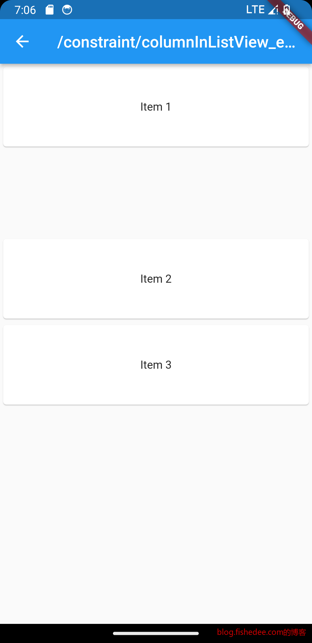
类似于在Unbounded约束下使用Expanded,没啥好说的
6 UI装饰组件
代码在这里
在html5中,样式是使用css或者style来表达的,在flutter中,所有的样式都是一个Widget。
6.1 Padding
import 'package:flutter/material.dart';

class PaddingDemo extends StatelessWidget {
  const PaddingDemo({
    Key? key,
  }) : super(key: key);

  @override
  Widget build(BuildContext context) {
    return const Padding(
      //上下左右各添加16像素补白
      padding: EdgeInsets.all(16),
      child: Column(
        //显式指定对齐方式为左对齐,排除对齐干扰
        crossAxisAlignment: CrossAxisAlignment.start,
        mainAxisSize: MainAxisSize.min,
        children: <Widget>[
          Padding(
            //左边添加8像素补白
            padding: EdgeInsets.only(left: 8),
            child: Text("Hello world"),
          ),
          Padding(
            //上下各添加8像素补白
            padding: EdgeInsets.symmetric(vertical: 8),
            child: Text("I am Jack"),
          ),
          Padding(
            // 分别指定四个方向的补白
            padding: EdgeInsets.fromLTRB(20, 0, 20, 20),
            child: Text("Your friend"),
          )
        ],
      ),
    );
  }
}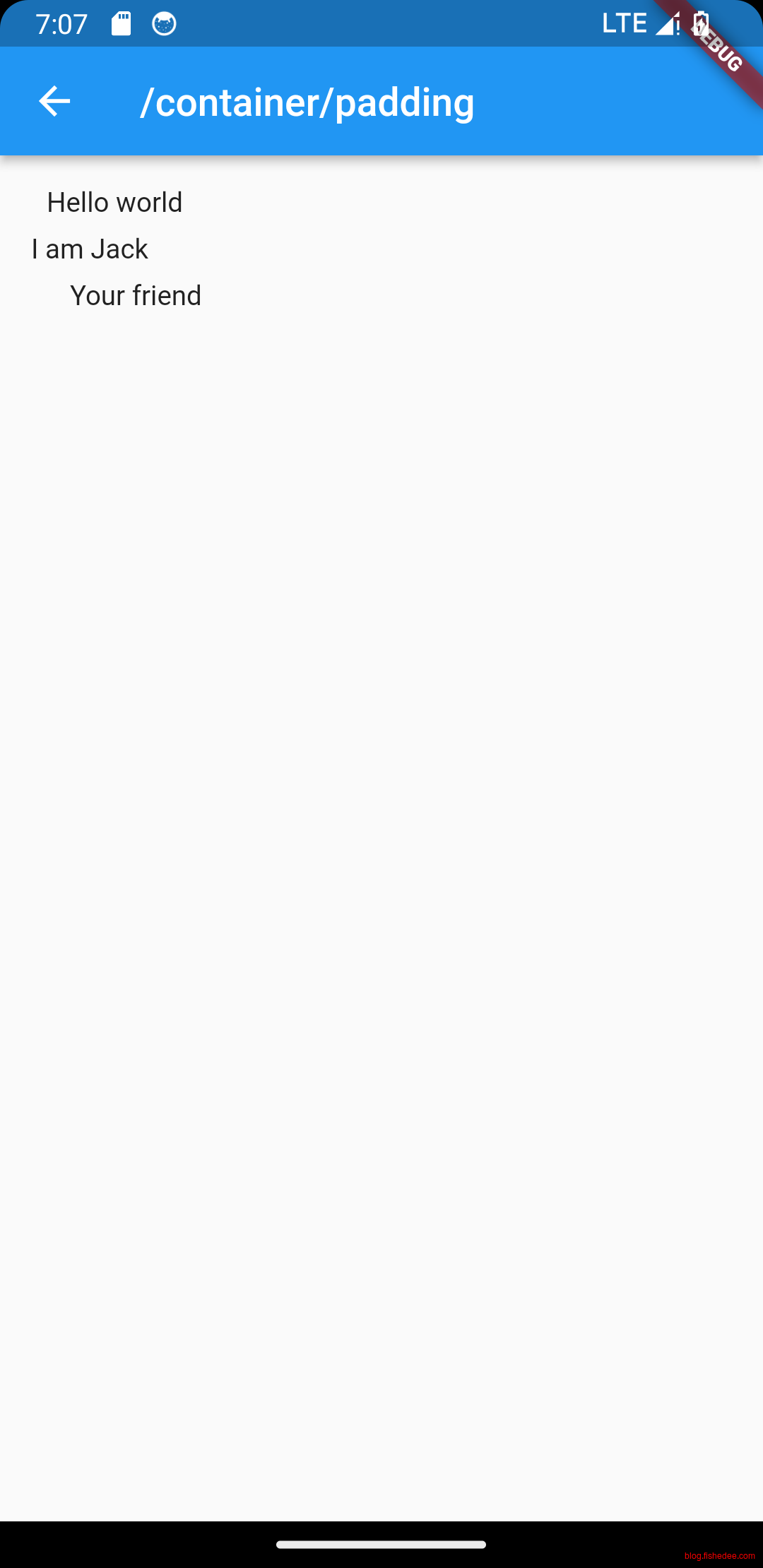
比较简单,没啥好说的
6.2 DecorateBox
import 'package:flutter/material.dart';

class DecorateBoxDemo extends StatelessWidget {
  const DecorateBoxDemo({
    Key? key,
  }) : super(key: key);

  @override
  Widget build(BuildContext context) {
    return Align(
        child: DecoratedBox(
            decoration: BoxDecoration(
              gradient: LinearGradient(
                  colors: [Colors.red, Colors.orange.shade700]), //背景渐变
              //边框,仅仅下边框
              border: const Border(
                  bottom: BorderSide(color: Colors.blue, width: 2)),
              //全边框
              //border: Border.all(color: Colors.blue, width: 1),
              //3像素圆角
              borderRadius: BorderRadius.circular(3.0),
              boxShadow: const [
                //阴影
                BoxShadow(
                    color: Colors.black54,
                    offset: Offset(2.0, 2.0),
                    blurRadius: 4.0)
              ],
            ),
            child: const Padding(
              padding: EdgeInsets.symmetric(horizontal: 80.0, vertical: 18.0),
              child: Text(
                "Login",
                style: TextStyle(color: Colors.white),
              ),
            )));
  }
}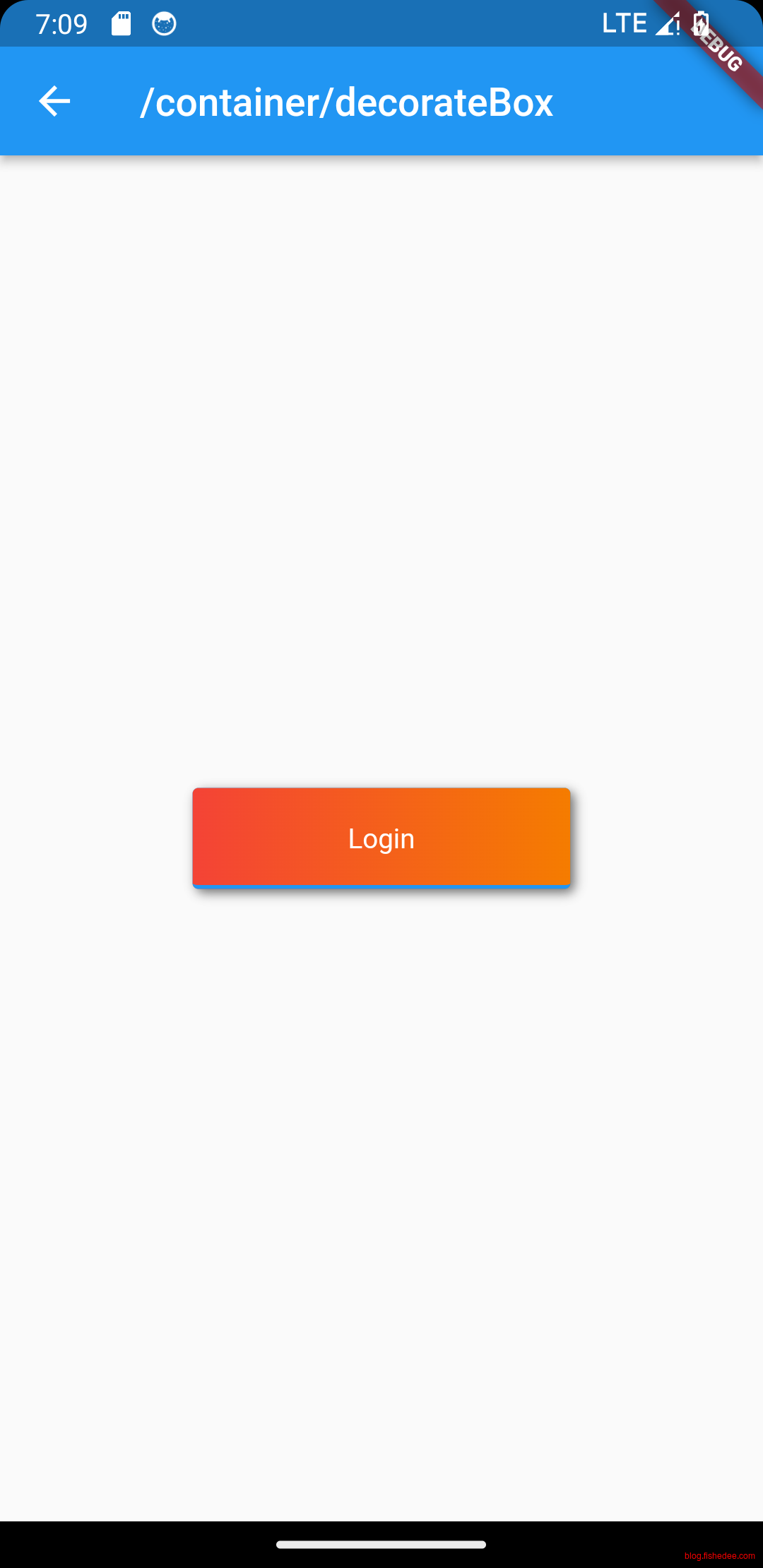
decoratedBox表达了
- color, 背景纯色,
- gradient,背景渐变
- border, 边框
- borderRadius,边框圆角
- boxShadow,阴影
6.3 Transform
import 'dart:math';

import 'package:flutter/material.dart';

class TransformDemo extends StatelessWidget {
  const TransformDemo({
    Key? key,
  }) : super(key: key);

  //Transform,仅工作在paint阶段,不影响原来widget的layout阶段,不影响原来widget所在排版
  Widget _buildTransformTranslate() {
    return DecoratedBox(
      decoration: const BoxDecoration(color: Colors.red),
      //默认原点为左上角,左移20像素,向上平移5像素
      child: Transform.translate(
        offset: const Offset(-20.0, -5.0),
        child: const Text("Hello world"),
      ),
    );
  }

  Widget _buildTransformRotate() {
    return DecoratedBox(
      decoration: const BoxDecoration(color: Colors.red),
      child: Transform.rotate(
        //旋转90度
        angle: pi / 2,
        child: const Text("Hello world"),
      ),
    );
  }

  Widget _buildTransformScale() {
    return DecoratedBox(
        decoration: const BoxDecoration(color: Colors.red),
        child: Transform.scale(
            scale: 1.5, //放大到1.5倍
            child: const Text("Hello world")));
  }

  Widget _buildTransformDoNotChangeLayout() {
    return Row(
      mainAxisAlignment: MainAxisAlignment.center,
      children: <Widget>[
        DecoratedBox(
            decoration: const BoxDecoration(color: Colors.red),
            child: Transform.rotate(
              angle: pi / 2, //旋转90度
              child: const Text("Hello world"),
            )),
        const Text(
          "你好",
          style: TextStyle(color: Colors.green, fontSize: 18.0),
        )
      ],
    );
  }

  Widget _buildRoratedBoxDoChangeLayout() {
    return const Row(
      mainAxisAlignment: MainAxisAlignment.center,
      children: <Widget>[
        DecoratedBox(
          decoration: BoxDecoration(color: Colors.red),
          //将Transform.rotate换成RotatedBox
          child: RotatedBox(
            quarterTurns: 1, //旋转90度(1/4圈)
            child: Text("Hello world"),
          ),
        ),
        Text(
          "你好",
          style: TextStyle(color: Colors.green, fontSize: 18.0),
        )
      ],
    );
  }

  @override
  Widget build(BuildContext context) {
    return Align(
        child: Column(
      //显式指定对齐方式为左对齐,排除对齐干扰
      crossAxisAlignment: CrossAxisAlignment.start,
      mainAxisSize: MainAxisSize.min,
      children: <Widget>[
        _buildTransformTranslate(),
        const SizedBox(height: 50),
        _buildTransformRotate(),
        const SizedBox(height: 50),
        _buildTransformScale(),
        const SizedBox(height: 50),
        _buildTransformDoNotChangeLayout(),
        const SizedBox(height: 50),
        _buildRoratedBoxDoChangeLayout(),
        const SizedBox(height: 50),
      ],
    ));
  }
}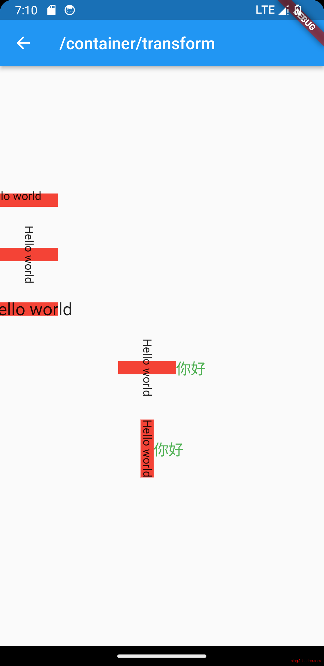
transform的注意点:
- Transform仅执行paint阶段,不影响原来widget的layout阶段,不影响原来widget所在排版。
- Transform包括有translate, rotate, scale
- RotatedBox与Transform不同的是,它真实地执行layout和paint阶段,会影响widget的所在排版。
6.4 Container
import 'package:flutter/material.dart';

class ContainerDemo extends StatelessWidget {
  const ContainerDemo({
    Key? key,
  }) : super(key: key);

  //Container同时组合了DecoratedBox,ConstrainedBox,Transform,Padding,Align
  Widget _buildContainerNormal() {
    return Container(
      margin: const EdgeInsets.only(top: 50.0, left: 120.0),
      constraints:
          const BoxConstraints.tightFor(width: 200.0, height: 150.0), //卡片大小
      decoration: const BoxDecoration(
        //背景装饰
        gradient: RadialGradient(
          //背景径向渐变
          colors: [Colors.red, Colors.orange],
          center: Alignment.topLeft,
          radius: .98,
        ),
        boxShadow: [
          //卡片阴影
          BoxShadow(
            color: Colors.black54,
            offset: Offset(2.0, 2.0),
            blurRadius: 4.0,
          )
        ],
      ),
      transform: Matrix4.rotationZ(.2), //卡片倾斜变换
      alignment: Alignment.center, //卡片内文字居中
      child: const Text(
        //卡片文字
        "5.20", style: TextStyle(color: Colors.white, fontSize: 40.0),
      ),
    );
  }

  @override
  Widget build(BuildContext context) {
    return Column(
      //主轴start
      mainAxisAlignment: MainAxisAlignment.start,
      children: [
        _buildContainerNormal(),
        const SizedBox(height: 50),
        Container(
          margin: const EdgeInsets.all(20.0), //容器外补白
          color: Colors.orange,
          child: const Text("Hello world!"),
        ),
        const SizedBox(height: 50),
        Container(
          padding: const EdgeInsets.all(20.0), //容器内补白
          color: Colors.orange,
          child: const Text("Hello world!"),
        ),
      ],
    );
  }
}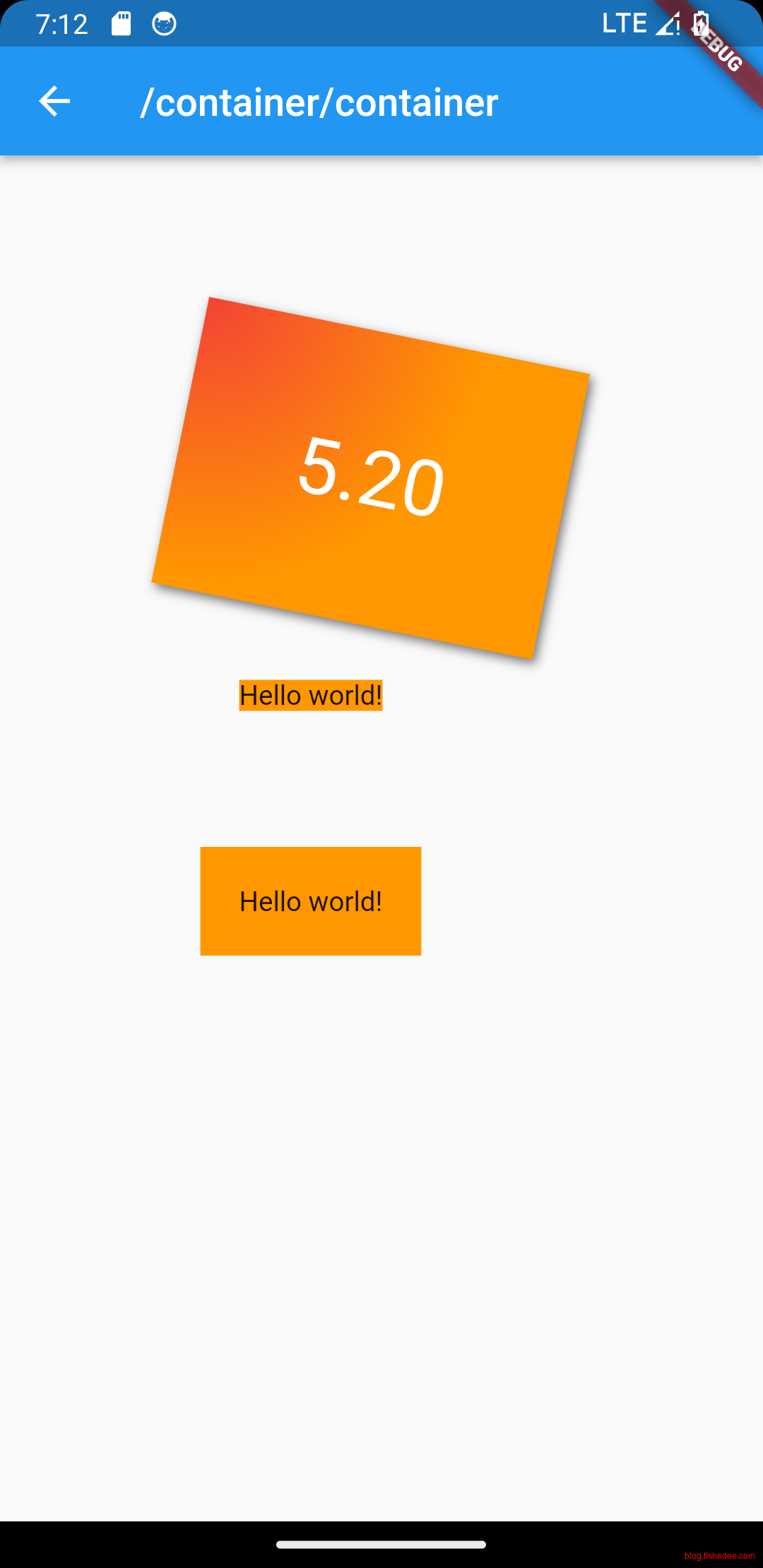
Container是一个组合组件,同时包含了
- 装饰组件,Padding,DecoratedBox,Transform
- 布局组件,ConstrainedBox,Align
Container可以说是相当齐全了。相对来说,它的性能也会稍差一点,在简单场景可以直接使用单一的装饰组件。另外,Container的margin其实就是用Padding来实现的而已。区别在于:
- margin,就是Padding在外,DecoratedBox在内。
- padding,就是DecoratedBox在外,Padding在内。
6.5 Clip
import 'package:flutter/material.dart';

class ClipDemo extends StatelessWidget {
  const ClipDemo({
    Key? key,
  }) : super(key: key);

  @override
  Widget build(BuildContext context) {
    // 头像
    Widget avatar = Image.asset("assets/images/infinite_star.webp",
        width: 60.0, fit: BoxFit.cover);
    return Center(
      child: Column(
        children: <Widget>[
          avatar, //不剪裁
          ClipOval(child: avatar), //剪裁为圆形
          ClipRRect(
            //剪裁为圆角矩形
            borderRadius: BorderRadius.circular(5.0),
            child: avatar,
          ),
          Row(
            mainAxisAlignment: MainAxisAlignment.center,
            children: <Widget>[
              Align(
                //align宽度设置为0.5,导致Align父组件更小,avatar更大。
                alignment: Alignment.topLeft,
                widthFactor: .5,
                child: avatar,
              ),
              const Text(
                "你好世界",
                style: TextStyle(color: Colors.green),
              )
            ],
          ),
          Row(
            mainAxisAlignment: MainAxisAlignment.center,
            children: <Widget>[
              ClipRect(
                //将溢出部分剪裁
                child: Align(
                  alignment: Alignment.topLeft,
                  widthFactor: .5, //宽度设为原来宽度一半
                  child: avatar,
                ),
              ),
              const Text("你好世界", style: TextStyle(color: Colors.green))
            ],
          ),
        ],
      ),
    );
  }
}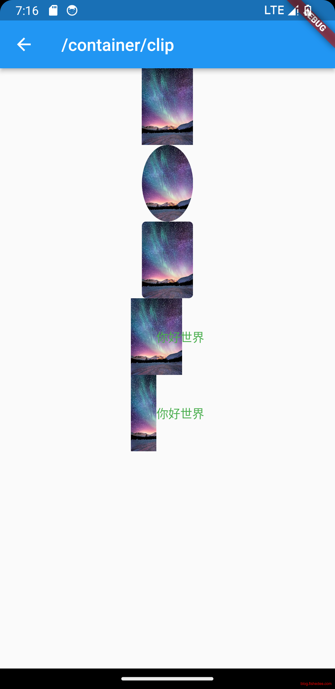
clip也比较简单,注意,clip会产生新的paint layer,应该尽少使用。
- ClipOval,剪裁为圆形
- ClipRRect,剪裁为圆角矩形
- ClipRect,剪裁为矩形。
Clip的一个常用法是,将子控件overflow的部分屏蔽掉,仅显示父空间宽高内的部分。
6.6 FittedBox
import 'package:flutter/material.dart';

class FittedBoxDemo extends StatelessWidget {
  const FittedBoxDemo({
    Key? key,
  }) : super(key: key);

  @override
  Widget build(BuildContext context) {
    return Center(
      child: Column(
        children: [
          //不缩放
          wContainer(BoxFit.none),
          const Text('Wendux'),
          //FittedBox的默认值为container,将子组件缩放到和父组件一样的大小
          wContainer(BoxFit.contain),
          const Text('Flutter中国'),
        ],
      ),
    );
  }

  Widget wContainer(BoxFit boxFit) {
    return Container(
      width: 50,
      height: 50,
      color: Colors.red,
      child: FittedBox(
        fit: boxFit,
        // 子容器超过父容器大小
        child: Container(width: 60, height: 70, color: Colors.blue),
      ),
    );
  }
}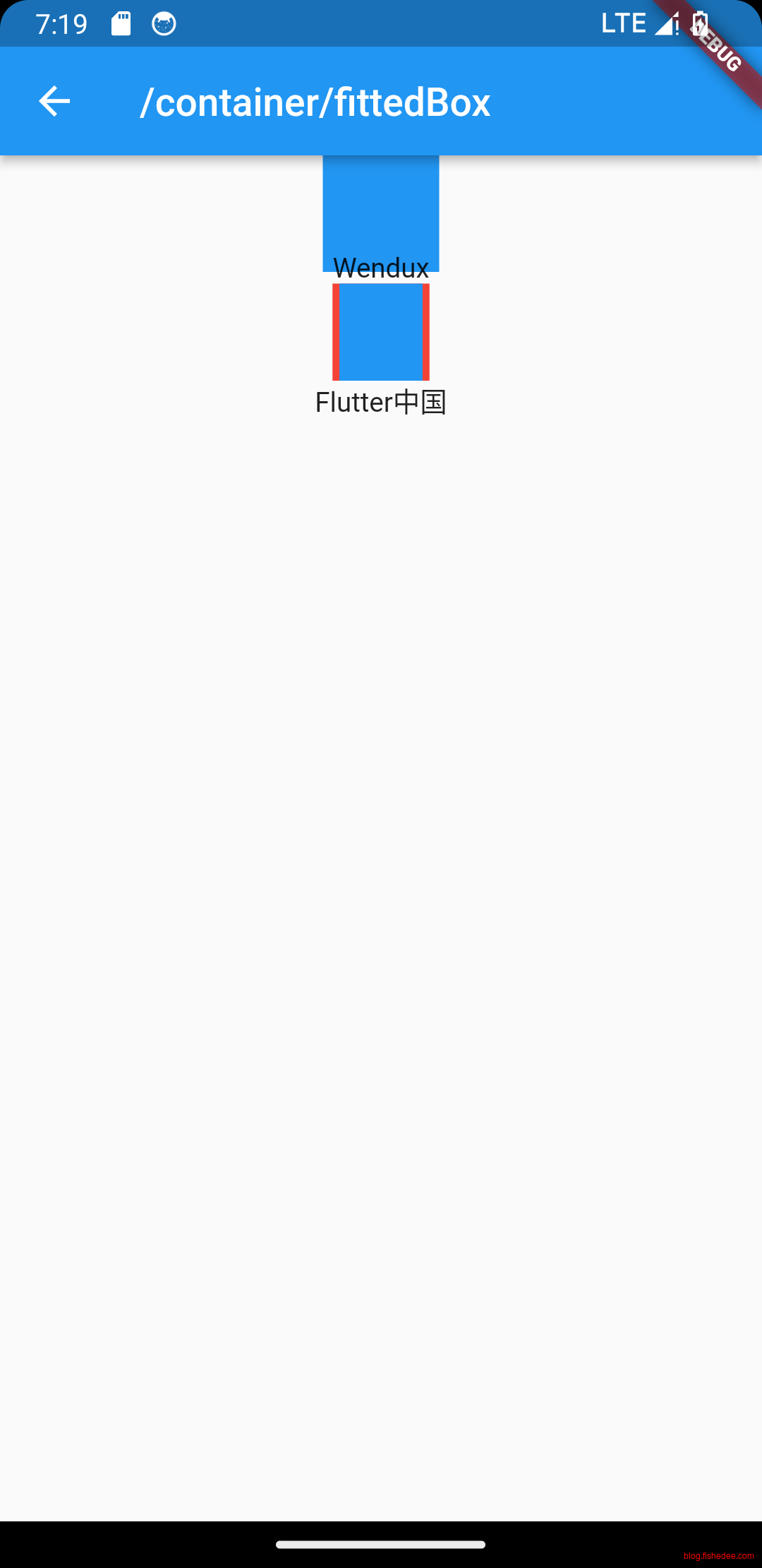
FittedBox的用法:
- FittedBox将Loose或Tight约束转换为一个Unbounded约束,返回一个满足上级约束的宽高。如果下级的宽高结果是Unbounded的话,则渲染错误error。
- FittedBox的fit默认值为boxFit,则它会将子组件缩放到和父组件一样的大小。然后使用scale的手段来显示。
- FittedBox的fit设置为none,则它不会将子组件进行放缩操作,这个时候的FittedBox的行为就像Overflow是一样的了。
7 UI滚动组件
代码在这里
flutter的滚动组件是第二个需要掌握的重点,除了SingleChildScrollView以外,所有的滚动组件都是虚拟滚动实现的,并且采用不同于第5节的,专用滚动组件内部的布局协议。
所以,flutter的滚动性能更好,渲染也更先进。难度会稍高,但必须要重点掌握。
7.1 SingleChildScrollView
import 'package:flutter/cupertino.dart';
import 'package:flutter/material.dart';

class SingleChildScrollViewDemo extends StatelessWidget {
  const SingleChildScrollViewDemo({
    Key? key,
  }) : super(key: key);

  @override
  Widget build(BuildContext context) {
    String str = "ABCDEFGHIJKLMNOPQRSTUVWXYZ";
    //默认情况下,没有ScrollBar,可以滚动
    return SingleChildScrollView(
      padding: const EdgeInsets.all(16.0),
      child: Center(
        child: Column(
          //动态创建一个List<Widget>
          children: str
              .split("")
              //每一个字母都用一个Text显示,字体为原来的两倍
              .map((c) => Text(
                    c,
                    textScaler: const TextScaler.linear(2),
                  ))
              .toList(),
        ),
      ),
    );
  }
}
SingleChildScrollView是最简单的滚动组件,由于没有实现Sliver的布局协议,这个组件仅适用于少量组件的情况。
7.2 ScrollBar
import 'package:flutter/cupertino.dart';
import 'package:flutter/material.dart';

class ScrollBarDemo extends StatelessWidget {
  const ScrollBarDemo({
    Key? key,
  }) : super(key: key);

  Widget _buildNormalScrollBar() {
    String str = "ABCDEFGHIJKLMNOPQRSTUVWXYZ";
    // 在Android和IOS环境下,都会显示普通的深色滚动条
    return Scrollbar(
      child: SingleChildScrollView(
        primary: true,
        padding: const EdgeInsets.all(16.0),
        child: Center(
          child: Column(
            //动态创建一个List<Widget>
            children: str
                .split("")
                //每一个字母都用一个Text显示,字体为原来的两倍
                .map((c) => Text(
                      c,
                      textScaler: const TextScaler.linear(2),
                    ))
                .toList(),
          ),
        ),
      ),
    );
  }

  Widget _buildIosScrollBar() {
    String str = "ABCDEFGHIJKLMNOPQRSTUVWXYZ";
    // 在IOS环境下,会显示半透明,圆角的滚动条
    // 在Android会显示普通的深色滚动条
    return CupertinoScrollbar(
      child: SingleChildScrollView(
        primary: false,
        padding: const EdgeInsets.all(16.0),
        child: Center(
          child: Column(
            //动态创建一个List<Widget>
            children: str
                .split("")
                //每一个字母都用一个Text显示,字体为原来的两倍
                .map((c) => Text(
                      c,
                      textScaler: const TextScaler.linear(2),
                    ))
                .toList(),
          ),
        ),
      ),
    );
  }

  @override
  Widget build(BuildContext context) {
    //如果单个页面有两个Scrollable的话,需要保证只有一个Scrollable的primary设置为true
    //这样才能保证都显示滚动条
    return Column(
      children: [
        Expanded(child: _buildNormalScrollBar()),
        Container(
          height: 30,
          color: Colors.red,
        ),
        Expanded(child: _buildIosScrollBar()),
      ],
    );
  }
}
- Scrollbar,在Android和IOS环境下,都会显示普通的深色滚动条
- CupertinoScrollbar,在IOS环境下,会显示半透明,圆角的滚动条
这个比较简单
7.3 ScrollPhysis
import 'package:flutter/cupertino.dart';
import 'package:flutter/material.dart';

class OverScrollBehavior extends ScrollBehavior {
  @override
  Widget buildOverscrollIndicator(
      BuildContext context, Widget child, ScrollableDetails details) {
    switch (getPlatform(context)) {
      case TargetPlatform.android:
      case TargetPlatform.fuchsia:
        return GlowingOverscrollIndicator(
          axisDirection: details.direction,
          //不显示头部水波纹
          showLeading: false,
          //不显示尾部水波纹
          showTrailing: false,
          color: Theme.of(context).hoverColor,
          child: child,
        );
      default:
        return super.buildScrollbar(context, child, details);
    }
  }
}

class ScrollPhysisDemo extends StatelessWidget {
  const ScrollPhysisDemo({
    Key? key,
  }) : super(key: key);

  Widget _buildClampingScrollPhysics() {
    String str = "ABCDEFGHIJKLMNOPQRSTUVWXYZ";
    // 在Android和IOS环境下,都会显示普通的深色滚动条
    return SingleChildScrollView(
      physics: const ClampingScrollPhysics(),
      primary: true,
      padding: const EdgeInsets.all(16.0),
      child: Center(
        child: Column(
          //动态创建一个List<Widget>
          children: str
              .split("")
              //每一个字母都用一个Text显示,字体为原来的两倍
              .map((c) => Text(
                    c,
                    textScaler: const TextScaler.linear(2),
                  ))
              .toList(),
        ),
      ),
    );
  }

  Widget _buildClampingScrollPhysicsAndNoneIndicator() {
    String str = "ABCDEFGHIJKLMNOPQRSTUVWXYZ";
    // 在Android和IOS环境下,都会显示普通的深色滚动条
    return ScrollConfiguration(
      behavior: OverScrollBehavior(),
      child: SingleChildScrollView(
        physics: const ClampingScrollPhysics(),
        primary: true,
        padding: const EdgeInsets.all(16.0),
        child: Center(
          child: Column(
            //动态创建一个List<Widget>
            children: str
                .split("")
                //每一个字母都用一个Text显示,字体为原来的两倍
                .map((c) => Text(
                      c,
                      textScaler: const TextScaler.linear(2),
                    ))
                .toList(),
          ),
        ),
      ),
    );
  }

  Widget _buildBouncingScrollPhysics() {
    String str = "ABCDEFGHIJKLMNOPQRSTUVWXYZ";
    // BouncingScrollPhysics,边界反弹效果,类似IOS的效果
    return SingleChildScrollView(
      physics: const BouncingScrollPhysics(),
      primary: false,
      padding: const EdgeInsets.all(16.0),
      child: Center(
        child: Column(
          //动态创建一个List<Widget>
          children: str
              .split("")
              //每一个字母都用一个Text显示,字体为原来的两倍
              .map((c) => Text(
                    c,
                    textScaler: const TextScaler.linear(2),
                  ))
              .toList(),
        ),
      ),
    );
  }

  @override
  Widget build(BuildContext context) {
    //如果单个页面有两个Scrollable的话,需要保证只有一个Scrollable的primary设置为true
    //这样才能保证都显示滚动条
    return Column(
      children: [
        Expanded(child: _buildClampingScrollPhysics()),
        Container(
          height: 30,
          color: Colors.red,
        ),
        Expanded(child: _buildClampingScrollPhysicsAndNoneIndicator()),
        Container(
          height: 30,
          color: Colors.red,
        ),
        Expanded(child: _buildBouncingScrollPhysics()),
      ],
    );
  }
}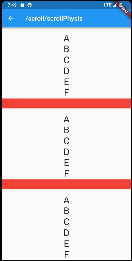
要点如下:
- ClampingScrollPhysics,默认值,滚动到尽头的时候,没有回弹效果,尽头会显示头部和尾部水波纹
- ClampingScrollPhysics + ScrollConfiguration,滚动到尽头的时候,没有回弹效果,尽头会隐藏头部和尾部水波纹
- BouncingScrollPhysics,类似IOS的滚动效果,滚动到尽头的时候,有回弹效果,没有头部和尾部水波纹。
7.4 ListView
7.4.1 基础
import 'package:flutter/cupertino.dart';
import 'package:flutter/material.dart';

class ListViewDemo extends StatelessWidget {
  const ListViewDemo({
    Key? key,
  }) : super(key: key);

  Widget _buildNormalListView() {
    //非lazy形式的listView,不推荐使用,会导致所有的Widget都会提前渲染。
    var size = 20;
    return ListView(
      primary: true,
      children: List.generate(size, (index) {
        index++;
        var str = "";
        for (var i = 0; i != index; i++) {
          str += "[Text $index]";
        }
        return Text(str);
      }),
    );
  }

  Widget _buildLazyListView() {
    //Lazy形式的listView,推荐使用,Widget按需加载
    return ListView.builder(
      primary: false,
      itemCount: 20,
      itemBuilder: (BuildContext context, int index) {
        index++;
        var str = "";
        for (var i = 0; i != index; i++) {
          str += "[Text $index]";
        }
        return Text(str);
      },
    );
  }

  Widget _buildLazyListViewFixHeight() {
    return ListView.builder(
      primary: false,
      itemCount: 20,
      //指定了itemExtent以后,每个项的高度都是高度的,无法变更
      //item项小的话,会提高高度,保证高度为itemExtent
      //item项大的话,会截取高度,保证高度为itemExtent
      itemExtent: 30,
      itemBuilder: (BuildContext context, int index) {
        index++;
        var str = "";
        for (var i = 0; i != index; i++) {
          str += "[Text $index]";
        }
        return Text(str);
      },
    );
  }

  Widget _buildLazyListViewPrototypeHeight() {
    return ListView.builder(
      primary: false,
      itemCount: 20,
      //指定了prototypeItem的话,以prototypeItem的高度作为每个项的实际高度
      //item项小的话,会提高高度,保证高度为prototypeItem的高度
      //item项大的话,会截取高度,保证高度为prototypeItem的高度
      prototypeItem: const Text("Text 1"),
      itemBuilder: (BuildContext context, int index) {
        index++;
        var str = "";
        for (var i = 0; i != index; i++) {
          str += "[Text $index]";
        }
        return Text(str);
      },
    );
  }

  Widget _buildLazyListViewWithSeperator() {
    //下划线widget预定义以供复用。
    Widget divider1 = const Divider(
      color: Colors.blue,
    );
    Widget divider2 = const Divider(color: Colors.green);
    //Lazy形式的listView,推荐使用,Widget按需加载
    return ListView.separated(
      primary: false,
      itemCount: 20,
      itemBuilder: (BuildContext context, int index) {
        index++;
        var str = "";
        for (var i = 0; i != index; i++) {
          str += "[Text $index]";
        }
        return Text(str);
      },
      //分割器构造器
      separatorBuilder: (BuildContext context, int index) {
        return index % 2 == 0 ? divider1 : divider2;
      },
    );
  }

  @override
  Widget build(BuildContext context) {
    //如果单个页面有两个Scrollable的话,需要保证只有一个Scrollable的primary设置为true
    //这样才能保证都显示滚动条
    return Column(
      children: [
        Expanded(child: _buildNormalListView()),
        Container(
          height: 30,
          color: Colors.red,
        ),
        Expanded(child: _buildLazyListView()),
        Container(
          height: 10,
          color: Colors.red,
        ),
        Expanded(child: _buildLazyListViewFixHeight()),
        Container(
          height: 10,
          color: Colors.red,
        ),
        Expanded(child: _buildLazyListViewPrototypeHeight()),
        Container(
          height: 10,
          color: Colors.red,
        ),
        Expanded(child: _buildLazyListViewWithSeperator()),
      ],
    );
  }
}
要点如下:
- 普通ListView,将所有Widget都一次性传入到children字段,不推荐使用,会导致所有的Widget都会提前build。
- 按需ListView,通过itemBuilder的形式来按需创建Widget,推荐使用,Widget按需加载。
ListView的其他特性:
- itemExtent,指定了itemExtent以后,每个项的高度都是高度的,无法变更。item项小的话,会提高高度,保证高度为itemExtent。item项大的话,会截取高度,保证高度为itemExtent
- prototypeItem,指定了prototypeItem的话,以prototypeItem的高度作为每个项的实际高度。item项小的话,会提高高度,保证高度为prototypeItem的高度。item项大的话,会截取高度,保证高度为prototypeItem的高度
- separatorBuilder,可以指定ListView每一项的分割器,这里的分割器可以重复的Widget,避免重复build。
7.4.2 无限滚动
import 'package:flutter/material.dart';
import 'package:english_words/english_words.dart';

class ListViewInfiniteDemo extends StatefulWidget {
  const ListViewInfiniteDemo({
    Key? key,
  }) : super(key: key);

  @override
  State<ListViewInfiniteDemo> createState() => _InfiniteListViewState();
}

class _InfiniteListViewState extends State<ListViewInfiniteDemo> {
  static const loadingTag = "##loading##"; //表尾标记
  final _words = <String>[loadingTag];

  @override
  void initState() {
    super.initState();
    _retrieveData();
  }

  @override
  Widget build(BuildContext context) {
    return Column(
      children: [
        ElevatedButton(
          onPressed: () {
            setState(() {
              if (_words.length > 2) {
                _words[1] += 'Fish';
              }
            });
          },
          child: const Text("修改第2项"),
        ),
        Expanded(
          child: _buildListView(context),
        ),
      ],
    );
  }

  Widget _buildListView(BuildContext context) {
    return ListView.separated(
      itemCount: _words.length,
      itemBuilder: (context, index) {
        //如果到了表尾
        if (_words[index] == loadingTag) {
          //不足100条,继续获取数据
          if (_words.length - 1 < 100) {
            //获取数据
            _retrieveData();
            //加载时显示loading
            return Container(
              padding: const EdgeInsets.all(16.0),
              alignment: Alignment.center,
              child: const SizedBox(
                width: 24.0,
                height: 24.0,
                child: CircularProgressIndicator(strokeWidth: 2.0),
              ),
            );
          } else {
            //已经加载了100条数据,不再获取数据。
            return Container(
              alignment: Alignment.center,
              padding: const EdgeInsets.all(16.0),
              child: const Text(
                "没有更多了",
                style: TextStyle(color: Colors.grey),
              ),
            );
          }
        }
        //显示单词列表项
        return ListTile(title: Text(_words[index]));
      },
      separatorBuilder: (context, index) => const Divider(height: .0),
    );
  }

  void _retrieveData() {
    Future.delayed(const Duration(seconds: 2)).then((e) {
      setState(() {
        //重新构建列表
        _words.insertAll(
          _words.length - 1,
          //每次生成20个单词
          generateWordPairs().take(20).map((e) => e.asPascalCase).toList(),
        );
      });
    });
  }
}
要点如下:
- 可以设置最后一项为loading组件,itemBuilder是最后一项,或者侦听scrollListener来触发下一项。
- 修改某一项的时候,仅需要修改本地数据,然后build一次就可以了。比较简单,甚至连data都不需要传入。
7.5 GridView
7.5.1 基础
import 'package:flutter/cupertino.dart';
import 'package:flutter/material.dart';

class GridViewDemo extends StatelessWidget {
  GridViewDemo({
    Key? key,
  }) : super(key: key);

  final widgets = [
    Image.asset('assets/images/vertical1.webp', fit: BoxFit.contain),
    Image.asset('assets/images/vertical2.webp', fit: BoxFit.contain),
    Image.asset('assets/images/vertical3.webp', fit: BoxFit.contain),
    Image.asset('assets/images/vertical4.webp', fit: BoxFit.contain),
    Image.asset('assets/images/vertical5.webp', fit: BoxFit.contain),
    Image.asset('assets/images/vertical6.webp', fit: BoxFit.contain)
  ];
  Widget _buildGridViewFixCrossAxis() {
    return GridView.builder(
      gridDelegate: const SliverGridDelegateWithFixedCrossAxisCount(
        crossAxisCount: 3, //横轴三个子widget
        //宽高比是固定的,默认就是1
        //childAspectRatio: 1.0 //宽高比为1时,子widget
      ),
      itemCount: widgets.length,
      itemBuilder: (context, index) => widgets[index],
    );
  }

  Widget _buildGridViewMaxExtentntCrossAxis() {
    return GridView.builder(
      gridDelegate: const SliverGridDelegateWithMaxCrossAxisExtent(
        maxCrossAxisExtent: 120, //横轴最宽120
        //宽高比是固定的,默认就是1
        //childAspectRatio: 1.0 //宽高比为1时,子widget
      ),
      itemCount: widgets.length,
      itemBuilder: (context, index) => widgets[index],
    );
  }

  @override
  Widget build(BuildContext context) {
    //如果单个页面有两个Scrollable的话,需要保证只有一个Scrollable的primary设置为true
    //这样才能保证都显示滚动条
    return Column(
      children: [
        Expanded(child: _buildGridViewFixCrossAxis()),
        Container(
          height: 30,
          color: Colors.red,
        ),
        Expanded(child: _buildGridViewMaxExtentntCrossAxis()),
      ],
    );
  }
}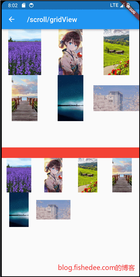
要点如下:
- GridView的宽高比都是固定的,默认就是1。可以通过修改childAspectRatio来配置。如果要支持不同宽高比的widget,需要使用其他的滚动组件。
- 不推荐使用children形式的提前渲染,推荐使用itemBuilder形式的按需渲染。
GridView的属性
- gridDelegate为SliverGridDelegateWithFixedCrossAxisCount,固定交叉轴的数量,无论GridView的宽度是多少。
- gridDelegate为SliverGridDelegateWithMaxCrossAxisExtent,以交叉轴宽度,和每个Widget的maxCrossAxisExtent配置,来决定交叉轴的数量。
无论哪种形式,GridView有两点是不变的
- 同一个GridView,每个Widget的宽高比都是固定的
- 同一个GridView,交叉轴的Widget数量都是固定的。
7.5.2 无限滚动
import 'package:flutter/cupertino.dart';
import 'package:flutter/material.dart';

class GridViewInfiniteDemo extends StatefulWidget {
  const GridViewInfiniteDemo({
    Key? key,
  }) : super(key: key);
  @override
  _InfiniteGridViewState createState() => _InfiniteGridViewState();
}

class _InfiniteGridViewState extends State<GridViewInfiniteDemo> {
  final List<IconData> _icons = []; //保存Icon数据

  @override
  void initState() {
    super.initState();
    // 初始化数据
    _retrieveIcons();
  }

  @override
  Widget build(BuildContext context) {
    return Column(
      children: [
        ElevatedButton(
          onPressed: () {
            setState(() {
              if (_icons.length > 2) {
                _icons[1] = Icons.baby_changing_station;
              }
            });
          },
          child: const Text("修改第2项"),
        ),
        Expanded(
          child: _buildGridView(context),
        ),
      ],
    );
  }

  Widget _buildGridView(BuildContext context) {
    return GridView.builder(
      gridDelegate: const SliverGridDelegateWithFixedCrossAxisCount(
        crossAxisCount: 3, //每行三列
        childAspectRatio: 1.0, //显示区域宽高相等
      ),
      itemCount: _icons.length,
      itemBuilder: (context, index) {
        //如果显示到最后一个并且Icon总数小于200时继续获取数据
        if (index == _icons.length - 1 && _icons.length < 200) {
          _retrieveIcons();
        }
        return Icon(_icons[index]);
      },
    );
  }

  //模拟异步获取数据
  void _retrieveIcons() {
    Future.delayed(const Duration(milliseconds: 200)).then((e) {
      setState(() {
        _icons.addAll([
          Icons.ac_unit,
          Icons.airport_shuttle,
          Icons.all_inclusive,
          Icons.beach_access,
          Icons.cake,
          Icons.free_breakfast,
        ]);
      });
    });
  }
}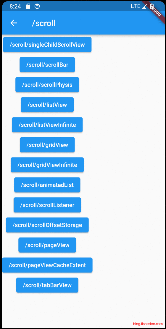
要点如下:
- 可以设置最后一项为loading组件,itemBuilder是最后一项,或者侦听scrollListener来触发下一项。
- 修改某一项的时候,仅需要修改本地数据,然后build一次就可以了。比较简单,甚至连data都不需要传入。
7.6 AnimatedList
import 'package:flutter/cupertino.dart';
import 'package:flutter/material.dart';

class AnimatedListDemo extends StatefulWidget {
  const AnimatedListDemo({Key? key}) : super(key: key);

  @override
  _AnimatedListRouteState createState() => _AnimatedListRouteState();
}

class _AnimatedListRouteState extends State<AnimatedListDemo> {
  var data = <String>[];
  int counter = 5;

  final globalKey = GlobalKey<AnimatedListState>();

  @override
  void initState() {
    for (var i = 0; i < counter; i++) {
      data.add('${i + 1}');
    }
    super.initState();
  }

  @override
  Widget build(BuildContext context) {
    return Stack(
      children: [
        AnimatedList(
          key: globalKey,
          initialItemCount: data.length,
          itemBuilder: (
            BuildContext context,
            int index,
            Animation<double> animation,
          ) {
            //添加列表项时会执行渐显动画
            return FadeTransition(
              opacity: animation,
              child: buildItem(context, index),
            );
          },
        ),
        buildAddBtn(),
      ],
    );
  }

  // 创建一个 “+” 按钮,点击后会向列表中插入一项
  Widget buildAddBtn() {
    return Positioned(
      bottom: 30,
      left: 0,
      right: 0,
      child: FloatingActionButton(
        child: const Icon(Icons.add),
        onPressed: () {
          // 添加一个列表项
          data.add('${++counter}');
          // 告诉列表项有新添加的列表项
          // 缺少这一句的话,即使放在setState里面也无法刷新数据。
          globalKey.currentState!.insertItem(data.length - 1);
          print('添加 $counter');
        },
      ),
    );
  }

  // 构建列表项
  Widget buildItem(context, index) {
    String char = data[index];
    return ListTile(
      //数字不会重复,所以作为Key
      key: ValueKey(char),
      title: Text(char),
      trailing: IconButton(
        icon: const Icon(Icons.delete),
        // 点击时删除
        onPressed: () => onDelete(context, index),
      ),
    );
  }

  void onDelete(context, index) {
    //缺少这一句的话,即使放在setState里面也无法刷新数据。
    globalKey.currentState!.removeItem(
      index,
      (context, animation) {
        // 删除过程执行的是反向动画,animation.value 会从1变为0
        var item = buildItem(context, index);
        print('删除 ${data[index]}');
        data.removeAt(index);
        // 删除动画是一个合成动画:渐隐 + 收缩列表项
        return FadeTransition(
          opacity: CurvedAnimation(
            parent: animation,
            //让透明度变化的更快一些
            curve: const Interval(0.5, 1.0),
          ),
          // 不断缩小列表项的高度
          child: SizeTransition(
            sizeFactor: animation,
            axisAlignment: 0.0,
            child: item,
          ),
        );
      },
      duration: const Duration(milliseconds: 100), // 动画时间为 100 ms
    );
  }
}
要点如下:
- itemBuilder,需要传入一个支持animation的Widget,以展示首次出现的动画
- addItem的时候,不能直接修改本地data,然后setState,这样是没有动画效果的,也不能更新页面数据。需要修改本地data,并且手动执行AnimatedList的insertItem,不需要调用setState,这样才能触发动画和更新页面数据。
- delItem的时候,不能直接修改本地data,然后setState,这样是没有动画效果的,也不能更新页面数据。需要修改本地data,并且手动执行AnimatedList的removeAt,不需要调用setState,这样才能触发动画和更新页面数据。
- 在调用removeAt的时候,需要传入离场动画。
评价:
- 这个设计不太好,不仅使用起来麻烦,而且改成了命令式的修改数据。
7.7 ScorllListener
import 'package:flutter/cupertino.dart';
import 'package:flutter/material.dart';

class ScrollListenerDemo extends StatefulWidget {
  const ScrollListenerDemo({
    Key? key,
  }) : super(key: key);

  @override
  State<ScrollListenerDemo> createState() => _ScrollListenerDemo();
}

class _ScrollListenerDemo extends State<ScrollListenerDemo> {
  final ScrollController _controller = ScrollController();

  @override
  void initState() {
    super.initState();
    _controller.addListener(() {
      print('listView1 offset ${_controller.offset}');
    });
  }

  Widget _buildNormalListView() {
    var size = 20;
    return ListView(
      controller: _controller,
      children: List.generate(size, (index) {
        index++;
        var str = "";
        for (var i = 0; i != index; i++) {
          str += "[Text $index]";
        }
        return Text(str);
      }),
    );
  }

  Widget _buildNormalListView2() {
    /*
    在接收到滚动事件时,参数类型为ScrollNotification,它包括一个metrics属性,它的类型是ScrollMetrics,该属性包含当前ViewPort及滚动位置等信息:
    pixels:当前滚动位置。
    maxScrollExtent:最大可滚动长度。
    extentBefore:滑出ViewPort顶部的长度;此示例中相当于顶部滑出屏幕上方的列表长度。
    extentInside:ViewPort内部长度;此示例中屏幕显示的列表部分的长度。
    extentAfter:列表中未滑入ViewPort部分的长度;此示例中列表底部未显示到屏幕范围部分的长度。
    atEdge:是否滑到了可滚动组件的边界(此示例中相当于列表顶或底部)。
    ScrollMetrics还有一些其他属性,读者可以自行查阅API文档。
    */
    var size = 20;
    //使用事件冒泡的方式来做滚动监听,可以得到较为丰富的事件消息。
    return NotificationListener<ScrollNotification>(
      /*
      /// Return true to cancel the notification bubbling. Return false to
      /// allow the notification to continue to be dispatched to further ancestors.
      */
      onNotification: (ScrollNotification notification) {
        print(
            'listView2 offset ${notification.metrics.pixels} ${notification.metrics.maxScrollExtent} ${notification.metrics.atEdge}');
        return false;
      },
      child: ListView(
        children: List.generate(size, (index) {
          index++;
          var str = "";
          for (var i = 0; i != index; i++) {
            str += "[Text $index]";
          }
          return Text(str);
        }),
      ),
    );
  }

  @override
  Widget build(BuildContext context) {
    //如果单个页面有两个Scrollable的话,需要保证只有一个Scrollable的primary设置为true
    //这样才能保证都显示滚动条
    return Column(
      children: [
        ElevatedButton(
            onPressed: () {
              _controller.animateTo(
                0,
                duration: const Duration(milliseconds: 200),
                curve: Curves.ease,
              );
            },
            child: const Text('返回顶部')),
        Expanded(child: _buildNormalListView()),
        Container(
          height: 30,
          color: Colors.red,
        ),
        Expanded(child: _buildNormalListView2()),
      ],
    );
  }
}
要点如下:
- 可以使用ScrollController来获取Scroll变化的事件,并且可以设置Scroll offset的位置。
- 可以使用NotificationListener来获取Scroll变化的事件,这样的话,事件的内容也比较详细。但是不能设置scroll offset的位置。
7.8 ScrollOffsetStorage
import 'package:flutter/cupertino.dart';
import 'package:flutter/material.dart';

class ScrollOffsetStorageDemo extends StatefulWidget {
  const ScrollOffsetStorageDemo({super.key});

  @override
  State<ScrollOffsetStorageDemo> createState() => _MyHomePageState();
}

class _MyHomePageState extends State<ScrollOffsetStorageDemo> {
  final List<Widget> pages = const <Widget>[
    ColorBoxPage(
      //PageStorageKey属于localKey的范畴
      //但是PageStorage检查到widget退出的时候,都会保存scrollOffset
      //新widget进来的时候,就会恢复scrollOffset
      key: PageStorageKey<String>('pageOne'),
    ),
    ColorBoxPage(
        //这个页面有PageStorageKey,所以每次滚动位置都会丢失
        //key: PageStorageKey<String>('pageTwo'),
        ),
  ];
  int currentTab = 0;
  final PageStorageBucket _bucket = PageStorageBucket();

  @override
  Widget build(BuildContext context) {
    return Scaffold(
      //body每次,仅显示当前Widget,另外一个Widget就会销毁
      //PageStorage在顶层记录每个PageStorageKey对应的位置
      body: PageStorage(
        bucket: _bucket,
        child: pages[currentTab],
      ),
      bottomNavigationBar: BottomNavigationBar(
        currentIndex: currentTab,
        onTap: (int index) {
          setState(() {
            currentTab = index;
          });
        },
        items: const <BottomNavigationBarItem>[
          BottomNavigationBarItem(
            icon: Icon(Icons.home),
            label: 'page 1',
          ),
          BottomNavigationBarItem(
            icon: Icon(Icons.settings),
            label: 'page2',
          ),
        ],
      ),
    );
  }
}

class ColorBoxPage extends StatelessWidget {
  const ColorBoxPage({super.key});

  @override
  Widget build(BuildContext context) {
    return ListView.builder(
      itemExtent: 250.0,
      itemBuilder: (BuildContext context, int index) => Container(
        padding: const EdgeInsets.all(10.0),
        child: Material(
          color: index.isEven ? Colors.cyan : Colors.deepOrange,
          child: Center(
            child: Text(index.toString()),
          ),
        ),
      ),
    );
  }
}
要点如下:
- Scaffold的body,默认是没有做页面缓存的,也就是每次页面都是重新创建Element实例的。在默认的情况下,滚动组件的滚动位置会丢失。
- 我们可以使用PageStorage来包裹滚动组件,而每个滚动组件使用PageStorageKey来指定。这样的话,当widget退出的时候,PageStorage会自动保存当前滚动组件的offset,下次重新创建Widget的时候,会自动恢复滚动组件的offset。
- 在Demo里面,Page1是设置有PageSorageKey,所以每次切换tab的时候,滚动位置都能恢复。Page2是没有设置PageStorageKey,所以每次切换tab的时候,滚动位置都没有恢复。
- 比较神奇的是,PageStorageKey不需要必须设置在滚动组件上,只需要设置在滚动组件的父组件上也可以。这可能是跟PageStorage侦听了ScrollNotification事件有关。
7.9 PageView
7.9.1 基础
import 'package:flutter/cupertino.dart';
import 'package:flutter/material.dart';

//PageView常用来实现 Tab 换页效果、图片轮动以及抖音上下滑页切换视频功能
class PageViewDemo extends StatelessWidget {
  const PageViewDemo({
    Key? key,
  }) : super(key: key);

  @override
  Widget build(BuildContext context) {
    var children = <Widget>[];
    // 生成 6 个 Tab 页
    for (int i = 0; i < 6; ++i) {
      children.add(PageViewCounter(text: 'Counter_$i'));
    }

    return PageView(
      //keepAlive的意义:
      //1. PageView只能缓存前后一页,超出的会丢失状态
      //2. ListView里面有一个类似的配置,addAutomaticKeepAlives,配置为true的时候,滑出viewport以后,依然会缓存widget。
      //   但是如果滑出viewPort的距离太远,依然会丢失状态
      //是否开启keepAlive:
      // 开启keepAlive能避免重复刷新页面状态,但是消耗更多的内存
      // 不开启keepAlive,切换页面需要重新刷新,状态需要移到父级来保存,否则会丢失状态。
      allowImplicitScrolling: true,
      // scrollDirection: Axis.vertical, // 滑动方向为垂直方向
      children: children,
    );
  }
}

class PageViewCounter extends StatefulWidget {
  const PageViewCounter({Key? key, required this.text}) : super(key: key);

  final String text;

  @override
  _PageViewCounter createState() => _PageViewCounter();
}

class _PageViewCounter extends State<PageViewCounter> {
  var _counter = 0;

  @override
  Widget build(BuildContext context) {
    print("build ${widget.text}");
    return Center(
      child: Column(mainAxisAlignment: MainAxisAlignment.center, children: [
        Center(child: Text("${widget.text}_$_counter")),
        ElevatedButton(
            onPressed: () {
              setState(() {
                _counter++;
              });
            },
            child: const Text("递增counter"))
      ]),
    );
  }
}
要点如下:
- PageView就是一个大号的ListView而已,它默认的大小就是整页的大小。它常用来实现 Tab 换页效果、图片轮动以及抖音上下滑页切换视频功能
- PageView在默认情况下,不缓存页面的Widget,在切换页面以后,旧Widget的State就会丢失。
- PageView即使打开了allowImplicitScrolling,而是仅缓存了前后3页的页面Widget的State。当滑动到第4页的时候,Widget的State就会丢失。
是否缓存Widget的State,我们称为KeepAlive,在ListView中也有类似的设定:
- ListView里面有一个类似的配置,addAutomaticKeepAlives,配置为true的时候,滑出viewport以后,依然会缓存widget。
- ListView中如果widget滑出viewPort的距离太远,依然会丢失State。
7.9.2 Widget缓存
import 'package:flutter/cupertino.dart';
import 'package:flutter/material.dart';

//PageView常用来实现 Tab 换页效果、图片轮动以及抖音上下滑页切换视频功能
class PageViewCacheExtentDemo extends StatelessWidget {
  const PageViewCacheExtentDemo({
    Key? key,
  }) : super(key: key);

  @override
  Widget build(BuildContext context) {
    var children = <Widget>[];
    // 生成 6 个 Tab 页
    for (int i = 0; i < 6; ++i) {
      children.add(
        //使用true的话,则在ListView或者PageView等Scroll组件中,无论什么时候都会缓存,无论滑出viewport有多远。
        //需谨慎使用
        KeepAliveWrapper(
          keepAlive: true,
          child: PageViewCounter(text: 'Counter_$i'),
        ),
      );
    }

    return PageView(
      //只能缓存前后一页,超出的会丢失状态
      allowImplicitScrolling: true,
      // scrollDirection: Axis.vertical, // 滑动方向为垂直方向
      children: children,
    );
  }
}

class PageViewCounter extends StatefulWidget {
  const PageViewCounter({Key? key, required this.text}) : super(key: key);

  final String text;

  @override
  _PageViewCounter createState() => _PageViewCounter();
}

class _PageViewCounter extends State<PageViewCounter> {
  var _counter = 0;

  @override
  Widget build(BuildContext context) {
    print("build ${widget.text}");
    return Center(
      child: Column(mainAxisAlignment: MainAxisAlignment.center, children: [
        Center(child: Text("${widget.text}_$_counter")),
        ElevatedButton(
            onPressed: () {
              setState(() {
                _counter++;
              });
            },
            child: const Text("递增counter"))
      ]),
    );
  }
}

class KeepAliveWrapper extends StatefulWidget {
  const KeepAliveWrapper({
    Key? key,
    this.keepAlive = true,
    required this.child,
  }) : super(key: key);
  final bool keepAlive;
  final Widget child;

  @override
  _KeepAliveWrapperState createState() => _KeepAliveWrapperState();
}

/*
* 由flutter来询问我们要不要keepAlive,混入AutomaticKeepAliveClientMixin就可以了
*/
class _KeepAliveWrapperState extends State<KeepAliveWrapper>
    with AutomaticKeepAliveClientMixin {
  @override
  Widget build(BuildContext context) {
    super.build(context);
    return widget.child;
  }

  @override
  void didUpdateWidget(covariant KeepAliveWrapper oldWidget) {
    if (oldWidget.keepAlive != widget.keepAlive) {
      // keepAlive 状态需要更新,实现在 AutomaticKeepAliveClientMixin 中
      updateKeepAlive();
    }
    super.didUpdateWidget(oldWidget);
  }

  //返回要不要keepAlive
  @override
  bool get wantKeepAlive => widget.keepAlive;
}
要点如下:
- 在滚动组件的里面,如果我们需要强制指定每个Widget都必须缓存,可以通过继承AutomaticKeepAliveClientMixin来实现,在wantKeepAlive属性中永远返回true就可以了。
- KeepAliveWrapper,需要谨慎使用,所有组件都keepAlive的话,对于内存是不少的压力。
7.10 TabBarView
import 'package:demo/scroll/pageViewCacheExtent.dart';
import 'package:flutter/cupertino.dart';
import 'package:flutter/material.dart';

class TabBarViewDemo extends StatefulWidget {
  const TabBarViewDemo({
    Key? key,
  }) : super(key: key);

  @override
  _TabViewRoute1State createState() => _TabViewRoute1State();
}

//TabBarView其实就是PageView和TabBar的组合使用而已
class _TabViewRoute1State extends State<TabBarViewDemo>
    with SingleTickerProviderStateMixin {
  late TabController _tabController;
  List tabs = ["新闻", "历史", "图片"];

  @override
  void initState() {
    super.initState();
    _tabController = TabController(length: tabs.length, vsync: this);
  }

  @override
  Widget build(BuildContext context) {
    return Scaffold(
      appBar: AppBar(
        title: const Text("App Name"),
        bottom: TabBar(
          //这里绑定同一个_tabController
          controller: _tabController,
          tabs: tabs.map((e) => Tab(text: e)).toList(),
        ),
      ),
      body: TabBarView(
        //这里绑定同一个_tabController
        controller: _tabController,
        children: tabs.map((e) {
          return KeepAliveWrapper(
            child: Container(
              alignment: Alignment.center,
              child: Text(e, textScaleFactor: 5),
            ),
          );
        }).toList(),
      ),
    );
  }

  @override
  void dispose() {
    // 释放资源
    _tabController.dispose();
    super.dispose();
  }
}
要点如下:
- TabBarView其实就是PageView和TabBar的组合使用而已。
- TabBarView既可以通过移动PageView来切换Tab,也可以点击TabBar来切换Tab.
- 为了让TabBar和TabBarView保存同步,他们需要绑定到同一个TabController上。
8 UI滚动Sliver
代码在这里
参考资料在这里
8.0 基础
| Sliver名称 | 功能 | 对应的可滚动组件 |
|---|---|---|
| SliverList | 列表 | ListView |
| SliverFixedExtentList | 高度固定的列表 | ListView,指定itemExtent时 |
| SliverAnimatedList | 添加/删除列表项可以执行动画 | AnimatedList |
| SliverGrid | 网格 | GridView |
| SliverPrototypeExtentList | 根据原型生成高度固定的列表 | ListView,指定prototypeItem 时 |
| SliverFillViewport | 包含多个子组件,每个都可以填满屏幕 | PageView |
除了和列表对应的 Sliver 之外还有一些用于对 Sliver 进行布局、装饰的组件,它们的子组件必须是 Sliver,我们列举几个常用的:
| Sliver名称 | 对应RenderBox |
|---|---|
| SliverPadding | Padding |
| SliverVisibility、SliverOpacity | Visibility、Opacity |
| SliverFadeTransition | FadeTransition |
| SliverLayoutBuilder | LayoutBuilder |
还有一些其他常用的 Sliver:
| Sliver名称 | 说明 |
|---|---|
| SliverAppBar | 对应 AppBar,主要是为了在 CustomScrollView 中使用。 |
| SliverToBoxAdapter | 一个适配器,可以将 RenderBox 适配为 Sliver,后面介绍。 |
| SliverPersistentHeader | 滑动到顶部时可以固定住,后面介绍。 |
Sliver是flutter滚动组件的底层实现组件,所有的虚拟滚动组件(ListView,GridView,PageView)底层有对应的Sliver组件。有些时候,我们需要单独使用Sliver,而不是直接使用ListView,例如,我们需要将多个ListView, GridView, PageView放在同一个滚动列表中。或者,我们需要自定义的Sliver组件,使得它可以与现有的Sliver组件协调一起工作。
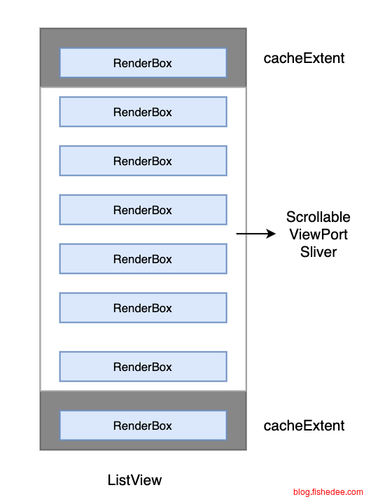
Flutter 中的可滚动组件主要由三个角色组成:Scrollable、Viewport 和 Sliver:
- Scrollable :用于处理滑动手势,确定滑动偏移,滑动偏移变化时构建 Viewport 。
- Viewport:显示的视窗,即列表的可视区域;
- Sliver:视窗里显示的元素。
具体布局过程:
- Scrollable 监听到用户滑动行为后,根据最新的滑动偏移构建 Viewport 。
- Viewport 将当前视口信息和配置信息通过 SliverConstraints 传递给 Sliver。
- Sliver 中对子组件(RenderBox)按需进行构建和布局,然后确认自身的位置、绘制等信息,保存在 geometry 中(一个 SliverGeometry 类型的对象)。
8.1 Sliver基础
import 'package:flutter/cupertino.dart';
import 'package:flutter/material.dart';

//ListView,GridView,PageView,AnimatedList其实底层都是用CustomScrollView + Silver来实现。
//我们可以直接用CustomScrollView + 多个silver一起做,实现多个滚动组件共用一个viewport和scrollable。
class SliverDemo extends StatelessWidget {
  const SliverDemo({
    Key? key,
  }) : super(key: key);

  @override
  Widget build(BuildContext context) {
    return CustomScrollView(
      slivers: <Widget>[
        // AppBar,包含一个导航栏.
        SliverAppBar(
          pinned: true, // 滑动到顶端时会固定住
          expandedHeight: 250.0,
          flexibleSpace: FlexibleSpaceBar(
            title: const Text('Demo'),
            background: Image.asset(
              "assets/images/star.webp",
              fit: BoxFit.cover,
            ),
          ),
        ),
        //SilverPadding下面依然需要用silver
        SliverPadding(
          padding: const EdgeInsets.all(8.0),
          sliver: SliverGrid(
            //Grid
            gridDelegate: const SliverGridDelegateWithFixedCrossAxisCount(
              crossAxisCount: 2, //Grid按两列显示
              mainAxisSpacing: 10.0,
              crossAxisSpacing: 10.0,
              childAspectRatio: 4.0,
            ),
            delegate: SliverChildBuilderDelegate(
              (BuildContext context, int index) {
                //创建子widget
                return Container(
                  alignment: Alignment.center,
                  color: Colors.cyan[100 * (index % 9)],
                  child: Text('grid item $index'),
                );
              },
              childCount: 20,
            ),
          ),
        ),
        //DecorateSilverList下面依然需要用silver
        DecoratedSliver(
          decoration: BoxDecoration(
            borderRadius: BorderRadius.circular(20),
            boxShadow: const [
              BoxShadow(
                  color: Color(0xFF111133),
                  blurRadius: 2,
                  offset: Offset(-2, -1))
            ],
            gradient: const LinearGradient(
              colors: <Color>[
                Color(0xFFEEEEEE),
                Color(0xFF111133),
              ],
              stops: <double>[0.1, 1.0],
            ),
          ),
          sliver: SliverGrid(
            //Grid
            gridDelegate: const SliverGridDelegateWithFixedCrossAxisCount(
              crossAxisCount: 2, //Grid按两列显示
              mainAxisSpacing: 10.0,
              crossAxisSpacing: 10.0,
              childAspectRatio: 4.0,
            ),
            delegate: SliverChildBuilderDelegate(
              (BuildContext context, int index) {
                //创建子widget
                return Container(
                  alignment: Alignment.center,
                  color: Colors.cyan[100 * (index % 9)],
                  child: Text('grid item $index'),
                );
              },
              childCount: 20,
            ),
          ),
        ),
        SliverList(
          delegate: SliverChildBuilderDelegate(
            (BuildContext context, int index) {
              //创建列表项
              return Container(
                alignment: Alignment.center,
                color: Colors.lightBlue[100 * (index % 9)],
                child: Text('list item $index'),
              );
            },
            childCount: 20,
          ),
        ),

        SliverToBoxAdapter(
          //可以嵌套一个不同轴方向的滚动控件,例如是水平方向的ListView,GridView,PageView
          //如果是嵌套相同轴方向的滚动控件,要么是使用silver组件,要么是使用renderBox组件,父组件用NestedScrollView
          child: SizedBox(
            height: 300,
            child: PageView(
              children: const [Text("1"), Text("2")],
            ),
          ),
        ),
        SliverToBoxAdapter(
          //可以嵌套任意非silver组件。
          child: Container(
            padding: const EdgeInsets.symmetric(vertical: 30),
            alignment: Alignment.center,
            decoration: BoxDecoration(
              border: Border.all(color: Colors.red, width: 1),
              color: Colors.yellow,
            ),
            child: const Text("Hello World"),
          ),
        ),
      ],
    );
  }
}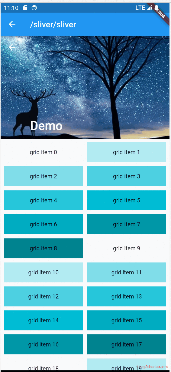
要点如下:
- 使用CustomScrollView,作为Sliver的容器。在CustomScrollView下只能存放Sliver组件,不能存放普通的RenderBox组件。因为两者的布局协议是不一样的。
- SliverAppBar,一个允许吸顶和floating的header
- SliverPadding,在Sliver容器下Padding组件,它的childWidget也只能是Sliver
- DecoratedSliver,在Sliver容器下的DecoratedBox组件,它的childWidget也只能是Sliver
- SliverGrid,在Sliver容器下的GridView组件。
- SliverList,在Sliver容器下的ListView组件。
- SliverToBoxAdapter,可以嵌套普通的RenderBox组件,但是注意嵌套的RenderBox组件的滚动轴方向必须是不相同的。例如在垂直方向的CustomScrollView可以嵌套水平方向的PageView,但是不能嵌套垂直方向的PageView,否则会导致滑动手势冲突。
8.2 SliverPersistHeader
import 'package:flutter/cupertino.dart';
import 'package:flutter/material.dart';

class SliverPersistHeaderDemo extends StatelessWidget {
  const SliverPersistHeaderDemo({
    Key? key,
  }) : super(key: key);

  @override
  Widget build(BuildContext context) {
    return Column(children: [
      //sticky 的Header,最小高度为50,初始高度为80,列表下拉的时候,会缩小为高度50
      const Expanded(
          child: PersistentHeaderRoute(
              pinned: true, floating: false, minHeight: 50, maxHeight: 80)),
      Container(
        height: 10,
        color: Colors.red,
      ),
      //sticky 的Header,最小高度为50,初始高度为50,列表下拉的时候,高度不变
      const Expanded(
          child: PersistentHeaderRoute(
              pinned: true, floating: false, minHeight: 50, maxHeight: 50)),
      Container(
        height: 10,
        color: Colors.red,
      ),
      //floating 的Header,最小高度为50,初始高度为80,列表下拉的时候,Header会消失,当稍微向上的时候,Header会重新出现,直至Header完全出现以后(高度80),才能下拉body
      const Expanded(
          child: PersistentHeaderRoute(
              pinned: false, floating: true, minHeight: 50, maxHeight: 80)),
      Container(
        height: 10,
        color: Colors.red,
      ),
      //普通的滚动Header,最小高度为50,初始高度为80,列表下拉的时候,Header会消失,当稍微向上的时候,Header会重新出现
      const Expanded(
          child: PersistentHeaderRoute(
              pinned: false, floating: false, minHeight: 50, maxHeight: 80)),
    ]);
  }
}

class PersistentHeaderRoute extends StatelessWidget {
  final bool pinned;

  final bool floating;

  final double minHeight;

  final double maxHeight;

  const PersistentHeaderRoute(
      {super.key,
      required this.pinned,
      required this.floating,
      required this.minHeight,
      required this.maxHeight});

  @override
  Widget build(BuildContext context) {
    print('$pinned, $floating, $minHeight,$maxHeight');
    return CustomScrollView(
      slivers: [
        SliverPersistentHeader(
          pinned: pinned,
          floating: floating,
          delegate: SliverHeaderDelegate(
            //有最大和最小高度
            pinned: pinned,
            minHeight: minHeight,
            maxHeight: maxHeight,
            child: buildHeader(1),
          ),
        ),
        buildSliverList(),
      ],
    );
  }

  // 构建固定高度的SliverList,count为列表项属相
  Widget buildSliverList([int count = 100]) {
    return SliverFixedExtentList(
      itemExtent: 50,
      delegate: SliverChildBuilderDelegate(
        (context, index) {
          return ListTile(title: Text('$index'));
        },
        childCount: count,
      ),
    );
  }

  // 构建 header
  Widget buildHeader(int i) {
    return Container(
      color: Colors.lightBlue.shade200,
      alignment: Alignment.centerLeft,
      child: Text("PersistentHeader $i"),
    );
  }
}

typedef SliverHeaderBuilder = Widget Function(
    BuildContext context, double shrinkOffset, bool overlapsContent);

class SliverHeaderDelegate extends SliverPersistentHeaderDelegate {
  // child 为 header
  SliverHeaderDelegate({
    required this.maxHeight,
    this.minHeight = 0,
    required this.pinned,
    required Widget child,
  })  : builder = ((a, b, c) => child),
        assert(minHeight <= maxHeight && minHeight >= 0);

  final bool pinned;
  final double maxHeight;
  final double minHeight;
  final SliverHeaderBuilder builder;

  @override
  Widget build(
    BuildContext context,
    double shrinkOffset,
    bool overlapsContent,
  ) {
    Widget child = builder(context, shrinkOffset, overlapsContent);
    //shrinkOffset为0,代表收缩程度最小,header处于最大的展开状态。
    //shrinkOffset为maxHeight,代表收缩程度最大,header处于最小的展开状态。
    //shrinkOffset读数最大为maxHeight,但是实际渲染的时候shrink只需要取maxHeight-minHeight就可以了。
    //因为body的开始渲染位置就是beginPaint = maxHeight - shrinkOffset。

    var headerExtent = maxHeight - shrinkOffset;
    var headerShowHeight = maxHeight - shrinkOffset;
    if (pinned && headerShowHeight < minHeight) {
      headerShowHeight = minHeight;
    }

    print(
        '${child.key}: shrink: $shrinkOffset,headerExtent: $headerExtent,headerHeight: $headerShowHeight, overlaps:$overlapsContent');
    // 让 header 尽可能充满限制的空间;宽度为 Viewport 宽度,
    // 高度随着用户滑动在[minHeight,maxHeight]之间变化。
    return SizedBox.expand(child: child);
  }

  @override
  double get maxExtent => maxHeight;

  @override
  double get minExtent => minHeight;

  @override
  bool shouldRebuild(SliverHeaderDelegate oldDelegate) {
    return oldDelegate.maxExtent != maxExtent ||
        oldDelegate.minExtent != minExtent;
  }
}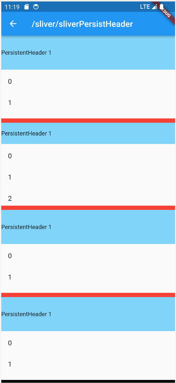
SliverPersistHeader是SliverAppBar的底层实现。要点如下:
- pinned为true的时候,是滚动Header一直存在。在滚动条最顶端的时候处于maxHeight高度,否则处于minHeight的高度。如果minHeight = maxHeight,则header保持大小不变。也就是说,header只有在顶部才会出现,高度处于[minHeight,maxHeight]的状态。
- floating为true的时候,是滚动Header按需显示。当滚动下拉的时候,header可以处于完全消失的状态。当滚动稍微往上方向的时候,header就会逐渐出现。也就是说,header随时都可以出现,高度处于[0,maxHeight]的状态。
- pinned和floating都是为false的时候,是滚动Header仅在滚动条顶部出现,minHeight是没有意义的。也就是说,header只有在顶部才会出现,高度处于[0,maxHeight]的状态。
SliverPersistentHeader需要一个SliverHeaderDelegate
- 返回一个minHeight,和maxHeight的高度。
- 在build回调里面,返回Header组件。
SliverHeaderDelegate在build回调的时候,也能获取得到Sliver的布局约束。
- shrinkOffset为0,代表收缩程度最小,header处于最大的展开状态。
- shrinkOffset为maxHeight,代表收缩程度最大,header处于最小的展开状态。
- header需要渲染的高度就是maxHeight - shrinkOffset。但是在pinned的情况下,实际渲染的时候header的渲染高度最小是minHeight,而不是0。
8.3 SliverMainAxisGroup
import 'package:demo/sliver/sliverPersistHeader.dart';
import 'package:flutter/cupertino.dart';
import 'package:flutter/material.dart';

//看这里
//https://cloud.tencent.com/developer/article/2321484?areaId=106001
class ItemData {
  final String groupName;
  final List<String> users;

  ItemData({required this.groupName, this.users = const []});

  static List<ItemData> get testData => [
        ItemData(groupName: '幻将术士', users: ['梦小梦', '梦千']),
        ItemData(
            groupName: '幻将剑客', users: ['捷特', '龙少', '莫向阳', '何解连', '浪封', '梦飞烟']),
        ItemData(groupName: '幻将弓者', users: ['巫缨', '巫妻孋', '摄王', '裔王', '梦童']),
        ItemData(
            groupName: '其他', users: List.generate(20, (index) => '小兵$index')),
      ];
}

//SliverMainAxisGroup包含一个SliverPersistentHeader和SliverList就可以轻松做到分组吸顶的效果
class SliverMainAxisGroupDemo extends StatelessWidget {
  const SliverMainAxisGroupDemo({super.key});

  @override
  Widget build(BuildContext context) {
    return CustomScrollView(
      slivers: ItemData.testData.map(_buildGroup).toList(),
    );
  }

  Widget _buildGroup(ItemData itemData) {
    return SliverMainAxisGroup(slivers: [
      SliverPersistentHeader(
        pinned: true,
        delegate: SliverHeaderDelegate(
          minHeight: 40,
          maxHeight: 40,
          pinned: true,
          child: Container(
            alignment: Alignment.centerLeft,
            color: const Color(0xffF6F6F6),
            padding: const EdgeInsets.only(left: 20),
            height: 40,
            child: Text(itemData.groupName),
          ),
        ),
      ),
      SliverList(
        delegate: SliverChildBuilderDelegate(
          (_, index) => _buildItemByUser(itemData.users[index]),
          childCount: itemData.users.length,
        ),
      ),
    ]);
  }

  Widget _buildItemByUser(String user) {
    return Container(
      alignment: Alignment.center,
      height: 56,
      child: Row(
        children: [
          const Padding(
            padding: EdgeInsets.only(left: 20, right: 10.0),
            child: FlutterLogo(size: 30),
          ),
          Text(
            user,
            style: const TextStyle(fontSize: 16),
          ),
        ],
      ),
    );
  }
}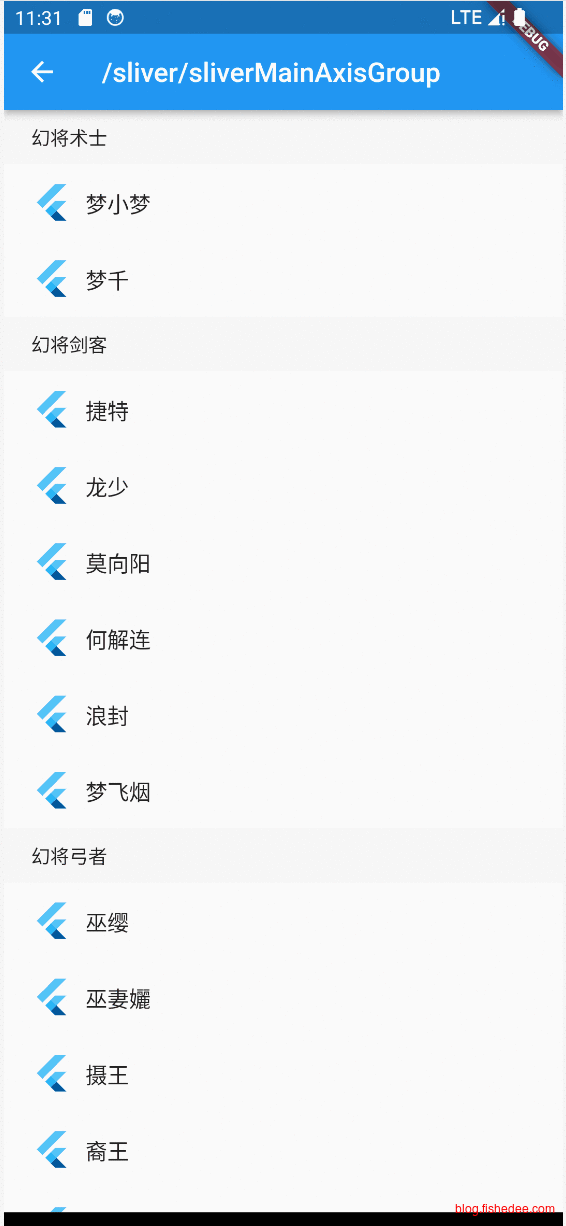
SliverMainAxisGroup其实都挺简单的。
- SliverMainAxisGroup包含一个SliverPersistentHeader和SliverList就可以轻松做到分组吸顶的效果
8.4 SliverRefreshControl
import 'package:flutter/cupertino.dart';
import 'package:flutter/material.dart';

class SliverRefreshControlDemo extends StatefulWidget {
  const SliverRefreshControlDemo({
    Key? key,
  }) : super(key: key);

  @override
  State<SliverRefreshControlDemo> createState() => _SilverRefreshControlDemo();
}

class _SilverRefreshControlDemo extends State<SliverRefreshControlDemo> {
  ScrollController _scrollController = new ScrollController();

  var count = 30;

  var isRefreshing = false;

  @override
  void initState() {
    super.initState();
    _scrollController.addListener(() {
      if (_scrollController.position.pixels + 20 >=
          _scrollController.position.maxScrollExtent) {
        _getMoreData();
      }
    });
  }

  _getMoreData() async {
    if (isRefreshing) {
      return;
    }
    isRefreshing = true;
    print('getMoreData');
    //模拟网络请求
    await Future.delayed(const Duration(milliseconds: 1000));
    setState(() {
      count += 30;
    });
    isRefreshing = false;
  }

  @override
  Widget build(BuildContext context) {
    return CustomScrollView(
      physics: const BouncingScrollPhysics(),
      controller: _scrollController,
      slivers: [
        //下拉刷新组件
        CupertinoSliverRefreshControl(
          /// 刷新过程中悬浮高度
          refreshIndicatorExtent: 60,

          ///触发刷新的距离
          refreshTriggerPullDistance: 100,

          /// 自定义布局
          builder: (context, buildRefreshindictor, pulledExtent,
              refreshTriggerPullDistance, refreshIndicatorExtent) {
            final text = switch (buildRefreshindictor) {
              RefreshIndicatorMode.armed => '松开刷新',
              RefreshIndicatorMode.refresh => '正在刷新',
              RefreshIndicatorMode.drag => '下拉刷新',
              RefreshIndicatorMode.inactive => '未开始',
              RefreshIndicatorMode.done => '刷新完成',
            };
            print(
                'pulledExtent : ${pulledExtent}   ,refreshTriggerPullDistance  : ${refreshTriggerPullDistance}    refreshIndicatorExtent:${refreshIndicatorExtent} $buildRefreshindictor');
            return Container(
              color: Colors.redAccent,
              height: 150,
              alignment: Alignment.center,
              child: AnimatedOpacity(
                  duration: const Duration(milliseconds: 300),
                  //opacity: top == 80.0 ? 1.0 : 0.0,
                  opacity: 1.0,
                  child: Text(
                    '已拉动:${pulledExtent.round()} $text',
                    style: const TextStyle(fontSize: 12.0),
                  )),
            );
          },
          //下拉刷新回调
          onRefresh: () async {
            //模拟网络请求
            await Future.delayed(const Duration(milliseconds: 1000));
            setState(() {
              count = 30;
            });
            //结束刷新
            return;
          },
        ),
        buildSliverList(count),
        SliverToBoxAdapter(
          //可以嵌套任意非silver组件。
          child: Container(
            padding: const EdgeInsets.symmetric(vertical: 30),
            alignment: Alignment.center,
            decoration: BoxDecoration(
              border: Border.all(color: Colors.red, width: 1),
              color: Colors.yellow,
            ),
            child: const Text("获取更多"),
          ),
        ),
      ],
    );
  }

  // 构建固定高度的SliverList,count为列表项属相
  Widget buildSliverList(int count) {
    return SliverFixedExtentList(
      itemExtent: 50,
      delegate: SliverChildBuilderDelegate(
        (context, index) {
          return ListTile(title: Text('$index'));
        },
        childCount: count,
      ),
    );
  }
}
要点如下:
- CustomScrollView,需要设置为BouncingScrollPhysics。
- 使用CupertinoSliverRefreshControl,指定触发悬浮和触发距离,传入builder,建立不同刷新状态下的刷新描述。onRefresh就是下拉触发
- 使用scrollController来获取是否到底的标记。
8.5 自定义Sliver组件
我们尝试自定义一个Sliver组件,以更好地理解Sliver的布局协议。
参考资料,看这里
Sliver 的布局协议如下:
- Viewport 将当前布局和配置信息通过 SliverConstraints 传递给 Sliver。
- Sliver 确定自身的位置、绘制等信息,保存在 geometry 中(一个 SliverGeometry 类型的对象)。
- Viewport 读取 geometry 中的信息来对 Sliver 进行布局和绘制。
可以看到,这个过程有两个重要的对象 SliverConstraints 和 SliverGeometry ,我们先看看 SliverConstraints 的定义:
class SliverConstraints extends Constraints {
    //主轴方向
    AxisDirection? axisDirection;
    //Sliver 沿着主轴从列表的哪个方向插入?枚举类型,正向或反向
    GrowthDirection? growthDirection;
    //用户滑动方向
    ScrollDirection? userScrollDirection;
    //当前Sliver理论上(可能会固定在顶部)已经滑出可视区域的总偏移
    double? scrollOffset;
    //当前Sliver之前的Sliver占据的总高度,因为列表是懒加载,如果不能预估时,该值为double.infinity
    double? precedingScrollExtent;
    //上一个 sliver 覆盖当前 sliver 的长度(重叠部分的长度),通常在 sliver 是 pinned/floating
    //或者处于列表头尾时有效,我们在后面的小节中会有相关的例子。
    double? overlap;
    //当前Sliver在Viewport中的最大可以绘制的区域。
    //绘制如果超过该区域会比较低效(因为不会显示)
    double? remainingPaintExtent;
    //纵轴的长度;如果列表滚动方向是垂直方向,则表示列表宽度。
    double? crossAxisExtent;
    //纵轴方向
    AxisDirection? crossAxisDirection;
    //Viewport在主轴方向的长度;如果列表滚动方向是垂直方向,则表示列表高度。
    double? viewportMainAxisExtent;
    //Viewport 预渲染区域的起点[-Viewport.cacheExtent, 0]
    double? cacheOrigin;
    //Viewport加载区域的长度,范围:
    //[viewportMainAxisExtent,viewportMainAxisExtent + Viewport.cacheExtent*2]
    double? remainingCacheExtent;
}
可以看见 SliverConstraints 中包含的信息非常多。当列表滑动时,如果某个 Sliver 已经进入了需要构建的区域,则列表会将 SliverConstraints 信息传递给该 Sliver,Sliver 就可以根据这些信息来确定自身的布局和绘制信息了。
Sliver 需要确定的是 SliverGeometry:
const SliverGeometry({
  //Sliver在主轴方向预估长度,大多数情况是固定值,用于计算sliverConstraints.scrollOffset
  this.scrollExtent = 0.0,
  this.paintExtent = 0.0, // 可视区域中的绘制长度
  this.paintOrigin = 0.0, // 绘制的坐标原点,相对于自身布局位置
  //在 Viewport中占用的长度;如果列表滚动方向是垂直方向,则表示列表高度。
  //范围[0,paintExtent]
  double? layoutExtent,
  this.maxPaintExtent = 0.0,//最大绘制长度
  this.maxScrollObstructionExtent = 0.0,
  double? hitTestExtent, // 点击测试的范围
  bool? visible,// 是否显示
  //是否会溢出Viewport,如果为true,Viewport便会裁剪
  this.hasVisualOverflow = false,
  //scrollExtent的修正值:layoutExtent变化后,为了防止sliver突然跳动(应用新的layoutExtent)
  //可以先进行修正,具体的作用在后面 SliverFlexibleHeader 示例中会介绍。
  this.scrollOffsetCorrection,
  double? cacheExtent, // 在预渲染区域中占据的长度
})
8.5.1 基础
import 'dart:math';
import 'dart:ui';

import 'package:flutter/cupertino.dart';
import 'package:flutter/material.dart';
import 'package:flutter/rendering.dart';

class SliverCustomDemo extends StatelessWidget {
  const SliverCustomDemo({
    Key? key,
  }) : super(key: key);

  @override
  Widget build(BuildContext context) {
    return CustomScrollView(
      slivers: [
        //我们需要实现的 SliverFlexibleHeader 组件
        MySilverToBoxAdapter(
          child: Image.asset("assets/images/star.webp"),
        ),
        // 构建一个list
        buildSliverList(30),
      ],
    );
  }

  // 构建固定高度的SliverList,count为列表项属相
  Widget buildSliverList(int count) {
    return SliverFixedExtentList(
      itemExtent: 50,
      delegate: SliverChildBuilderDelegate(
        (context, index) {
          return ListTile(title: Text('$index'));
        },
        childCount: count,
      ),
    );
  }
}

//看SilverToBoxAdapter的代码
class MySilverToBoxAdapter extends SingleChildRenderObjectWidget {
  const MySilverToBoxAdapter({
    Key? key,
    required Widget child,
  }) : super(key: key, child: child);

  @override
  RenderObject createRenderObject(BuildContext context) {
    //返回的是RenderSliver,而不是RenderBox,使用专用的 Sliver 布局协议
    return RenderMySilverToBoxAdapter();
  }
}

//关键要看RenderSliverToBoxAdapter的代码
class RenderMySilverToBoxAdapter extends RenderSliverSingleBoxAdapter {
  RenderMySilverToBoxAdapter();

  @override
  void performLayout() {
    //对child进行布局
    child!.layout(constraints.asBoxConstraints(), parentUsesSize: true);
    final double childExtent = child!.size.height;

    //可以简单地理解为max(childExtent - constraints.scrollOffset, 0)
    final double paintedChildSize =
        calculatePaintOffset2(constraints, from: 0.0, to: childExtent);

    print(
        'scrollExtent childExtent:$childExtent offset:${constraints.scrollOffset}, paintedChildSize:$paintedChildSize');
    geometry = SliverGeometry(
      //在滚动条中占有的位置
      scrollExtent: childExtent,
      //在当前viewport的paint中起始渲染位置
      paintOrigin: 0,
      //在当前viewport的paint中渲染的大小
      paintExtent: paintedChildSize,
      //在当前viewport的paint中最大占用的位置
      maxPaintExtent: childExtent,
      //在当前viewPort中的piant中占用的位置,这个不填的话,默认就是paintExtent
      layoutExtent: paintedChildSize,
    );

    //设置child的起始渲染位置
    setChildParentData2(child!, constraints, geometry!);
  }

  double calculatePaintOffset2(SliverConstraints constraints,
      {required double from, required double to}) {
    assert(from <= to);
    final double a = constraints.scrollOffset;
    final double b =
        constraints.scrollOffset + constraints.remainingPaintExtent;
    return clampDouble(clampDouble(to, a, b) - clampDouble(from, a, b), 0.0,
        constraints.remainingPaintExtent);
  }

  @protected
  void setChildParentData2(RenderObject child, SliverConstraints constraints,
      SliverGeometry geometry) {
    final SliverPhysicalParentData childParentData =
        child.parentData! as SliverPhysicalParentData;
    childParentData.paintOffset = Offset(0.0, -constraints.scrollOffset);
  }
}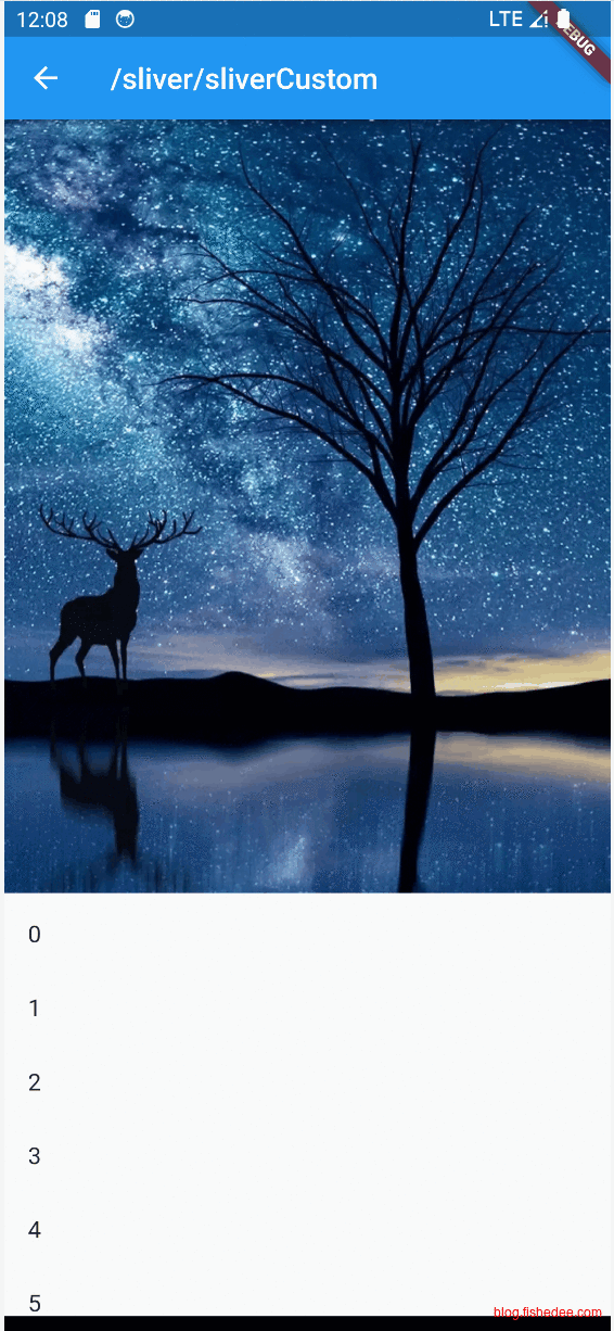
Sliver组件中有一个为SliverToBoxAdapter,它可以将普通的RenderBox组件转换为Sliver组件。我们这个demo做类似的行为,将任意的RenderBox转换为Sliver组件,为了简化,我们只实现了
- 垂直方向的RenderBox转换
- 仅考虑普通ltr方向的滚动
- 不考虑cacheExtent的处理
MySilverToBoxAdapter的流程:
- 创建对应的RenderObject,为RenderMySilverToBoxAdapter。这是每个MySilverToBoxAdapter的Widget所对应的Element,实际layout和paint所使用的RenderObject。
- 由于MySliverToBoxAdapter,包含了一个child,直接从RenderSliverSingleBoxAdapter继承来使用。
- performLayout是实际布局的开始,先调用child.laoyout。由于child是RenderBox,不能直接使用SliverConstraints,我们使用asConstraint,转换为普通的SliverConstraints。
- child布局完成以后,我们就能得到它的width和height了。
由于我们只渲染viewport里面的child数据。
- paintOrigin为0,从viewport顶部开始渲染
- paintExtent = childExtent - constraints.scrollOffset,当前的childWidgt的高度,减去scrollOffset已经遮挡的部分。注意,这里的scrollOffset总是相对于,当前widget的scrollOffset,不是整个滚动条的scrollOffset。
- scrollExtent = layoutExtent = childExtent,无论child滚动到哪个位置,它在滚动条中总是占用的位置。
最后,由于我们只是渲染了childWidgt的可见部分(childExtent - constraints.scrollOffset),所以,childWidget在viewport渲染的时候,需要先往上偏移constraints.scrollOffset的。这就是最后一行设置childParentData.paintOffset的原因。
8.5.2 仿微信朋友圈
import 'dart:math';
import 'dart:ui';

import 'package:flutter/cupertino.dart';
import 'package:flutter/material.dart';
import 'package:flutter/rendering.dart';

class SliverCustomDemo2 extends StatelessWidget {
  const SliverCustomDemo2({
    Key? key,
  }) : super(key: key);

  @override
  Widget build(BuildContext context) {
    return CustomScrollView(
      //为了能使CustomScrollView拉到顶部时还能继续往下拉,必须让 physics 支持弹性效果
      physics: const BouncingScrollPhysics(),
      slivers: [
        //我们需要实现的 SliverFlexibleHeader 组件
        SliverFlexibleHeader(
          visibleExtent: 200, // 初始状态在列表中占用的布局高度
          // 为了能根据下拉状态变化来定制显示的布局,我们通过一个 builder 来动态构建布局。
          builder: (context) {
            var result = GestureDetector(
              onTap: () => print('tap'), //测试是否可以响应事件
              child: const Image(
                image: AssetImage("assets/images/star.webp"),
                alignment: Alignment.bottomCenter,
                fit: BoxFit.cover,
              ),
            );
            return result;
          },
        ),
        // 构建一个list
        buildSliverList(30),
      ],
    );
  }

  // 构建固定高度的SliverList,count为列表项属相
  Widget buildSliverList(int count) {
    return SliverFixedExtentList(
      itemExtent: 50,
      delegate: SliverChildBuilderDelegate(
        (context, index) {
          return ListTile(title: Text('$index'));
        },
        childCount: count,
      ),
    );
  }
}

typedef SliverFlexibleHeaderBuilder = Widget Function(
  BuildContext context,
  //ScrollDirection direction,
);

class SliverFlexibleHeader extends StatelessWidget {
  const SliverFlexibleHeader({
    Key? key,
    required this.builder,
    required this.visibleExtent,
  }) : super(key: key);

  final double visibleExtent;

  final SliverFlexibleHeaderBuilder builder;

  @override
  Widget build(BuildContext context) {
    //关键是实现_SliverFlexibleHeader
    return _SliverFlexibleHeader(
      visibleExtent: visibleExtent,
      child: LayoutBuilder(
        builder: (BuildContext context, BoxConstraints constraints) {
          return builder(context);
        },
      ),
    );
  }
}

class _SliverFlexibleHeader extends SingleChildRenderObjectWidget {
  _SliverFlexibleHeader({
    Key? key,
    required Widget child,
    required this.visibleExtent,
  }) : super(key: key, child: child);

  double visibleExtent;

  @override
  RenderObject createRenderObject(BuildContext context) {
    //返回的是RenderSliver,而不是RenderBox,使用专用的 Sliver 布局协议
    return _FlexibleHeaderRenderSliver(visibleExtent);
  }
}

//_FlexibleHeaderRenderSliver的目标是
//在performLayout中
//1. 获取当前的constraints
//2. 对child进行布局计算
//3. 设置本地geometry变量,以供CustomScrollView进行布局使用
class _FlexibleHeaderRenderSliver extends RenderSliverSingleBoxAdapter {
  _FlexibleHeaderRenderSliver(this.visibleExtent);

  double visibleExtent;

  @override
  void performLayout() {
    //对child进行布局
    child!.layout(constraints.asBoxConstraints(), parentUsesSize: true);
    final double childExtent = child!.size.height;
    double offsetAdd = constraints.overlap < 0 ? constraints.overlap.abs() : 0;

    var offsetFixedSub = childExtent - visibleExtent;

    //可以简单地理解为max(visibleExtent - constraints.scrollOffset, 0)
    final double paintedChildSize =
        calculatePaintOffset(constraints, from: 0.0, to: visibleExtent);

    print(
        'scrollExtent childExtent:$childExtent offset:${constraints.scrollOffset}, paintedChildSize:${paintedChildSize + offsetAdd}');

    geometry = SliverGeometry(
      //在滚动条中占有的位置
      scrollExtent: visibleExtent,
      //paintOrigin,负数的话,代表从可见viewPort往上偏移开始渲染
      paintOrigin: -offsetFixedSub,
      //在当前可见viewport的paint中渲染的大小
      paintExtent: paintedChildSize + offsetAdd,
      //在当前可见viewport的paint中最大占用的位置
      maxPaintExtent: paintedChildSize + offsetAdd,
    );

    //设置child的起始渲染位置
    final newChild = child!.parentData!;
    final SliverPhysicalParentData childParentData =
        newChild as SliverPhysicalParentData;
    childParentData.paintOffset =
        Offset(0.0, -constraints.scrollOffset + offsetAdd);
  }
}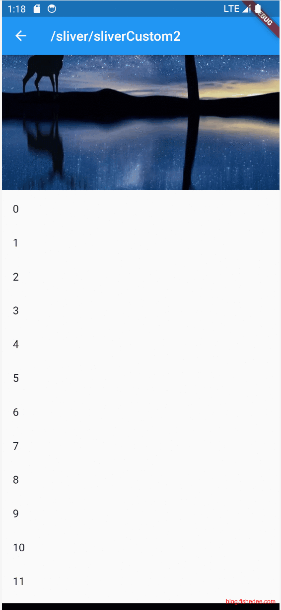
高仿微信朋友圈的果冻效果,要点如下:
- 图片占有较高的高度,但是仅显示高度为200,在滚动条的位置也是200,多余的部分在可见viewport以外进行渲染。
- 当滚动条过度滚动,也就是overlap的时候,需要将多余的部分显示出来。
因此:
- scrollExtennt = max(visibleExtent - constraints.scrollOffset, 0),而不是childExtent。
- 从不可见部分开始渲染,所以paintOrgin = visibleExtent - childExtent
- 当滚动条过度滚动的时候,scrollOffset依然为0,但是overlap会变成一个负数。
- 这个时候,paintExtent就是已有的paintedChildSize+overlap。当overlap出现的时候,图片就需要往下移动,所以childParentData.paintOffset = Offset(0.0, -constraints.scrollOffset + offsetAdd);
8.6 NestedScrollView
CustomScrollView虽然如此强大,但是它依然无法包含所有的Sliver场景。例如
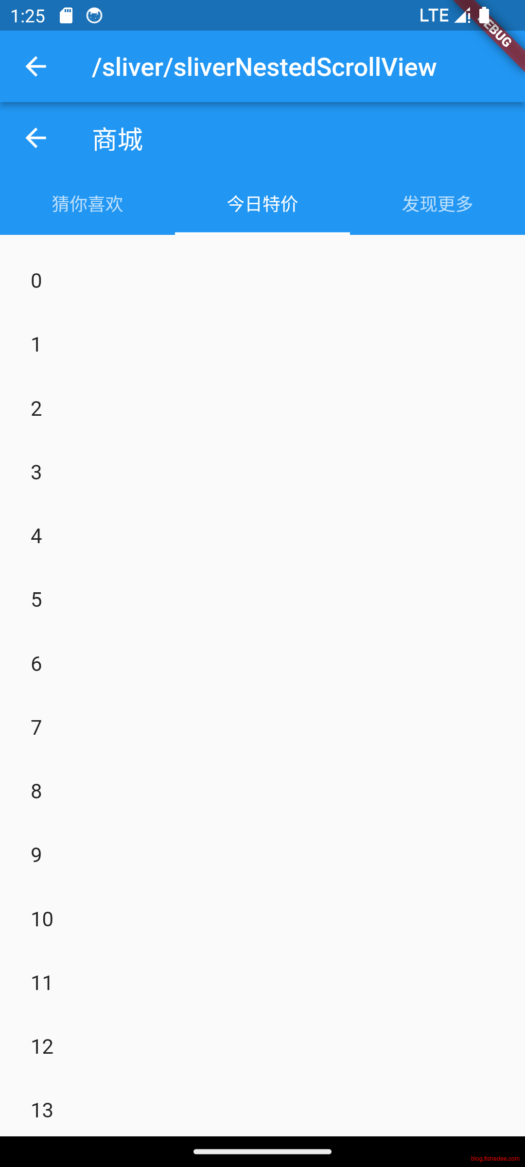
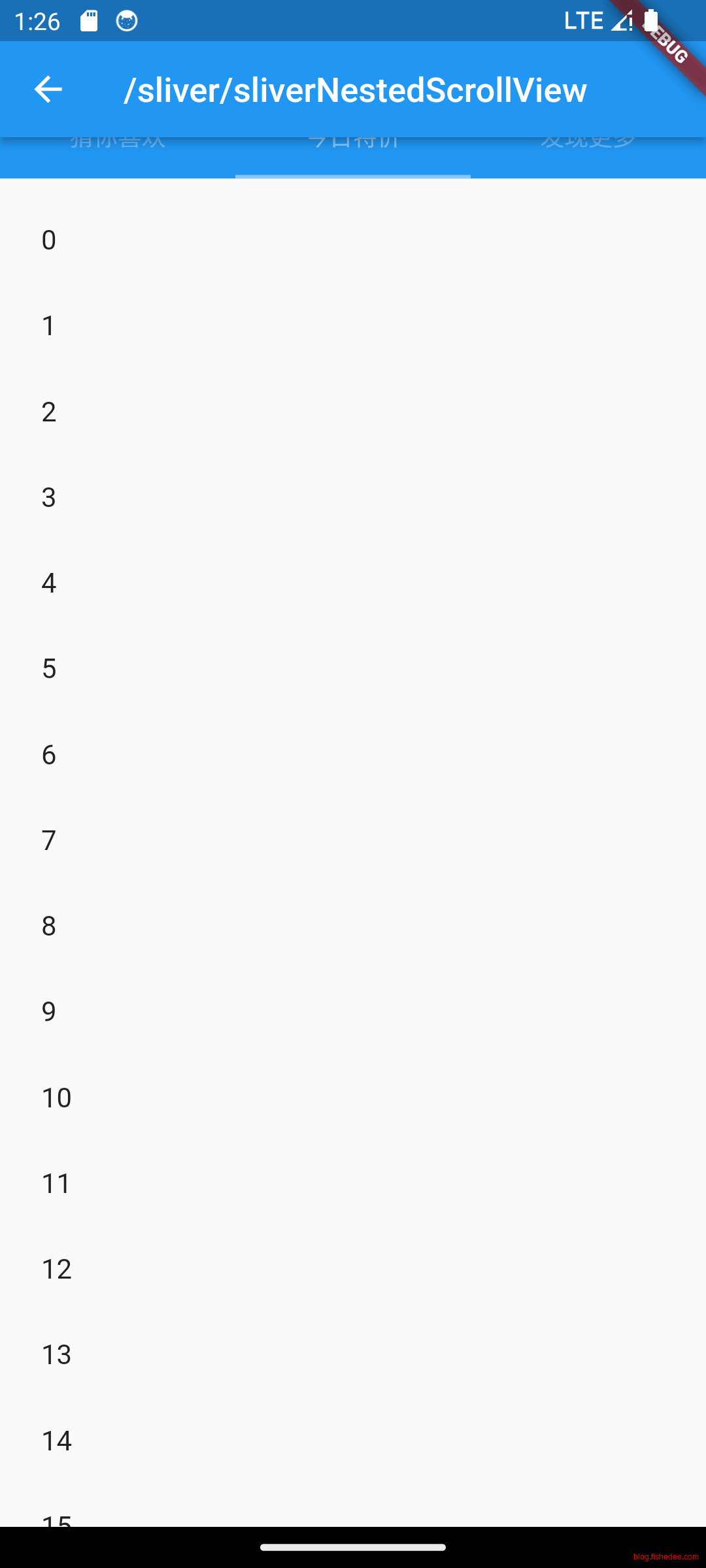
AppBar和下方的TabView是共用一个滚动区域的。因为AppBar是floating出现的AppBar,是按需浮动出现的,需要侦听滚动变化才能按需出现。但是TabView虽然是滚动组件,但是没有对应的Sliver组件。
这种情况就很尴尬了,如果AppBar和TabView各自使用的话,各自都有一个滚动条,无法做到协同隐藏和出现AppBar。如果AppBar和TabView共用一个滚动条的话,它们需要一起放在CustomScrollView中,可是TabView不是一个Sliver组件,无法直接放到CustomScrollView里面,所以显示也是不对的。
为了解决这个问题,flutter提供了NestedScrollView。它的方法是为AppBar和TabView提供各自的滚动区域,然后通过协同滚动区域来模拟实现单一滚动区域的效果。这只是一个tradeoff的操作,在实际操作中,我们还是强烈建议尽可能使用CustomScrollView + Sliver的实现方式。
注意,不要企图将TabView放入到SliverToBoxAdapter,或者打开TabView的shrinkWrap属性,这样会将TabView从虚拟滚动退化为普通滚动,每次layout和paint都会将整个TabView的所有组件都计算出来,这明显是一个严重的性能问题。
因此,禁止打开滚动组件的shrinkWrap属性,也禁止将列表组件放入SliverToBoxAdapter。
8.6.1 AppBar与TabView嵌套的下ScrollView
import 'package:flutter/material.dart';

class SliverNestedScrollViewDemo extends StatelessWidget {
  const SliverNestedScrollViewDemo({Key? key}) : super(key: key);

  @override
  Widget build(BuildContext context) {
    final _tabs = <String>['猜你喜欢', '今日特价', '发现更多'];
    // 构建 tabBar
    return DefaultTabController(
      length: _tabs.length, // tab的数量.
      child: Scaffold(
        body: NestedScrollView(
          headerSliverBuilder: (BuildContext context, bool innerBoxIsScrolled) {
            return <Widget>[
              SliverAppBar(
                title: const Text('商城'),
                floating: true,
                snap: true,
                forceElevated: innerBoxIsScrolled,
                bottom: TabBar(
                  tabs: _tabs.map((String name) => Tab(text: name)).toList(),
                ),
              ),
            ];
          },
          body: TabBarView(
            children: _tabs.map((String name) {
              return Builder(
                builder: (BuildContext context) {
                  return CustomScrollView(
                    key: PageStorageKey<String>(name),
                    slivers: <Widget>[
                      SliverPadding(
                        padding: const EdgeInsets.all(8.0),
                        sliver: buildSliverList(50),
                      ),
                    ],
                  );
                },
              );
            }).toList(),
          ),
        ),
      ),
    );
  }

  // 构建固定高度的SliverList,count为列表项属相
  Widget buildSliverList(int count) {
    return SliverFixedExtentList(
      itemExtent: 50,
      delegate: SliverChildBuilderDelegate(
        (context, index) {
          return ListTile(title: Text('$index'));
        },
        childCount: count,
      ),
    );
  }
}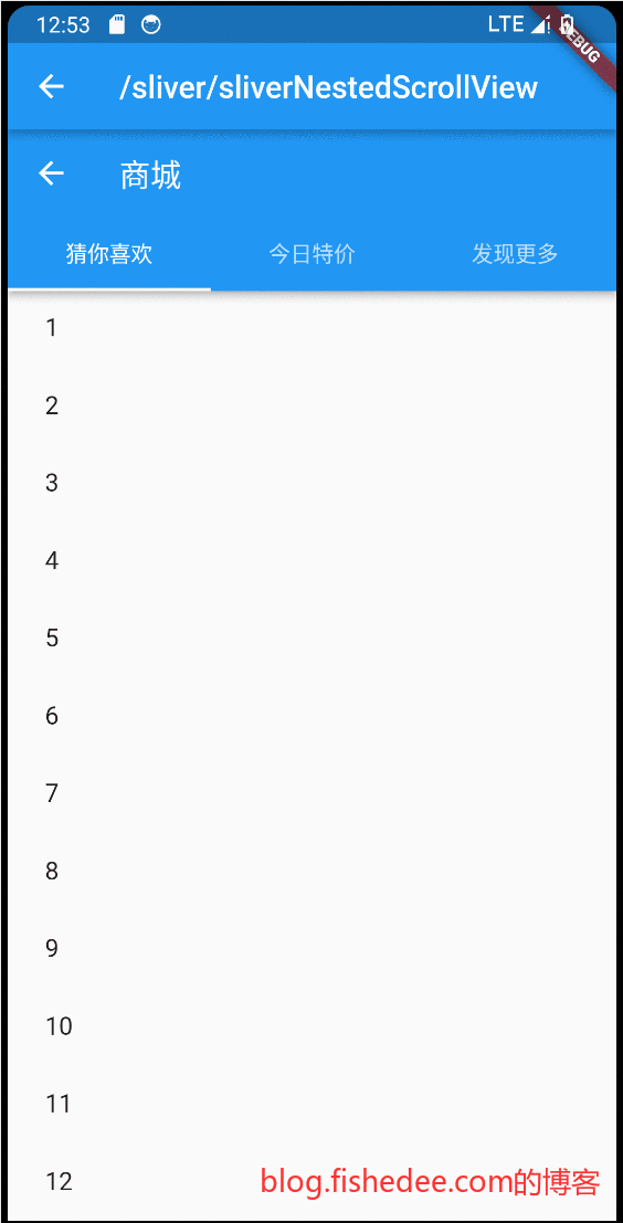
要点如下:
- 将AppBar和TabBarView都全部放在NestedScrollView里面。
- NestedScrollView的headerSliverBuilder存放sliver组件,body存放普通的RenderBox组件。
在Demo中,我们可以看到一些小瑕疵,在往上滚动的情况中,floating的AppBar会逐渐出现。但是这个AppBar的出现没有让TabBarView往下移动,直接导致了TabBarView的部分页面被AppBar遮挡了
8.6.2 SliverOverlapAbsorber滚动协调
import 'package:flutter/material.dart';

class SliverNestedScrollViewDemo2 extends StatelessWidget {
  const SliverNestedScrollViewDemo2({Key? key}) : super(key: key);

  @override
  Widget build(BuildContext context) {
    final _tabs = <String>['猜你喜欢', '今日特价', '发现更多'];
    // 构建 tabBar
    return DefaultTabController(
      length: _tabs.length, // tab的数量.
      child: Scaffold(
        body: NestedScrollView(
          headerSliverBuilder: (BuildContext context, bool innerBoxIsScrolled) {
            return <Widget>[
              SliverOverlapAbsorber(
                handle:
                    NestedScrollView.sliverOverlapAbsorberHandleFor(context),
                sliver: SliverAppBar(
                  title: const Text('商城'),
                  floating: true,
                  snap: true,
                  forceElevated: innerBoxIsScrolled,
                  bottom: TabBar(
                    tabs: _tabs.map((String name) => Tab(text: name)).toList(),
                  ),
                ),
              ),
            ];
          },
          body: TabBarView(
            children: _tabs.map((String name) {
              return Builder(
                builder: (BuildContext context) {
                  return CustomScrollView(
                    key: PageStorageKey<String>(name),
                    slivers: <Widget>[
                      SliverOverlapInjector(
                        handle: NestedScrollView.sliverOverlapAbsorberHandleFor(
                            context),
                      ),
                      SliverPadding(
                        padding: const EdgeInsets.all(8.0),
                        sliver: buildSliverList(50),
                      ),
                    ],
                  );
                },
              );
            }).toList(),
          ),
        ),
      ),
    );
  }

  // 构建固定高度的SliverList,count为列表项属相
  Widget buildSliverList(int count) {
    return SliverFixedExtentList(
      itemExtent: 50,
      delegate: SliverChildBuilderDelegate(
        (context, index) {
          return ListTile(title: Text('$index'));
        },
        childCount: count,
      ),
    );
  }
}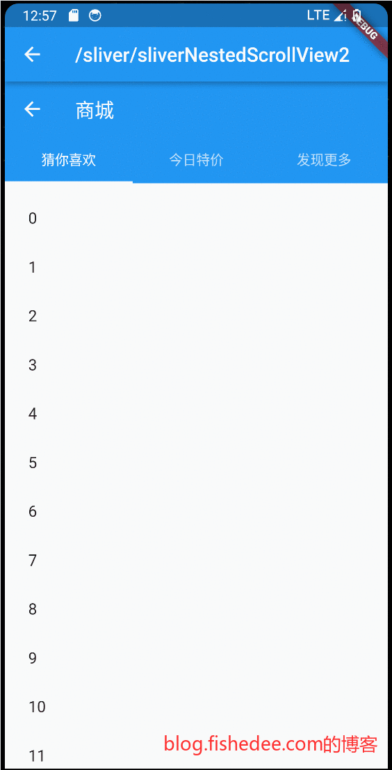
要点如下:
- NestedScrollView的header组件用SliverOverlapAbsorber包裹起来。
- NestedScrollView的body组件,增加一个SliverOverlapInjector的子控件就可以了。
这样的话,当AppBar往下浮现的时候,TabBarView也会同步往下移动,以保证TabBarView不会被遮挡
9 功能性组件
代码在这里
9.1 PopScope
import 'package:flutter/material.dart';

class PopScopeDemo extends StatefulWidget {
  const PopScopeDemo({
    Key? key,
  }) : super(key: key);

  @override
  WillPopScopeTestRouteState createState() {
    return WillPopScopeTestRouteState();
  }
}

class WillPopScopeTestRouteState extends State<PopScopeDemo> {
  bool canPopScope = false;

  final snackBar = SnackBar(
    content: const Text('1秒内再按一次确认返回'),
    duration: const Duration(seconds: 1),
    action: SnackBarAction(
      label: '',
      onPressed: () {
        // Some code to undo the change.
      },
    ),
  );

  DateTime? _lastPressedAt;

  @override
  Widget build(BuildContext context) {
    return PopScope(
      canPop: false,
      onPopInvoked: (didPop) {
        if (didPop) {
          return;
        }
        if (_lastPressedAt == null ||
            DateTime.now().difference(_lastPressedAt!) >
                const Duration(seconds: 1)) {
          //两次点击间隔超过1秒则重新计时
          _lastPressedAt = DateTime.now();
          ScaffoldMessenger.of(context).showSnackBar(snackBar);
          setState(() {
            canPopScope = false;
          });
          return;
        }
        ScaffoldMessenger.of(context).hideCurrentSnackBar();
        Navigator.pop(context);
      },
      child: Container(
        alignment: Alignment.center,
        child: const Text("1秒内连续按两次返回键退出"),
      ),
    );
  }
}
要点如下:
- PopScope,阻止默认的返回操作,包括点击返回按钮的操作。
- canPop为false的时候,就能阻止默认的返回操作。然后在onPopInvoked回调里面按需pop就可以了
9.2 Provider
// 一个通用的InheritedWidget,保存需要跨组件共享的状态
import 'dart:collection';

import 'package:flutter/material.dart';

//相当于react里面的context
//可以跨组件进行获取数据,常用于主题数据的获取
class InheritedProvider<T> extends InheritedWidget {
  const InheritedProvider({
    super.key,
    required this.data,
    required Widget child,
  }) : super(child: child);

  final T data;

  @override
  bool updateShouldNotify(InheritedProvider<T> old) {
    //在此简单返回true,则每次更新都会调用依赖其的子孙节点的`didChangeDependencies`。
    return true;
  }
}

class ChangeNotifier implements Listenable {
  List listeners = [];
  @override
  void addListener(VoidCallback listener) {
    //添加监听器
    listeners.add(listener);
  }

  @override
  void removeListener(VoidCallback listener) {
    //移除监听器
    listeners.remove(listener);
  }

  void notifyListeners() {
    //通知所有监听器,触发监听器回调
    for (final listener in listeners) {
      listener();
    }
  }
}

//是一个Widget,包装了对ChangeNotifier的addListen和removeListen.
class ShareDataProvider<T extends ChangeNotifier> extends StatefulWidget {
  const ShareDataProvider({
    super.key,
    required this.data,
    required this.child,
  });

  final Widget child;
  final T data;

  //定义一个便捷方法,方便子树中的widget获取共享数据
  static T get<T>(BuildContext context) {
    final provider =
        context.getElementForInheritedWidgetOfExactType<InheritedProvider<T>>();
    return (provider!.widget as InheritedProvider<T>).data;
  }

  //定义一个便捷方法,方便子树和侦听中的widget中的共享数据
  static T listen<T>(BuildContext context) {
    final provider =
        context.dependOnInheritedWidgetOfExactType<InheritedProvider<T>>();
    return provider!.data;
  }

  @override
  State<ShareDataProvider<T>> createState() => _ShareDataProvider<T>();
}

class _ShareDataProvider<T extends ChangeNotifier>
    extends State<ShareDataProvider<T>> {
  void update() {
    //如果数据发生变化(model类调用了notifyListeners),重新构建InheritedProvider
    setState(() => {});
  }

  @override
  void didUpdateWidget(ShareDataProvider<T> oldWidget) {
    //当Provider更新时,如果新旧数据不"==",则解绑旧数据监听,同时添加新数据监听
    if (widget.data != oldWidget.data) {
      oldWidget.data.removeListener(update);
      widget.data.addListener(update);
    }
    super.didUpdateWidget(oldWidget);
  }

  @override
  void initState() {
    // 给model添加监听器
    widget.data.addListener(update);
    super.initState();
  }

  @override
  void dispose() {
    // 移除model的监听器
    widget.data.removeListener(update);
    super.dispose();
  }

  @override
  Widget build(BuildContext context) {
    //注意,这里使用了缓存的child,只要parent不刷新,那么就会一直使用旧的widget
    return InheritedProvider<T>(
      data: widget.data,
      child: widget.child,
    );
  }
}

class Consumer<T> extends StatelessWidget {
  const Consumer({
    super.key,
    required this.builder,
  });

  final Widget Function(BuildContext context, T value) builder;

  @override
  Widget build(BuildContext context) {
    return builder(
      context,
      ShareDataProvider.listen<T>(context),
    );
  }
}

class Item {
  Item(this.price, this.count);
  double price; //商品单价
  int count; // 商品份数
}

class CartModel extends ChangeNotifier {
  // 用于保存购物车中商品列表
  final List<Item> _items = [];

  // 禁止改变购物车里的商品信息
  UnmodifiableListView<Item> get items => UnmodifiableListView(_items);

  // 购物车中商品的总价
  double get totalPrice =>
      _items.fold(0, (value, item) => value + item.count * item.price);

  // 将 [item] 添加到购物车。这是唯一一种能从外部改变购物车的方法。
  void add(Item item) {
    _items.add(item);
    // 通知监听器(订阅者),重新构建InheritedProvider, 更新状态。
    notifyListeners();
  }
}

class ProviderDemo extends StatefulWidget {
  const ProviderDemo({
    super.key,
  });

  @override
  State<ProviderDemo> createState() => _ProviderDemo();
}

//这个唯一的性能缺陷是,从根部开始刷新的话,还是会可能出现多余的build
class _ProviderDemo extends State<ProviderDemo> {
  @override
  Widget build(BuildContext context) {
    return Center(
      child: ShareDataProvider<CartModel>(
        data: CartModel(),
        child: Builder(builder: (context) {
          return Column(
            children: <Widget>[
              Consumer<CartModel>(builder: (context, cart) {
                print("Text build");
                return Text("总价: ${cart.totalPrice}");
              }),
              Builder(builder: (context) {
                print("ElevatedButton build");
                return ElevatedButton(
                  child: const Text("添加商品"),
                  onPressed: () {
                    //给购物车中添加商品,添加后总价会更新
                    ShareDataProvider.get<CartModel>(context)
                        .add(Item(20.0, 1));
                  },
                );
              }),
            ],
          );
        }),
      ),
    );
  }
}
可以看到点击以后,只有Text重新build了,Button没有触发build。
要点在_ProviderDemo。InheritedWidget其实就是React中传递context的方法。但是,InheritedWidget还原生提供了InheritedWidget变化后回调触发。
- ShareDataProvider,提供DataModel数据,并且刷新InheritedWidget的地方。这里的写法有点隐晦,它侦听data的变化,然后重新刷新底层的InheritedWidget。注意,ShareDataProvider的child是一直保持相同引用的,因此重新build底层InheritedWidget的时候,仅仅触发了InheritedWidget对应的依赖组件。InheritedWidget根据updateShouldNotify来判定是否需要触发倾听它事件的widget。
- Consumer,拿出DataModel数据,并侦听InheritedWidget的变化。实现比较简单,通过BuildContext.dependOnInheritedWidgetOfExactType来拿到对应的InheritedWidget即可。
InheritedWidget的用法:
- 跨组件树的数据传递
- 跨组件树的数据触发。
9.3 Builder/StatefulBuilder
import 'package:flutter/material.dart';
import 'package:flutter/widgets.dart';

class BuilderDemo extends StatefulWidget {
  const BuilderDemo({
    super.key,
  });

  @override
  State<BuilderDemo> createState() => _BuilderDemo();
}

class _BuilderDemo extends State<BuilderDemo> {
  @override
  Widget build(BuildContext context) {
    var counter = 0;
    return Column(
      children: [
        ElevatedButton(
          onPressed: () {
            setState(() {});
          },
          child: const Text("全页刷新"),
        ),
        Container(
          color: Colors.red,
          height: 20,
        ),
        Builder(builder: (context) {
          print('build builder');
          return const Text("123");
        }),
        Container(
          color: Colors.red,
          height: 20,
        ),
        StatefulBuilder(builder: (context, setState) {
          print('build StatefulBuilder');
          return Row(
            children: [
              Text("counter_$counter"),
              ElevatedButton(
                onPressed: () {
                  setState(() {
                    //读取的是本地build的变量,在全页刷新的时候,会丢失。
                    //需要将变量放在stateful里面的
                    counter++;
                  });
                },
                child: const Text("inc"),
              )
            ],
          );
        }),
        Container(
          color: Colors.red,
          height: 20,
        ),
        MyStatefulBuilder<MyCounter>(
          builder: (context, useDataRef) {
            print('build MyStatefulBuilder');
            var data = useDataRef(() {
              return MyCounter();
            });
            return Row(
              children: [
                Text("counter_${data.counter}"),
                ElevatedButton(
                  onPressed: () {
                    setState(() {
                      data.inc();
                    });
                  },
                  child: const Text("inc"),
                )
              ],
            );
          },
        )
      ],
    );
  }
}

class MyCounter extends MyChangeNotifier {
  var counter = 0;

  void inc() {
    counter++;
    notifyListeners();
  }
}

class MyChangeNotifier implements Listenable {
  List listeners = [];
  @override
  void addListener(VoidCallback listener) {
    //添加监听器
    listeners.add(listener);
  }

  @override
  void removeListener(VoidCallback listener) {
    //移除监听器
    listeners.remove(listener);
  }

  void notifyListeners() {
    //通知所有监听器,触发监听器回调
    for (final listener in listeners) {
      listener();
    }
  }
}

typedef MyBuilderUseDataRef<T> = T Function(T Function() firstInit);

typedef MyBuilderHandler<T> = Function(
    BuildContext context, MyBuilderUseDataRef<T> useDataRef);

class MyStatefulBuilderInner<T extends MyChangeNotifier>
    extends StatefulWidget {
  const MyStatefulBuilderInner({
    super.key,
    required this.builder,
  });

  final MyBuilderHandler<T> builder;

  @override
  State<MyStatefulBuilderInner<T>> createState() => _MyBuilderInner<T>();
}

class _MyBuilderInner<T extends MyChangeNotifier>
    extends State<MyStatefulBuilderInner<T>> {
  late final T data;

  bool hasInit = false;

  Widget? cacheWidget;

  @override
  void initState() {
    super.initState();
  }

  @override
  void dispose() {
    super.dispose();
    if (this.hasInit) {
      data.removeListener(refresh);
    }
  }

  refresh() {
    setState(() {});
  }

  T useDataRef(T Function() firstInit) {
    if (hasInit) {
      return data;
    }
    data = firstInit();
    data.addListener(refresh);
    hasInit = true;
    return data;
  }

  @override
  Widget build(BuildContext context) {
    return widget.builder(context, useDataRef);
  }
}

class MyStatefulBuilder<T extends MyChangeNotifier> extends StatefulWidget {
  const MyStatefulBuilder({
    super.key,
    required this.builder,
  });

  final MyBuilderHandler<T> builder;

  @override
  State<MyStatefulBuilder<T>> createState() => _MyStatefulBuilder<T>();
}

class _MyStatefulBuilder<T extends MyChangeNotifier>
    extends State<MyStatefulBuilder<T>> {
  Widget? _oldWidget;

  @override
  Widget build(BuildContext context) {
    var old = _oldWidget;
    if (old == null) {
      var newWidget = MyStatefulBuilderInner(builder: widget.builder);
      _oldWidget = newWidget;
      return newWidget;
    }
    return old;
  }
}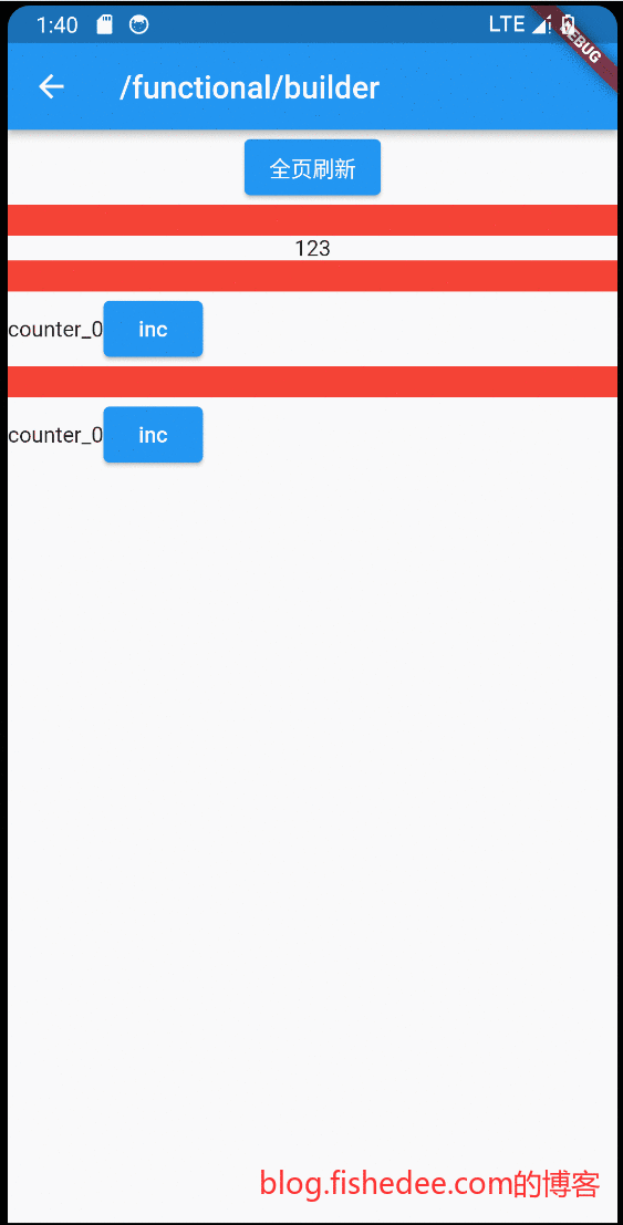
- Builder,是通用方法,可以在不声明StatelssWidget的情况下,以函数的方式返回一个Widget组件。
- StatefulBuilder,允许在纯组件中创建一个非纯组件的方法。但是,仍然没有解决State数据应该放哪里的问题。因为在纯组件中,所有的数据都是final的,不允许修改的,State放在纯组件的成员变量,肯定不行。如果State放在纯组件的build函数是可以的,但是如果纯组件重新build的话,状态就会丢失。
- MyStatefulBuilder,以类似React的方法创建一个hook,可以读取非纯组件里面的data数据。可以看一下源代码的实现方法。
9.4 ValueListenableBuilder
import 'package:flutter/material.dart';

class ValueListenableDemo extends StatefulWidget {
  const ValueListenableDemo({Key? key}) : super(key: key);

  @override
  State<ValueListenableDemo> createState() => _ValueListenableState();
}

class _ValueListenableState extends State<ValueListenableDemo> {
  // 定义一个ValueNotifier,当数字变化时会通知 ValueListenableBuilder
  final ValueNotifier<int> _counter = ValueNotifier<int>(0);
  static const double textScaleFactor = 1.5;

  @override
  Widget build(BuildContext context) {
    // 添加 + 按钮不会触发整个 ValueListenableRoute 组件的 build
    print('build');
    return Scaffold(
      appBar: AppBar(title: Text('ValueListenableBuilder 测试')),
      body: Center(
        child: ValueListenableBuilder<int>(
          builder: (BuildContext context, int value, Widget? child) {
            // builder 方法只会在 _counter 变化时被调用
            return Row(
              mainAxisAlignment: MainAxisAlignment.center,
              children: <Widget>[
                child!,
                Text('$value 次', textScaleFactor: textScaleFactor),
              ],
            );
          },
          valueListenable: _counter,
          // 当子组件不依赖变化的数据,且子组件收件开销比较大时,指定 child 属性来缓存子组件非常有用
          child: const Text('点击了 ', textScaleFactor: textScaleFactor),
        ),
      ),
      floatingActionButton: FloatingActionButton(
        child: const Icon(Icons.add),
        // 点击后值 +1,触发 ValueListenableBuilder 重新构建
        onPressed: () => _counter.value += 1,
      ),
    );
  }
}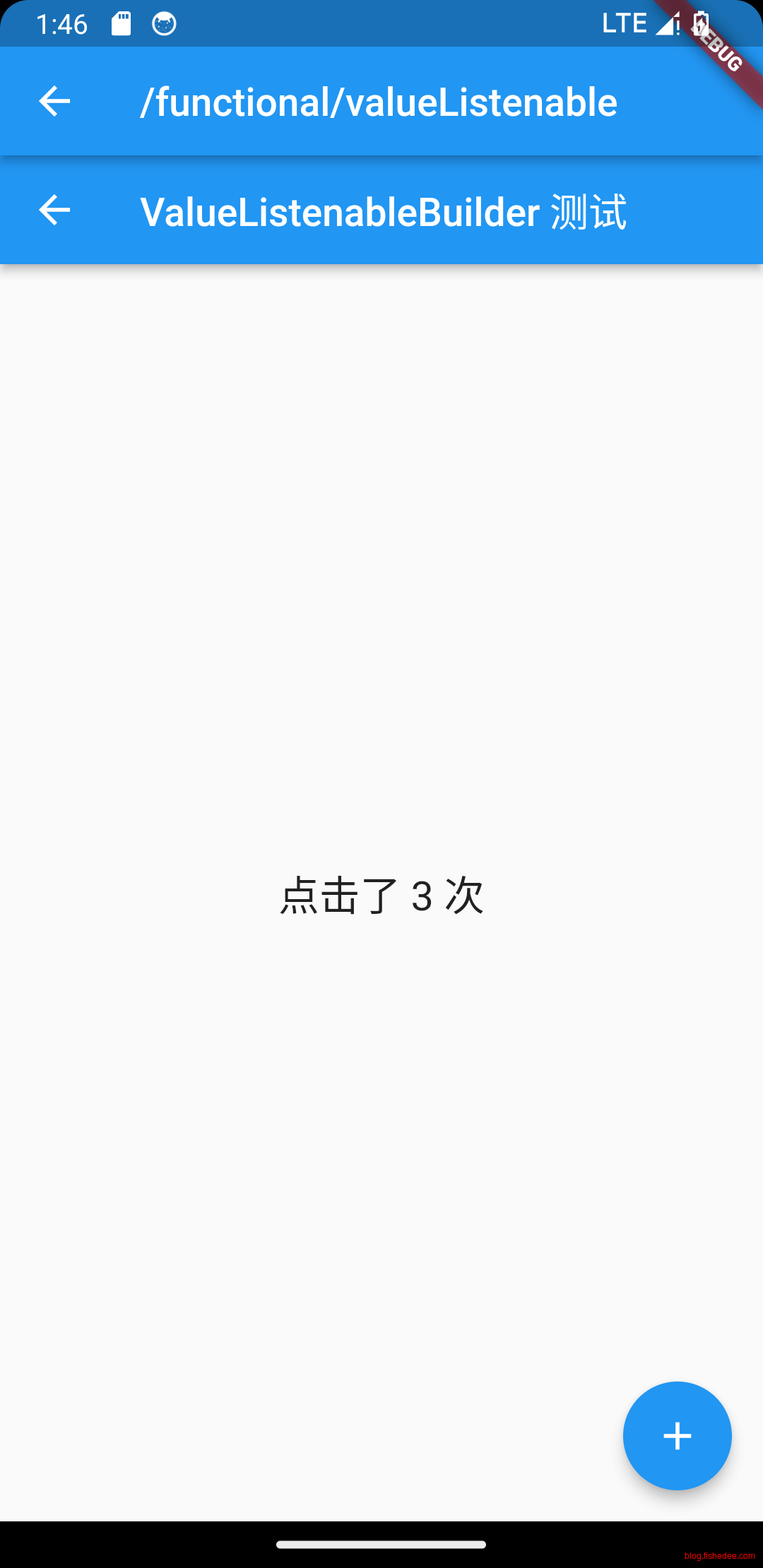
这个比较简单,没啥好说的。
9.5 showGeneralDialog
import 'package:flutter/material.dart';

class DialogDemo extends StatefulWidget {
  const DialogDemo({
    super.key,
  });

  @override
  State<DialogDemo> createState() => _DialogDemo();
}

class _DialogDemo extends State<DialogDemo> {
  @override
  Widget build(BuildContext context) {
    var counter = 0;
    return Column(children: [
      ElevatedButton(
        onPressed: () {
          showDialog<bool>(
            context: context,
            builder: (context) {
              return AlertDialog(
                title: const Text("提示"),
                content: const Text("您确定要删除当前文件吗?"),
                actions: <Widget>[
                  TextButton(
                    child: const Text("取消"),
                    onPressed: () => Navigator.of(context).pop(), // 关闭对话框
                  ),
                  TextButton(
                    child: const Text("删除"),
                    onPressed: () {
                      //关闭对话框并返回true
                      Navigator.of(context).pop(true);
                    },
                  ),
                ],
              );
            },
          );
        },
        child: const Text("点我打开normalDialog"),
      ),
      ElevatedButton(
        onPressed: () {
          showDialog<bool>(
            context: context,
            builder: (context) {
              return SimpleDialog(
                title: const Text('请选择语言'),
                children: <Widget>[
                  SimpleDialogOption(
                    onPressed: () {
                      // 返回1
                      Navigator.pop(context, 1);
                    },
                    child: const Padding(
                      padding: EdgeInsets.symmetric(vertical: 6),
                      child: Text('中文简体'),
                    ),
                  ),
                  SimpleDialogOption(
                    onPressed: () {
                      // 返回2
                      Navigator.pop(context, 2);
                    },
                    child: const Padding(
                      padding: EdgeInsets.symmetric(vertical: 6),
                      child: Text('美国英语'),
                    ),
                  ),
                ],
              );
            },
          );
        },
        child: const Text("点我打开simpleDialog"),
      ),
      ElevatedButton(
        onPressed: () {
          showCustomDialog<bool>(
            context: context,
            builder: (context) {
              return AlertDialog(
                title: const Text("提示"),
                content: const Text("您确定要删除当前文件吗?"),
                actions: <Widget>[
                  TextButton(
                    child: const Text("取消"),
                    onPressed: () => Navigator.of(context).pop(),
                  ),
                  TextButton(
                    child: const Text("删除"),
                    onPressed: () {
                      // 执行删除操作
                      Navigator.of(context).pop(true);
                    },
                  ),
                ],
              );
            },
          );
        },
        child: const Text("点我打开customDialog"),
      ),
    ]);
  }
}

Future<T?> showCustomDialog<T>({
  required BuildContext context,
  bool barrierDismissible = true,
  required WidgetBuilder builder,
  ThemeData? theme,
}) {
  final ThemeData theme = Theme.of(context);
  return showGeneralDialog(
    context: context,
    pageBuilder: (BuildContext buildContext, Animation<double> animation,
        Animation<double> secondaryAnimation) {
      final Widget pageChild = Builder(builder: builder);
      return SafeArea(
        child: Builder(builder: (BuildContext context) {
          return Theme(data: theme, child: pageChild);
        }),
      );
    },
    barrierDismissible: barrierDismissible,
    barrierLabel: MaterialLocalizations.of(context).modalBarrierDismissLabel,
    barrierColor: Colors.black87, // 自定义遮罩颜色
    transitionDuration: const Duration(milliseconds: 150),
    transitionBuilder: _buildMaterialDialogTransitions,
  );
}

Widget _buildMaterialDialogTransitions(
    BuildContext context,
    Animation<double> animation,
    Animation<double> secondaryAnimation,
    Widget child) {
  // 使用缩放动画
  return ScaleTransition(
    scale: CurvedAnimation(
      parent: animation,
      curve: Curves.easeOut,
    ),
    child: child,
  );
}
要点如下:
- flutter的dialog其实也是一个路由,依然可以用push,然后await结果来返回。
- showDialog和showSimpleDialog是material的方法,可以用来打开常用的dialog
- showGeneralDialog是flutter的方法,可以自定义dialog打开的动画效果。
10 事件
代码在这里,总体比较简单
10.1 原生事件
import 'package:flutter/material.dart';

class ListenerDemo extends StatefulWidget {
  const ListenerDemo({super.key});

  @override
  State<ListenerDemo> createState() => _PointerMoveIndicatorState();
}

class _PointerMoveIndicatorState extends State<ListenerDemo> {
  PointerEvent? _event;

  @override
  Widget build(BuildContext context) {
    return Align(
      child: Listener(
        child: Container(
          alignment: Alignment.center,
          color: Colors.blue,
          width: 300.0,
          height: 150.0,
          child: Text(
            '${_event?.localPosition ?? ''}',
            style: const TextStyle(color: Colors.white),
          ),
        ),
        onPointerDown: (PointerDownEvent event) =>
            setState(() => _event = event),
        onPointerMove: (PointerMoveEvent event) =>
            setState(() => _event = event),
        onPointerUp: (PointerUpEvent event) => setState(() => _event = event),
      ),
    );
  }
}
直接使用Listener就可以侦听原生事件了,但是不推荐这样做,我们更常使用合成事件。
10.2 合成事件
10.2.1 GestureDetectorTap
import 'package:flutter/material.dart';

class GestureDetectorTapDemo extends StatefulWidget {
  const GestureDetectorTapDemo({super.key});

  @override
  State<GestureDetectorTapDemo> createState() => _GestureDetectorTapDemo();
}

class _GestureDetectorTapDemo extends State<GestureDetectorTapDemo> {
  String _operation = "No Gesture detected!"; //保存事件名
  @override
  Widget build(BuildContext context) {
    return Center(
      child: GestureDetector(
        child: Container(
          alignment: Alignment.center,
          color: Colors.blue,
          width: 200.0,
          height: 100.0,
          child: Text(
            _operation,
            style: const TextStyle(color: Colors.white),
          ),
        ),
        onTap: () => updateText("Tap"), //点击
        onDoubleTap: () => updateText("DoubleTap"), //双击
        onLongPress: () => updateText("LongPress"), //长按
      ),
    );
  }

  void updateText(String text) {
    //更新显示的事件名
    setState(() {
      _operation = text;
    });
  }
}
使用GestureDetector就可以侦听合成事件了,比较简单。
10.2.2 GestureDetectorDrag
import 'package:flutter/material.dart';

class GestureDetectorDragDemo extends StatefulWidget {
  const GestureDetectorDragDemo({super.key});

  @override
  State<GestureDetectorDragDemo> createState() => _GestureDetectorDragDemo();
}

class _GestureDetectorDragDemo extends State<GestureDetectorDragDemo> {
  double _top = 0.0; //距顶部的偏移
  double _left = 0.0; //距左边的偏移

  @override
  Widget build(BuildContext context) {
    return Stack(
      children: <Widget>[
        Positioned(
          top: _top,
          left: _left,
          child: GestureDetector(
            child: CircleAvatar(child: Text("A")),
            //手指按下时会触发此回调
            onPanDown: (DragDownDetails e) {
              //打印手指按下的位置(相对于屏幕)
              print("用户手指按下:${e.globalPosition}");
            },
            //手指滑动时会触发此回调
            onPanUpdate: (DragUpdateDetails e) {
              //用户手指滑动时,更新偏移,重新构建
              setState(() {
                _left += e.delta.dx;
                _top += e.delta.dy;
              });
            },
            onPanEnd: (DragEndDetails e) {
              //打印滑动结束时在x、y轴上的速度
              print(e.velocity);
            },
          ),
        )
      ],
    );
  }
}
也是没啥好说的,直接使用GestureDetector来侦听事件就可以了。
10.2.3 GestureDetectorScale
import 'package:flutter/material.dart';

class GestureDetectorScaleDemo extends StatefulWidget {
  const GestureDetectorScaleDemo({super.key});

  @override
  State<GestureDetectorScaleDemo> createState() => _GestureDetectorScaleDemo();
}

class _GestureDetectorScaleDemo extends State<GestureDetectorScaleDemo> {
  double _width = 200.0; //通过修改图片宽度来达到缩放效果

  @override
  Widget build(BuildContext context) {
    return Center(
      child: GestureDetector(
        //指定宽度,高度自适应
        child: Image.asset("assets/images/star.webp", width: _width),
        onScaleUpdate: (ScaleUpdateDetails details) {
          setState(() {
            //缩放倍数在0.8到10倍之间
            _width = 200 * details.scale.clamp(.8, 10.0);
          });
        },
      ),
    );
  }
}
使用双指的放大和缩小图片
10.2.4 TapGestureRecognizer
import 'package:flutter/gestures.dart';
import 'package:flutter/material.dart';

class GestureRecognizerDemo extends StatefulWidget {
  const GestureRecognizerDemo({super.key});

  @override
  State<GestureRecognizerDemo> createState() => _GestureRecognizerDemo();
}

class _GestureRecognizerDemo extends State<GestureRecognizerDemo> {
  final _tapGestureRecognizer = TapGestureRecognizer();
  bool _toggle = false; //变色开关

  @override
  void dispose() {
    //用到GestureRecognizer的话一定要调用其dispose方法释放资源
    _tapGestureRecognizer.dispose();
    super.dispose();
  }

  @override
  Widget build(BuildContext context) {
    return Center(
      child: Text.rich(
        TextSpan(
          children: [
            const TextSpan(text: "你好世界"),
            TextSpan(
              text: "点我变色",
              style: TextStyle(
                fontSize: 30.0,
                color: _toggle ? Colors.blue : Colors.red,
              ),
              recognizer: _tapGestureRecognizer
                ..onTap = () {
                  setState(() {
                    _toggle = !_toggle;
                  });
                },
            ),
            const TextSpan(text: "你好世界"),
          ],
        ),
      ),
    );
  }
}
GestureRecognizer是比GestureDetector更底层的合成事件,一般用来做富文本的局部事件响应。
11 UI动画
动画也是flutter的一个重点,但是相对来说,重要性低一点,而且难度也低。
代码在这里
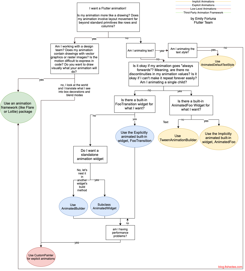
flutter提供了很多动画的工具类,flutter动画的基本组件:
AnimationController,是动画的开关启动,screen sync同步,以及同步启动和关闭,持续的时间。启动以后,输入当前时间,计算出当前动画的百分比。它extends Animation,它的主要用法
- .value,获取当前进度
- addListener,添加进度侦听
- addStatusListener,添加状态侦听
- forward,正向执行
- reverse,反向执行
Curve,定义了变化的插值方式,包括了linear,easeIn,easeOut等实例。Stagger动画所用的Interval也是extends Curve. 这个Curve主要有两种用法:
- transform,从[0,1]输入插值为新的[0,1]。
- CurvedAnimation(parent:controller,curve:curve),将现有的Animation和Curve组合转换为新的Animation。
Tween,将[0,1]范围映射到目标范围。定义了实际数值的起始和结束值。输入0和1之间的插值,以及起始和结束值,输出当前值。包括了ColorTween,Tween<double>,Tween<Rect>,Tween<EdgeInsets>等各种实例。这个Tween主要有两种用法:
- evaluate/transform,从[0,1]范围转换为目标范围。
- tween.animate(animation),将Tween转换为新的Animation。
侦听动画value的变化.
- setState,从controller中倾听变化,然后手动setState
- AnimatedWidget,StatelessWidget的一个子类,自动对animation绑定listen,并且dipose
- AnimationBuilder,以声明的方式,绑定animation,并且创建一个dom包围子类,来间接控制子dom的大小或位置。
11.1 侦听value的变化
11.1.1 setState
import 'package:flutter/material.dart';

class AnimationManualListenDemo extends StatefulWidget {
  const AnimationManualListenDemo({Key? key}) : super(key: key);

  @override
  State<AnimationManualListenDemo> createState() => _AnimationManualDemo();
}

//需要继承TickerProvider,如果有多个AnimationController,则应该使用TickerProviderStateMixin。
class _AnimationManualDemo extends State<AnimationManualListenDemo>
    with SingleTickerProviderStateMixin {
  late Animation<double> animation;
  late AnimationController controller;

  @override
  initState() {
    super.initState();
    controller = AnimationController(
      duration: const Duration(seconds: 2),
      vsync: this,
    );

    //匀速
    //图片宽高从0变到300
    animation = Tween(begin: 0.0, end: 300.0).animate(controller)
      ..addListener(() {
        //需要手动倾听value的变化,然后进行setState
        setState(() => {});
      });

    //启动动画(正向执行)
    controller.forward();
  }

  @override
  Widget build(BuildContext context) {
    return Center(
      child: Image.asset(
        "assets/images/star.webp",
        width: animation.value,
        height: animation.value,
      ),
    );
  }

  @override
  dispose() {
    //路由销毁时需要释放动画资源
    controller.dispose();
    super.dispose();
  }
}
手动侦听的方法比较简单,就是AnimationController触发的时候,setState以下就可以了
11.1.2 AnimatedWidget
import 'package:flutter/material.dart';

class AnimationAutoListenDemo extends StatefulWidget {
  const AnimationAutoListenDemo({Key? key}) : super(key: key);

  @override
  State<AnimationAutoListenDemo> createState() => _AnimationManualDemo();
}

//需要继承TickerProvider,如果有多个AnimationController,则应该使用TickerProviderStateMixin。
class _AnimationManualDemo extends State<AnimationAutoListenDemo>
    with SingleTickerProviderStateMixin {
  late Animation<double> animation;
  late AnimationController controller;

  @override
  initState() {
    super.initState();
    controller = AnimationController(
      duration: const Duration(seconds: 2),
      vsync: this,
    );

    //加入曲线做法
    animation = CurvedAnimation(parent: controller, curve: Curves.easeIn);

    //启动动画(正向执行)
    controller.forward();
  }

  @override
  Widget build(BuildContext context) {
    return Center(
      child: AnimatedImage(animation: animation),
    );
  }

  @override
  dispose() {
    //路由销毁时需要释放动画资源
    controller.dispose();
    super.dispose();
  }
}

class AnimatedImage extends AnimatedWidget {
  const AnimatedImage({
    Key? key,
    required this.animation,
  }) : super(key: key, listenable: animation);

  final Animation<double> animation;

  @override
  Widget build(BuildContext context) {
    final value = Tween(begin: 0.0, end: 300.0).evaluate(animation);
    return Center(
      child: Image.asset(
        "assets/images/star.webp",
        width: value,
        height: value,
      ),
    );
  }
}
另外一个简单的做法是使用AnimatedWidget,将Animation交给它,它就能自动侦听变化来setState了
11.1.3 AnimatedBuilder
import 'package:flutter/material.dart';

class AnimationAutoListenDemo2 extends StatefulWidget {
  const AnimationAutoListenDemo2({Key? key}) : super(key: key);

  @override
  State<AnimationAutoListenDemo2> createState() => _AnimationManualDemo();
}

//需要继承TickerProvider,如果有多个AnimationController,则应该使用TickerProviderStateMixin。
class _AnimationManualDemo extends State<AnimationAutoListenDemo2>
    with SingleTickerProviderStateMixin {
  late Animation<double> animation;
  late AnimationController controller;

  @override
  initState() {
    super.initState();
    controller = AnimationController(
      duration: const Duration(seconds: 2),
      vsync: this,
    );

    //加入曲线做法
    animation = CurvedAnimation(parent: controller, curve: Curves.easeIn);

    //启动动画(正向执行)
    controller.forward();
  }

  @override
  Widget build(BuildContext context) {
    return AnimatedBuilder(
      animation: animation,
      builder: (BuildContext ctx, child) {
        final value = Tween(begin: 0.0, end: 300.0).evaluate(animation);
        return Center(
          child: Image.asset(
            "assets/images/star.webp",
            width: value,
            height: value,
          ),
        );
      },
    );
  }

  @override
  dispose() {
    //路由销毁时需要释放动画资源
    controller.dispose();
    super.dispose();
  }
}
另外一种简单的办法就是用AnimatedBuilder了,相对来说也比较简单。
11.2 侦听status的变化
// ignore_for_file: unused_local_variable
// #docregion ShakeCurve
import 'dart:math';

// #enddocregion ShakeCurve
import 'package:flutter/material.dart';

// #docregion diff
class AnimatedLogo extends AnimatedWidget {
  const AnimatedLogo({super.key, required Animation<double> animation})
      : super(listenable: animation);

  // Make the Tweens static because they don't change.
  static final _opacityTween = Tween<double>(begin: 0.1, end: 1);
  static final _sizeTween = Tween<double>(begin: 0, end: 300);

  @override
  Widget build(BuildContext context) {
    final animation = listenable as Animation<double>;
    return Center(
      child: Opacity(
        opacity: _opacityTween.evaluate(animation),
        child: Container(
          margin: const EdgeInsets.symmetric(vertical: 10),
          height: _sizeTween.evaluate(animation),
          width: _sizeTween.evaluate(animation),
          child: const FlutterLogo(),
        ),
      ),
    );
  }
}

class AnimationStatusListenDemo extends StatefulWidget {
  const AnimationStatusListenDemo({super.key});

  @override
  State<AnimationStatusListenDemo> createState() => _LogoAppState();
}

class _LogoAppState extends State<AnimationStatusListenDemo>
    with SingleTickerProviderStateMixin {
  late Animation<double> animation;
  late AnimationController controller;

  @override
  void initState() {
    super.initState();
    // #docregion AnimationController, tweens
    controller =
        AnimationController(duration: const Duration(seconds: 2), vsync: this);
    // #enddocregion AnimationController, tweens
    animation = CurvedAnimation(parent: controller, curve: Curves.easeIn)
      ..addStatusListener((status) {
        if (status == AnimationStatus.completed) {
          controller.reverse();
        } else if (status == AnimationStatus.dismissed) {
          controller.forward();
        }
      });
    controller.forward();
  }

  @override
  Widget build(BuildContext context) => AnimatedLogo(animation: animation);

  @override
  void dispose() {
    controller.dispose();
    super.dispose();
  }
}
我们也可以侦听动画的status变化,从而实现一个自动重复往返的动画显示。在controller加入addStatusListener就可以了。
11.3 Explicit动画
11.3.1 Page动画
import 'package:flutter/material.dart';

class PageAnimationDemo extends StatelessWidget {
  const PageAnimationDemo({super.key});

  @override
  Widget build(BuildContext context) {
    return Scaffold(
      appBar: AppBar(),
      body: Center(
        child: ElevatedButton(
          onPressed: () {
            Navigator.of(context).push(_createRoute());
          },
          child: const Text('Go!'),
        ),
      ),
    );
  }
}

Route _createRoute() {
  return PageRouteBuilder(
    pageBuilder: (context, animation, secondaryAnimation) => const Page2(),
    transitionsBuilder: (context, animation, secondaryAnimation, child) {
      const begin = Offset(0.0, 1.0);
      const end = Offset.zero;
      const curve = Curves.ease;

      var tween = Tween(begin: begin, end: end).chain(CurveTween(curve: curve));

      //从底部往上的AnimatedWidget
      return SlideTransition(
        position: animation.drive(tween),
        child: child,
      );
    },
  );
}

class Page2 extends StatelessWidget {
  const Page2({super.key});

  @override
  Widget build(BuildContext context) {
    return Scaffold(
      appBar: AppBar(),
      body: const Center(
        child: Text('Page 2'),
      ),
    );
  }
}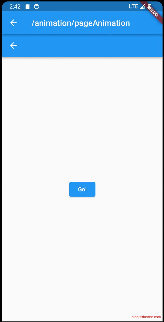
要点如下:
- 新建route的时候,使用的是Navigator.of(context).push。
- push的参数需要一个PageRouteBuilder的组件,这个组件里面可以定义transitionsBuilder,从而实现页面动画。
- transitionsBuilder的参数animation,当页面跳转的时候,animation的数值是从0到1的。当页面pop的时候,animation的数值是从1到0的。因此我们可以通过包装animation来实现页面动画。
最后,页面跳转的效果刚好都是对称的,进场的时候是从底部往顶部,退场的时候是从顶部往底部。要实现非对称的页面跳转效果,可以看11.8.2节
11.3.2 Transition
在Page动画中我们用到了Transition,它跟第6.3节的Transform是非常相似的。区别在于,Transition是需要Animation参数,它继承自AnimatedWidget的。Transform是普通的Widget组件,不继承自AnimatedWidget的。
它们的相同之处在于,它们都是在paint阶段工作中,不影响childWidget原来的layout。
有很多现有的Transition,可以看这里
| Transition | 效果 |
|---|---|
| ScaleTransition | 放大缩小 |
| SlideTransition | 滑动 |
| SizeTransition | 飞入,展开 |
| RotationTransition | 旋转 |
| PositionedTransition | 更改在Stack布局中的位置 |
| FadeTransition | 渐变 |
| DecoratedBoxTransition | 更改外观,从圆变方等 |
| CupertinoPageTransition | 仿IOS的果冻drawer效果 |
| CupertinoFullscreenDialogTransition | 仿IOS的对话框效果 |
11.4 Implicit动画
实现动画的方式都比较枯燥,
- 定义animationController
- 定义tween
- 侦听value的变化来setState
- 更新对应的widget就可以了
有没有简单的方法,当widget的属性发生变化的时候,自动插值widget的属性变化值,就能产生动画。这样的话,仅需1步就可以实现动画。可以的,这既是Implicit动画。
| 组件 | 隐式组件 |
|---|---|
| Align | AnimatedAlign |
| Opacity | AnimatedOpacity |
| Padding | AnimatedPadding |
| Positioned | AnimatedPositioned |
| DefaultTextStyle | AnimatedDefaultTextStyle |
| Container | AnimatedContainer |
11.4.1 AnimatedOpacity
/*
Putting it all together
The Fade-in text effect example demonstrates the following features of the AnimatedOpacity widget.

* It listens for state changes to its opacity property.
* When the opacity property changes, it animates the transition to the new value for opacity.
* It requires a duration parameter to define how long the transition between the values should take.
*/
// Copyright 2019 the Dart project authors. All rights reserved.
// Use of this source code is governed by a BSD-style license
// that can be found in the LICENSE file.
// AnimatedOpacity用法
import 'package:flutter/material.dart';

const owlUrl =
    'https://raw.githubusercontent.com/flutter/website/main/src/assets/images/docs/owl.jpg';

class ImplicitAnimationDemo extends StatefulWidget {
  const ImplicitAnimationDemo({super.key});

  @override
  State<ImplicitAnimationDemo> createState() => _FadeInDemoState();
}

class _FadeInDemoState extends State<ImplicitAnimationDemo> {
  double opacity = 0;

  @override
  Widget build(BuildContext context) {
    double height = MediaQuery.of(context).size.height;
    return Center(
      child: Column(
        children: <Widget>[
          Image.asset("assets/images/vertical6.webp", height: height * 0.5),
          TextButton(
            child: const Text(
              'Show Details',
              style: TextStyle(color: Colors.blueAccent),
            ),
            onPressed: () => setState(() {
              opacity = 1;
            }),
          ),
          AnimatedOpacity(
            duration: const Duration(seconds: 2),
            opacity: opacity,
            child: const Column(
              children: [
                Text('Type: Owl'),
                Text('Age: 39'),
                Text('Employment: None'),
              ],
            ),
          )
        ],
      ),
    );
  }
}
直接修改AnimatedOpacity的组件就可以实现动画了,无需controller,tween, listener。
11.4.2 AnimatedContainer
// Copyright 2019 the Dart project authors. All rights reserved.
// Use of this source code is governed by a BSD-style license
// that can be found in the LICENSE file.
//AnimatedContainer用法
// Copyright 2019 the Dart project authors. All rights reserved.
// Use of this source code is governed by a BSD-style license
// that can be found in the LICENSE file.

import 'dart:math';

import 'package:flutter/material.dart';

const _duration = Duration(milliseconds: 400);

double randomBorderRadius() {
  return Random().nextDouble() * 64;
}

double randomMargin() {
  return Random().nextDouble() * 64;
}

Color randomColor() {
  return Color(0xFFFFFFFF & Random().nextInt(0xFFFFFFFF));
}

class ImplicitAnimationDemo2 extends StatefulWidget {
  const ImplicitAnimationDemo2({super.key});

  @override
  State<ImplicitAnimationDemo2> createState() => _AnimatedContainerDemoState();
}

class _AnimatedContainerDemoState extends State<ImplicitAnimationDemo2> {
  late Color color;
  late double borderRadius;
  late double margin;

  @override
  void initState() {
    super.initState();
    color = randomColor();
    borderRadius = randomBorderRadius();
    margin = randomMargin();
  }

  void change() {
    setState(() {
      color = randomColor();
      borderRadius = randomBorderRadius();
      margin = randomMargin();
    });
  }

  @override
  Widget build(BuildContext context) {
    return Scaffold(
      body: Center(
        child: Column(
          children: <Widget>[
            SizedBox(
              width: 128,
              height: 128,
              child: AnimatedContainer(
                margin: EdgeInsets.all(margin),
                //可以使用curve的曲线插值
                curve: Curves.easeInOutBack,
                decoration: BoxDecoration(
                  color: color,
                  borderRadius: BorderRadius.circular(borderRadius),
                ),
                duration: _duration,
              ),
            ),
            ElevatedButton(
              child: const Text('Change'),
              onPressed: () => change(),
            ),
          ],
        ),
      ),
    );
  }
}
AnimatedContainer也是类似的做法,比较简单
11.5 hero动画
11.5.1 基础
// Copyright 2017 The Chromium Authors. All rights reserved.
// Use of this source code is governed by a BSD-style license that can be
// found in the LICENSE file.

// Tap on the source route's photo to push a new route,
// containing the same photo at a different location and scale.
// Return to the previous route by tapping the image, or by using the
// device's back-to-the-previous-screen gesture.
// You can slow the transition using the timeDilation property.

import 'package:flutter/material.dart';
import 'package:flutter/scheduler.dart' show timeDilation;

class HeroBasicDemo extends StatelessWidget {
  const HeroBasicDemo({super.key});

  @override
  Widget build(BuildContext context) {
    timeDilation = 10.0; // 1.0 means normal animation speed.

    return Center(
      child: PhotoHero(
        photo: 'assets/images/flippers-alpha.png',
        width: 300,
        onTap: () {
          Navigator.of(context).push(MaterialPageRoute<void>(
            builder: (context) {
              return Scaffold(
                appBar: AppBar(
                  title: const Text('Flippers Page'),
                ),
                body: Container(
                  // Set background to blue to emphasize that it's a new route.
                  color: Colors.lightBlueAccent,
                  padding: const EdgeInsets.all(16),
                  alignment: Alignment.topLeft,
                  child: PhotoHero(
                    photo: 'assets/images/flippers-alpha.png',
                    width: 100,
                    onTap: () {
                      Navigator.of(context).pop();
                    },
                  ),
                ),
              );
            },
          ));
        },
      ),
    );
  }
}

class PhotoHero extends StatelessWidget {
  const PhotoHero({
    super.key,
    required this.photo,
    this.onTap,
    required this.width,
  });

  final String photo;
  final VoidCallback? onTap;
  final double width;

  @override
  Widget build(BuildContext context) {
    return SizedBox(
      width: width,
      child: Hero(
        tag: photo,
        //InkWell是水墨点击效果。它需要一个parent来展示水墨效果。由于在Hero动画过程中,会缺少parent。
        //所以父级使用了一个Hero组件。Material相当于Container,只是有Material设定而已。
        child: Material(
          color: Colors.transparent,
          child: InkWell(
            onTap: onTap,
            child: Image.asset(
              photo,
              fit: BoxFit.contain,
            ),
          ),
        ),
      ),
    );
  }
}
hero动画实现了在页面跳转的时候,保持某些Widget可以跨页面变化的效果。
- 使用方法比较简单,对需要跨页面跳转的部分,用Hero包装就可以了,比较tag获取相同hero的部分。
- Hero包装的部分,在跨页面变化的过程中,仅仅改变它的SizeBox,不改变其他部分。
Hero动画原理,具体可以看这里:
- 页面开始跳转,Hero从前后两个页面中,找到Hero和Tag相同的两个Widget,并计算两个Widget的position和size。
- 旧页面widget被删掉,同时被Hero复制一个相同位置和大小的Widget。
- 页面跳转过程中,Hero将widget逐渐执行动画,动画只改变它的position和size。
- 页面跳转结束,Hero删除跳转用的widget,仅显示新页面的widget。
11.5.2 Radial动画
// Copyright 2017 The Chromium Authors. All rights reserved.
// Use of this source code is governed by a BSD-style license that
// can be found in the LICENSE file.

// A "radial transformation" as defined here:
// https://m1.material.io/motion/transforming-material.html#transforming-material-radial-transformation

// In this example, the destination route (which completely obscures
// the source route once the page transition has finished),
// displays the Hero image in a Card containing a column of two
// widgets: the image, and some descriptive text.

import 'dart:math' as math;

import 'package:flutter/material.dart';
import 'package:flutter/scheduler.dart' show timeDilation;

class Photo extends StatelessWidget {
  const Photo({super.key, required this.photo, this.onTap});

  final String photo;
  final VoidCallback? onTap;

  @override
  Widget build(BuildContext context) {
    return Material(
      // Slightly opaque color appears where the image has transparency.
      color: Theme.of(context).primaryColor.withOpacity(0.25),
      child: InkWell(
        onTap: onTap,
        child: LayoutBuilder(
          builder: (context, size) {
            return Image.asset(
              photo,
              fit: BoxFit.contain,
            );
          },
        ),
      ),
    );
  }
}

class RadialExpansion extends StatelessWidget {
  //maxRadius是外圆半径
  //clipRectSize是外圆内接矩形的边长,为maxRadius/sqrt(2) * 2。
  const RadialExpansion({
    super.key,
    required this.maxRadius,
    this.child,
  }) : clipRectSize = 2.0 * (maxRadius / math.sqrt2);

  final double maxRadius;
  final double clipRectSize;
  final Widget? child;

  @override
  Widget build(BuildContext context) {
    /*仅有ClipOval的话,就只进行ClipOval的圆形剪裁
    return ClipOval(
      child: child
    );
    */
    //ClipOval先剪圆,然后内接一个ClipRect(正方形)来进行剪矩形
    //hero开始的时候,ClipOval较小,clipRectSize比较大,所以ClipRect不起效果,显示出来就是圆形
    //hero结束的时候,ClipOval较大,clipRectSize相对小,所以ClipRect起效果,显示出来就是矩形
    return ClipOval(
      child: Center(
        child: SizedBox(
          width: clipRectSize,
          height: clipRectSize,
          child: ClipRect(
            child: child,
          ),
        ),
      ),
    );
  }
}

class HeroRadialDemo extends StatelessWidget {
  const HeroRadialDemo({super.key});

  //半径
  static double kMinRadius = 32.0;
  static double kMaxRadius = 128.0;
  static Interval opacityCurve =
      const Interval(0.0, 0.75, curve: Curves.fastOutSlowIn);

  static RectTween _createRectTween(Rect? begin, Rect? end) {
    return MaterialRectCenterArcTween(begin: begin, end: end);
  }

  static Widget _buildPage(
      BuildContext context, String imageName, String description) {
    return Container(
      color: Theme.of(context).canvasColor,
      child: Center(
        child: Card(
          elevation: 8,
          child: Column(
            mainAxisSize: MainAxisSize.min,
            children: [
              SizedBox(
                width: kMaxRadius * 2.0,
                height: kMaxRadius * 2.0,
                child: Hero(
                  createRectTween: _createRectTween,
                  tag: imageName,
                  child: RadialExpansion(
                    maxRadius: kMaxRadius,
                    child: Photo(
                      photo: imageName,
                      onTap: () {
                        Navigator.of(context).pop();
                      },
                    ),
                  ),
                ),
              ),
              Text(
                description,
                style: const TextStyle(fontWeight: FontWeight.bold),
                textScaler: const TextScaler.linear(3),
              ),
              const SizedBox(height: 16),
            ],
          ),
        ),
      ),
    );
  }

  Widget _buildHero(
    BuildContext context,
    String imageName,
    String description,
  ) {
    return SizedBox(
      width: kMinRadius * 2.0,
      height: kMinRadius * 2.0,
      child: Hero(
        createRectTween: _createRectTween,
        tag: imageName,
        child: RadialExpansion(
          maxRadius: kMaxRadius,
          child: Photo(
            photo: imageName,
            onTap: () {
              Navigator.of(context).push(
                PageRouteBuilder<void>(
                  pageBuilder: (context, animation, secondaryAnimation) {
                    //animation是页面切换的0~1进度条
                    //页面自身的切换动画效果,opacity
                    return AnimatedBuilder(
                      //AnimatedBuilder,将组件绑定到animation的lister
                      animation: animation,
                      builder: (context, child) {
                        return Opacity(
                          //opacityCurve从0和1进度,转换到曲线的opacity
                          opacity: opacityCurve.transform(animation.value),
                          child: _buildPage(context, imageName, description),
                        );
                      },
                    );
                  },
                ),
              );
            },
          ),
        ),
      ),
    );
  }

  @override
  Widget build(BuildContext context) {
    timeDilation = 5.0; // 1.0 is normal animation speed.

    return Container(
      padding: const EdgeInsets.all(32),
      alignment: FractionalOffset.bottomLeft,
      child: Row(
        mainAxisAlignment: MainAxisAlignment.spaceBetween,
        children: [
          _buildHero(context, 'assets/images/chair-alpha.png', 'Chair'),
          _buildHero(
              context, 'assets/images/binoculars-alpha.png', 'Binoculars'),
          _buildHero(
              context, 'assets/images/beachball-alpha.png', 'Beach ball'),
        ],
      ),
    );
  }
}
如果在hero动画变化过程中,我们不仅需要Size的变化,还需要形状变化的时候,怎么办。
- Hero动画里面,总是有一个ClipRect的操作。hero开始的时候,ClipOval较小,clipRectSize比较大,所以ClipRect不起效果,显示出来就是圆形。hero结束的时候,ClipOval较大,clipRectSize相对小,所以ClipRect起效果,显示出来就是矩形。
- Hero动画中,传入createRectTween参数,指定插值方式为MaterialRectCenterArcTween,而不是默认的Tween<Rect>,这是使用径向过渡时 hero 的长宽比例,而不是仅仅的大小比例。
11.6 Stagger动画
11.6.1 无重叠
import 'package:flutter/material.dart';

class StaggerAnimationDemo extends StatefulWidget {
  const StaggerAnimationDemo({super.key});

  @override
  State<StaggerAnimationDemo> createState() => _StaggerRouteState();
}

class _StaggerRouteState extends State<StaggerAnimationDemo>
    with TickerProviderStateMixin {
  late AnimationController _controller;

  @override
  void initState() {
    super.initState();

    _controller = AnimationController(
      duration: const Duration(milliseconds: 2000),
      vsync: this,
    );
  }

  _playAnimation() async {
    try {
      //先正向执行动画
      await _controller.forward().orCancel;
      //再反向执行动画
      await _controller.reverse().orCancel;
    } on TickerCanceled {
      //捕获异常。可能发生在组件销毁时,计时器会被取消。
    }
  }

  @override
  Widget build(BuildContext context) {
    return Center(
      child: Column(
        children: [
          ElevatedButton(
            onPressed: () => _playAnimation(),
            child: const Text("start animation"),
          ),
          Container(
            width: 300.0,
            height: 300.0,
            decoration: BoxDecoration(
              color: Colors.black.withOpacity(0.1),
              border: Border.all(
                color: Colors.black.withOpacity(0.5),
              ),
            ),
            //调用我们定义的交错动画Widget
            child: StaggerAnimation(controller: _controller),
          ),
        ],
      ),
    );
  }
}

class StaggerAnimation extends StatelessWidget {
  StaggerAnimation({
    Key? key,
    required this.controller,
  }) : super(key: key) {
    //高度动画
    height = Tween<double>(
      begin: .0,
      end: 300.0,
    ).animate(
      CurvedAnimation(
        parent: controller,
        curve: const Interval(
          0.0, 0.6, //间隔,前60%的动画时间
          curve: Curves.ease,
        ),
      ),
    );

    color = ColorTween(
      begin: Colors.green,
      end: Colors.red,
    ).animate(
      CurvedAnimation(
        parent: controller,
        curve: const Interval(
          0.0, 0.6, //间隔,前60%的动画时间
          curve: Curves.ease,
        ),
      ),
    );

    padding = Tween<EdgeInsets>(
      begin: const EdgeInsets.only(left: .0),
      end: const EdgeInsets.only(left: 100.0),
    ).animate(
      CurvedAnimation(
        parent: controller,
        curve: const Interval(
          0.6, 1.0, //间隔,后40%的动画时间
          curve: Curves.ease,
        ),
      ),
    );
  }

  late final Animation<double> controller;
  late final Animation<double> height;
  late final Animation<EdgeInsets> padding;
  late final Animation<Color?> color;

  Widget _buildAnimation(BuildContext context, child) {
    return Container(
      alignment: Alignment.bottomCenter,
      padding: padding.value,
      child: Container(
        color: color.value,
        width: 50.0,
        height: height.value,
      ),
    );
  }

  @override
  Widget build(BuildContext context) {
    return AnimatedBuilder(
      builder: _buildAnimation,
      animation: controller,
    );
  }
}
用法还是比较简单的
- 重叠动画依赖的是Interval组件,而Interval组件本身就是属于Curve的
- 我们可以用CurvedAnimation,将Interval组件和AnimationController转换为新的Animation
- 然后用Tween.animate,将第二步的Animation转换为新的Animation。
- 最后将这个Animation传给AnimatedBuilder就可以执行动画了。
Interval的用法也比较简单,直接传入动画的起始和结束的百分比时间就可以了。
11.6.2 有重叠
import 'package:flutter/material.dart';

class StaggerAnimationDemo2 extends StatefulWidget {
  const StaggerAnimationDemo2({
    super.key,
  });

  @override
  State<StaggerAnimationDemo2> createState() =>
      _ExampleStaggeredAnimationsState();
}

class _ExampleStaggeredAnimationsState extends State<StaggerAnimationDemo2>
    with SingleTickerProviderStateMixin {
  late AnimationController _drawerSlideController;

  @override
  void initState() {
    super.initState();

    _drawerSlideController = AnimationController(
      vsync: this,
      duration: const Duration(milliseconds: 150),
    );
  }

  @override
  void dispose() {
    _drawerSlideController.dispose();
    super.dispose();
  }

  bool _isDrawerOpen() {
    return _drawerSlideController.value == 1.0;
  }

  bool _isDrawerOpening() {
    return _drawerSlideController.status == AnimationStatus.forward;
  }

  bool _isDrawerClosed() {
    return _drawerSlideController.value == 0.0;
  }

  void _toggleDrawer() {
    if (_isDrawerOpen() || _isDrawerOpening()) {
      _drawerSlideController.reverse();
    } else {
      _drawerSlideController.forward();
    }
  }

  @override
  Widget build(BuildContext context) {
    return Scaffold(
      backgroundColor: Colors.white,
      appBar: _buildAppBar(),
      body: Stack(
        children: [
          _buildContent(),
          _buildDrawer(),
        ],
      ),
    );
  }

  PreferredSizeWidget _buildAppBar() {
    return AppBar(
      title: const Text(
        'Flutter Menu',
        style: TextStyle(
          color: Colors.black,
        ),
      ),
      backgroundColor: Colors.transparent,
      elevation: 0.0,
      automaticallyImplyLeading: false,
      actions: [
        AnimatedBuilder(
          animation: _drawerSlideController,
          builder: (context, child) {
            return IconButton(
              onPressed: _toggleDrawer,
              icon: _isDrawerOpen() || _isDrawerOpening()
                  ? const Icon(
                      Icons.clear,
                      color: Colors.black,
                    )
                  : const Icon(
                      Icons.menu,
                      color: Colors.black,
                    ),
            );
          },
        ),
      ],
    );
  }

  Widget _buildContent() {
    // Put page content here.
    return const SizedBox();
  }

  Widget _buildDrawer() {
    return AnimatedBuilder(
      animation: _drawerSlideController,
      builder: (context, child) {
        return FractionalTranslation(
          translation: Offset(1.0 - _drawerSlideController.value, 0.0),
          child: _isDrawerClosed() ? const SizedBox() : const Menu(),
        );
      },
    );
  }
}

class Menu extends StatefulWidget {
  const Menu({super.key});

  @override
  State<Menu> createState() => _MenuState();
}

class _MenuState extends State<Menu> with SingleTickerProviderStateMixin {
  static const _menuTitles = [
    'Declarative style',
    'Premade widgets',
    'Stateful hot reload',
    'Native performance',
    'Great community',
  ];

  static const _initialDelayTime = Duration(milliseconds: 50);
  static const _itemSlideTime = Duration(milliseconds: 250);
  static const _staggerTime = Duration(milliseconds: 50);
  static const _buttonDelayTime = Duration(milliseconds: 150);
  static const _buttonTime = Duration(milliseconds: 500);
  final _animationDuration = _initialDelayTime +
      (_staggerTime * _menuTitles.length) +
      _buttonDelayTime +
      _buttonTime;

  late AnimationController _staggeredController;
  final List<Interval> _itemSlideIntervals = [];
  late Interval _buttonInterval;

  @override
  void initState() {
    super.initState();

    _createAnimationIntervals();

    //controller需要传入总时间,传出当前的0~1
    _staggeredController = AnimationController(
      vsync: this,
      duration: _animationDuration,
    )..forward();
  }

  void _createAnimationIntervals() {
    //计算每个interval的起始时间和持续时间
    //注意,多个item之间不是一个接一个,是一个动作的中途,就会开始另外一个
    //interval不是具体的事件,是一个百分比
    for (var i = 0; i < _menuTitles.length; ++i) {
      final startTime = _initialDelayTime + (_staggerTime * i);
      final endTime = startTime + _itemSlideTime;
      _itemSlideIntervals.add(
        Interval(
          startTime.inMilliseconds / _animationDuration.inMilliseconds,
          endTime.inMilliseconds / _animationDuration.inMilliseconds,
        ),
      );
    }

    final buttonStartTime =
        Duration(milliseconds: (_menuTitles.length * 50)) + _buttonDelayTime;
    final buttonEndTime = buttonStartTime + _buttonTime;
    _buttonInterval = Interval(
      buttonStartTime.inMilliseconds / _animationDuration.inMilliseconds,
      buttonEndTime.inMilliseconds / _animationDuration.inMilliseconds,
    );
  }

  @override
  void dispose() {
    _staggeredController.dispose();
    super.dispose();
  }

  @override
  Widget build(BuildContext context) {
    return Container(
      color: Colors.white,
      child: Stack(
        fit: StackFit.expand,
        children: [
          _buildFlutterLogo(),
          _buildContent(),
        ],
      ),
    );
  }

  Widget _buildFlutterLogo() {
    return const Positioned(
      right: -100,
      bottom: -30,
      child: Opacity(
        opacity: 0.2,
        child: FlutterLogo(
          size: 400,
        ),
      ),
    );
  }

  Widget _buildContent() {
    return Column(
      crossAxisAlignment: CrossAxisAlignment.start,
      children: [
        const SizedBox(height: 16),
        ..._buildListItems(),
        const Spacer(),
        _buildGetStartedButton(),
      ],
    );
  }

  List<Widget> _buildListItems() {
    final listItems = <Widget>[];
    for (var i = 0; i < _menuTitles.length; ++i) {
      listItems.add(
        AnimatedBuilder(
          animation: _staggeredController,
          builder: (context, child) {
            //计算当前百分比,然后转换成曲线插值
            final animationPercent = Curves.easeOut.transform(
              _itemSlideIntervals[i].transform(_staggeredController.value),
            );
            final opacity = animationPercent;
            final slideDistance = (1.0 - animationPercent) * 150;

            return Opacity(
              opacity: opacity,
              child: Transform.translate(
                offset: Offset(slideDistance, 0),
                child: child,
              ),
            );
          },
          child: Padding(
            padding: const EdgeInsets.symmetric(horizontal: 36, vertical: 16),
            child: Text(
              _menuTitles[i],
              textAlign: TextAlign.left,
              style: const TextStyle(
                fontSize: 24,
                fontWeight: FontWeight.w500,
              ),
            ),
          ),
        ),
      );
    }
    return listItems;
  }

  Widget _buildGetStartedButton() {
    return SizedBox(
      width: double.infinity,
      child: Padding(
        padding: const EdgeInsets.all(24),
        child: AnimatedBuilder(
          animation: _staggeredController,
          builder: (context, child) {
            final animationPercent = Curves.elasticOut.transform(
                _buttonInterval.transform(_staggeredController.value));
            final opacity = animationPercent.clamp(0.0, 1.0);
            final scale = (animationPercent * 0.5) + 0.5;

            return Opacity(
              opacity: opacity,
              child: Transform.scale(
                scale: scale,
                child: child,
              ),
            );
          },
          child: ElevatedButton(
            style: ElevatedButton.styleFrom(
              shape: const StadiumBorder(),
              backgroundColor: Colors.blue,
              padding: const EdgeInsets.symmetric(horizontal: 48, vertical: 14),
            ),
            onPressed: () {},
            child: const Text(
              'Get started',
              style: TextStyle(
                color: Colors.white,
                fontSize: 22,
              ),
            ),
          ),
        ),
      ),
    );
  }
}
包含了重叠的Animation,这里的用法也比较简单
- AnimationController保持不变
- 当animation变动的时候,使用Intervl.transform来转换到新值,使用Tween.evaluate来转换到widget实际的值。
11.7 Simulation动画
import 'package:flutter/material.dart';
import 'package:flutter/physics.dart';

class SimulationAnimationDemo extends StatelessWidget {
  const SimulationAnimationDemo({super.key});

  @override
  Widget build(BuildContext context) {
    return const DraggableCard(
      child: FlutterLogo(
        size: 128,
      ),
    );
  }
}

/// A draggable card that moves back to [Alignment.center] when it's
/// released.
class DraggableCard extends StatefulWidget {
  const DraggableCard({required this.child, super.key});

  final Widget child;

  @override
  State<DraggableCard> createState() => _DraggableCardState();
}

class _DraggableCardState extends State<DraggableCard>
    with SingleTickerProviderStateMixin {
  late AnimationController _controller;

  /// The alignment of the card as it is dragged or being animated.
  ///
  /// While the card is being dragged, this value is set to the values computed
  /// in the GestureDetector onPanUpdate callback. If the animation is running,
  /// this value is set to the value of the [_animation].
  Alignment _dragAlignment = Alignment.center;

  late Animation<Alignment> _animation;

  /// Calculates and runs a [SpringSimulation].
  void _runAnimation(Offset pixelsPerSecond, Size size) {
    //controller绑定了Tween.
    _animation = _controller.drive(
      AlignmentTween(
        begin: _dragAlignment,
        end: Alignment.center,
      ),
    );
    //FIXME unitVelocity看不懂
    // Calculate the velocity relative to the unit interval, [0,1],
    // used by the animation controller.
    final unitsPerSecondX = pixelsPerSecond.dx / size.width;
    final unitsPerSecondY = pixelsPerSecond.dy / size.height;
    final unitsPerSecond = Offset(unitsPerSecondX, unitsPerSecondY);
    final unitVelocity = unitsPerSecond.distance;

    const spring = SpringDescription(
      mass: 30,
      stiffness: 1,
      damping: 1,
    );

    final simulation = SpringSimulation(spring, 0, 1, -unitVelocity);

    //设置物理模拟器
    _controller.animateWith(simulation);
  }

  @override
  void initState() {
    super.initState();
    _controller = AnimationController(vsync: this);

    _controller.addListener(() {
      setState(() {
        _dragAlignment = _animation.value;
      });
    });
  }

  @override
  void dispose() {
    _controller.dispose();
    super.dispose();
  }

  @override
  Widget build(BuildContext context) {
    final size = MediaQuery.of(context).size;
    return GestureDetector(
      onPanDown: (details) {
        _controller.stop();
      },
      onPanUpdate: (details) {
        //Alignment的0,0是中心位置
        setState(() {
          _dragAlignment += Alignment(
            details.delta.dx / (size.width / 2),
            details.delta.dy / (size.height / 2),
          );
        });
      },
      onPanEnd: (details) {
        //松开的时候进行回弹到原来的位置
        _runAnimation(details.velocity.pixelsPerSecond, size);
      },
      child: Align(
        alignment: _dragAlignment,
        child: Card(
          child: widget.child,
        ),
      ),
    );
  }
}
- 使用AnimationController的animateWith来传入Simulation即可。
11.8 Switcher动画
Switcher动画,是当Widget的State发生改变的时候,Widget对应的进场和退场动画。
11.8.1 对称的进场退场
import 'package:flutter/material.dart';

class AnimationSwitcherDemo extends StatefulWidget {
  const AnimationSwitcherDemo({super.key});
  @override
  State<AnimationSwitcherDemo> createState() =>
      _AnimatedSwitcherCounterRouteState();
}

class _AnimatedSwitcherCounterRouteState extends State<AnimationSwitcherDemo> {
  int _count = 0;

  @override
  Widget build(BuildContext context) {
    return Center(
      child: Column(
        mainAxisAlignment: MainAxisAlignment.center,
        children: <Widget>[
          AnimatedSwitcher(
            duration: const Duration(milliseconds: 500),
            transitionBuilder: (Widget child, Animation<double> animation) {
              //执行缩放动画
              return ScaleTransition(child: child, scale: animation);
            },
            child: Text(
              '$_count',
              //显示指定key,不同的key会被认为是不同的Text,这样才能执行动画
              key: ValueKey<int>(_count),
              style: Theme.of(context).textTheme.headline4,
            ),
          ),
          ElevatedButton(
            child: const Text(
              '+1',
            ),
            onPressed: () {
              setState(() {
                _count += 1;
              });
            },
          ),
        ],
      ),
    );
  }
}
用法比较简单:
- 在AnimatedSwitcher里面的child放入当前要显示的Widget
- 在AnimatedSwitcher的transitionBuilder,返回一个需要的动画效果就可以了。当进场的时候,animation从0到1。当退场的时候,animation从1到0。因此,进场和退场的效果总是对称的。
11.8.2 非对称的进场退场
import 'package:flutter/material.dart';

class AnimationSwitcherDemo2 extends StatefulWidget {
  const AnimationSwitcherDemo2({super.key});
  @override
  State<AnimationSwitcherDemo2> createState() =>
      _AnimatedSwitcherCounterRouteState();
}

class _AnimatedSwitcherCounterRouteState extends State<AnimationSwitcherDemo2> {
  int _count = 0;

  @override
  Widget build(BuildContext context) {
    return Center(
      child: Column(
        mainAxisAlignment: MainAxisAlignment.center,
        children: <Widget>[
          AnimatedSwitcher(
            duration: const Duration(milliseconds: 200),
            transitionBuilder: (Widget child, Animation<double> animation) {
              return SlideTransitionX(
                direction: AxisDirection.down, //上入下出
                position: animation,
                child: child,
              );
            },
            child: Text(
              '$_count',
              //显示指定key,不同的key会被认为是不同的Text,这样才能执行动画
              key: ValueKey<int>(_count),
              style: Theme.of(context).textTheme.headline4,
            ),
          ),
          ElevatedButton(
            child: const Text(
              '+1',
            ),
            onPressed: () {
              setState(() {
                _count += 1;
              });
            },
          ),
        ],
      ),
    );
  }
}

class SlideTransitionX extends AnimatedWidget {
  SlideTransitionX({
    Key? key,
    required Animation<double> position,
    this.transformHitTests = true,
    this.direction = AxisDirection.down,
    required this.child,
  }) : super(key: key, listenable: position) {
    switch (direction) {
      case AxisDirection.up:
        _tween = Tween(begin: const Offset(0, 1), end: const Offset(0, 0));
        break;
      case AxisDirection.right:
        _tween = Tween(begin: const Offset(-1, 0), end: const Offset(0, 0));
        break;
      case AxisDirection.down:
        _tween = Tween(begin: const Offset(0, -1), end: const Offset(0, 0));
        break;
      case AxisDirection.left:
        _tween = Tween(begin: const Offset(1, 0), end: const Offset(0, 0));
        break;
    }
  }

  final bool transformHitTests;

  final Widget child;

  final AxisDirection direction;

  late final Tween<Offset> _tween;

  @override
  Widget build(BuildContext context) {
    final position = listenable as Animation<double>;
    Offset offset = _tween.evaluate(position);
    if (position.status == AnimationStatus.reverse) {
      switch (direction) {
        case AxisDirection.up:
          offset = Offset(offset.dx, -offset.dy);
          break;
        case AxisDirection.right:
          offset = Offset(-offset.dx, offset.dy);
          break;
        case AxisDirection.down:
          offset = Offset(offset.dx, -offset.dy);
          break;
        case AxisDirection.left:
          offset = Offset(-offset.dx, offset.dy);
          break;
      }
    }
    return FractionalTranslation(
      translation: offset,
      transformHitTests: transformHitTests,
      child: child,
    );
  }
}
我们仔细看一下Demo,可以发现进场和退场效果是不对称,但是更符合使用习惯的。
- 进场是从上方滚动到中间,对称的退场应该是从中间滚动到上方。
- 但是这里的退场效果是,从中间滚动到下方。
这里实现的关键是:
- 进场动画是,animation是从0到1,_tween是Offset(0, -1)到Offset(0, 0)。
- 退场动画的时候,我们可以从animation.status == reverse来推断出来。这个时候的animation是1到0,对应的Offset是从Offset(0, 0)到Offset(0, -1)。这个时候,我们进行稍微的取反操作就可以了转换为(offset.x, -offset.y),就能变为Offset(0, 0)到Offset(0, 1)了。
12 UI自定义组件
代码在这里
这里较少用到,可以稍微忽略,涉及到flutter的三棵树和绘制流程。
12.1 自定义组合组件
import 'package:flutter/material.dart';

class CustomWidgetDemo extends StatelessWidget {
  const CustomWidgetDemo({super.key});

  @override
  Widget build(BuildContext context) {
    var curText = "cc";
    return StatefulBuilder(builder: (context, setState) {
      return Column(children: [
        MyRichText(
          text: curText,
          linkStyle: const TextStyle(fontSize: 15),
        ),
        ElevatedButton(
          onPressed: () {
            setState(() {
              curText += "\ndd";
            });
          },
          child: const Text("点我"),
        )
      ]);
    });
  }
}

class MyRichText extends StatefulWidget {
  const MyRichText({
    super.key,
    required this.text, // 文本字符串
    required this.linkStyle, // url链接样式
  });

  final String text;
  final TextStyle linkStyle;

  @override
  State<MyRichText> createState() => _MyRichTextState();
}

class _MyRichTextState extends State<MyRichText> {
  TextSpan _textSpan = const TextSpan(children: []);

  @override
  Widget build(BuildContext context) {
    return RichText(
      text: _textSpan,
    );
  }

  void parseText(String text) {
    // 耗时操作:解析文本字符串,构建出TextSpan。
    // 省略具体实现。
    final textList = widget.text.split("\n");
    List<TextSpan> list = [];
    for (int i = 0; i < textList.length; i++) {
      String newText = textList[i];
      if (i != textList.length - 1) {
        newText += '\n';
      }
      list.add(TextSpan(
        text: newText,
        style: i % 2 == 0
            ? const TextStyle(color: Colors.red)
            : const TextStyle(color: Colors.blue),
      ));
    }
    _textSpan = TextSpan(
      style: widget.linkStyle,
      children: list,
    );
  }

  @override
  void initState() {
    parseText(widget.text);
    super.initState();
  }

  //当用新widget去配置旧widget的时候,就会触发该方法
  @override
  void didUpdateWidget(MyRichText oldWidget) {
    if (widget.text != oldWidget.text) {
      parseText(widget.text);
    }
    super.didUpdateWidget(oldWidget);
  }
}
自定义组合组件比较简单,我们一直都有用。要稍微注意的是,如果我们的组件里面用到了缓存操作的时候,就需要在didUpdateWidget的地方去更新缓存。否则新widget复用当前elemnt的时候,build出来的还是旧widget的页面。
12.2 CustomPaint
import 'package:flutter/material.dart';
import 'dart:math';

class CustomPaintDemo extends StatelessWidget {
  const CustomPaintDemo({Key? key}) : super(key: key);

  @override
  Widget build(BuildContext context) {
    return StatefulBuilder(builder: (context, setState) {
      return Center(
        child: Column(
          mainAxisSize: MainAxisSize.min,
          children: [
            //放入独立的画布上渲染,避免上面的对象渲染导致下方需要重绘
            RepaintBoundary(
              child: CustomPaint(
                size: const Size(300, 300), //指定画布大小
                painter: MyPainter(),
              ),
            ),
            //添加一个刷新button
            ElevatedButton(
                onPressed: () {
                  setState(() {});
                },
                child: const Text("刷新"))
          ],
        ),
      );
    });
  }
}

class MyPainter extends CustomPainter {
  @override
  void paint(Canvas canvas, Size size) {
    print('paint');
    var rect = Offset.zero & size;
    //画棋盘
    drawChessboard(canvas, rect);
    //画棋子
    drawPieces(canvas, rect);
  }

  void drawChessboard(Canvas canvas, Rect rect) {
    //棋盘背景
    var paint = Paint()
      ..isAntiAlias = true
      ..style = PaintingStyle.fill //填充
      ..color = const Color(0xFFDCC48C);
    canvas.drawRect(rect, paint);

    //画棋盘网格
    paint
      ..style = PaintingStyle.stroke //线
      ..color = Colors.black38
      ..strokeWidth = 1.0;

    //画横线
    for (int i = 0; i <= 15; ++i) {
      double dy = rect.top + rect.height / 15 * i;
      canvas.drawLine(Offset(rect.left, dy), Offset(rect.right, dy), paint);
    }

    for (int i = 0; i <= 15; ++i) {
      double dx = rect.left + rect.width / 15 * i;
      canvas.drawLine(Offset(dx, rect.top), Offset(dx, rect.bottom), paint);
    }
  }

  //画棋子
  void drawPieces(Canvas canvas, Rect rect) {
    double eWidth = rect.width / 15;
    double eHeight = rect.height / 15;
    //画一个黑子
    var paint = Paint()
      ..style = PaintingStyle.fill
      ..color = Colors.black;
    //画一个黑子
    canvas.drawCircle(
      Offset(rect.center.dx - eWidth / 2, rect.center.dy - eHeight / 2),
      min(eWidth / 2, eHeight / 2) - 2,
      paint,
    );
    //画一个白子
    paint.color = Colors.white;
    canvas.drawCircle(
      Offset(rect.center.dx + eWidth / 2, rect.center.dy - eHeight / 2),
      min(eWidth / 2, eHeight / 2) - 2,
      paint,
    );
  }

/*
2. 绘制性能
绘制是比较昂贵的操作,所以我们在实现自绘控件时应该考虑到性能开销,下面是两条关于性能优化的建议:

尽可能的利用好shouldRepaint返回值;在UI树重新build时,控件在绘制前都会先调用该方法以确定是否有必要重绘;假如我们绘制的UI不依赖外部状态,即外部状态改变不会影响我们的UI外观,那么就应该返回false;如果绘制依赖外部状态,那么我们就应该在shouldRepaint中判断依赖的状态是否改变,如果已改变则应返回true来重绘,反之则应返回false不需要重绘。

绘制尽可能多的分层;在上面五子棋的示例中,我们将棋盘和棋子的绘制放在了一起,这样会有一个问题:由于棋盘始终是不变的,用户每次落子时变的只是棋子,但是如果按照上面的代码来实现,每次绘制棋子时都要重新绘制一次棋盘,这是没必要的。优化的方法就是将棋盘单独抽为一个组件,并设置其shouldRepaint回调值为false,然后将棋盘组件作为背景。然后将棋子的绘制放到另一个组件中,这样每次落子时只需要绘制棋子。
*/
  @override
  bool shouldRepaint(CustomPainter oldDelegate) {
    //
    return false;
  }
}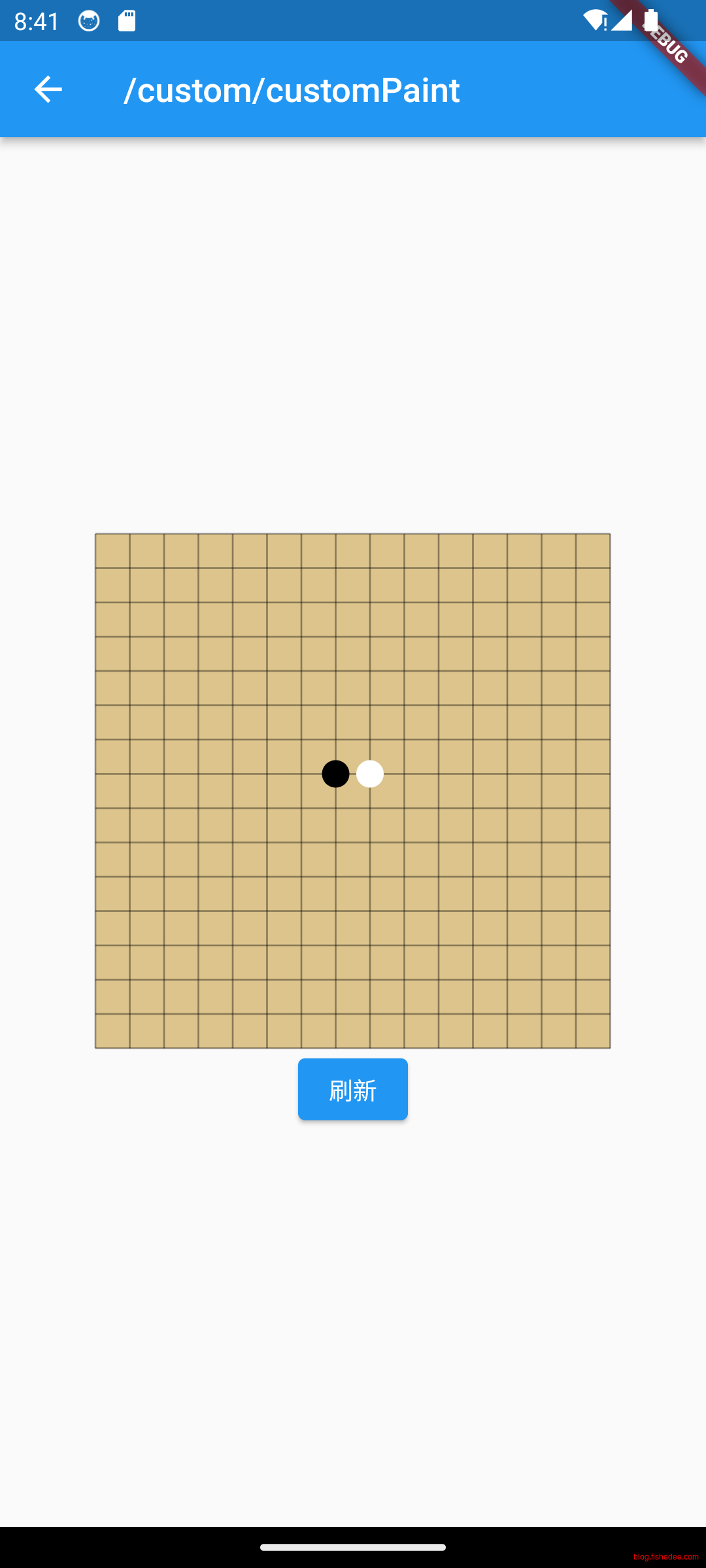
在flutter里面直接使用CustomPaint就能自定义paint阶段的操作了。在这里我们也能看到关于canvas的操作
12.3 RenderObjectWidget
import 'package:flutter/material.dart';
import 'package:flutter/scheduler.dart';

class CustomPaintWidgetDemo extends StatelessWidget {
  const CustomPaintWidgetDemo({super.key});

  @override
  Widget build(BuildContext context) {
    var counter = 0;
    return StatefulBuilder(builder: (context, setState) {
      return Align(
        child: Column(
          mainAxisSize: MainAxisSize.min,
          children: [
            SizedBox(
              width: 100,
              height: 100,
              child: DoneWidget(key: ValueKey(counter)),
            ),
            ElevatedButton(
              onPressed: () {
                setState(() {
                  counter++;
                });
              },
              child: const Text("刷新"),
            )
          ],
        ),
      );
    });
  }
}

class DoneWidget extends LeafRenderObjectWidget {
  const DoneWidget({
    super.key,
    this.strokeWidth = 2.0,
    this.color = Colors.green,
    this.outline = false,
  });

  //线条宽度
  final double strokeWidth;
  //轮廓颜色或填充色
  final Color color;
  //如果为true,则没有填充色,color代表轮廓的颜色;如果为false,则color为填充色
  final bool outline;

  @override
  RenderObject createRenderObject(BuildContext context) {
    print('createRenderObject key:${key}');
    return RenderDoneObject(
      strokeWidth,
      color,
      outline,
    )..animationStatus = AnimationStatus.forward; // 创建时执行正向动画
  }

  @override
  void updateRenderObject(context, RenderDoneObject renderObject) {
    print('updateRenderObject key:${key}');
    renderObject
      ..strokeWidth = strokeWidth
      ..outline = outline
      ..color = color;
  }
}

class RenderDoneObject extends RenderBox with RenderObjectAnimationMixin {
  double strokeWidth;
  Color color;
  bool outline;

  ValueChanged<bool>? onChanged;

  RenderDoneObject(
    this.strokeWidth,
    this.color,
    this.outline,
  );

  // 动画执行时间为 300ms
  @override
  Duration get duration => const Duration(milliseconds: 300);

  @override
  void doPaint(PaintingContext context, Offset offset) {
    // 可以对动画运用曲线
    Curve curve = Curves.easeIn;
    final _progress = curve.transform(progress);

    Rect rect = offset & size;
    final paint = Paint()
      ..isAntiAlias = true
      ..style = outline ? PaintingStyle.stroke : PaintingStyle.fill //填充
      ..color = color;

    if (outline) {
      paint.strokeWidth = strokeWidth;
      rect = rect.deflate(strokeWidth / 2);
    }

    // 画背景圆
    context.canvas.drawCircle(rect.center, rect.shortestSide / 2, paint);

    paint
      ..style = PaintingStyle.stroke
      ..color = outline ? color : Colors.white
      ..strokeWidth = strokeWidth;

    final path = Path();

    Offset firstOffset =
        Offset(rect.left + rect.width / 6, rect.top + rect.height / 2.1);

    final secondOffset = Offset(
      rect.left + rect.width / 2.5,
      rect.bottom - rect.height / 3.3,
    );

    path.moveTo(firstOffset.dx, firstOffset.dy);

    const adjustProgress = .6;
    //画 "勾"
    if (_progress < adjustProgress) {
      //第一个点到第二个点的连线做动画(第二个点不停的变)
      Offset _secondOffset = Offset.lerp(
        firstOffset,
        secondOffset,
        _progress / adjustProgress,
      )!;
      path.lineTo(_secondOffset.dx, _secondOffset.dy);
    } else {
      //链接第一个点和第二个点
      path.lineTo(secondOffset.dx, secondOffset.dy);
      //第三个点位置随着动画变,做动画
      final lastOffset = Offset(
        rect.right - rect.width / 5,
        rect.top + rect.height / 3.5,
      );
      Offset _lastOffset = Offset.lerp(
        secondOffset,
        lastOffset,
        (progress - adjustProgress) / (1 - adjustProgress),
      )!;
      path.lineTo(_lastOffset.dx, _lastOffset.dy);
    }
    context.canvas.drawPath(path, paint..style = PaintingStyle.stroke);
  }

  @override
  void performLayout() {
    // 如果父组件指定了固定宽高,则使用父组件指定的,否则宽高默认置为 25
    size = constraints.constrain(
      constraints.isTight ? Size.infinite : const Size(25, 25),
    );
  }
}

mixin RenderObjectAnimationMixin on RenderObject {
  double _progress = 0;
  int? _lastTimeStamp;

  // 动画时长,子类可以重写
  Duration get duration => const Duration(milliseconds: 1000);
  AnimationStatus _animationStatus = AnimationStatus.completed;
  // 设置动画状态
  set animationStatus(AnimationStatus v) {
    if (_animationStatus != v) {
      markNeedsPaint();
    }
    _animationStatus = v;
  }

  double get progress => _progress;
  set progress(double v) {
    _progress = v.clamp(0, 1);
  }

  @override
  void paint(PaintingContext context, Offset offset) {
    // 调用子类绘制逻辑,子类根据progress作渲染
    doPaint(context, offset);

    _scheduleAnimation();
  }

  void _scheduleAnimation() {
    if (_animationStatus != AnimationStatus.completed) {
      //当前动画未完成的情况下,都需要标记下一帧动画的触发回调
      //需要在Flutter 当前frame 结束之前再执行,因为不能在绘制过程中又将组件标记为需要重绘
      SchedulerBinding.instance.addPostFrameCallback((Duration timeStamp) {
        if (_lastTimeStamp != null) {
          //根据时间差计算当前的progress进度变化值delta
          double delta = (timeStamp.inMilliseconds - _lastTimeStamp!) /
              duration.inMilliseconds;

          //在特定情况下,可能在一帧中连续的往frameCallback中添加了多次,导致两次回调时间间隔为0,
          //这种情况下应该继续请求重绘。
          if (delta == 0) {
            markNeedsPaint();
            return;
          }

          if (_animationStatus == AnimationStatus.reverse) {
            delta = -delta;
          }
          _progress = _progress + delta;
          if (_progress >= 1 || _progress <= 0) {
            _animationStatus = AnimationStatus.completed;
            _progress = _progress.clamp(0, 1);
          }
        }
        //标记重绘,注意是markNeedPaint,不是markNeedsLayout(),不需要重排版。
        markNeedsPaint();
        _lastTimeStamp = timeStamp.inMilliseconds;
      });
    } else {
      _lastTimeStamp = null;
    }
  }

  // 子类实现绘制逻辑的地方
  void doPaint(PaintingContext context, Offset offset);
}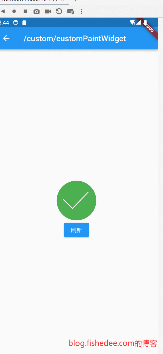
- 如果我们需要同时自定义layout和paint,就需要自定义自己的RenderObjectWidget了。由于我们的自定义组件没有child,我们直接从LeafRenderObjectWidget继承出来。
- RenderObjectWidget的关键在于createRenderObject和updateRenderObject。当首次从Widget创建Element的时候,就会调用createRenderObject。当其他Widget复用当前Element的时候,就会调用updateRenderObject。
- RenderBox的关键在于实现,performLayout,根据布局约束计算当前的size。paint,根据当前的页面来绘图
- 由于我们的组件还有动画效果,每次paint阶段结束以后,都会触发markNeedsPaint,通知flutter下一帧还得继续paint,以保持一个动画效果。
13 数据
代码在这里,总体比较简单,直接使用就可以了。
13.1 ajax
import 'dart:convert';
import 'dart:typed_data';

import 'package:flutter/material.dart';
import 'package:http/http.dart' as http;

class HttpDemo extends StatefulWidget {
  const HttpDemo({super.key});

  @override
  State<HttpDemo> createState() => _HttpDemo();
}

class _HttpDemo extends State<HttpDemo> {
  String content = "";

  Uint8List imageData = Uint8List(0);

  @override
  Widget build(BuildContext context) {
    return SingleChildScrollView(
      child: Column(
        children: [
          Text(content),
          ElevatedButton(
            onPressed: onRequestGet,
            child: const Text("查看GET请求包"),
          ),
          ElevatedButton(
            onPressed: onRequestPostForm,
            child: const Text("查看POST FORM请求包"),
          ),
          ElevatedButton(
            onPressed: onRequestPostJson,
            child: const Text("查看POST JSON请求包"),
          ),
          ElevatedButton(
            onPressed: onRequestHostError,
            child: const Text("查看请求Host不存在"),
          ),
          ElevatedButton(
            onPressed: onRequestPathError,
            child: const Text("查看请求Path不存在"),
          ),
          Image.memory(imageData, fit: BoxFit.cover),
          ElevatedButton(
            onPressed: onDownloadFile,
            child: const Text("下载图片"),
          ),
          ElevatedButton(
            onPressed: onUploadFile,
            child: const Text("上传文件"),
          ),
        ],
      ),
    );
  }

  onRequestGet() async {
    Map<String, String> parameters = {
      'x': '3',
      'y': '4',
    };
    Uri uri = Uri.parse('http://httpbin.org/anything')
        .replace(queryParameters: parameters);
    final response = await http.get(
      uri,
    );
    content = response.body;
    setState(() {});
  }

  onRequestPostForm() async {
    Map<String, String> parameters = {
      'x': '3',
      'y': '4',
    };
    Uri uri = Uri.parse("").replace(queryParameters: parameters);

    final response = await http.post(
      Uri.parse('http://httpbin.org/anything'),
      headers: {
        'Content-Type':
            'application/x-www-form-urlencoded', // 指定请求的Content-Type为URL-encoded
      },
      body: uri.query,
    );
    content = response.body;
    setState(() {});
  }

  onRequestPostJson() async {
    Map<String, String> parameters = {
      'x': '3',
      'y': '4',
    };

    final response = await http.post(
      Uri.parse('http://httpbin.org/anything'),
      headers: {
        'Content-Type': 'application/json', // 指定请求的Content-Type为URL-encoded
      },
      body: jsonEncode(parameters),
    );
    content = response.body;
    setState(() {});
  }

  onRequestHostError() async {
    try {
      Map<String, String> parameters = {
        'x': '3',
        'y': '4',
      };

      final response = await http.post(
        Uri.parse('https://error_cc/'),
        headers: {
          'Content-Type': 'application/json', // 指定请求的Content-Type为URL-encoded
        },
        body: jsonEncode(parameters),
      );
      content = response.body;
      setState(() {});
    } on http.ClientException catch (e) {
      print('http.ClientException $e');
    } catch (e) {
      print('other exception $e');
    }
  }

  onRequestPathError() async {
    Map<String, String> parameters = {
      'x': '3',
      'y': '4',
    };

    final response = await http.post(
      Uri.parse('https://httpbin.org/ccc'),
      headers: {
        'Content-Type': 'application/json', // 指定请求的Content-Type为URL-encoded
      },
      body: jsonEncode(parameters),
    );
    content = response.body;
    print('statusCode ${response.statusCode}');
    setState(() {});
  }

  onDownloadFile() async {
    final response = await http.get(
      Uri.parse('https://httpbin.org/image/jpeg'),
    );
    imageData = response.bodyBytes;
    setState(() {});
  }

  onUploadFile() async {
    // 创建一个Multipart请求
    var request = http.MultipartRequest(
        'POST', Uri.parse("https://httpbin.org/anything"));

    // 添加文件到请求
    request.files.add(
      //直接指向文件
      //await http.MultipartFile('file', file.path),
      http.MultipartFile.fromBytes('file', imageData),
    );

    // 发送请求
    final response = await request.send();

    content = await response.stream.bytesToString();
    print('statusCode ${response.statusCode}');
    setState(() {});
  }
}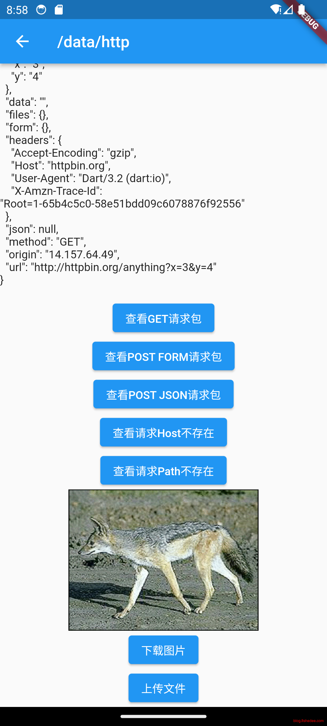
简单,没啥好说的
13.2 json
import 'dart:convert';

import 'package:flutter/material.dart';
import 'package:json_annotation/json_annotation.dart';
import 'package:decimal/decimal.dart';

//part的名称必须与当前文件一致的
part 'json.g.dart';

//dart run build_runner build --delete-conflicting-outputs
//dart run build_runner watch --delete-conflicting-outputs

@JsonSerializable()
class Address {
  String? street;
  String city;

  Address(this.street, this.city);

  factory Address.fromJson(Map<String, dynamic> json) =>
      _$AddressFromJson(json);
  Map<String, dynamic> toJson() => _$AddressToJson(this);
}

@JsonSerializable()
class Item {
  int id;

  Decimal amount;

  Decimal? price;

  Item(this.id, this.amount, this.price);

  factory Item.fromJson(Map<String, dynamic> json) => _$ItemFromJson(json);
  Map<String, dynamic> toJson() => _$ItemToJson(this);
}

@JsonSerializable(explicitToJson: true)
class User {
  User(this.name, this.address, this.items, this.color);

  String name;
  Address? address;

  Color? color;

  List<Item> items;

  factory User.fromJson(Map<String, dynamic> json) => _$UserFromJson(json);
  Map<String, dynamic> toJson() => _$UserToJson(this);
}

enum Color {
  red('红色'),
  green('绿色'),
  blue('蓝色');

  //构造函数必须是const的,因此成员变量也必须是final的
  final String label;
  const Color(this.label);

  @override
  String toString() {
    //每个枚举都有一个index
    return 'color:$label, index $index';
  }
}

testBasic() {
  var input = '''
{
  "name":"fish",
  "address":{
    "street":"st1",
    "city":"mc"
  },
  "items":[
    {
      "id":1,
      "amount":"123",
      "price":"34.12"
    },
     {
      "id":2,
      "amount":"123"
    }
  ],
  "color":"blue"
}
''';
  final input2 = jsonDecode(input) as Map<String, dynamic>;
  final user = User.fromJson(input2);
  print('user ${user.toJson()}');
  String output = jsonEncode(user);
  print('user output [$output]');
}

testEmpty() {
  var input = '''
{
  "address":{
    "street":"st1",
    "city":"mc"
  },
  "items":[
  ]
}
''';
  try {
    final input2 = jsonDecode(input) as Map<String, dynamic>;
    final user = User.fromJson(input2);
    print('user ${user.toJson()}');
  } catch (e, s) {
    print('username is null,so fail! $e,$s');
  }
}

testStringCanNotAsNum() {
  var input = '''
{
  "name":"cat",
  "items":[
      {
        "id":"123",
        "amount":"456"
      }
  ]
}
''';
  try {
    final input2 = jsonDecode(input) as Map<String, dynamic>;
    final user = User.fromJson(input2);
    print('user ${user.toJson()}');
  } catch (e, s) {
    print('id "123" is not int,so fail! $e,$s');
  }
}

testEnumIsNotExist() {
  var input = '''
{
  "name":"cat",
  "color":"yellow",
  "items":[
  ]
}
''';
  try {
    final input2 = jsonDecode(input) as Map<String, dynamic>;
    final user = User.fromJson(input2);
    print('user ${user.toJson()}');
  } catch (e, s) {
    print('color [yellow] is not exist,so fail! $e,$s');
  }
}

class JsonDemo extends StatelessWidget {
  const JsonDemo({super.key});

  test() {
    testBasic();
    testEmpty();
    testEnumIsNotExist();
    testStringCanNotAsNum();
  }

  @override
  Widget build(BuildContext context) {
    return Column(children: [
      ElevatedButton(
        onPressed: test,
        child: const Text('点我试试'),
      )
    ]);
  }
}
flutter里面是不允许使用反射的,所以序列化的操作只能依赖代码生成器,以下代码生成器的触发命令
dart run build_runner build --delete-conflicting-outputs
dart run build_runner watch --delete-conflicting-outputs
watch是监控模式
// GENERATED CODE - DO NOT MODIFY BY HAND

part of 'json.dart';

// **************************************************************************
// JsonSerializableGenerator
// **************************************************************************

Address _$AddressFromJson(Map<String, dynamic> json) => Address(
      json['street'] as String?,
      json['city'] as String,
    );

Map<String, dynamic> _$AddressToJson(Address instance) => <String, dynamic>{
      'street': instance.street,
      'city': instance.city,
    };

Item _$ItemFromJson(Map<String, dynamic> json) => Item(
      json['id'] as int,
      Decimal.fromJson(json['amount'] as String),
      json['price'] == null ? null : Decimal.fromJson(json['price'] as String),
    );

Map<String, dynamic> _$ItemToJson(Item instance) => <String, dynamic>{
      'id': instance.id,
      'amount': instance.amount,
      'price': instance.price,
    };

User _$UserFromJson(Map<String, dynamic> json) => User(
      json['name'] as String,
      json['address'] == null
          ? null
          : Address.fromJson(json['address'] as Map<String, dynamic>),
      (json['items'] as List<dynamic>)
          .map((e) => Item.fromJson(e as Map<String, dynamic>))
          .toList(),
      $enumDecodeNullable(_$ColorEnumMap, json['color']),
    );

Map<String, dynamic> _$UserToJson(User instance) => <String, dynamic>{
      'name': instance.name,
      'address': instance.address?.toJson(),
      'color': _$ColorEnumMap[instance.color],
      'items': instance.items.map((e) => e.toJson()).toList(),
    };

const _$ColorEnumMap = {
  Color.red: 'red',
  Color.green: 'green',
  Color.blue: 'blue',
};
这是生成出来的代码,也比较简单。
13.3 持久化
13.3.1 key-value
import 'package:flutter/material.dart';
import 'package:shared_preferences/shared_preferences.dart';

class PersistKeyValueDemo extends StatelessWidget {
  const PersistKeyValueDemo({super.key});

  @override
  Widget build(BuildContext context) {
    return const MyHomePage(title: 'Shared preferences demo');
  }
}

class MyHomePage extends StatefulWidget {
  const MyHomePage({super.key, required this.title});

  final String title;

  @override
  State<MyHomePage> createState() => _MyHomePageState();
}

class _MyHomePageState extends State<MyHomePage> {
  int _counter = 0;

  @override
  void initState() {
    super.initState();
    _loadCounter();
  }

  /// Load the initial counter value from persistent storage on start,
  /// or fallback to 0 if it doesn't exist.
  Future<void> _loadCounter() async {
    final prefs = await SharedPreferences.getInstance();
    setState(() {
      _counter = prefs.getInt('counter') ?? 0;
    });
  }

  /// After a click, increment the counter state and
  /// asynchronously save it to persistent storage.
  Future<void> _incrementCounter() async {
    final prefs = await SharedPreferences.getInstance();
    setState(() {
      //key-value存储结构,不适合放入大量数据,get与set
      _counter = (prefs.getInt('counter') ?? 0) + 1;
      prefs.setInt('counter', _counter);
    });
  }

  @override
  Widget build(BuildContext context) {
    return Scaffold(
      body: Center(
        child: Column(
          mainAxisAlignment: MainAxisAlignment.center,
          children: [
            const Text(
              'You have pushed the button this many times: ',
            ),
            Text(
              '$_counter',
              style: Theme.of(context).textTheme.headlineMedium,
            ),
          ],
        ),
      ),
      floatingActionButton: FloatingActionButton(
        onPressed: _incrementCounter,
        tooltip: 'Increment',
        child: const Icon(Icons.add),
      ),
    );
  }
}
使用SharedPreferences来存放数据,比较简单。
13.3.2 file
import 'dart:async';
import 'dart:io';

import 'package:flutter/material.dart';
import 'package:path_provider/path_provider.dart';

class PersistFileDemo extends StatelessWidget {
  const PersistFileDemo({super.key});

  @override
  Widget build(BuildContext context) {
    return FlutterDemo(storage: CounterStorage());
  }
}

class FlutterDemo extends StatefulWidget {
  const FlutterDemo({super.key, required this.storage});

  final CounterStorage storage;

  @override
  State<FlutterDemo> createState() => _FlutterDemoState();
}

class _FlutterDemoState extends State<FlutterDemo> {
  int _counter = 0;

  @override
  void initState() {
    super.initState();
    widget.storage.readCounter().then((value) {
      setState(() {
        _counter = value;
      });
    });
  }

  Future<File> _incrementCounter() {
    setState(() {
      _counter++;
    });

    // Write the variable as a string to the file.
    return widget.storage.writeCounter(_counter);
  }

  @override
  Widget build(BuildContext context) {
    return Scaffold(
      appBar: AppBar(
        title: const Text('Reading and Writing Files'),
      ),
      body: Center(
        child: Text(
          'Button tapped $_counter time${_counter == 1 ? '' : 's'}.',
        ),
      ),
      floatingActionButton: FloatingActionButton(
        onPressed: _incrementCounter,
        tooltip: 'Increment',
        child: const Icon(Icons.add),
      ),
    );
  }
}

class CounterStorage {
  Future<String> get _localPath async {
    final directory = await getApplicationDocumentsDirectory();

    return directory.path;
  }

  Future<File> get _localFile async {
    final path = await _localPath;
    return File('$path/counter.txt');
  }

  Future<int> readCounter() async {
    try {
      final file = await _localFile;

      //读取文件
      // Read the file
      final contents = await file.readAsString();

      return int.parse(contents);
    } catch (e) {
      // If encountering an error, return 0
      return 0;
    }
  }

  Future<File> writeCounter(int counter) async {
    final file = await _localFile;

    //写入文件
    // Write the file
    return file.writeAsString('$counter');
  }
}
使用文件来存放数据,也比较简单
13.3.3 sqlite
import 'dart:async';

import 'package:flutter/material.dart';
import 'package:path/path.dart';
import 'package:sqflite/sqflite.dart';

class PersistSqliteDemo extends StatelessWidget {
  const PersistSqliteDemo({super.key});

  @override
  Widget build(BuildContext context) {
    return const Column(children: [
      ElevatedButton(
        onPressed: test,
        child: const Text('点我试试'),
      )
    ]);
  }
}

void test() async {
  // Avoid errors caused by flutter upgrade.
  // Importing 'package:flutter/widgets.dart' is required.
  WidgetsFlutterBinding.ensureInitialized();
  // Open the database and store the reference.
  //返回一个Future对象
  final database = openDatabase(
    // Set the path to the database. Note: Using the `join` function from the
    // `path` package is best practice to ensure the path is correctly
    // constructed for each platform.
    //默认的datbase位置,安全
    join(await getDatabasesPath(), 'doggie_database.db'),
    // When the database is first created, create a table to store dogs.
    onCreate: (db, version) {
      //将迁移脚本都放在这里
      // Run the CREATE TABLE statement on the database.
      return db.execute(
        'CREATE TABLE dogs(id INTEGER PRIMARY KEY, name TEXT, age INTEGER)',
      );
    },
    // Set the version. This executes the onCreate function and provides a
    // path to perform database upgrades and downgrades.
    version: 1,
  );

  // Define a function that inserts dogs into the database
  Future<void> insertDog(Dog dog) async {
    // Get a reference to the database.
    final db = await database;

    // Insert the Dog into the correct table. You might also specify the
    // `conflictAlgorithm` to use in case the same dog is inserted twice.
    //
    // In this case, replace any previous data.

    //insert语句
    await db.insert(
      'dogs',
      dog.toMap(),
      conflictAlgorithm: ConflictAlgorithm.replace,
    );
  }

  // A method that retrieves all the dogs from the dogs table.
  Future<List<Dog>> dogs() async {
    // Get a reference to the database.
    final db = await database;

    // Query the table for all The Dogs.
    final List<Map<String, dynamic>> maps = await db.query('dogs');

    // Convert the List<Map<String, dynamic> into a List<Dog>.
    // 读取数据
    return List.generate(maps.length, (i) {
      return Dog(
        id: maps[i]['id'] as int,
        name: maps[i]['name'] as String,
        age: maps[i]['age'] as int,
      );
    });
  }

  Future<void> updateDog(Dog dog) async {
    // Get a reference to the database.
    final db = await database;

    // Update the given Dog.
    //更新数据
    await db.update(
      'dogs',
      dog.toMap(),
      // Ensure that the Dog has a matching id.
      where: 'id = ?',
      // Pass the Dog's id as a whereArg to prevent SQL injection.
      whereArgs: [dog.id],
    );
  }

  Future<void> deleteDog(int id) async {
    // Get a reference to the database.
    final db = await database;

    // Remove the Dog from the database.
    //删除数据
    await db.delete(
      'dogs',
      // Use a `where` clause to delete a specific dog.
      where: 'id = ?',
      // Pass the Dog's id as a whereArg to prevent SQL injection.
      whereArgs: [id],
    );
  }

  // Create a Dog and add it to the dogs table
  var fido = const Dog(
    id: 0,
    name: 'Fido',
    age: 35,
  );

  await insertDog(fido);

  // Now, use the method above to retrieve all the dogs.
  print(await dogs()); // Prints a list that include Fido.

  // Update Fido's age and save it to the database.
  fido = Dog(
    id: fido.id,
    name: fido.name,
    age: fido.age + 7,
  );
  await updateDog(fido);

  // Print the updated results.
  print(await dogs()); // Prints Fido with age 42.

  // Delete Fido from the database.
  await deleteDog(fido.id);

  // Print the list of dogs (empty).
  print(await dogs());
}

class Dog {
  final int id;
  final String name;
  final int age;

  const Dog({
    required this.id,
    required this.name,
    required this.age,
  });

  // Convert a Dog into a Map. The keys must correspond to the names of the
  // columns in the database.
  Map<String, dynamic> toMap() {
    return {
      'id': id,
      'name': name,
      'age': age,
    };
  }

  // Implement toString to make it easier to see information about
  // each dog when using the print statement.
  @override
  String toString() {
    return 'Dog{id: $id, name: $name, age: $age}';
  }
}用Sqlite来存放数据,这里的跟Android里面使用Sqlite的接口相似,看这里
13.4 后台异步
import 'dart:async';
import 'dart:convert';

import 'package:flutter/foundation.dart';
import 'package:flutter/material.dart';
import 'package:http/http.dart' as http;

class ComputeIsolateDemo extends StatelessWidget {
  const ComputeIsolateDemo({super.key});

  @override
  Widget build(BuildContext context) {
    const appTitle = 'Isolate Demo';

    return const MaterialApp(
      title: appTitle,
      home: MyHomePage(title: appTitle),
    );
  }
}

Future<List<Photo>> fetchPhotos(http.Client client) async {
  final response = await client
      .get(Uri.parse('https://jsonplaceholder.typicode.com/photos'));

  // Use the compute function to run parsePhotos in a separate isolate.
  //放入隔离的isoltate进行异步的解码操作
  return compute(parsePhotos, response.body);
}

// A function that converts a response body into a List<Photo>.
List<Photo> parsePhotos(String responseBody) {
  final parsed =
      (jsonDecode(responseBody) as List).cast<Map<String, dynamic>>();

  return parsed.map<Photo>((json) => Photo.fromJson(json)).toList();
}

class Photo {
  final int albumId;
  final int id;
  final String title;
  final String url;
  final String thumbnailUrl;

  const Photo({
    required this.albumId,
    required this.id,
    required this.title,
    required this.url,
    required this.thumbnailUrl,
  });

  factory Photo.fromJson(Map<String, dynamic> json) {
    return Photo(
      albumId: json['albumId'] as int,
      id: json['id'] as int,
      title: json['title'] as String,
      url: json['url'] as String,
      thumbnailUrl: json['thumbnailUrl'] as String,
    );
  }
}

class MyHomePage extends StatelessWidget {
  const MyHomePage({super.key, required this.title});

  final String title;

  @override
  Widget build(BuildContext context) {
    return Scaffold(
      appBar: AppBar(
        title: Text(title),
      ),
      body: FutureBuilder<List<Photo>>(
        future: fetchPhotos(http.Client()),
        builder: (context, snapshot) {
          if (snapshot.hasError) {
            return const Center(
              child: Text('An error has occurred!'),
            );
          } else if (snapshot.hasData) {
            return PhotosList(photos: snapshot.data!);
          } else {
            return const Center(
              child: CircularProgressIndicator(),
            );
          }
        },
      ),
    );
  }
}

class PhotosList extends StatelessWidget {
  const PhotosList({super.key, required this.photos});

  final List<Photo> photos;

  @override
  Widget build(BuildContext context) {
    return GridView.builder(
      gridDelegate: const SliverGridDelegateWithFixedCrossAxisCount(
        crossAxisCount: 2,
      ),
      itemCount: photos.length,
      itemBuilder: (context, index) {
        return Image.network(photos[index].thumbnailUrl);
      },
    );
  }
}
使用compute来创建新的isolate做异步的耗时操作,注意,dart的isolate相当于多进程架构,内存是不共享的。
13.5 webSocket
import 'package:flutter/material.dart';
import 'package:web_socket_channel/web_socket_channel.dart';

class WebSocketDemo extends StatelessWidget {
  const WebSocketDemo({super.key});

  @override
  Widget build(BuildContext context) {
    const title = 'WebSocket Demo';
    return const MaterialApp(
      title: title,
      home: MyHomePage(
        title: title,
      ),
    );
  }
}

class MyHomePage extends StatefulWidget {
  const MyHomePage({
    super.key,
    required this.title,
  });

  final String title;

  @override
  State<MyHomePage> createState() => _MyHomePageState();
}

class _MyHomePageState extends State<MyHomePage> {
  final TextEditingController _controller = TextEditingController();
  final _channel = WebSocketChannel.connect(
    Uri.parse('wss://echo.websocket.events'),
  );

  @override
  Widget build(BuildContext context) {
    return Scaffold(
      appBar: AppBar(
        title: Text(widget.title),
      ),
      body: Padding(
        padding: const EdgeInsets.all(20),
        child: Column(
          crossAxisAlignment: CrossAxisAlignment.start,
          children: [
            Form(
              child: TextFormField(
                controller: _controller,
                decoration: const InputDecoration(labelText: 'Send a message'),
              ),
            ),
            const SizedBox(height: 24),
            StreamBuilder(
              stream: _channel.stream,
              builder: (context, snapshot) {
                return Text(snapshot.hasData ? '${snapshot.data}' : '');
              },
            )
          ],
        ),
      ),
      floatingActionButton: FloatingActionButton(
        onPressed: _sendMessage,
        tooltip: 'Send message',
        child: const Icon(Icons.send),
      ), // This trailing comma makes auto-formatting nicer for build methods.
    );
  }

  void _sendMessage() {
    if (_controller.text.isNotEmpty) {
      _channel.sink.add(_controller.text);
    }
  }

  @override
  void dispose() {
    _channel.sink.close();
    _controller.dispose();
    super.dispose();
  }
}
webSocket代码,这个也简单
14 其它
代码在这里
14.1 错误上报
import 'package:flutter/material.dart';
import 'dart:ui';

/*
//全局异常捕捉最好放在main之前执行。
main() async {
  FlutterError.onError = (details) {
    FlutterError.presentError(details);
    //myErrorsHandler.onErrorDetails(details);
  };
  PlatformDispatcher.instance.onError = (error, stack) {
    //myErrorsHandler.onError(error, stack);
    return true;
  };
  runApp(const ErrorReportDemo());
}
*/

class ErrorReportDemo extends StatelessWidget {
  const ErrorReportDemo({super.key});

  tryFail() async {
    await Future.delayed(const Duration(seconds: 1));
    throw Exception('fish is fail!');
  }

  @override
  Widget build(BuildContext context) {
    FlutterError.onError = (details) {
      FlutterError.presentError(details);
      print('onError $details');
      //myErrorsHandler.onErrorDetails(details);
    };
    PlatformDispatcher.instance.onError = (error, stack) {
      print('PlatformDispatcherError $error $stack');
      //myErrorsHandler.onError(error, stack);
      return true;
    };
    return MaterialApp(
        builder: (context, widget) {
          Widget error = const Text('...rendering error...');
          if (widget is Scaffold || widget is Navigator) {
            error = Scaffold(body: Center(child: error));
          }
          ErrorWidget.builder = (errorDetails) => error;
          if (widget != null) return widget;
          throw StateError('widget is null');
        },
        home: Column(
          children: [
            ElevatedButton(
              onPressed: () {
                tryFail();
              },
              child: const Text("点我试试"),
            )
          ],
        ));
  }
}
可以统一捕捉未处理的异步错误,然后进行统一的报错和上报操作。
14.2 原生控件通信
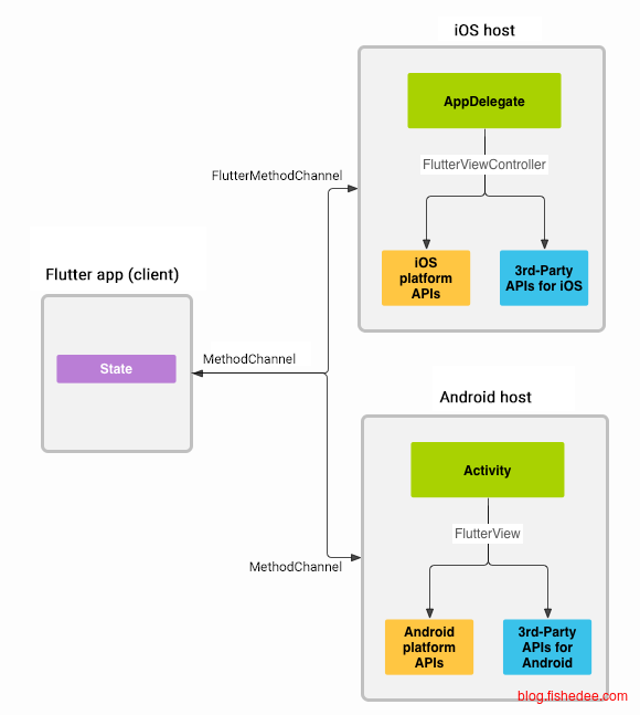
文档看这里,我们要实现了可以实时获取电池状态的接口。
13.2.1 Flutter端
// Copyright 2014 The Flutter Authors. All rights reserved.
// Use of this source code is governed by a BSD-style license that can be
// found in the LICENSE file.

import 'dart:async';

import 'package:flutter/material.dart';
import 'package:flutter/services.dart';

class BatteryDemo extends StatefulWidget {
  const BatteryDemo({super.key});

  @override
  State<BatteryDemo> createState() => _PlatformChannelState();
}

class _PlatformChannelState extends State<BatteryDemo> {
  static const MethodChannel methodChannel =
      MethodChannel('samples.flutter.io/battery');
  static const EventChannel eventChannel =
      EventChannel('samples.flutter.io/charging');

  String _batteryLevel = 'Battery level: unknown.';
  String _chargingStatus = 'Battery status: unknown.';

  Future<void> _getBatteryLevel() async {
    String batteryLevel;
    try {
      final int? result = await methodChannel.invokeMethod('getBatteryLevel');
      batteryLevel = 'Battery level: $result%.';
    } on PlatformException catch (e) {
      if (e.code == 'NO_BATTERY') {
        batteryLevel = 'No battery.';
      } else {
        batteryLevel = 'Failed to get battery level.';
      }
    }
    setState(() {
      _batteryLevel = batteryLevel;
    });
  }

  @override
  void initState() {
    super.initState();
    eventChannel.receiveBroadcastStream().listen(_onEvent, onError: _onError);
  }

  void _onEvent(Object? event) {
    setState(() {
      _chargingStatus =
          "Battery status: ${event == 'charging' ? '' : 'dis'}charging.";
    });
  }

  void _onError(Object error) {
    setState(() {
      _chargingStatus = 'Battery status: unknown.';
    });
  }

  @override
  Widget build(BuildContext context) {
    return Material(
      child: Column(
        mainAxisAlignment: MainAxisAlignment.spaceEvenly,
        children: <Widget>[
          Column(
            mainAxisAlignment: MainAxisAlignment.center,
            children: <Widget>[
              Text(_batteryLevel, key: const Key('Battery level label')),
              Padding(
                padding: const EdgeInsets.all(16.0),
                child: ElevatedButton(
                  onPressed: _getBatteryLevel,
                  child: const Text('Refresh'),
                ),
              ),
            ],
          ),
          Text(_chargingStatus),
        ],
      ),
    );
  }
}
要点如下:
- MethodChannel,用来调用原生的接口,通过自定义包名直接创建,然后使用invokeMethod来调用得到结果
- EventChannel,用来侦听来自原生的消息,通过自定义包名来直接获取,然后使用receiveBroadcastStream.listen来获取消息。
注意,以上操作都会经历消息的序列化和反序列化操作,会有一点overhead的损失。
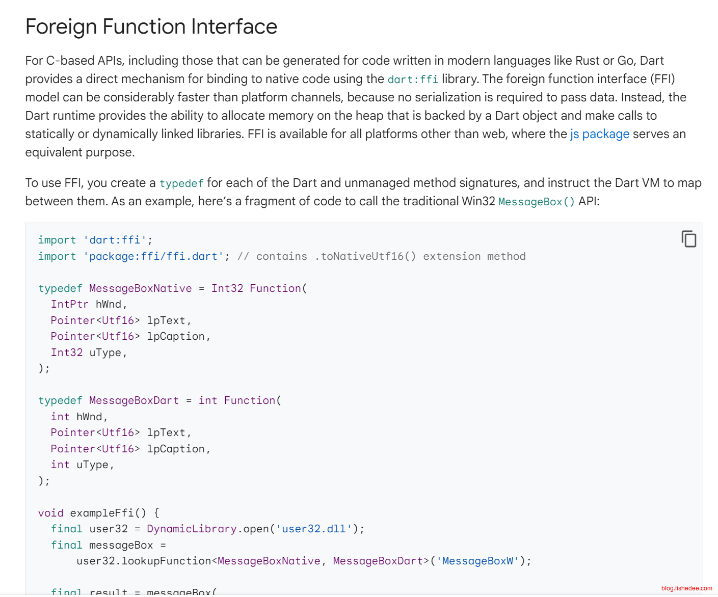
flutter提供了FFI的方式,访问类C语言接口,不需要消息的序列化和反序列化操作。
13.2.2 Android端
package com.example.demo

import android.content.BroadcastReceiver
import android.content.Context
import android.content.ContextWrapper
import android.content.Intent
import android.content.IntentFilter
import android.os.BatteryManager
import android.os.Build.VERSION
import android.os.Build.VERSION_CODES
import io.flutter.embedding.android.FlutterActivity
import io.flutter.embedding.engine.FlutterEngine
import io.flutter.plugin.common.EventChannel
import io.flutter.plugin.common.EventChannel.EventSink
import io.flutter.plugin.common.EventChannel.StreamHandler
import io.flutter.plugin.common.MethodChannel


class MainActivity: FlutterActivity() {
    private val BATTERY_CHANNEL = "samples.flutter.io/battery"
    private val CHARGING_CHANNEL = "samples.flutter.io/charging"

    override fun configureFlutterEngine(flutterEngine: FlutterEngine) {
        EventChannel(flutterEngine.dartExecutor, CHARGING_CHANNEL).setStreamHandler(
            object : StreamHandler {
                private var chargingStateChangeReceiver: BroadcastReceiver? = null
                override
                fun onListen(arguments: Any?, events: EventSink) {
                    chargingStateChangeReceiver = createChargingStateChangeReceiver(events)
                    registerReceiver(
                        chargingStateChangeReceiver, IntentFilter(Intent.ACTION_BATTERY_CHANGED)
                    )
                }

                override
                fun onCancel(arguments: Any?) {
                    unregisterReceiver(chargingStateChangeReceiver)
                    chargingStateChangeReceiver = null
                }
            }
        )
        MethodChannel(
            flutterEngine.dartExecutor,
            BATTERY_CHANNEL
        ).setMethodCallHandler { call, result ->
            if (call.method == "getBatteryLevel") {
                val batteryLevel = getBatteryLevel()
                if (batteryLevel != -1) {
                    result.success(batteryLevel)
                } else {
                    result.error("UNAVAILABLE", "Battery level not available.", null)
                }
            } else {
                result.notImplemented()
            }
        }
    }

    private fun createChargingStateChangeReceiver(events: EventSink): BroadcastReceiver? {
        return object : BroadcastReceiver() {
            override fun onReceive(context: Context, intent: Intent) {
                val status = intent.getIntExtra(BatteryManager.EXTRA_STATUS, -1)
                if (status == BatteryManager.BATTERY_STATUS_UNKNOWN) {
                    events.error("UNAVAILABLE", "Charging status unavailable", null)
                } else {
                    val isCharging = status == BatteryManager.BATTERY_STATUS_CHARGING ||
                            status == BatteryManager.BATTERY_STATUS_FULL
                    events.success(if (isCharging) "charging" else "discharging")
                }
            }
        }
    }

    private fun getBatteryLevel(): Int {
        return if (VERSION.SDK_INT >= VERSION_CODES.LOLLIPOP) {
            val batteryManager = getSystemService(BATTERY_SERVICE) as BatteryManager
            batteryManager.getIntProperty(BatteryManager.BATTERY_PROPERTY_CAPACITY)
        } else {
            val intent = ContextWrapper(applicationContext).registerReceiver(
                null,
                IntentFilter(Intent.ACTION_BATTERY_CHANGED)
            )
            intent!!.getIntExtra(BatteryManager.EXTRA_LEVEL, -1) * 100 /
                    intent.getIntExtra(BatteryManager.EXTRA_SCALE, -1)
        }
    }
}
在android/app/src/main的MainActivity加入以上代码即可,不太难。
15 原理
参考资料:
强烈建议看《Flutter实战第二版》,讲解很清楚,而且有Demo测试,我在这里仅作一些非常简要的描述,只从宏观的角度说明整个流程,去掉了很多优化类的操作
15.1 三棵树
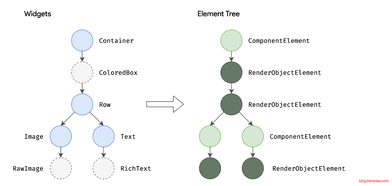
- Widget,相当于React.createElement,在每次build/render都会重新生成,描述的其实是页面的配置,而不是页面中真实显示的对象。
- Element,相当于Html5中的DOM,就是指页面中真实显示的对象。
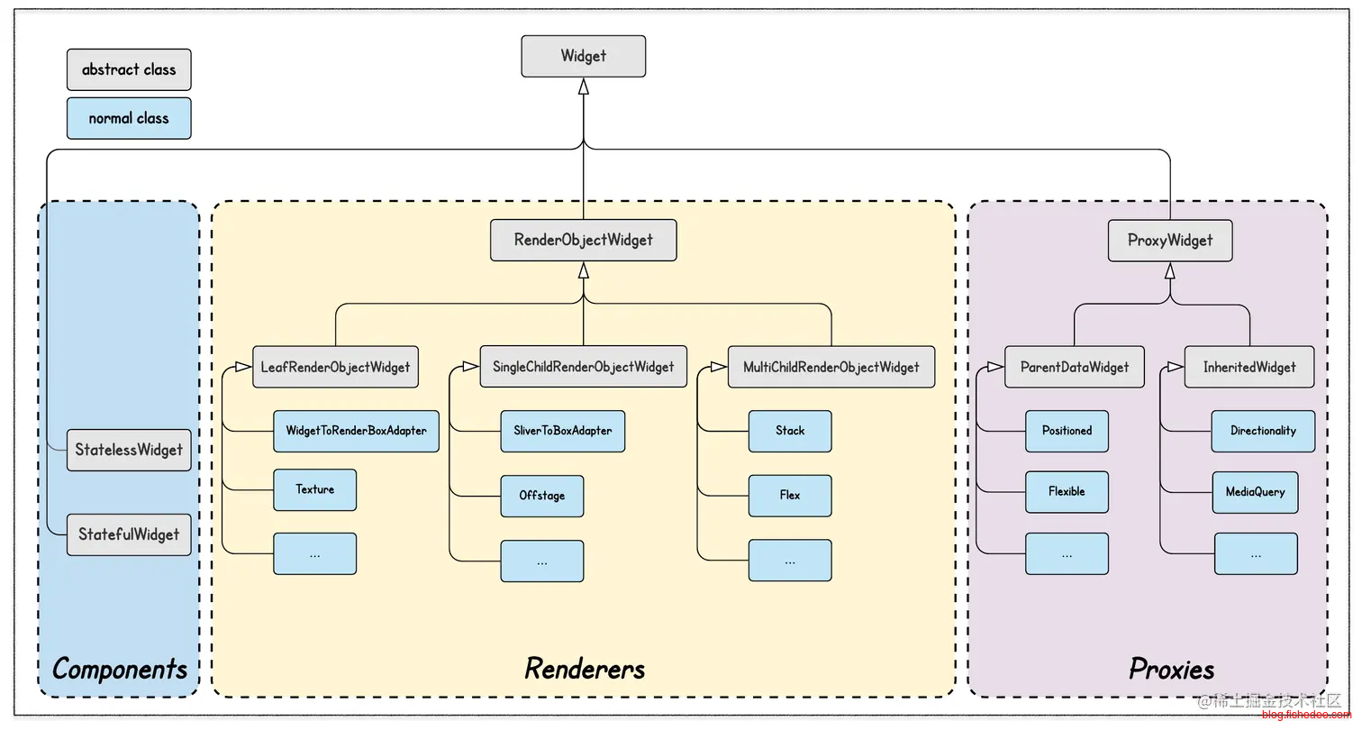
Widget一共有三种类型,分别是:
- ComponentWidget,将别人的Widget组合为自己的Widget,它们没有进行任何实际的layout和paint能力。我们最常用的StatelessWidget和StatefulWidget,就是来自于这类的Widget。
- RenderWidget,有实际layout和paint能力的组件,我们称为RenderObjectWidget。他们只分三种,LeafRenderObjectWidget(没有child节点),SingleChildRenderWidget(最多单个child节点),MultiChildRenderWidget(允许有多个child节点)。
- ProxyWidget,功能类的组件,分别是ParentDataWidget和InheritedWidget,没啥好说,忽略他们吧。
class Widget{

  ...

  static bool canUpdate(Widget oldWidget, Widget newWidget) {
    return oldWidget.runtimeType == newWidget.runtimeType
        && oldWidget.key == newWidget.key;
  }

  ...
}
在Widget与Element的映射逻辑是很简单的,类似于React里面的diff逻辑。
- 如果前后两个Widget的runtimeType和key都是相等的话,就复用原来的Element,并且在复用Element上,调用它的element.didUpdateWidget。看12.1的例子。
- 如果前后两个Widget的runtimeType或者key是不相等,那么就重新创建新的Element,调用widget.createElement。
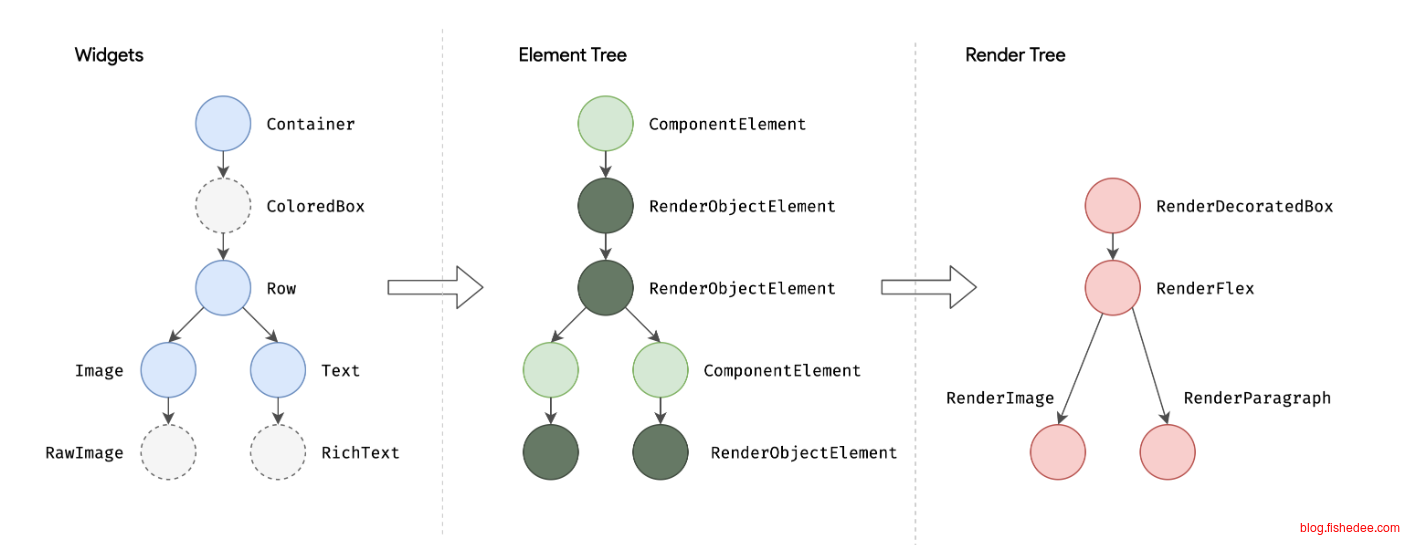
从Widget生成Element以后,我们就可以拿着Element进行渲染流程。由于实际渲染的时候,我们其实仅需要RenderWidget,ComponentWidget是没有任何layout和paint的能力。所以,flutter生成了第三颗树。
从ElementTree生成RenderObject,那么渲染的时候就可以直接只用RenderObject树就可以了,这样渲染的速度就能提高(略过没啥用的ElementTree),而且RenderObject可以设计成更多渲染优化的操作。
abstract class RenderObjectWidget{
  RenderObject createRenderObject(BuildContext context);
  void updateRenderObject(BuildContext context, covariant RenderObject renderObject) { };
}

abstract class RenderObjectElement{
  @override
  void mount(Element? parent, Object? newSlot) {
    super.mount(parent, newSlot);

    _renderObject = (widget as RenderObjectWidget).createRenderObject(this);
    attachRenderObject(newSlot);

    super.performRebuild(); // clears the "dirty" flag
  }

  @mustCallSuper
  void update(covariant Widget newWidget) {

    ...

    _widget = newWidget;
    super.update(newWidget);

    ...

    _performRebuild(); // calls widget.updateRenderObject()
  }


  @pragma('vm:prefer-inline')
  void _performRebuild() {
    ...

    (widget as RenderObjectWidget).updateRenderObject(this, renderObject);

    ...

    super.performRebuild(); // clears the "dirty" flag
  }

}
从源代码中可以看到,从ElementTree生成RenderObject的操作。
- 从当前的Element在mount的时候,取出当前的widget,然后取widget的createRenderObject。
- 当Element在update为新Widget的时候,会触发update回调,取出当前的widget,然后调用新widget的updateRenderObject。
可以看到,从ElementTree生成RenderObjectTree的过程,最终还是会调用widget的createRenderObject和updateRenderObject。
因此最终渲染到屏幕上的内容就是RenderObjectTree,而且这个RenderObjectTree包含了所有的layout, paint的操作。
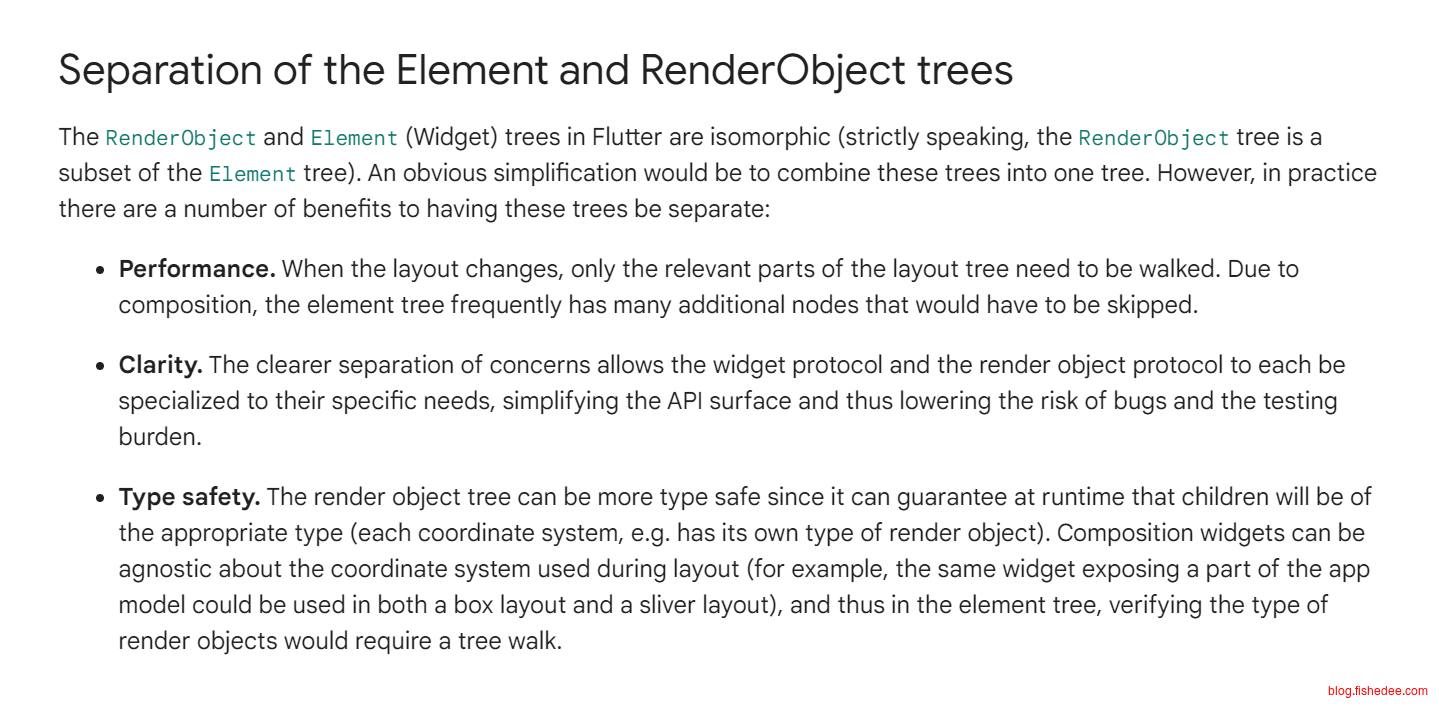
flutter专门介绍了为啥要将ElementTree和RenderObjectTree拆开。
15.2 渲染流程
//src/widgets/framework.dart
class StatefulWidget{
  @protected
  void setState(VoidCallback fn) {
    ...

    final Object? result = fn() as dynamic;

    ...

    _element!.markNeedsBuild();
  }
}

abstract class Element{
  void markNeedsBuild() {
    ...
    if (dirty) {
      return;
    }
    _dirty = true;

    owner!.scheduleBuildFor(this);
  }
}
当我们调用setState的时候,发生了什么操作,显然,StatefulWidget.markNeedsBuild中仅仅是将当前的element设置为dirty而已,并没有立即进行layout和paint的操作。
那么,什么时候才在RenderObjectTree上进行真实的layout和paint的操作呢。
//src/widgets/binding.dart
class WidgetsBinding extends RendererBinding{
  @override
  void drawFrame() {
    ...
    if (rootElement != null) {
      buildOwner!.buildScope(rootElement!);
    }
    super.drawFrame();
    buildOwner!.finalizeTree();
    ...
  }
}

//src/rendering/binding.dart
class RendererBinding{
  @protected
  void drawFrame() {
    rootPipelineOwner.flushLayout();
    rootPipelineOwner.flushCompositingBits();
    rootPipelineOwner.flushPaint();
    if (sendFramesToEngine) {
      for (final RenderView renderView in renderViews) {
        renderView.compositeFrame(); // this sends the bits to the GPU
      }
      rootPipelineOwner.flushSemantics(); // this sends the semantics to the OS.
      _firstFrameSent = true;
    }
  }
}
答案是当flutter调用到 frame 状态的时候,才进行layout和paint的操作。结合以上源代码,我们得到:
- 当触发setState的时候,flutter只是标记当前的element是dirty而已,没有进行layout和paint的操作。并且,通知flutter有空的时候触发一次frame操作,批量将所有dirty的element进行layout和paint操作。
- flutter在有空的时候,调度到frame状态,它就会执行layout和paint。
因此,我们进一步得到两个重要的结论:
- 在单次事件操作中,重复触发相同element的setState不会有性能问题,因为flutter不是立即进行layout和paint,是有空的时候批量进行layout和paint的。
- 默认情况下,flutter不会对单独组件的paint结果进行缓存,因为缓存paint结果的代价非常大,flutter宁愿在每次paint阶段,都是将当前页所有的widget从头到尾paint一遍的。因此无论页面的某些widget不进行任何变化,也不setState,也会在paint阶段执行一次。如果某些组件我们希望在paint阶段进行缓存,我们可以将它放在RepaintBoundary组件下,这样flutter就会缓存整个widget树的paint结果。看12.2的节的Demo,去除RepaintBoundary以后,你会发现无论是页面的哪个widget刷新,都会导致paint CustomPaint.
渲染管线,看到这里的话,我们基本就能理解整个渲染过程了,一般情况也够用了,无需继续看。后续三节讲的是如何优化渲染流程的各个阶段而已。
15.3 layout
在直觉情况下,某个element标记dirty,将整个element树从根部开始进行重新layout就可以了。显然,这样的性能很差。
Flutter的解决方法,从当前标记为dirty的element开始往上寻找第一个RelayoutBoundary的节点。下一次布局的时候,仅需要RelayoutBoundary节点开始重新layout就可以了。
那么,一个组件是否是 relayoutBoundary 的条件是什么呢?这里有一个原则和四个场景,原则是“组件自身的大小变化不会影响父组件”,如果一个组件满足以下四种情况之一,则它便是 relayoutBoundary :
- 当前组件父组件的大小不依赖当前组件大小时;这种情况下父组件在布局时会调用子组件布局函数时并会给子组件传递一个 parentUsesSize 参数,该参数为 false 时表示父组件的布局算法不会依赖子组件的大小。
- 组件的大小只取决于父组件传递的约束,而不会依赖后代组件的大小。这样的话后代组件的大小变化就不会影响自身的大小了,这种情况组件的 sizedByParent 属性必须为 true(具体我们后面会讲)。
- 父组件传递给自身的约束是一个严格约束(固定宽高,下面会讲);这种情况下即使自身的大小依赖后代元素,但也不会影响父组件。
- 组件为根组件;Flutter 应用的根组件是 RenderView,它的默认大小是当前设备屏幕大小。
对应的代码实现是:
abstract class RenderObject{
  void layout(Constraints constraints, { bool parentUsesSize = false }) {
    ...

    // parent is! RenderObject 为 true 时则表示当前组件是根组件,因为只有根组件没有父组件。
    if (!parentUsesSize || sizedByParent || constraints.isTight || parent is! RenderObject) {
      _relayoutBoundary = this;
    } else {
      _relayoutBoundary = (parent! as RenderObject)._relayoutBoundary;
    }

    ...
  }
}
15.4 paint
在直觉情况下,某个element在layout以后,我们也是将整个element树从根部开始进行重新paint就可以了,这正是flutter的默认行为。但是,很显然,这样的性能并不满足部分情况的要求。
- 在当前element的父亲有RepaintBoundary的时候,我们只需要重新渲染这个RepaintBoundary就可以了,页面的其他部分不需要重新渲染。
- 在动画显示的时候,每次都将所有widget重新paint的话,显然会导致性能问题。所以动画的Transition组件都会生成一个RepaintBoundary,它被称为TransformLayer
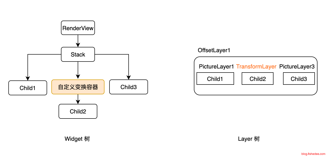
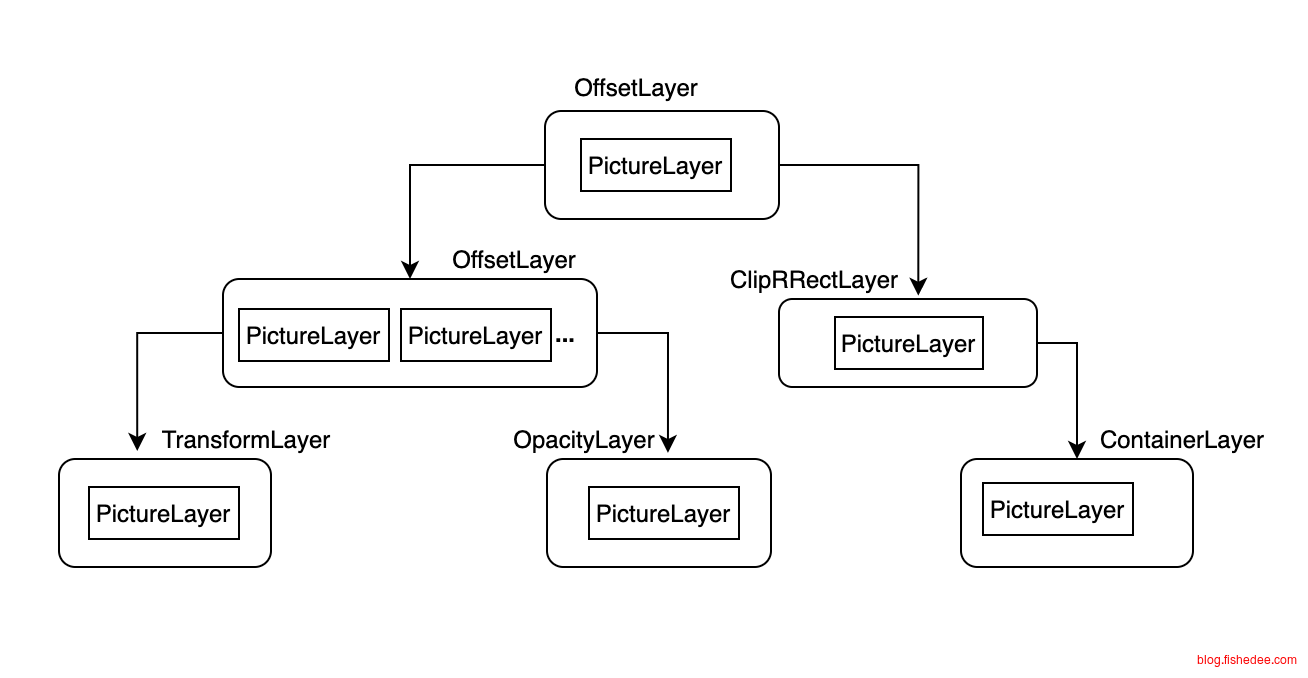
因此,在渲染流程的layout阶段,flutter的widget会按需触发markNeedsPaint(layout结果不变的话,当然不需要触发markNeedsPaint),从而计算有哪些的RepaintBoundary需要重绘,哪些不需要重绘。
当一个节点需要重绘时,我们得找到离它最近的第一个父级绘制边界节点,然后让它重绘即可,而markNeedsRepaint 正是完成了这个过程,当一个节点调用了它时,具体的步骤如下:
- 会从当前节点一直往父级查找,直到找到一个绘制边界节点时终止查找,然后会将该绘制边界节点添加到其PiplineOwner的 _nodesNeedingPaint列表中(保存需要重绘的绘制边界节点)。
- 在查找的过程中,会将自己到绘制边界节点路径上所有节点的_needsPaint属性置为true,表示需要重新绘制。
- 请求新的 frame ,执行重绘重绘流程。
markNeedsRepaint 删减后的核心源码如下:
abstract class RenderObject{
  void markNeedsPaint() {
    if (_needsPaint) return;
    _needsPaint = true;
    if (isRepaintBoundary) { // 如果是当前节点是边界节点
        owner!._nodesNeedingPaint.add(this); //将当前节点添加到需要重新绘制的列表中。
        owner!.requestVisualUpdate(); // 请求新的frame,该方法最终会调用scheduleFrame()
    } else if (parent is RenderObject) { // 若不是边界节点且存在父节点
      final RenderObject parent = this.parent! as RenderObject;
      parent.markNeedsPaint(); // 递归调用父节点的markNeedsPaint
    } else {
      // 如果是根节点,直接请求新的 frame 即可
      if (owner != null)
        owner!.requestVisualUpdate();
    }
  }
}
15.5 composite
这里有一个很好的demo,看这里
//src/rendering/binding.dart
class RendererBinding{
  @protected
  void drawFrame() {
    rootPipelineOwner.flushLayout();
    rootPipelineOwner.flushCompositingBits();
    rootPipelineOwner.flushPaint();
    if (sendFramesToEngine) {
      for (final RenderView renderView in renderViews) {
        renderView.compositeFrame(); // this sends the bits to the GPU
      }
      rootPipelineOwner.flushSemantics(); // this sends the semantics to the OS.
      _firstFrameSent = true;
    }
  }
}
compositeFrame就是将多个layer合并起来而已,叠起来一起输出。但是缓存paint结果,也就是创建layer实在过于昂贵(内存占用大)。所以,在默认情况,flutter会寻找哪些地方是可以尽量避免使用layer,而使用canvas的transform来代替。正就是flushCompositingBits的工作。
16 部署
参考资料:
16.1 应用图标
16.1.1 flutter_launcher_icons
dev_dependencies:
  flutter_launcher_icons: ^0.13.1

#flutter pub run flutter_launcher_icons:main
flutter_launcher_icons:
  android: true
  ios: true
  image_path_ios: "assets/logo/ios.png"
  image_path_android: "assets/logo/android.png"
使用flutter_launcher_icons来配置logo就可以了,执行脚本flutter pub run flutter_launcher_icons:main就能生成各个平台的logo
16.1.2 Android原生工具
看这里
尽可能使用Android的原生工具来做图标,这样不仅性能比较好,而且兼容性很好,因为Anroid的平台分裂很严重,每个厂家对应图标的大小和形状都不同。
16.2 应用名称
16.2.1 ios
<key>CFBundleDisplayName</key>
<string>App名字</string>
<key>CFBundleIdentifier</key>
<string>$(PRODUCT_BUNDLE_IDENTIFIER)</string>
<key>CFBundleName</key>
<string>trade_app</string>
修改ios/Runner/Info.plist文件,其中
- CFBundleDisplayName是用户可以看到的名字
- CFBundleName是内部可以看到的名字,可以看成是进程名
- CFBundleIdentifier是完整的标识,包括包名,例如是com.example.myapp
16.2.2 android
<manifest xmlns:android="http://schemas.android.com/apk/res/android">
    <application
        android:label="App名字"
        android:name="${applicationName}"
        android:icon="@mipmap/ic_launcher">
    </application>
</manifest>
修改android/app/src/main/AndroidManifest.xml文件,修改里面的label标签就可以了
16.3 最低支持版本
16.3.1 ios
IPHONEOS_DEPLOYMENT_TARGET = 12.0修改ios/Runner.xcodeproj/project.pbxproj文件,搜索以上关键字,设置为最低版本为12
16.3.2 android
defaultConfig {
    applicationId "com.example.app"
    minSdkVersion 21
    targetSdkVersion 34
    versionCode flutterVersionCode.toInteger()
    versionName flutterVersionName
}
修改android/app/build.gradle文件,其中的minSdkVersion为21的话就是Android 5.0版本了
16.4 打包
参考资料:
16.4.1 ios
16.4.2 android
flutter build apk --release --obfuscate --split-debug-info .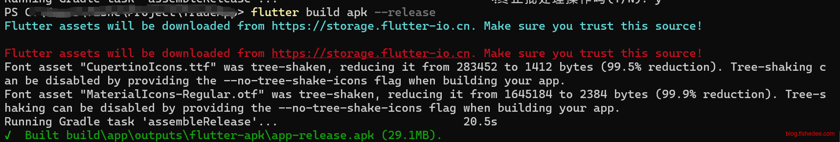
打包的时候,进行代码混淆,并分离debug符号信息
android {
    ...

    buildTypes {
        debug {
            signingConfig signingConfigs.debug
            debuggable true
        }

        release {
            signingConfig signingConfigs.release
            minifyEnabled true
            shrinkResources true
            proguardFiles getDefaultProguardFile('proguard-android.txt'), 'proguard-rules.pro'

            ndk {
                abiFilters "armeabi", "armeabi-v7a", "arm64-v8a"
            }
        }
    }
}
在app/build.gradle中,我们可以通过配置ndk项,指定只打包arm架构的apk包,这样能大幅减少apk包
20 FAQ
20.1 图片在flutter和Native有双层缓存
改用图片纹理渲染
20 总结
flutter的整体架构明显要比html5更加简单高效,而且功能比较强大。整个开发过程中,整体工具严谨高效,比微信小程序的工具链好太多了。而且,flutter的设计上追求高性能,总体来说,它依然有望达到Native的性能和开发体验。可以看这里
- Sublinear layout
- Sublinear widget building
- Linear reconciliation
- Constant-factor optimizations
- Building widgets on demand
- dart语言同时支持AOT和JIT
flutter的不足还有:
- dart语言在AOT以后,依然与Java相差近一倍的性能,还有较大的进步空间。
- 动画实际效果相比Native还是稍弱,而且支持点不多。
跨平台UI的技术路线:
- 自绘UI实现跨平台,例如flutter,优点是,大幅避免了消息序列化与反序列化的overhead,跨端渲染一致性比较高,兼容性比较好。缺点是,无法利用Native平台的优化,就像flutter上的滑动动画效果与原生依然比较弱,对于较前沿的环境(AR,MR),flutter很难提供及时的支持。
- 调用Native UI组件实现跨平台,例如ReactNative,优点是,可以充分利用Native平台的优化,缺点是序列化overhead比较高,兼容性较差,部分情况下的坑简直无解。
鱼与熊掌无法兼得,跨平台UI需要搭配业务实际需要来决策,并没有银弹。总体而言,flutter还是值得看好的。
- 本文作者: fishedee
- 版权声明: 本博客所有文章均采用 CC BY-NC-SA 3.0 CN 许可协议,转载必须注明出处!